A Coastal Home Redesigned
The Property
This young family wanted to create a fun and inspiring second home they could also rent out. From the start, they made it clear they didn’t want to use the typical traditional or muted tones you often find in coastal homes; they wanted to use lots of colour and fun, geometric patterns, as opposed to florals and pastels. We also sourced a mix of antique, vintage, high-street and bespoke furniture, and really explored different styles of lighting and joinery.
Everything needed to be resilient and hardwearing, as the property was intended to be predominantly a holiday rental. This meant using suppliers, fabrics and finishes often seen in the hospitality industry. The client also wanted to be involved in sourcing the antiques and vintage pieces, so it ended up being a collaboration to mix the old with the new.
The property was bought from an older couple and the farmhouse was in good condition, excluding a couple of damp issues. We were lucky there were zero structural or planning applications necessary as we needed to be finished by the summer. We started on site in February and handed the keys over by June, just in time for peak season.
/https%3A%2F%2Fsheerluxe.com%2Fsites%2Fsheerluxe%2Ffiles%2Farticles%2F2021%2F12%2F1-hallway-living_0.png)
The Sitting Room
This is the main entertaining space, where there are lots of nods to Rita Konig’s style – I love her use of colour. The central focus was the Rapture & Wright fabric on the ottoman – using a soft green on the walls and then deepening these tones on the two sofas, the orange and pink fabric on the ottoman really stands out. As well as various fabrics, it’s so important to use natural finishes in a space – otherwise it can feel very cold and sometimes look cheap. We mixed in bamboo, metal, glass and timber, all of which help bring the scheme together.


The Games Room
We wanted to use bold colour on the walls here, as it’s the main socialising space and needed to be able to transition easily from day to night. I love how the rust orange offsets the blue. We kept the bookshelf in the nook and decided to place a piano in front for some extra character. Initially, we had designed a built-in bar for this area, but felt it wasn't sympathetic to the style of the farmhouse.
The Study
Given how most of us now need office spaces in our home, it was vital to incorporate space for more than one person to be able to work here at a time. The colour on the walls was chosen to ensure the sofa, covered in a Rapture & Wright fabric again, became the main focal point.
/https%3A%2F%2Fsheerluxe.com%2Fsites%2Fsheerluxe%2Ffiles%2Farticles%2F2021%2F12%2F3-kitchen_0.png)
The Kitchen
The kitchen is at the back of the house and set into the landscape, so there isn’t as much light in this area as other parts of the house. Instead, we kept it fresh and elegant with our paint choices. We stuck to a muted, neutral colour palette – the main paint colour being Drop Cloth from Farrow & Ball. We also knew the work surface would be made from timber. Then, to make a feature of the island and backsplash by the oven, we had lots of pieces cut from a slab of green marble. It has lots of the same pink-y undertones you see in Drop Cloth. The paint for the utility room was always going to be a standout, 'in your face' kind of colour. From the start, the client really wanted to have fun with this space, so we went for a very deep purple – Brinjal by Farrow & Ball. We decided a mustard tone would sit nicely against the Brinjal, so we selected a beautiful print from Rapture & Wright for the curtains, which hide the appliances.


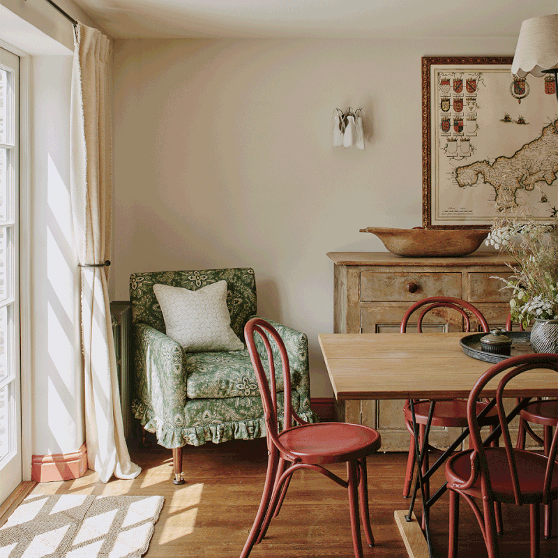
The Dining Room
Red accents were the theme in this space. We kept the walls neutral to ensure enough transition from the kitchen, but highlighted the skirting and architrave to add some character at a minimal cost. We sourced some more vintage pieces for this room, so it didn't feel too modern. The map on the wall is an antique showing the area surrounding the property.


The Main Bedroom & En-Suite
The initial scheme for this bedroom was feminine and soft – it was the only space in the property that was supposed to look this way. After discussing it with the client, however, we felt it needed firmer colours to demonstrate it was intended to be used by both men and women. We chose to use softer shapes in the space, such as the headboard from Ensemblier, but then wrap it in a punchy green velvet, teamed with darker timber and some geometric lamp bases from . We also used some pretty green and blue fabric on a bespoke bolster, to pull all the different tones together.
For the en-suite, we painted the walls in Lichen by Farrow & Ball to create more of a calm environment. The bathroom has a beautiful view out to the sea, and we wanted to mimic this inside, so we used a softer tone to complement the changes in light throughout the day. We used Zellige tiles in the shower – the glossy texture really adds some warmth to this space, and it was refreshing to be able to use colour in a bathroom, as opposed to stark white.
/https%3A%2F%2Fsheerluxe.com%2Fsites%2Fsheerluxe%2Ffiles%2Farticles%2F2021%2F12%2Fchildrens-bedroom_0.png)
The Children's Bedroom
The bright green iron beds in this room make a real statement. Our client wanted to create a fun and inviting space for her children, but one which still felt versatile enough for guests to use when it came time to rent it out. We decided to use more pattern and details in the cushion (Beata Heuman’s Folly Cushion) and chair (Lewis & Wood, Dot) and then keep the walls simple (Willow V by Paint & Paper Library). The large chequerboard pattern on the floor is fun, but it’s also hardwearing. Adding a few soft touches, such as the mohair throw from Samuel Tweed, made the room feel cosier.
The Guest Bedroom
The colours we landed on for this room were inspired by the chest of drawers, which has a soft red and pink undertone to it. The client wanted this guest room to be softer than the other one, which has an iron four-poster bed in it, so we decided to focus on the headboard and cover it in a floral fabric from Colefax & Fowler (Jardine). We teamed it with bright red bedside tables from Alfred Newall to really help it pop.


The Guest Bathroom
The main guest bathroom services two other bedrooms in the house. We kept the existing vanity and upscaled it by painting it in Farrow & Ball De Nimes. The colour choice came from the delicate pattern on the existing blinds, which sit so well in the bathroom, so we wanted to keep this running throughout. We replaced the shower with a walk-in version and used mosaic willow leaf tiles from Fired Earth.
Visit IsabelleLomas.com
Interior Photography Courtesy Of Chris Horwood - @HorwoodPhoto
DISCLAIMER: We endeavour to always credit the correct original source of every image we use. If you think a credit may be incorrect, please contact us at info@sheerluxe.com.
/https%3A%2F%2Fsheerluxe.com%2Fsites%2Fsheerluxe%2Ffiles%2Fwebsite-images%2F2025%2F03%2Fsign-up-pop-up.jpg)
