Everything You Need To Know About Colour Psychology
What is colour psychology?
Colour psychology is the study of how colour can influence our mood and our behaviour, how we feel about ourselves, and how we interact with each other. When light strikes the human eye, the wave lengths are converted into electrical impulses via the retina. These impulses pass through the hypothalamus, which is the part of the brain that controls our hormones. This is where our emotions come from. So, in psychological terms, colour is not just visual, it’s emotional too.
How exactly can colour affect our emotions?
Colour affects how we react, how we behave, our wellbeing, our energy levels, our appetite, what we buy, what restaurant or coffee shop we choose, what outfit we put on in the morning. We are constantly reacting to colour cues and making colour-based decisions whether we are conscious of it or not. Think about the tube map, traffic lights, warning signs, unripe/ripe fruit – colour is a communicator and a language. But it’s important to remember that our emotional response to colour comes from the combination of colours – we never see any of them in isolation.
Why is it important?
We are so bombarded with beautiful images, picture-perfect homes and fast-moving trends that it can be difficult to filter out what really makes us happy, as well aswhat the difference between who we really are and who we aspire to be. Colour psychology enables everyone to learn about the best colours for their home, and it enables us to get the most out of the colour choices we make.
So, how do we relate to colour?
For me, there are three main ways human beings relate to colour:
Personal Colour Association
This is all about what colour means to you personally. Perhaps your favourite (or least favourite) colours are influenced by a holiday, a childhood memory or an experience you associate with a particular colour. This could be positive or negative.
Colour In Culture
Different colours symbolise different things in different cultures. White in the West symbolises purity (which is why brides wear it at weddings) but in India and China, white is a symbol of death.
Colour Psychology
This is the way in which we respond emotionally to a colour, often on an unconscious level.
Tell us more about how individual colours affect us…
Red affects us on a physical level. It has the longest wavelength, so we tend to see this colour first. It triggers physical responses; it's stimulating and related to masculinity and our flight or fight instinct. But it’s a bit of a myth that red raises the heart rate: a study at Leeds University suggested the increase in heart rate when exposed to red is actually only about 0.3%. Dark red tones are physically stimulating but light red tones (pink) are physically soothing.
Blue affects the mind and mental responses. It stimulates thought and intellect. Light blue tones are mentally soothing while darker blue tones are mentally stimulating.
Yellow affects our emotions and impacts our nervous system. It can boost self-esteem and confidence, and encourage optimism, positivity and uplifting thoughts.
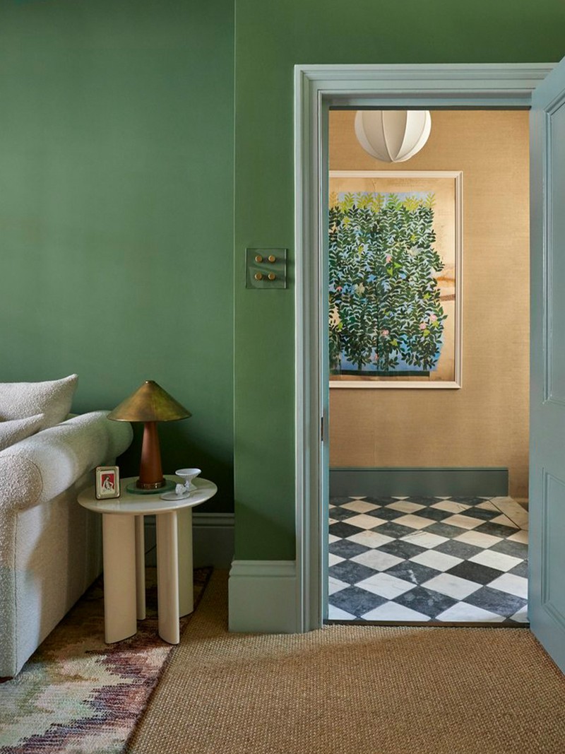
Green is the colour of balance and harmony between the physical of red, the intellect of blue and the emotions of yellow. Green is the balance between mind, body and emotional self.
What about when you change the saturation of a colour?
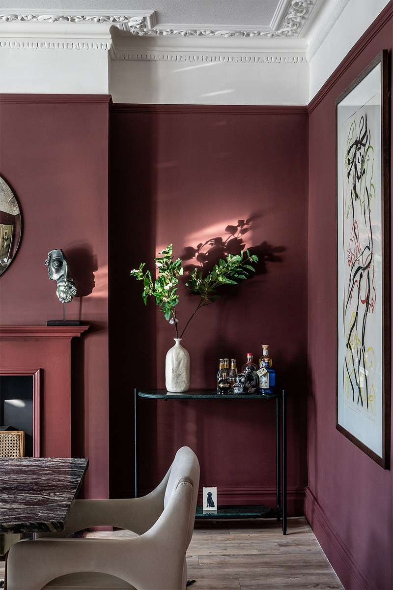
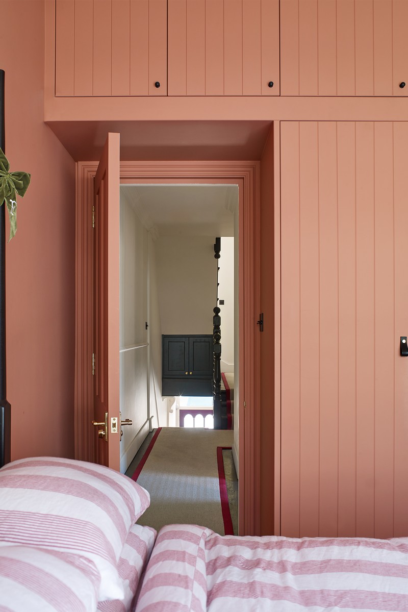
To change a colour you either add black, white or both. For example, pink is a derivative of red – it’s red plus white – but whereas red is physically stimulating, pink is physically soothing. If cuddles were a colour, they’d be pink. While red exudes warmth, energy, excitement, passion and even rebellion, and works well in a dining room, reception room, living room or as an accent colour, pink is nurturing, caring, feminine and warm. It really suits a nursery, bedroom, kitchen, hallway, living room or creative home office. Orange – also a derivative of red – is physically and emotionally stimulating. It’s warm, fun and playful, and it works well in spaces with high social interaction, such as a kitchen, workplace, hallway or dining room. That’s why you may have noticed terracotta having a resurgence recently.
Yellow is emotionally stimulating and we love it in breakfast areas, kitchens, bathrooms, a nursery and as an accent colour – especially on the ceiling. Whereas yellow with a touch of black can be emotionally stimulating, with a touch of white it can be emotionally soothing.
Because green is the colour of life, it is the one colour that requires almost no adjustment for the eye to see it, indicating it as a colour of balance and harmony. It’s reassuring and safe, suggesting new life and growth, and even universal peace. It’s very popular in kitchens at the moment, and works well in a bedroom, home office, study and living room. Depending on the tone, it can be balancing and soothing, or balancing and stimulating.
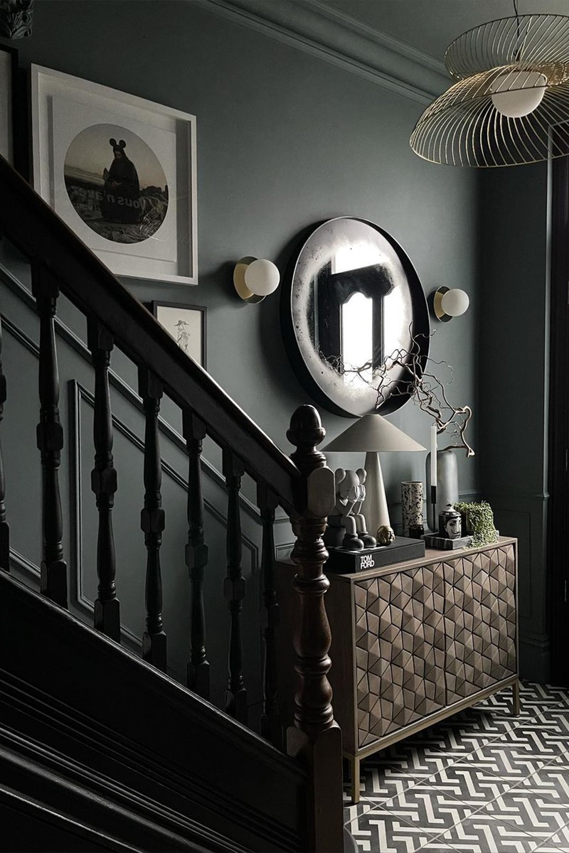
Blue is the UK's favourite colour and it can be mentally stimulating or mentally soothing depending on the hue. It encourages logic, communication, clarity of thought, calm, reflection and serenity. In a home office, go for light blue to encourage creativity and dark blue for better concentration. Also, consider using it in bathrooms, children’s playrooms, hallways and bedrooms – in fact, if you want to get a good night’s sleep, a pale blue ceiling will calm your mind.
Beige and brown represent the earth and offer an assured, safe, dependable, cosy, warm and comfortable space, which is why it works well in a living room, study, bedroom and bathroom.
White is pure, simple and clear, conveying a sense of perfection, but it can be sterile, cold and isolating. Black absorbs all the light and reflects nothing back, but can convey a sense of glamour and elegance, sophistication and gravitas, but it can also feel oppressive, menacing and heavy. Interestingly, despite its presence in many homes in the last decade, grey is virtually absent of colour. In general colour psychology terms, there are no positive qualities to grey. To make it work, look for grey hues that contain undertones of other colours you are drawn to.
/https%3A%2F%2Fsheerluxe.com%2Fsites%2Fsheerluxe%2Ffiles%2Farticles%2F2023%2F04%2Fcolour-psychology-studio-duggan-and-lick-landscape.png)
How do you know which colours you’re drawn to?
I’d suggest you go to a department store and fill a basket with whatever you’re drawn to – forget what the item is, just pick up what you like and then review your choices. You’ll quickly see your own patterns and personal style emerge. You can also work out what you like from what you wear – the colours we wear can really influence our mood, which is why we recently launched our apparel range, so if you love a muted pink, not only can you have it in your home, you can carry the feeling with you in other ways.
What happens if you have different tastes to the people you live with?
It’s really common to have conflicting styles, but I believe there’s a way to find common ground. Most of the time it’s easier to compromise than you think, especially around pink, which is the new neutral, and green, which is nature’s neutral. If there are spaces in a home which one person uses more than the other, they can take the opportunity to use a colour they particularly love there.
Visit Lick.com
DISCLAIMER: We endeavour to always credit the correct original source of every image we use. If you think a credit may be incorrect, please contact us at info@sheerluxe.com.
/https%3A%2F%2Fsheerluxe.com%2Fsites%2Fsheerluxe%2Ffiles%2Fwebsite-images%2F2025%2F03%2Fsign-up-pop-up.jpg)
