How 9 Interior Designers Make Neutrals Exciting
Paul West
@ConsideredThings
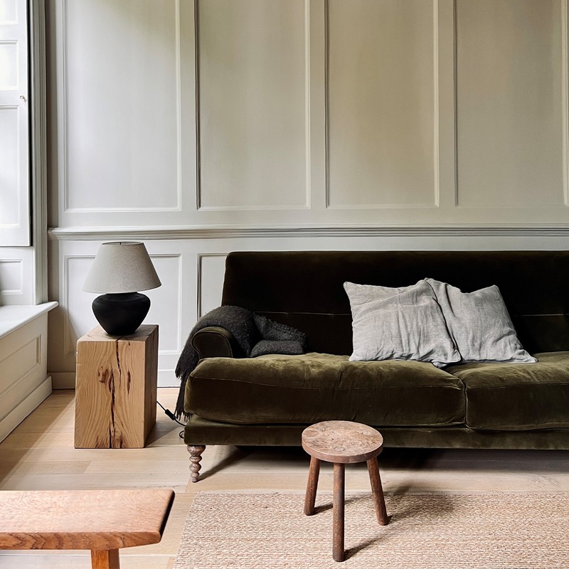
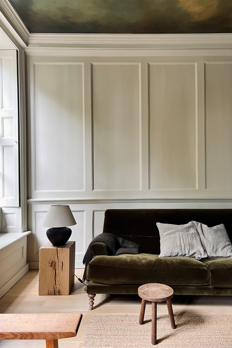
Find your complementary neutral. Our home was built in 1717 – making it a late Queen Anne, early Georgian townhouse. In keeping with the original layout, our drawing room is on the first floor. It’s south facing with three tall windows with views of the trees and street outside. The room has a hand-painted 'cloud' ceiling that mostly consists of green tones, and to complement this (and the greenery outside), we chose Farrow & Ball ‘Old White’. It’s described as a ‘historic grey-green’ – perfect for this old house.
Assemble a supporting cast. Previously, the solid oak floor was stained in a chequered pattern but we knew a more neutral look would provide a better canvas for our furniture and not fight with the ceiling. We sanded the floor back to its original colour and added some white oil treatment to help it recede. As for the woodwork – the shutters, panelling, door frames, box cornice, and skirting – we painted it all in ‘Old White’ to simplify the look and celebrate the architectural details in equal measure.
Pay attention to the finishing touches. The lighting and furniture are all quite eclectic but what unites them is that they’re made from real materials – stone, steel, wood, wool, leather. Colour is inherent in the materials – the only exception is we had the sofa reupholstered in a beautiful moss green velvet, to work with the green tones of the room and the scenery outside.
Noor Charchafchi
CEO & Founder At Celine Interior Design
Start with the walls. We chose ‘Shadow White’ from Farrow & Ball – finding a wall colour is essential because you need it to pull together all the elements of the scheme, but it also needs to work with the lighting, both natural and artificial. In this particular room, we wanted to create two separate spaces, a bedroom and a dressing room, so the paint needed to feel warm and enveloping but also bright and practical.
Play with texture and pattern. Making a neutral scheme work comes down to texture, pattern, contrasting wood and metal finishes, so the room doesn't feel dull. In this bedroom, we used laser-cut leather on the headboard which sits against soft wools on the bed. The softness and tonality of the fabrics are emphasised by the strong accents we used elsewhere, such as the brushed brass cabinet handles and floating picture frames.
Find a theme. The oversized windows in this space and the abundance of natural light were the initial inspiration for a 'nature' inspired room. We wanted to accentuate the calming, organic aesthetic by pulling in dark green tones on the bed and through our use of subtle motifs such as the bedroom wall lights. The delicate hand-painted de Gournay wall covering contrasted with the brass accents which are woven throughout.
Edo Mapelli Mozzi
CEO & Founder At Banda
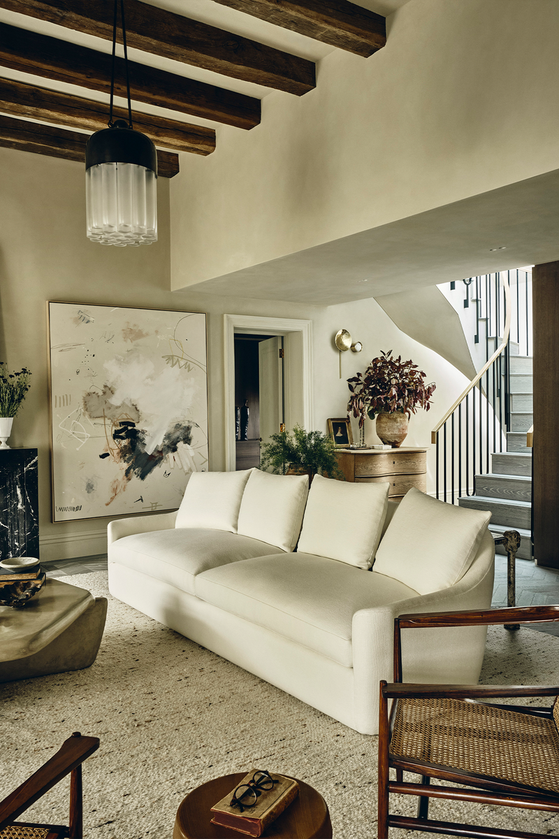
Make the most of different, but still warm, tones. This colour palette of this penthouse is dominated by natural tones – drifting gently from olive through to taupe. Realised in clay plaster, the calming shades have a depth and warmth that’s emphasised by the natural light that fills the room at every time of the day. The room is so light and bright we were able to continue the colour up and across the unusually high ceilings. We then softened the look by introducing old oak beams juxtaposed with modern statement lighting.
Use neutral textures. We chose simple plain linen window treatments so as not to detract from the view of the garden square outside and used natural textures throughout – lots of linen, cotton, soft wool, cane and vintage wood. The dresser in the background is vintage, sourced from an antiques market and has a very seductive, soft curve to it. The rustic red leaf arrangement provides a good focal point, too.
Zone the space to make it work in harmony. We chose contemporary herringbone flooring in a similar tone, with a large wool rug to zone the seating area. The vintage rosewood and cane chairs bridge the gap between the dining area and living room, while the striking angular tadelakt coffee table offers up a smooth sheen within the same neutral colour palette.
Adele Lonergan
Co-Founder & Creative Director At Covet Noir
Inspect the proportions. Set within a 17th century converted chapel that was once a recording studio, this penthouse apartment has incredible proportions. The double height, open plan living space is flooded with light from two sides and its west-facing orientation makes it lovely and light in the evenings. As such, we knew we wanted to keep the colour palette fresh and simple. A colour we always come back to is Farrow & Ball ‘All White’. It’s crisp without being cold, and reflects the tones around it, which means it's incredibly versatile.
Install a show-stopper. In this project, it’s the double height bespoke bookcase with a bronze sliding ladder. We designed the shelves to draw the eye up and highlight the beautiful arched chapel windows. The simple wide-plank oak floor complements the architectural proportions – a more detailed floor would have felt too busy.
Introduce organic elements. Given the grand volumes of this living space, it was important to zone the different areas to make it feel liveable, but to make it feel even more inviting, we focused on introducing organic touches and materials. The textured rattan chairs balance the vintage Calacatta marble coffee and soft textured materials like the sheepskin Tired Man armchair add a cosy feel without being fussy.
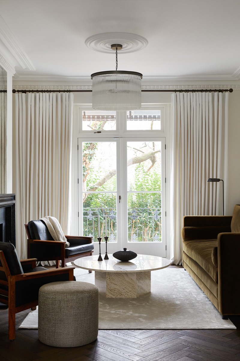
Work with what you have. The clients were keen to use a deeper colour because they wanted the living room to have a members’ club feel. But we knew that, due to the tall narrow proportions of this Notting Hill townhouse, a rich tone would overwhelm the east-facing room. Instead, we found a neutral shade with a hint of warmth to compliment the chocolate-toned timber floor. After testing a few colours, we settled on ‘Holland Park’ by Mylands. The beauty is its subtle yellow pigment, which makes it perfect for period properties.
Pick the right materials. The previous owners removed the original fireplace so we knew we wanted to reinstate it. Once we’d selected the chocolate-hued herringbone floor, we started thinking about what stone would be best suited for the surround. While a light stone would have been lovely, we wanted something with more contrast. The honed Nero Marquina adds both depth and drama, while the Bolection design does not intrude on the narrow space. We also added plasterworks throughout to reinstate some much-needed character to this Victorian home.
Focus on contrast and juxtaposition. We carefully mixed materials and textures rather than introducing lots of colour and pattern. The bronze and glass chandelier adds a bit of glam, offset by the creamy toned travertine coffee table. The deep ochre velvet sofa adds richness, which is then juxtaposed with the vintage leather armchairs that add a more masculine feel.
Murude Katipoglu
Founder Of Design Stories
Understand the setting. The Boathouse is a charming timber building within the 900-acre Ewhurst Park Estate, once home to the Duke of Wellington. For the walls, I picked an archive colour from Farrow & Ball. It is a light taupe with pink undertones, making the space feel light, airy but still warm. The room has double-height ceilings, chunky timber beams, and full-height doors. I wanted the space to feel as if it blended with the outdoors, so I opted for a neutral background to contrast nicely with the dark textured wood on the joinery.
Look at the lighting and needs of the space. It was important to me that the colour would work as well in a dimly lit room as it would in natural daylight – it also needed to be able to create a warm and cosy environment when people were gathered around the large open fireplace or having a candle-lit dinner around the timber dining table. That led us to heavy natural linens in soft light tones, pops of pastel colours and hard woods combined with woven textures and antique brass and bronze details.
Samuel Pye
Creative Manager At Echlin
Prioritise calm and texture. Our favourite neutral is polished plaster as it offers a calming backdrop but still provides lots of texture. If you don't want to invest in an applied finish, there are lime wash paints like Bauwerk that add the texture without the need for a specialist. When choosing a neutral wall colour, it’s important to make sure you try out some samples first. It's amazing how hard it can be to really understand the different tones in the paint books, and the same colours can look very different in different spaces. The descriptions on the paint brand websites are actually very useful, and even better if you can get to one of their dedicated stores. Little Greene's ‘Slaked Lime’, ‘Portland Stone’ and ‘French Grey’ come in different darkness levels, so you can choose the best one for your space and aspect.
Think about the atmosphere you’re trying to create. For example, is this a room that you want to relax in? Is this a space that kids will use? Are you a formal or informal person? For grander spaces we tend to be drawn to deeper tones like rust, olive, mustard – all of them pair well with more traditional neutrals. If we're looking at an open plan living space for all the family, we might bring in brighter greens, reds and yellows or we may leave that to the artwork. Often, matte or burnished black and bronze accents work really well in neutral spaces as they can hide or distract from things like televisions and curtain poles.
Sheena Murphy
Founder At nune
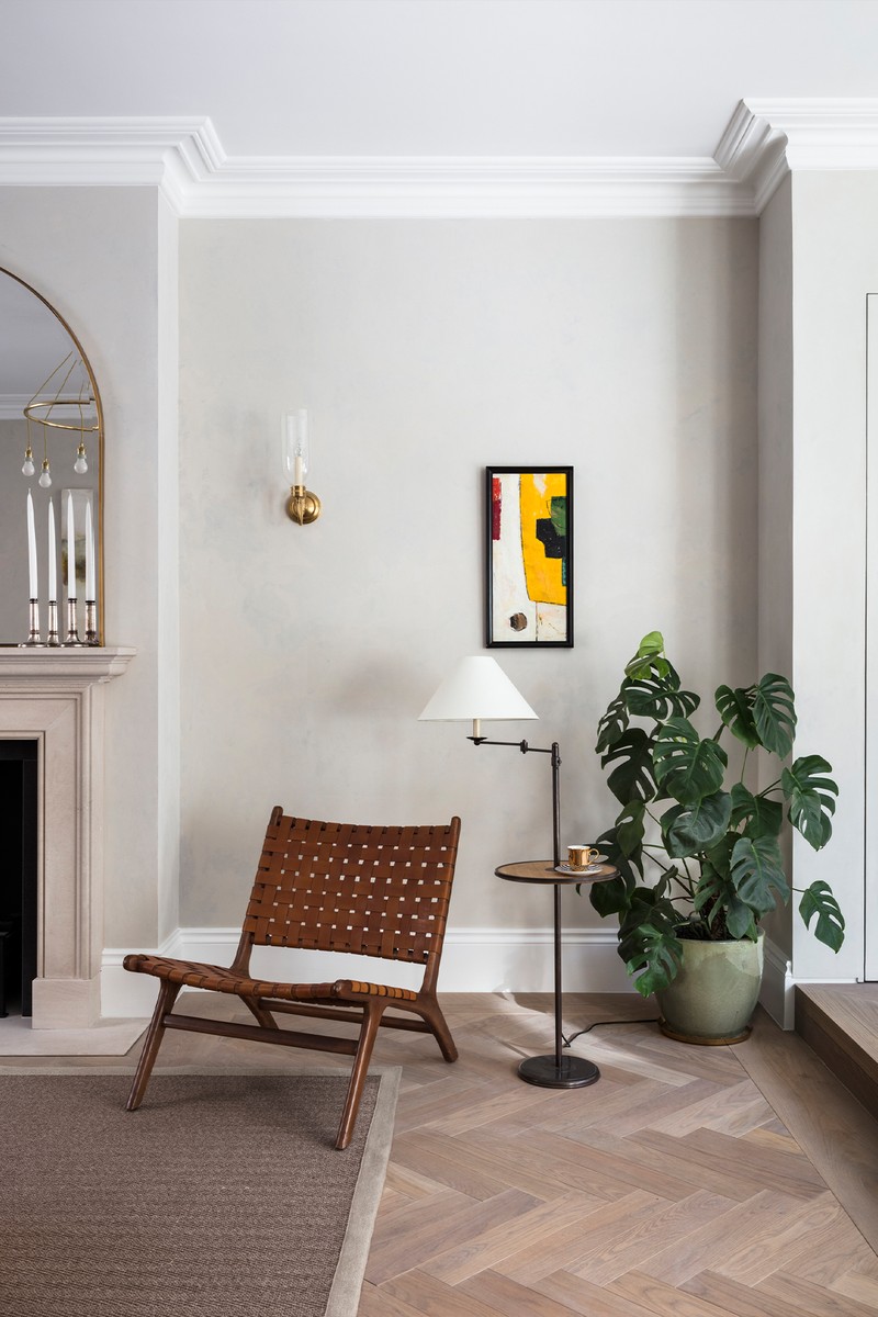
Think outside the box. Neutrals are the most subtle, nuanced colours to work with. It's often assumed that white, ivory, cream and beige are what they are, but tonal shifts can impact a space significantly. It can take a room from feeling cold to cosy. In this London living room, we used Little Greene's ‘Joanna’, which is a warm neutral with lots of depth. It has a hint of pink which lends a softness to the space and allows for the introduction of colours like rust, brown and beige. We often wrap the wall colour onto the ceiling but didn't here because the ceilings, which are north facing, feel relatively low, so applying a slightly lighter, brighter tone lifted the room a little.
Ensure enough tonal difference. When working with neutrals, it's important to ensure enough texture, shape and tonal difference to avoid it feeling flat or one dimensional. We did this through architectural details like the soft curved archways, adding small scale Japanese tile to the curved fireplace, layering in a high-low texture rug and chunky wool upholstery on the armchairs.
Tie everything together. We did so with a mix of ceramics in earthy tones and varied shapes, vintage lighting and artwork in shades of butter, mahogany and chestnut – all of which sit comfortably against the pale neutral wall colour, upholstery and oak flooring.
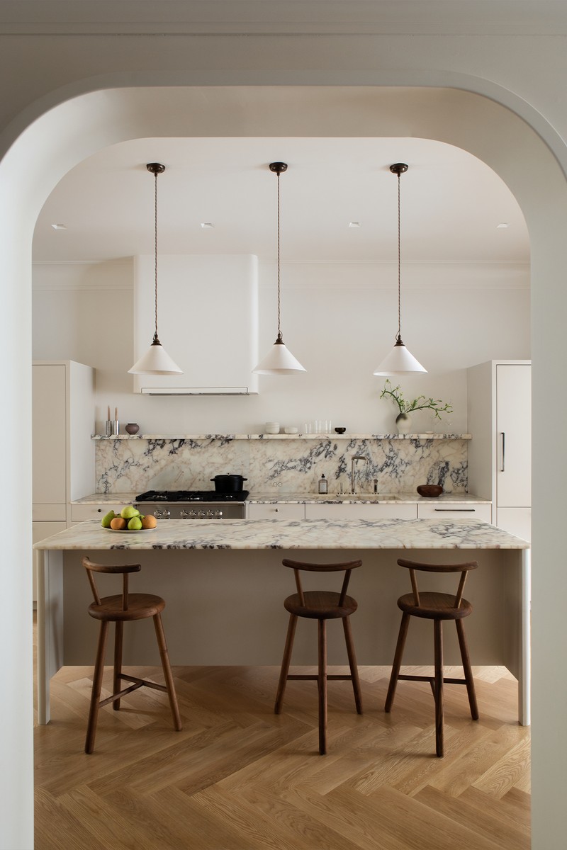
Look for dimension. This paint colour has become one of our go-tos if we need a clean white with some dimension – it allows for both warm and cool tones to co-exist harmoniously. It's so versatile, in fact, we wrapped it onto the ceilings in this urban kitchen. The space sits in the centre of the Victorian house with exposure to both the north and south, so the light is ever changing.
Balance cool with warm. The calacatta viola marble we used for the countertops and backsplash sings against the origami white walls and warm grey cabinets. The pewter hardware, purple hued stone and grey kitchen cabinets pull the scheme in a cooler direction but the oak flooring, walnut stools and pink-butterscotch veins in the stone provide a nice amount of warmth so the result feels balanced.
Nod to the traditional. We used this ceramic lighting from Devol for its creamy tone and crackle glaze – both of which feel a little bit traditional. Those, paired with the handmade feeling of the Edward Collinson stools and the curves on both the extractor hood and the architecture framing the room, make it feel inviting.
For more information, visit BandaProperty.com, EchlinLondon.com, StudioDesignStories.com, CelineInteriorDesign.com, NuneNune.com & CovetNoir.com. Follow @ConsideredThings on Instagram.
DISCLAIMER: We endeavour to always credit the correct original source of every image we use. If you think a credit may be incorrect, please contact us at info@sheerluxe.com.
/https%3A%2F%2Fsheerluxe.com%2Fsites%2Fsheerluxe%2Ffiles%2Farticles%2F2022%2F11%2Fsl-2-decorating-neutrals-celine-interior.png?itok=oOWatGy4)
/https%3A%2F%2Fsheerluxe.com%2Fsites%2Fsheerluxe%2Ffiles%2Farticles%2F2022%2F11%2Fsl-4-decorating-neutrals-covet-noir.png?itok=3HL6ng8w)
/https%3A%2F%2Fsheerluxe.com%2Fsites%2Fsheerluxe%2Ffiles%2Farticles%2F2022%2F11%2Fsl-6-decorating-neutrals-design-stories.png?itok=iSFuDmt0)
/https%3A%2F%2Fsheerluxe.com%2Fsites%2Fsheerluxe%2Ffiles%2Farticles%2F2022%2F11%2Fsl-8-decorating-neutrals-nune.png?itok=v1tqN7RU)
