The Bestselling Colours From The UK’s Top Paint Brands
FARROW & BALL
Creative director Charlotte Cosby says:
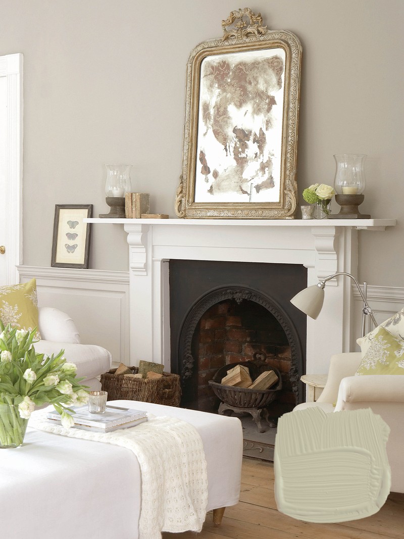
Joa’s White
Named after our colour curator Joa Studholme, this white is a great neutral option. It has a warm tone, complemented by a small amount of black pigment, and brings a cosy feel to any space of the home. It would work well with pinks and reds to create a soft contrast.
Shop here
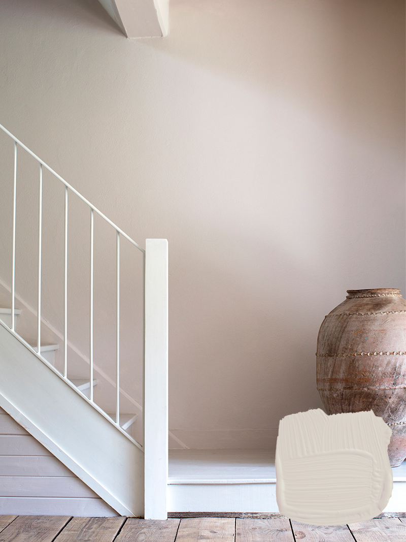
Elephant’s Breath
This is one of our most popular shades, originally created by the renowned British interior designer John Fowler. It’s a mid-grey with a hint of magenta that can almost look lilac in the cooler light of west facing rooms. Try offsetting it with shades like London Clay or Charleston Grey.
Shop here
Stirabout
This earthy oatmeal colour was inspired by the nurturing porridge favoured over many centuries in Ireland. Part of the colour collection that launched in 2022, this tone has a hint of underlying grey which is ideal for relaxed interiors without feeling too cold. Try pairing it with Jitney and natural fabrics for a laidback look.
Shop here
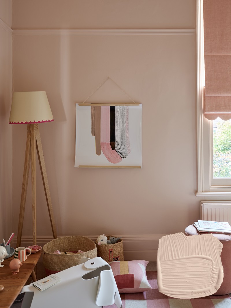
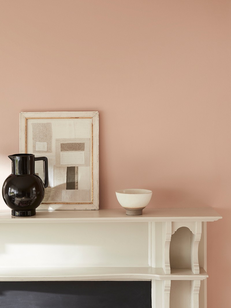
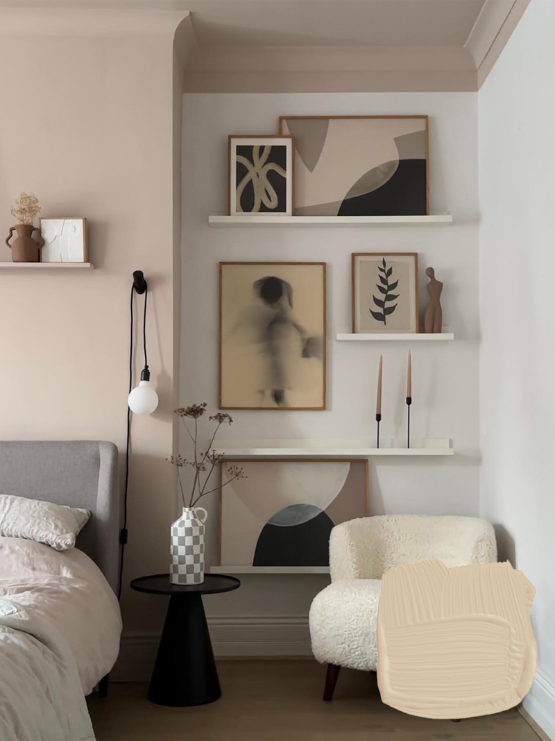
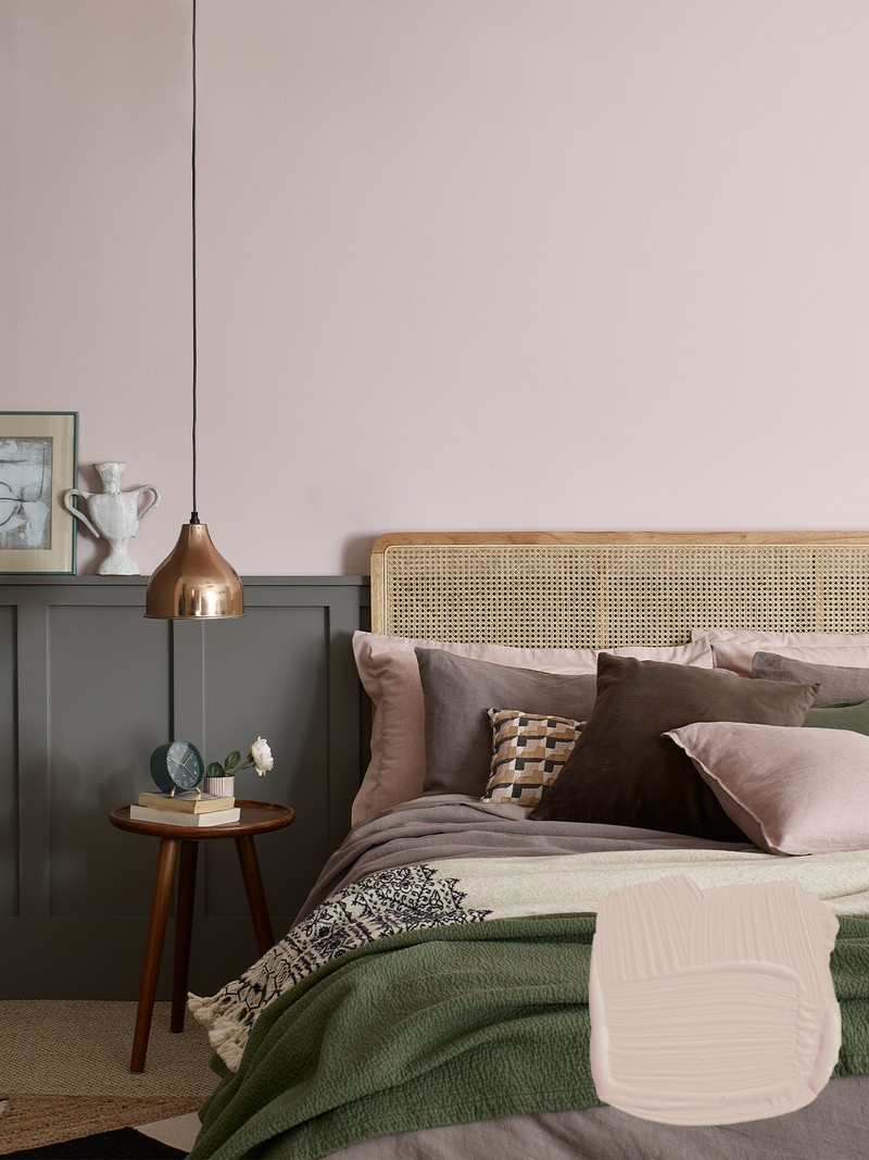
Setting Plaster
This dusty pink is named after the walls in newly plastered houses. It’s a pink in historic terms but has a certain softness from a touch of yellow pigment. The timeless Setting Plaster creates a wonderful backdrop for antique furniture and works well with Tanner's Brown in a more contemporary home.
Shop here
Beverly
This clean mid green is named after a kind and generous member of the Farrow & Ball team who is sadly no longer with us. It’s a dependable, uncomplicated colour, which can feel even greener in bright daylight or more conservative in lower light. We recommend pairing it with Shaded White or Eddy.
Shop here
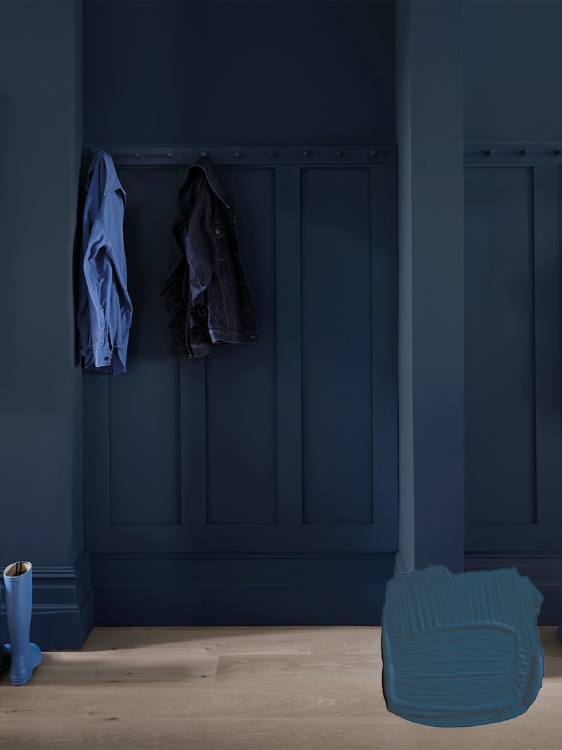
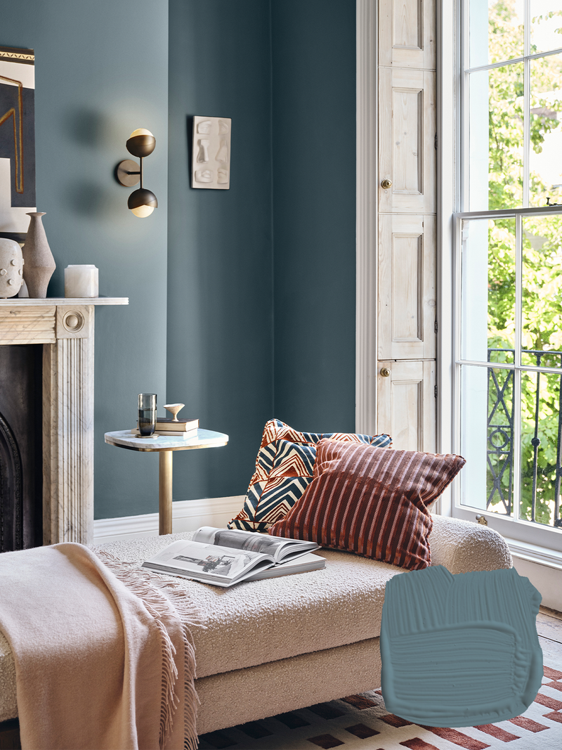
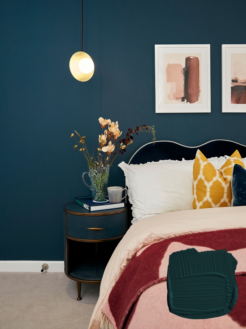
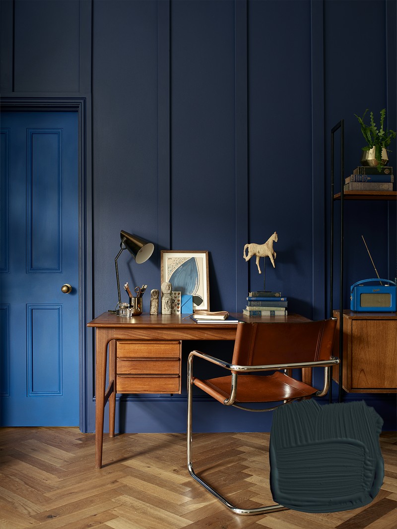
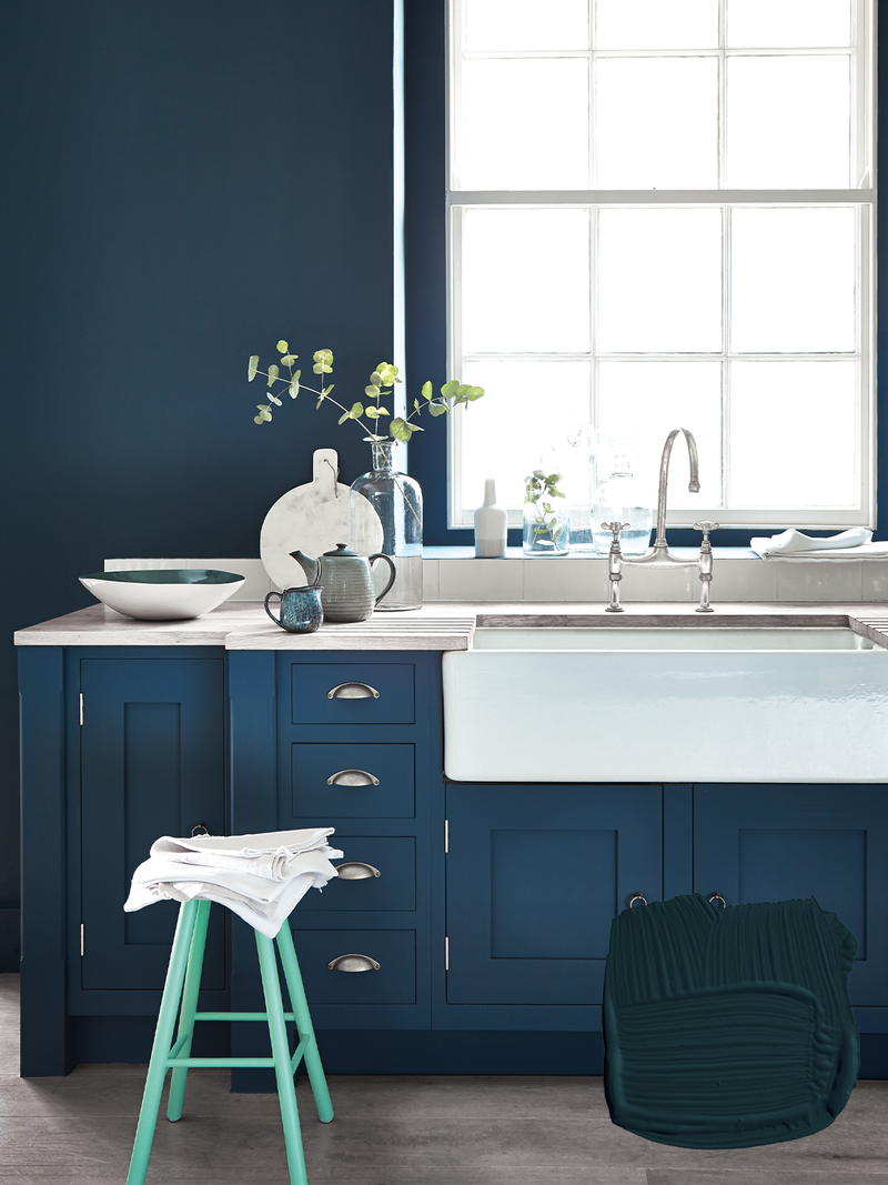
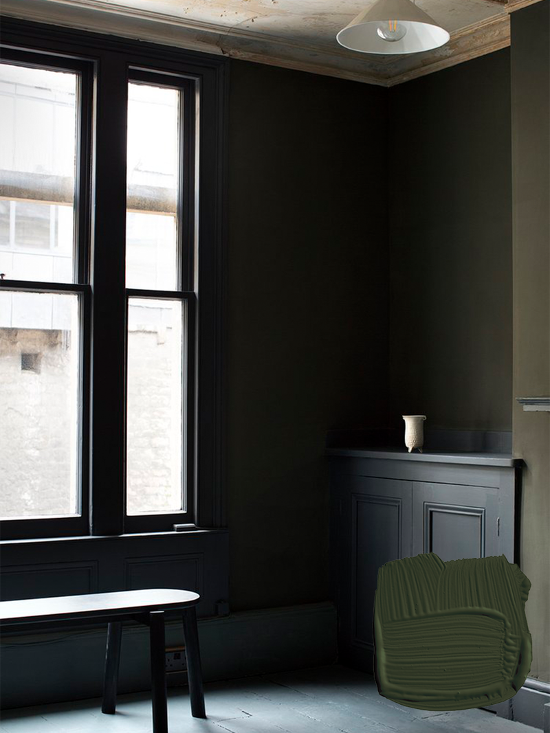
Hague Blue
This strong blue takes its name from the fantastically coloured woodwork used by the Dutch. It works on ground skirtings or as an accent colour on the walls when teamed with Borrowed Light. The green undertones of this deep and dramatic blue mean it sits as happily outside as it does in small, dark rooms.
Shop here
LICK
Director of interior design Tash Bradley says:
White 02
White is an eternally popular and safe option as it creates a soft and airy colour palette, balancing out the light and creating an effortless, crisp feel to a home. Our White 02 is an off-white with grey undertones that’s not too bright and just cool enough. It will make your space feel clean and sophisticated.
Shop here
Grey 08
A velvet-soft, cool charcoal grey with blue undertones, Grey 08 has a glamorous character which makes a room feel rich yet relaxing. It’s the perfect colour for cosy living areas. Pair it with a soft, light pink velvet sofa to really bring the colour to life.
Shop here
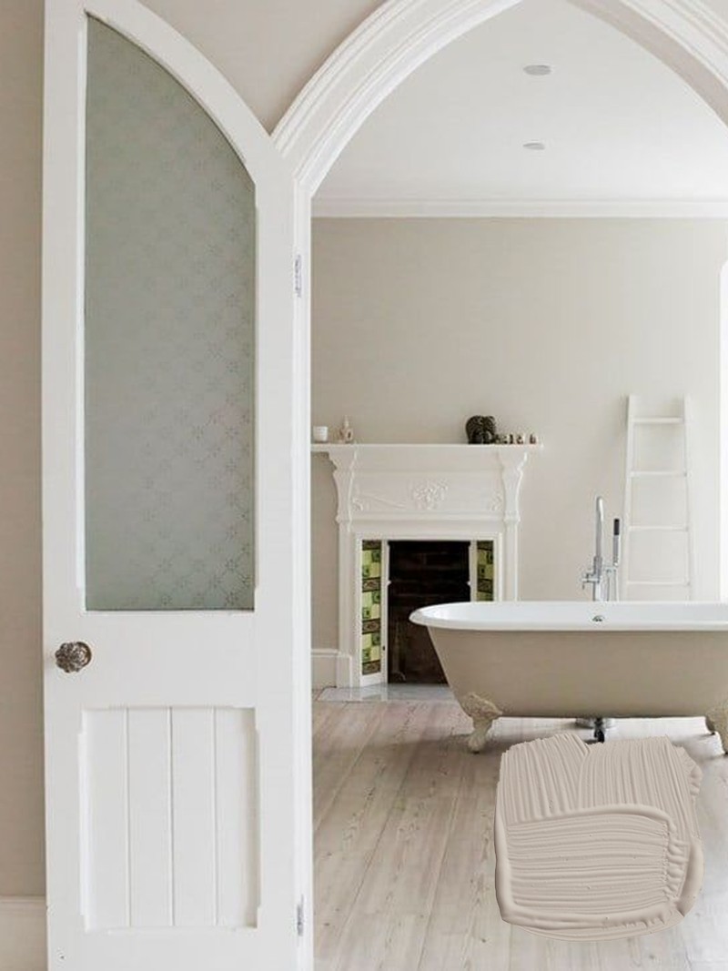
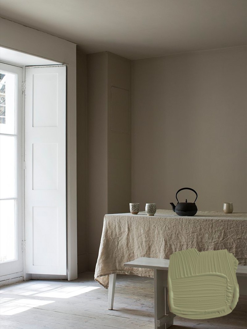
Taupe 03
Taupe 03 is a warm and subtle taupe with red and grey undertones. It has a dependable, nurturing quality that’s ideal for a calming and grounding home. One of our most popular colours for a reason, Taupe 03 suits any room, but works particularly well in bedrooms that crave a warm and earthy feel.
Shop here
Pink 01
This is Lick’s most delicate and understated pink. With its light grey undertones, the shade is soothing and nurturing for a calm and inviting space. Easy on the eye, it’s no surprise that it’s one of our most popular pinks as it can be used throughout the house. I recommend this to clients as it fills every room with a soft warm glow.
Shop here
Green 02
Your eye needs little to no adjustment when looking at green, which is what makes it one of the most restful, soothing colours. People are particularly drawn to sage because it has the relaxing effects of being surrounded by nature. Our Green 02 has blue and grey undertones, and is versatile enough for kitchens, bedrooms, living rooms and more.
Shop here
Blue 06
A slate blue with cool black undertones, Blue 06 is mentally stimulating, creating the perfect space to spark creativity and aid mental focus. It lends itself particularly well to home offices, but it’s also a lovely colour for bedrooms and living rooms. Blue 06 also creates a feeling of depth and spaciousness, so it also works in small, darker spaces.
Shop here
DULUX HERITAGE
Creative lead Stephanie King says:
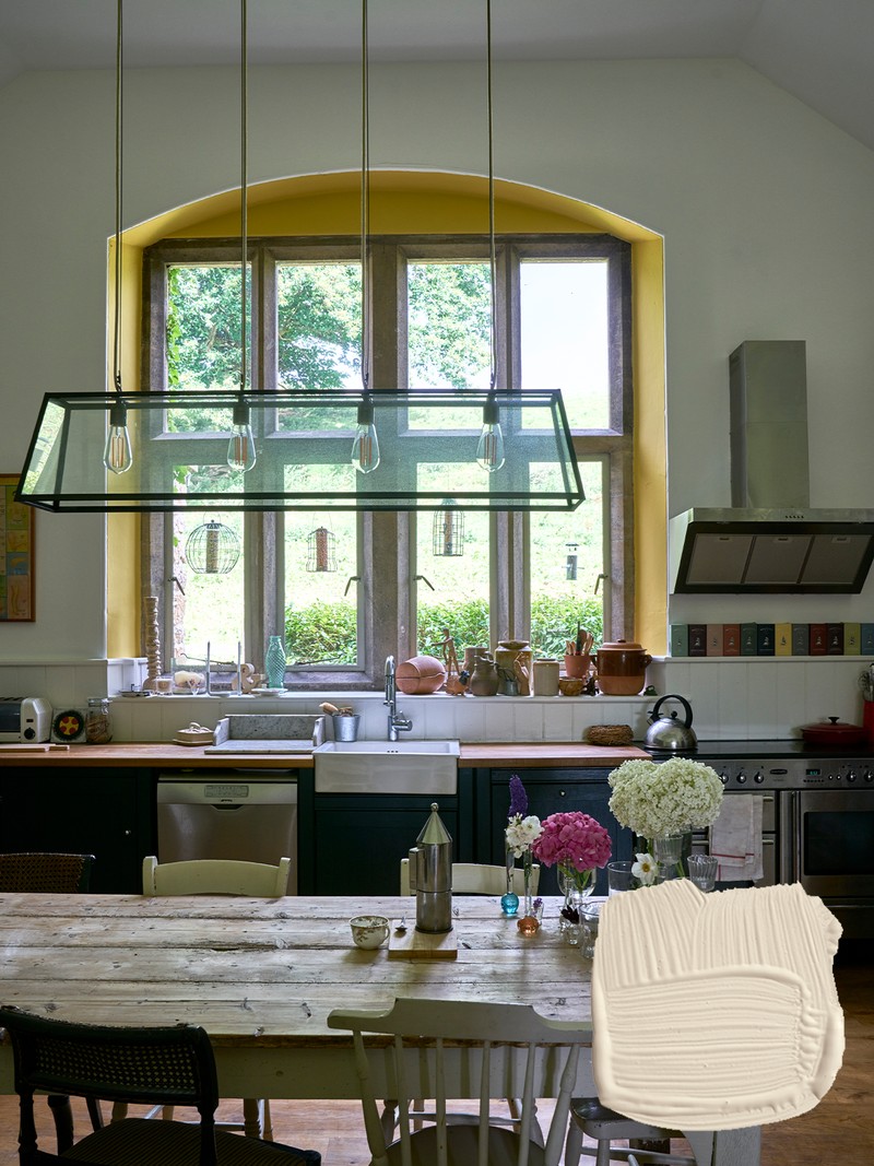
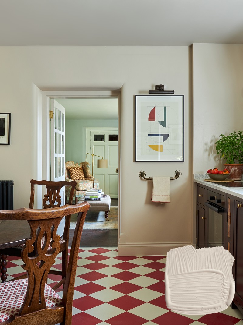
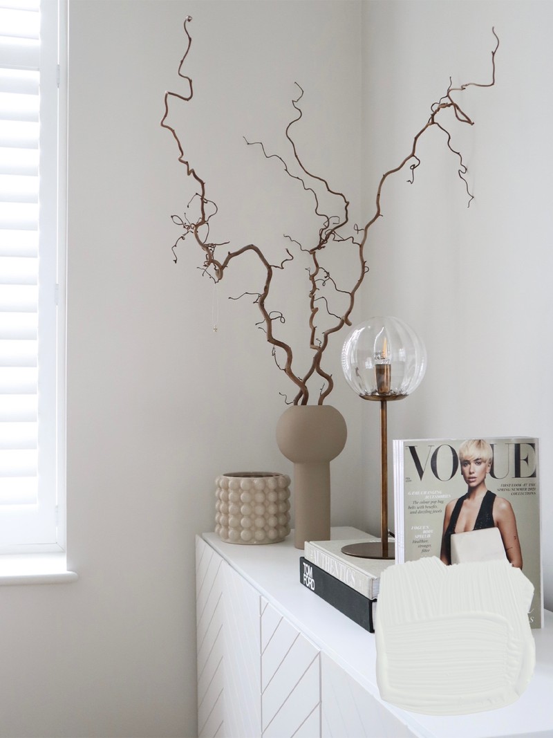
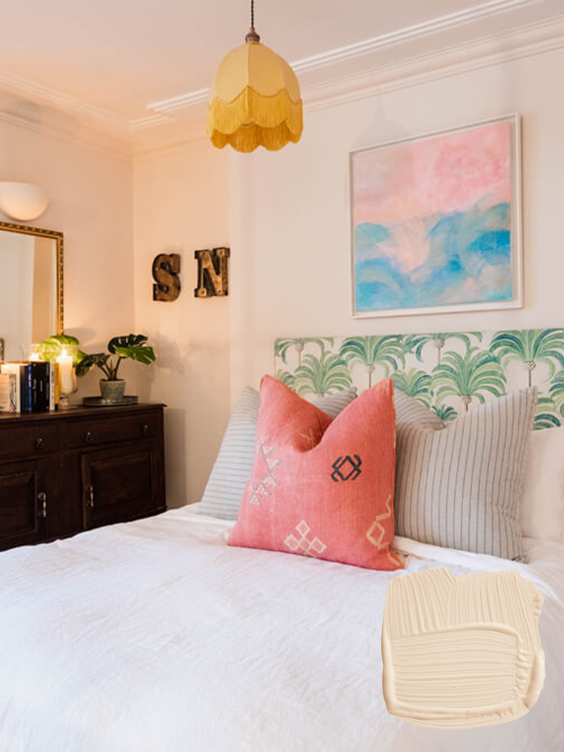
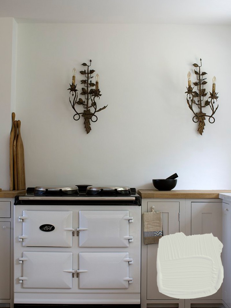
Indian White
This white is sophisticated and warm. It's a soft and understated addition to any room but still feels light and airy enough to use in the darkest of corners. It works well layered with other coordinating pale tones such as Chalk White and Beachcomb Grey, allowing some brighter pops of colour in accessories to take centre stage.
Shop here
Romney Wool
This is a classic grey and a great option for any space. It’s a very pale taupe and has a cooler appearance than a cream or beige of the same depth so it’s more flexible in what it can be paired with. For a dramatic contrasting, pair it with deeper blues and violets like our Midnight Teal or Mauve Mist. Personally, I like to keep this colour simple and use with tonal shades of grey for a more modern look.
Shop here
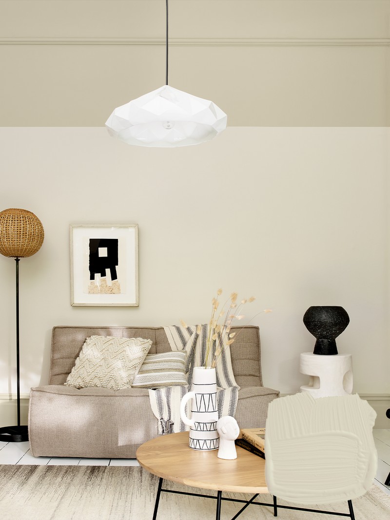
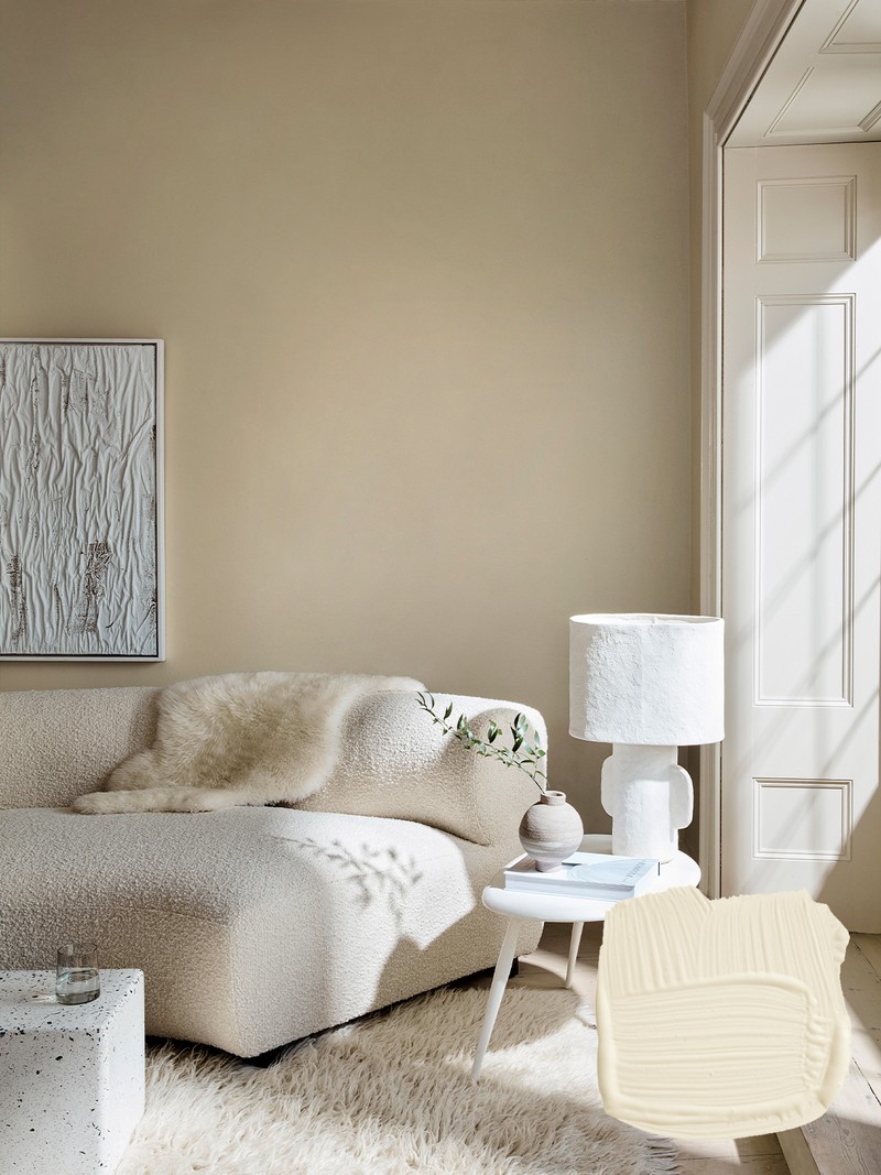
Flax Seed
Flax Seed is a muted pale beige that captures the timeless quality of vintage pearls while also being a modern and sophisticated vanilla shade for everyday use. It works well with tones of subtle olive green such as Cornish Clay and Olive Tree, which enhances its natural straw-like tones. Consider it for hardworking transitional spaces such as hallways, landing areas and family living spaces.
Shop here
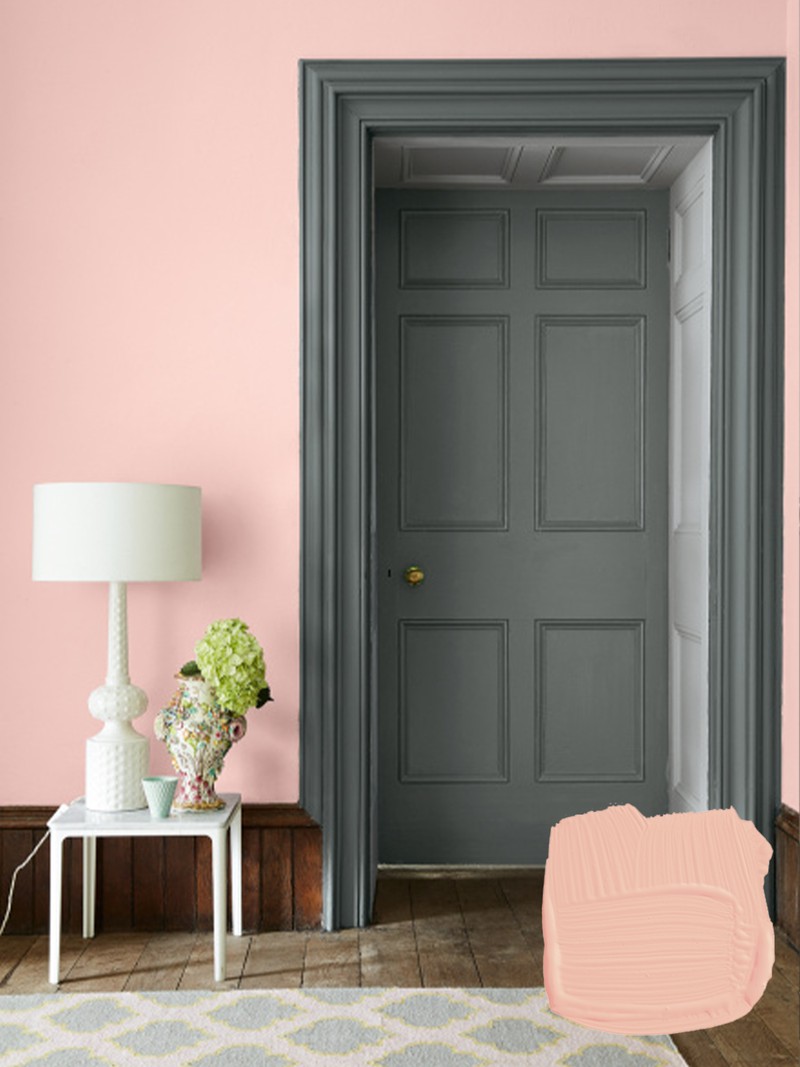
Potters Pink
Potters Pink is a great option for injecting colour and warmth into the home. It’s a pale blush shade reminiscent of Edwardian cottage garden blooms like peonies. It works with Marble White if want to keep pink as the central focus, but I like it with unexpected colours such as Mud Lark which neutralises the traditional, ultra-feminine feel pink often has.
Shop here
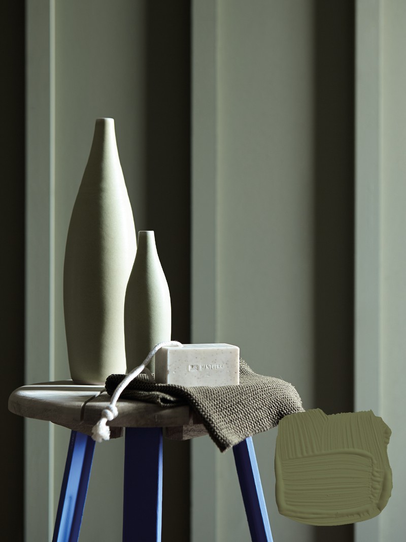
Stone Green
Stone Green is a personal favourite, too. It’s a mid-grey green that has natural connection to materials like granite and marble with its muted tones reflected in their flecks. It’s a sophisticated and versatile shade, and its relatively neutral in tone, so works well with numerous colour families. I like how it sits with pinks and terracotta shades.
Shop here
DH Oxford Blue
This is a deep, sumptuous navy that once would have been exceptionally expensive to create – it retains some of that extravagance with its ultramarine, deep violet undertone. It works well with other blues in a tonal scheme as well as in combination with crisp neutrals such as Edelweiss White or Quartz Grey. With its moody, evocative feel, it’s an ideal wraparound colour in a study or office.
Shop here
LITTLE GREENE
Creative director Ruth Mottershead says:
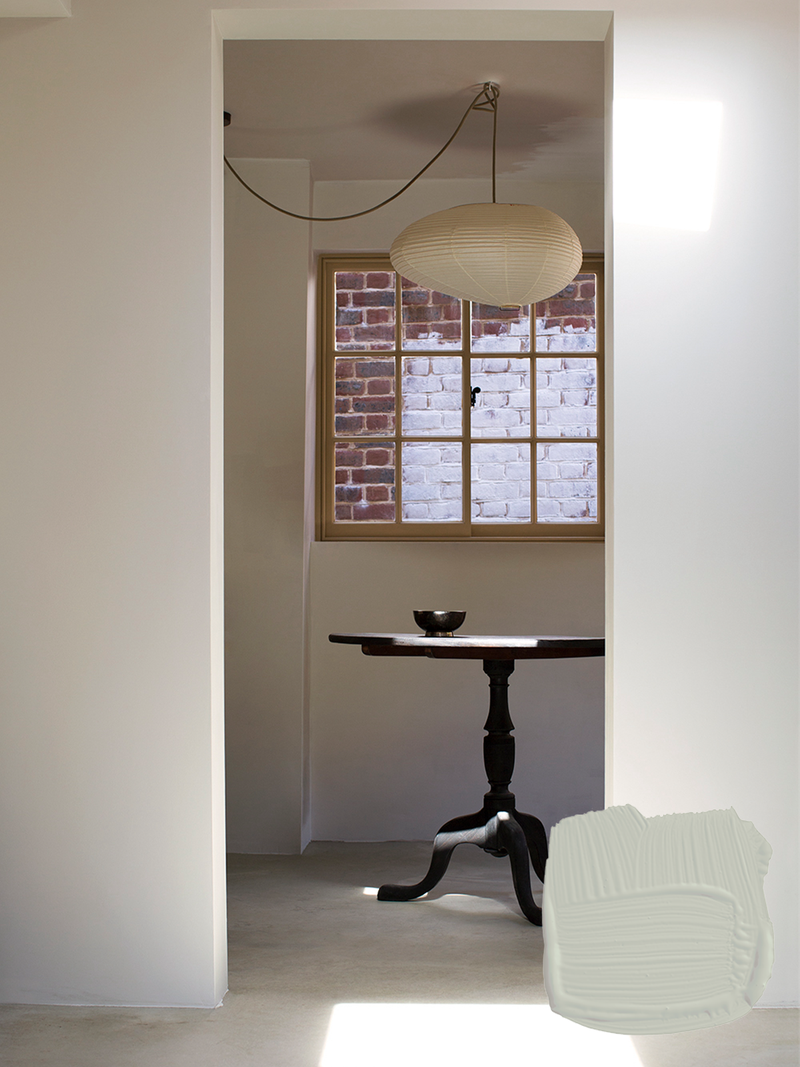
Silent White
White is often one of the most difficult shades to choose because there are many variants and finding the right tone can be a challenge. Avoid ‘brilliant whites’ which can feel clinical and go for ‘off whites’ like our Silent White which adds softly spoken depth to an interior. It will work well with lighter and deeper versions of the colour on walls, ceilings and trims.
Shop here
French Grey
Greys should be well balanced like shades from the French Grey family. This colour is incredibly versatile as it’s not too warm or too cold. It goes well with blues, greens and pinks, as well as earthy colours like Nether Red and French Dark Grey to create a comforting, soothing scheme that evokes a sense of calm.
Shop here
Portland Stone
We’re seeing a real shift away from cold toned greys and a move to warm neutral shades like Portland Stone. It's earthy, versatile and particularly elegant when used alongside its sister shades Portland Stone Pale and Portland Stone Dark.
Shop here
Confetti
In recent years pink has found its way into every corner of the home. Soft pinks like Confetti are particularly popular, as they provide warmth to a space while remaining light and welcoming. It contrasts well with darker colours such as Lamp Black for a bold kitchen space, or moody greens like Livid for a contemporary take on a classic pink and green pairing.
Shop here
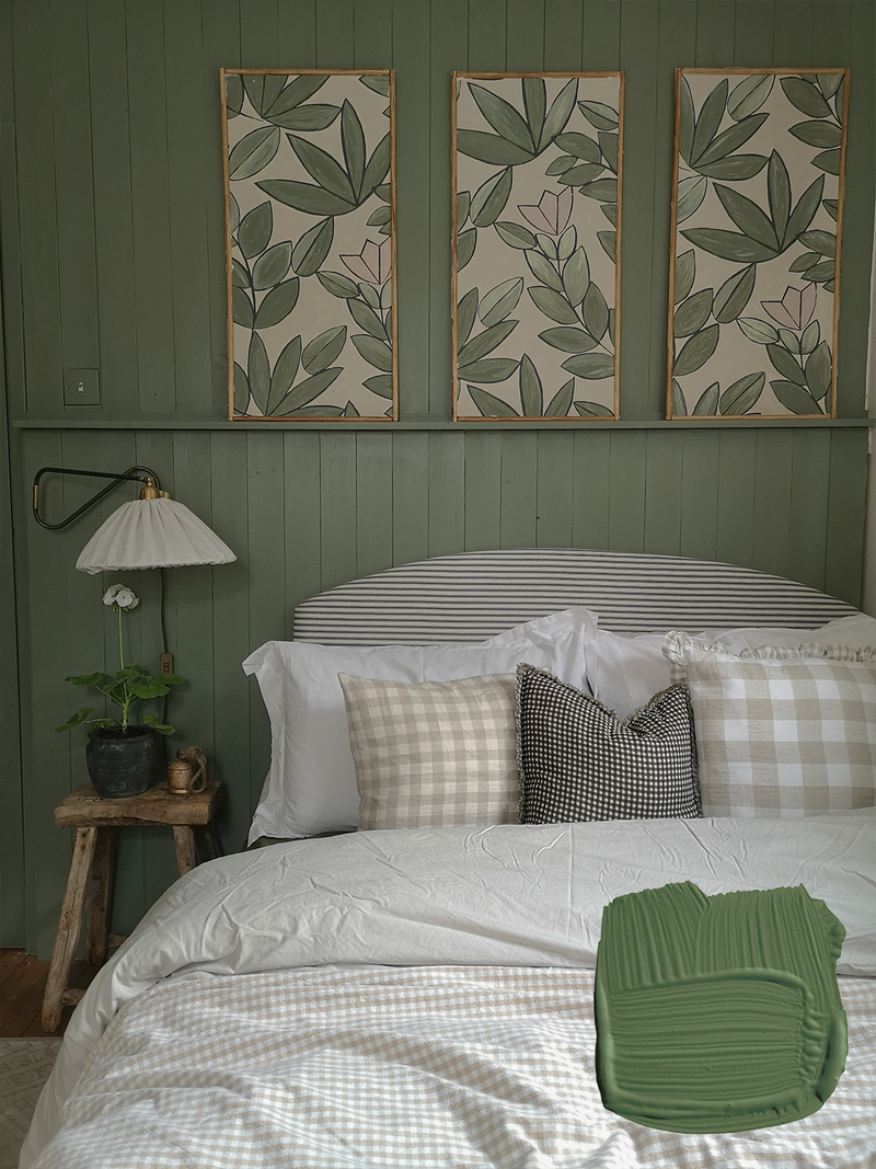
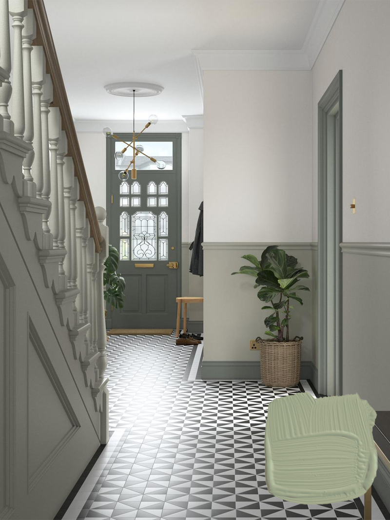
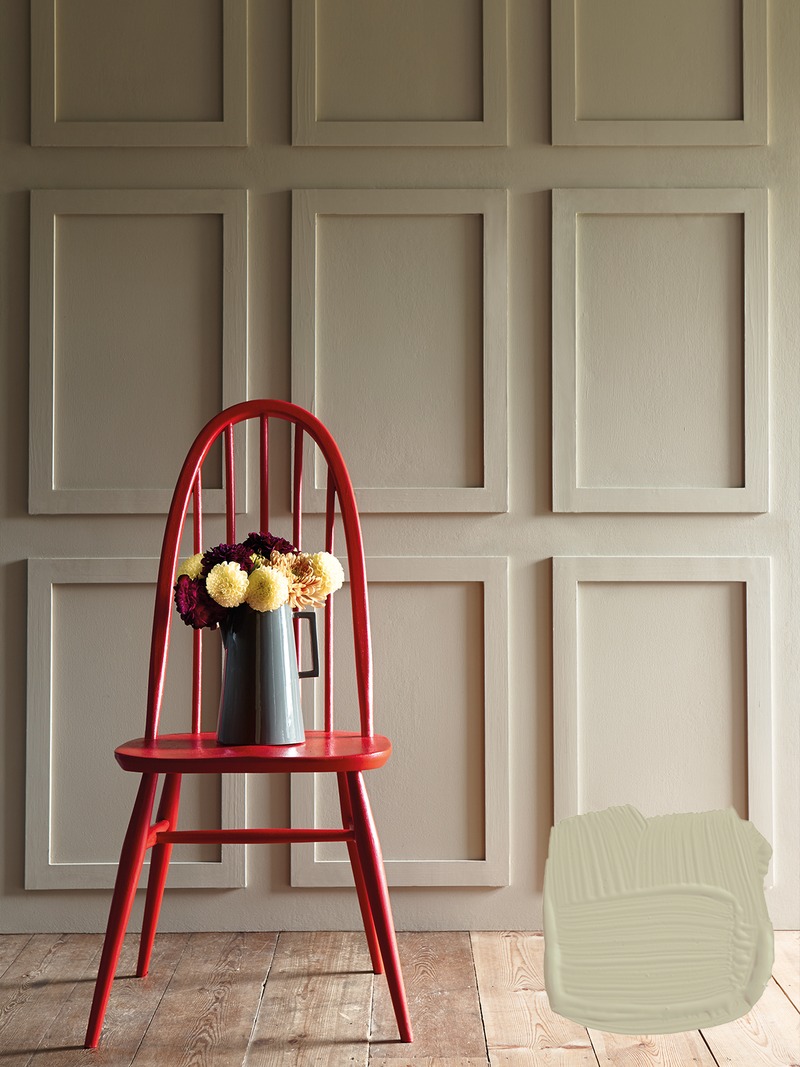
Sage Green
Green is a wonderful colour to embrace in any space, from bedrooms to bathrooms and kitchens. Muted shades like Sage Green are favourites because they’re timeless and versatile. Not too warm nor too cool, it works in urban or country settings, and traditional or contemporary spaces.
Shop here
Hicks’ Blue
Hicks’ Blue is a deep inky blue paint created by prominent mid-century designer David Hicks. He was known for using powerful colours combinations for dramatic effect. Pair this shade with a related white such as Slaked Lime for a soft and gentle scheme.
Shop here
ATELIER ELLIS
Founder Cassandra Ellis says:
Warm White
This is our everyday go-to white. With a wonderful balance of red and ochre undertones, it has just enough colour in it to be warm and inviting. It’s a fool-proof shade that goes with just about everything.
Shop here
Lulling
Lulling is an elegant neutral grey. We don’t make cold greys, instead creating shades that are quietly warm. This shade sits in the family with Milk and Quiet Grey, so these all work beautifully together. It also loves Aged Black, Totara and Bitter Chocolate for darker contrasts.
Shop here
Khadi
This is probably our most popular shade overall. Khadi works in every space as it has lots of gorgeous ochre pigments. If you live in a new build or modern home, it’s a great colour to soften the edges.
Shop here
Solstice
Solstice is our perfectly ‘dirty’ pink neutral. It glows but it’s still quiet, so you could use the shade as a white or neutral in your space. It’s also a great option for a ceiling and works particularly well with the shade Pollen.
Shop here
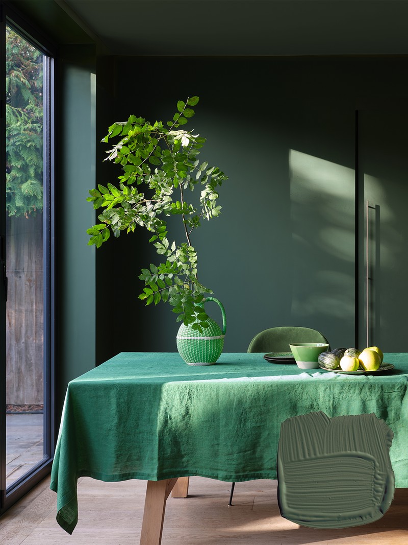
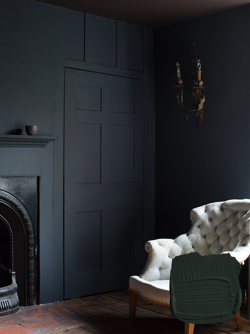
Under Wood
This is our deepest green, inspired by the forest floor. It’s a beautiful option for the kitchen, or any living areas where you spend time during the evening as it’s incredibly calming.
Shop here
Sumira
Sumira is a lovely deep blue. Extremely complex in its pigment make-up, it’s like being wrapped in an indigo bath. The colour works with all our neutral families and loves Zumai – brown and blue are a beautiful combination.
Shop here
Or continue to comment as a Guest below
DISCLAIMER: We endeavour to always credit the correct original source of every image we use. If you think a credit may be incorrect, please contact us at info@sheerluxe.com.
/https%3A%2F%2Fsheerluxe.com%2Fsites%2Fsheerluxe%2Ffiles%2Fwebsite-images%2F2025%2F03%2Fsign-up-pop-up.jpg)
