Exploring A London Home With International Ties
The Property
The property is a 1930s five-bedroom terraced house in north London, close to Queen’s Park and Kensal Rise. It was originally configured as five bedrooms and three bathrooms, and following the renovation, it is now a five-bedroom, four-bathroom family home.
The clients – a couple with three young children – had relocated from Amsterdam a few years prior and had already been living in the house for some time before embarking on the project. The previous owners had undertaken significant structural work, including a ground floor rear extension and a loft conversion. While this created generous square footage, the layout didn’t suit my clients’ lifestyle. The ground floor had been opened up entirely, resulting in a vast, cavernous space that lacked intimacy and left behind awkward dead zones. The upper floors were also inefficiently planned – particularly the first floor which housed four bedrooms sharing one bathroom. A key part of the brief was to completely rework the internal layout to create a more cohesive, liveable and intimate home for a busy family of five.
On the first floor, we transformed one of the smaller bedrooms into a generous en-suite and carved out a dressing room from an adjoining bedroom to create a proper main bedroom suite. The floor now accommodates a main bedroom with dressing room and en-suite, two children’s bedrooms, a family bathroom and additional linen storage. The loft, which had previously housed the main suite, was reconfigured to provide two bedrooms and a bathroom – creating a dedicated guest bedroom and a separate home office. The project ultimately required a full gut renovation and refurbishment. Although structurally extended, the house needed to be entirely reimagined internally to align with the clients’ lifestyle and aesthetic ambitions.
The Brief
The brief was split into two parts: reconfigure the layout to suit modern family living and create a home that felt warm, characterful and distinctly British. The clients had previously decorated homes in both London and Amsterdam in a contemporary, Scandi-inspired style with neutral palettes. For this house, they wanted something entirely different – a layered, colour-led scheme that felt inviting, expressive and rooted in modern British design.
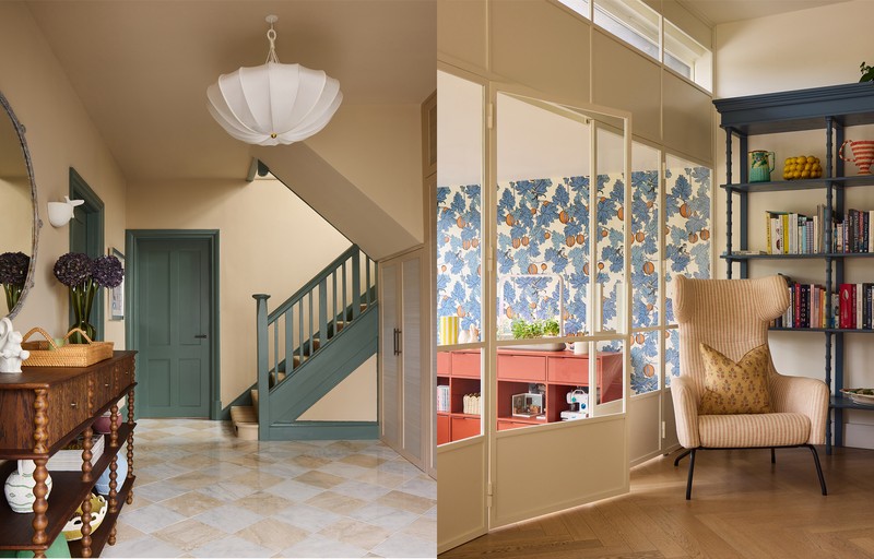
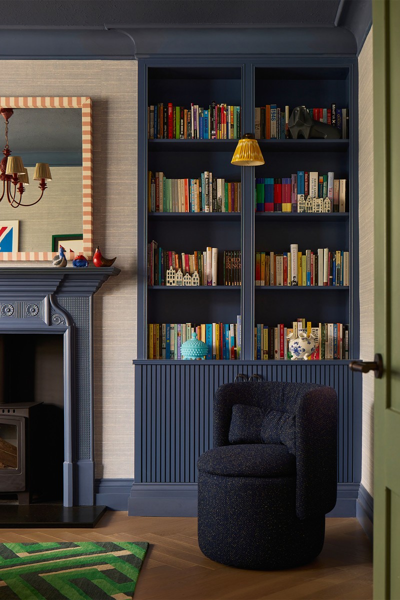
The property felt boxy and stripped of character, particularly as many original features had been removed during earlier extension works. To reintroduce architectural interest, we added wall and ceiling panelling in some rooms, and we colour-drenched the staircase and all the woodwork throughout the house in a blue-green tone (Farrow & Ball’s ‘Green Smoke’), creating continuity and visual rhythm from floor to floor.
The entrance set the tone with an earthy, creamy neutral that flows up through the landings. From there, the palette evolves: a denim-inspired living room punctuated with primary accents; a cinnamon-drenched sitting room that feels cocooning and sun-kissed; peach and cinnamon tones in the girls’ bedroom; deep blues in the main suite and boy’s bedroom.
Sustainability was an important consideration. We retained and repurposed existing kitchen cabinetry and splashback, reworked the island to improve functionality, and reused several pieces of furniture through thoughtful reupholstery. Supporting British makers and craftspeople was another priority. Bespoke pieces by Alfred Newall, including the extending walnut dining table and entrance console, sit alongside lighting and accessories from Porta Romana, Matilda Goad, Birdie Fortescue and Trove by Studio Duggan, with fabrics by GP & J Baker and Christopher Farr. The result is a layered family home that balances colour, craftsmanship and practicality – intimate rather than cavernous, and expressive without feeling overwhelming.
LET'S TAKE THE TOUR
The Entrance
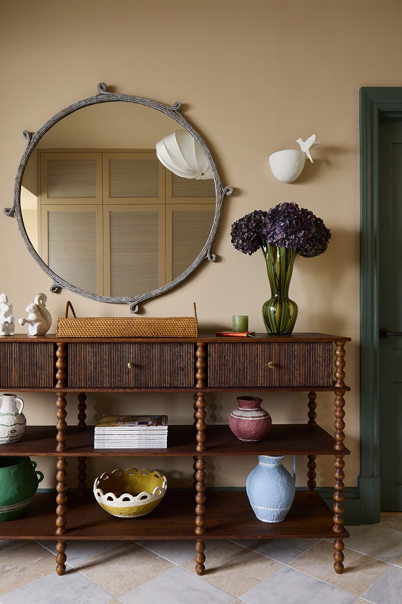
Here, we created a calming, earthy backdrop that would flow from the entrance up through the landings. The client was drawn to warm neutrals, so we chose ‘Tawny’ by Edward Bulmer for its creamy, beige warmth. All the walls and ceilings are colour-drenched, with blue-green woodwork (including the staircase, skirting and doors) to create continuity throughout the house. Chequerboard marble flooring in soft beige-pink tones keep the space light and fresh and the bespoke joinery for storage and bench seating is also painted in ‘Tawny’ with inset silk wallpaper panels for texture. Rattan baskets beneath the bench and a tapestry cushion add warmth, while the bespoke dark oak console and a verdigris mirror introduce depth and contrast.
Wall Paint: Edward Bulmer 'Tawny’
Console: Alfred Newall
Mirror: Porta Romana
Papier-Mâché Urns & Vases: Birdie Fortescue
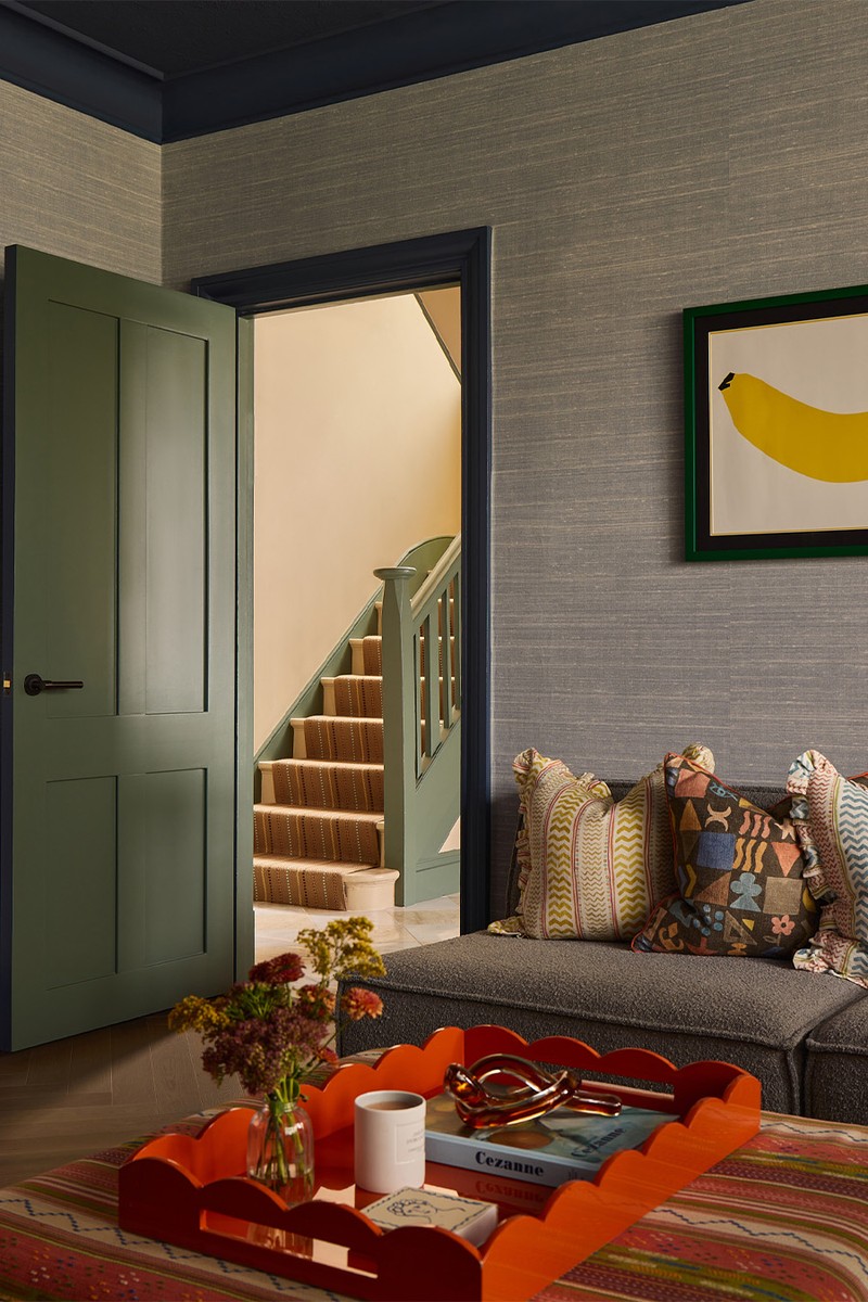
The Family Room
The inspiration for the family room was a relaxed, denim-inspired palette punctuated with confident primary accents. The starting point was two existing artworks; a playful banana piece and a portrait of Queen Elizabeth, both featuring bold primary colours. Rather than compete with them, we leaned in. The walls and upholstery create a layered “washed denim” backdrop, allowing the artworks to pop while maintaining cohesion. Punches of red, blue and yellow are echoed subtly through the accessories and soft furnishings, creating a room that feels bold yet grounded – perfect for daily family life.
Wallpaper: Phillip Jeffries
Striped Fabric Mirror: Alice Palmer
Wall Lights & Shades: Pooky
Shade: Pooky
Cushions: GP&J Baker Potato Print & GP & J Baker Wriggle Room Print
/https%3A%2F%2Fsheerluxe.com%2Fsites%2Fsheerluxe%2Ffiles%2Farticles%2F2026%2F02%2Fsl-240226-exploring-a-london-home-with-international-ties-12.jpg)
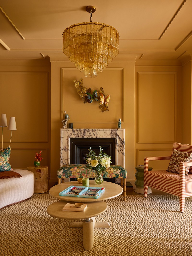
The Living Room
We wanted to create a light-filled room reminiscent of Palm Beach or the Mediterranean, so the entire room was colour-drenched in ‘Cinnamon’ by Edward Bulmer for cocooning warmth. To introduce architectural character, we reinstated wall and ceiling panelling and a new Viola marble fireplace surround, while a glass pendant adds an amber glow. Bespoke arches link visually with the dining room beyond, creating a dramatic stepped transition.
Wall Paint: Edward Bulmer 'Cinnamon'
Glass Pendant: Soho Home
Bench (In Front Of The Fireplace): David Seyfried, Gresham Stool, Upholstered In GP&J Baker Trumpet Flowers
Side Tables: West Elm Cami Ceramic Stool
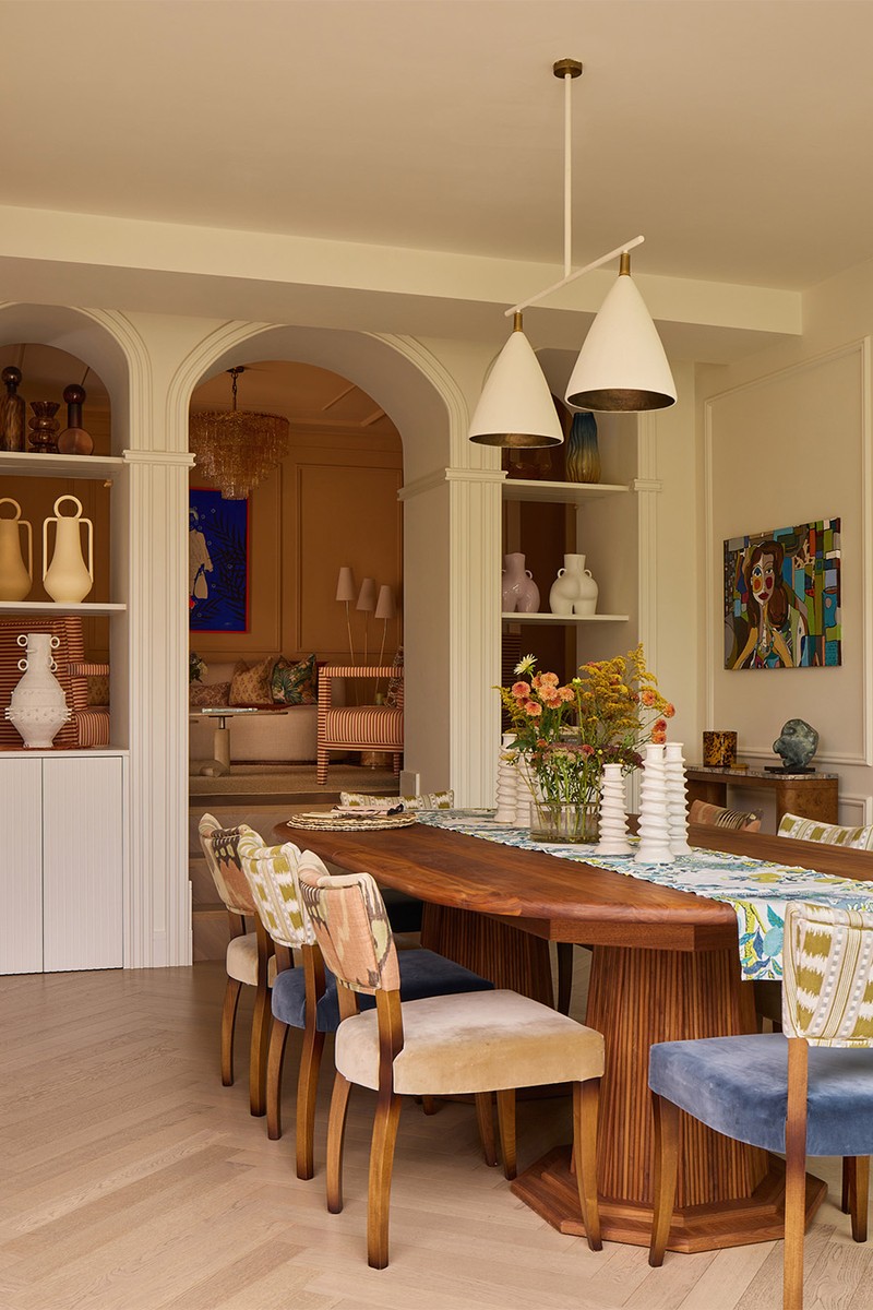
The Dining Room
Where the reception embraces warmth and colour, the dining room was intentionally quieter. As it sits open plan with the kitchen and overlooks the garden, we wanted it to feel light, cohesive and connected to the outdoors. The walls are painted in a creamy white to provide a neutral canvas, allowing architectural details, particularly the arches, to become the focal point. The softness of the palette ensures the space transitions seamlessly between day-to-day dining and more formal gatherings.
Bespoke Extending Walnut Dining Table: Alfred Newall
Dining Chairs: Soho Home
Pendant: Porta Romana
Consoles: Soho Home
Table Runner: Schumacher 'Citrus Garden'
/https%3A%2F%2Fsheerluxe.com%2Fsites%2Fsheerluxe%2Ffiles%2Farticles%2F2026%2F02%2Fsl-240226-exploring-a-london-home-with-international-ties-kitchen-full-bleed.jpg)
The Kitchen
To improve functionality within the generous footprint of the kitchen, we introduced a half-partition wall between the dining area and kitchen. This subtle intervention creates a sense of privacy while carving out a new, intimate seating zone within the larger space. Sustainability was central to the approach here, and as the existing cabinetry and marble splashback were in excellent condition. Rather than replacing them, we reworked the layout to optimise flow and storage. The result is a kitchen that feels refreshed and more practical, without unnecessary waste – proof that good design doesn’t always mean starting from scratch.
Shelving Unit: Birdie Fortescue
Tattan Coffee Table: Habitat
Bar Stools: Similar Daals
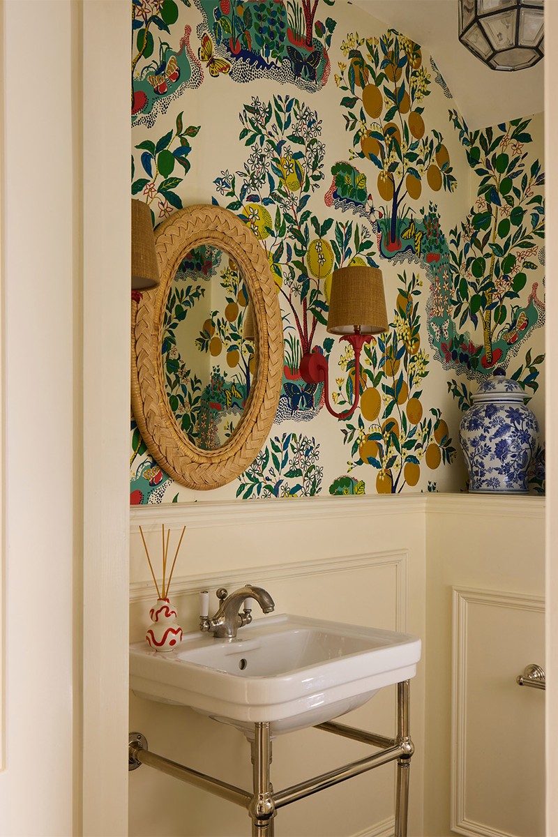
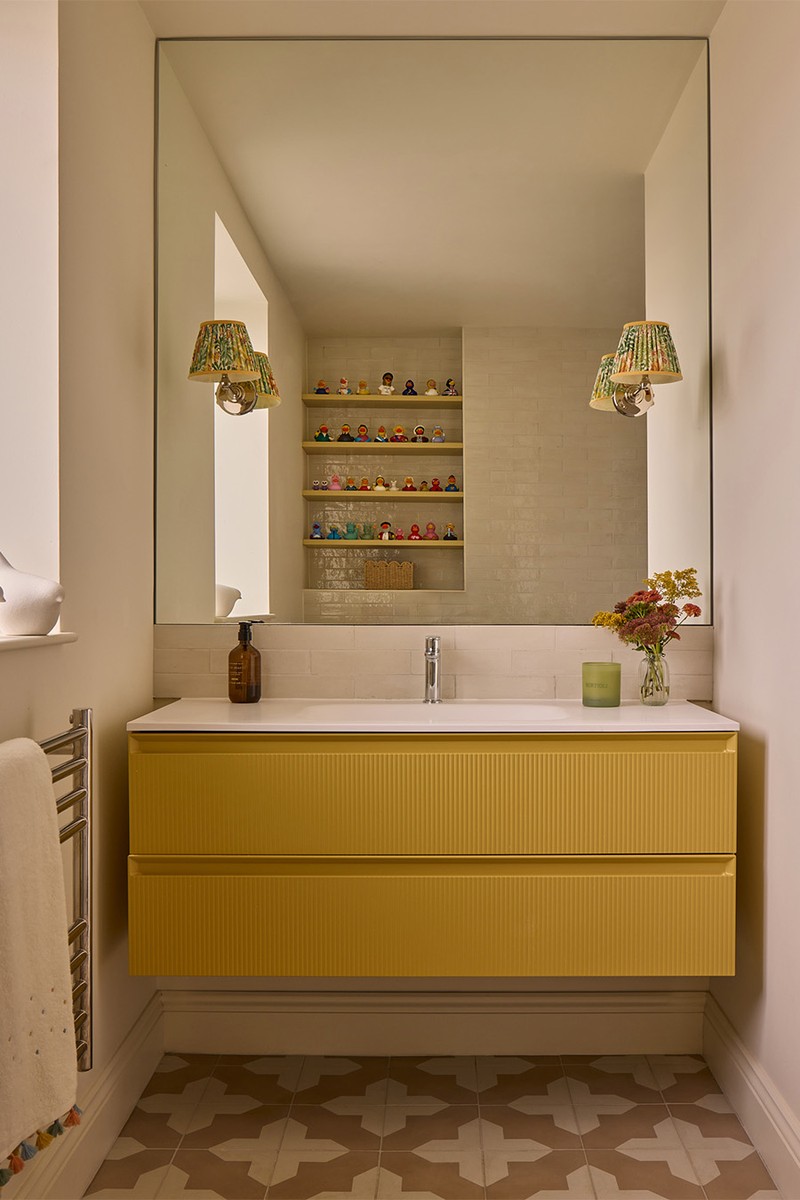
The Powder Room
The powder room offered an opportunity for something playful and transportative. Inspired by a Mediterranean garden, the space layers colour and pattern in a way that feels joyful. It’s a small room with big personality – somewhere guests can discover an unexpected burst of colour away from the calmer main living areas.
Wall Panelling Paint: Edward Bulmer' Spanish White'
Wallpaper: Schumacher 'Citrus Garden'
Wall Lights: Porta Romana
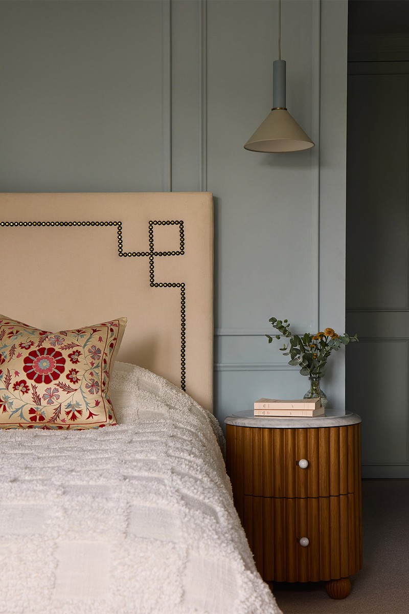
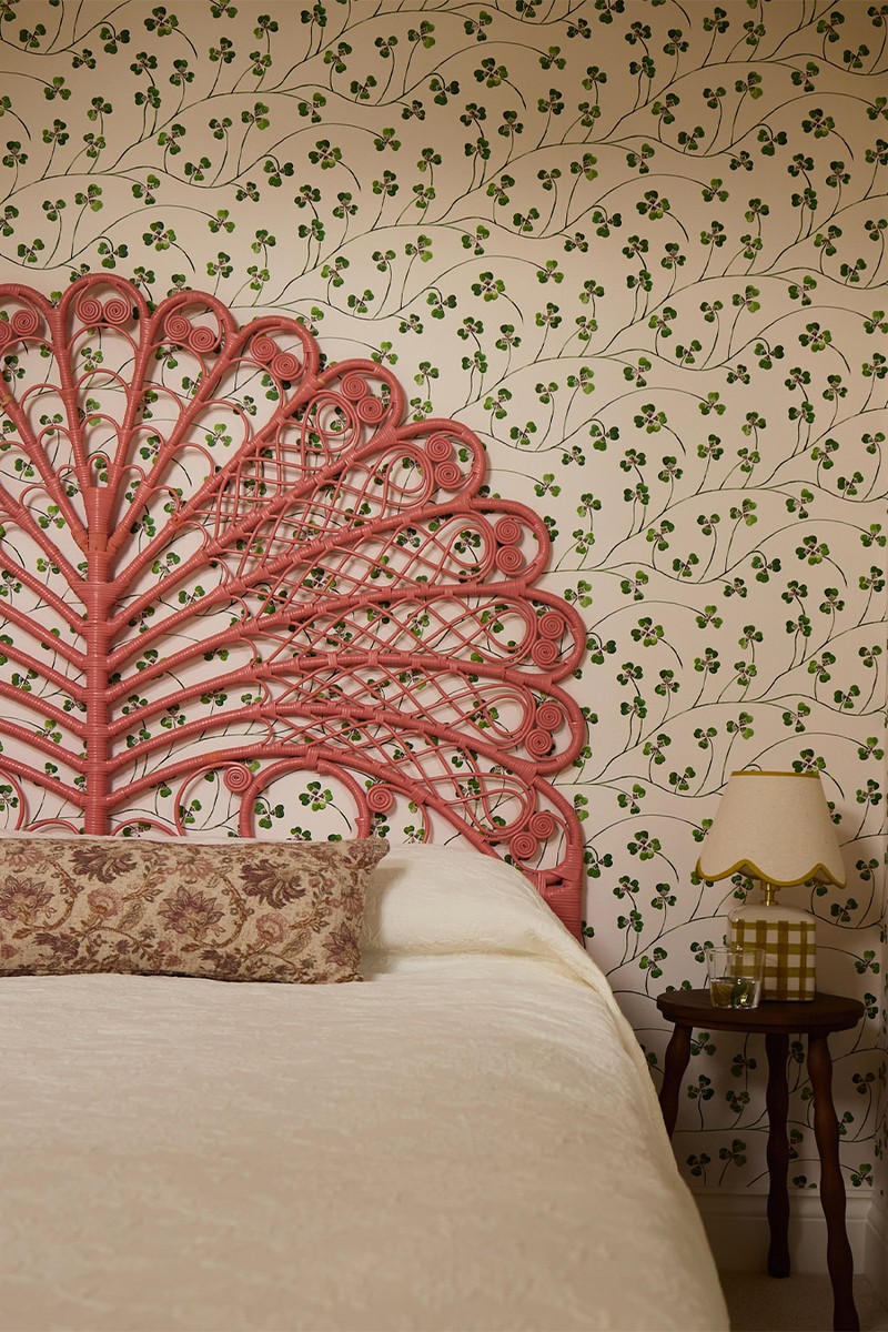
The Main Bedroom
The master suite was envisioned as a true retreat and sanctuary for the owners – a space to decompress from daily life. We reconfigured the layout by borrowing space from an adjoining bedroom to carve out a dedicated dressing room and transformed another into a generous en-suite. The bedroom itself is layered in soothing tones and tactile textures to create a cocooning effect. Every detail fosters a sense of calm – from the tonal palette to the wallpapered ceilings and the softness of the upholstery.
Silk Pendant: Gong
Ceiling Wallpaper: Schumacher Cloud Toile In 'Mineral'
Wall Colour: Edward Bulmer 'Aerial Tint'
Bedside Tables: Soho Home Carlisle Bedside Table
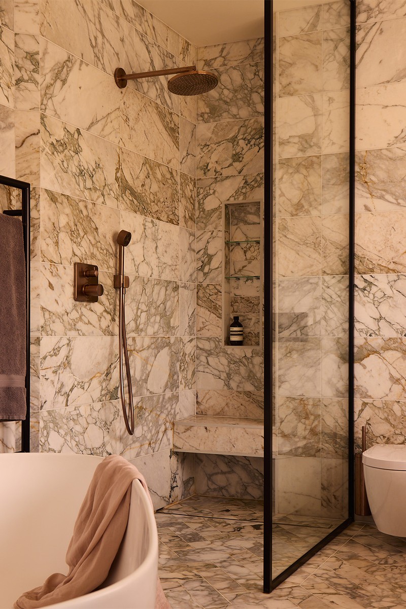
The Main En-Suite
The ensuite continues the retreat-like sanctuary brief, inspired by spa environments and natural materials. A large window allowed us to frame the double vanity beautifully, complete with bespoke swivel mirrors that add both practicality and elegance. The generous footprint enabled a wet-room feel, with a spacious walk-in shower and freestanding bath. The overall effect is a place to pause and unwind at the end of the day.
Sanitaryware: CP Hart
Calacatta Arabescato Amazon Marble Tiles: Starel Stones
Bath Tub: CP Hart
Blinds: Colour & Co
Hanging Vanity Lights: Nova Slim Pendant Light In Bronze: J Adams & Co
/https%3A%2F%2Fsheerluxe.com%2Fsites%2Fsheerluxe%2Ffiles%2Farticles%2F2026%2F02%2Fsl-240226-exploring-a-london-home-with-international-ties-46.jpg)
The Boy’s Bedroom
The son was very clear that he wanted a “forest bedroom" so that led us to source a striking tree-scape wallpaper, which immediately set the tone for the scheme. Layered with warm woods and tactile textiles in a beautiful deep jewel blue, the space feels immersive yet comforting – imaginative but still sophisticated enough to grow with him.
Joinery & Ceiling Colour: Farrow & Ball 'Hague Blue'
Wallpaper: Sandberg, Raphael Blue
Bedside Light: Marks & Spencer Amelia Table Lamp
/https%3A%2F%2Fsheerluxe.com%2Fsites%2Fsheerluxe%2Ffiles%2Farticles%2F2026%2F02%2Fsl-240226-home-tour-studio-raymond-girls-room.jpg)
The Girls’ Bedroom
The brief was to create a shared bedroom that felt feminine but not overly “kiddy”, ensuring longevity as the girls grow. We introduced softness through colour and textiles, balancing playful elements with more timeless choices. The result is a space that feels sweet and inviting without being saccharine so that it's adaptable enough to evolve with them over time.
Wallpaper: Schumacher Tonal Paperweave In Ivory
Ceiling Colour: Farrow & Ball 'Pointing'
Trim Colour: Edward Bulmer 'Etruscan Brown'
Chest Of Drawers: Trove
Lamp: Similar Marks & Spencer
The Family Bathroom
For the family bathroom, the aim was longevity. We wanted something neutral and elevated that would work for the children now but feel appropriate as they grow older. The starting point was the cement beige floor tiles, which provided warmth and subtle texture. From there, we built a calm, timeless scheme that felt practical yet considered.
Cement Floor Tiles: Bert & May
Wall Lights: Pooky
Wall Colour: Farrow & Ball 'Pointing'
Wall Tiles: Topps Tiles, Zellica Antique White
Wall Lights: Pooky; Shade Pooky
The Guest Loft Bedroom
The guest loft bedroom draws inspiration from the English country. With its uneven ceilings and walls, we leaned into the quirks of the space, using a leafy wallpaper to soften angles and disguise irregularities. The result is somewhere fun and slightly unexpected – a charming retreat tucked away at the top of the house.
Wallpaper: Lucky Leaf CommonRoom
Woodwork Colour: Edward Bulmer 'Spanish White'
Lamp: Similar Marks & Spencer
Bedside Stool: Zara Home
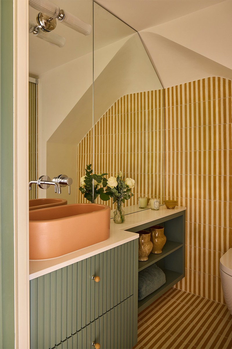
The Guest Loft Bathroom
The adjoining loft bathroom presented a challenge as it's very small, awkward and constrained. We reworked the layout to improve flow and functionality, making every centimetre count. Mustard stripe tiles were the starting point for the scheme, injecting warmth and personality into the compact space. It’s bold, playful and entirely unexpected – a small room with a confident impact.
Vanity & Woodwork Colour: Farrow & Ball 'Green Smoke'
Floor & Shower Tiles: Otto Tiles, Mustard Stripes
Visit STUDIORAYMONDINTERIORS.CO.UK
Photography by Boz Gagovski
Or continue to comment as a Guest below
DISCLAIMER: We endeavour to always credit the correct original source of every image we use. If you think a credit may be incorrect, please contact us at info@sheerluxe.com.
/https%3A%2F%2Fsheerluxe.com%2Fsites%2Fsheerluxe%2Ffiles%2Fwebsite-images%2F2025%2F03%2Fsign-up-pop-up.jpg)
