Interiors Masterclass: How To Use Pattern
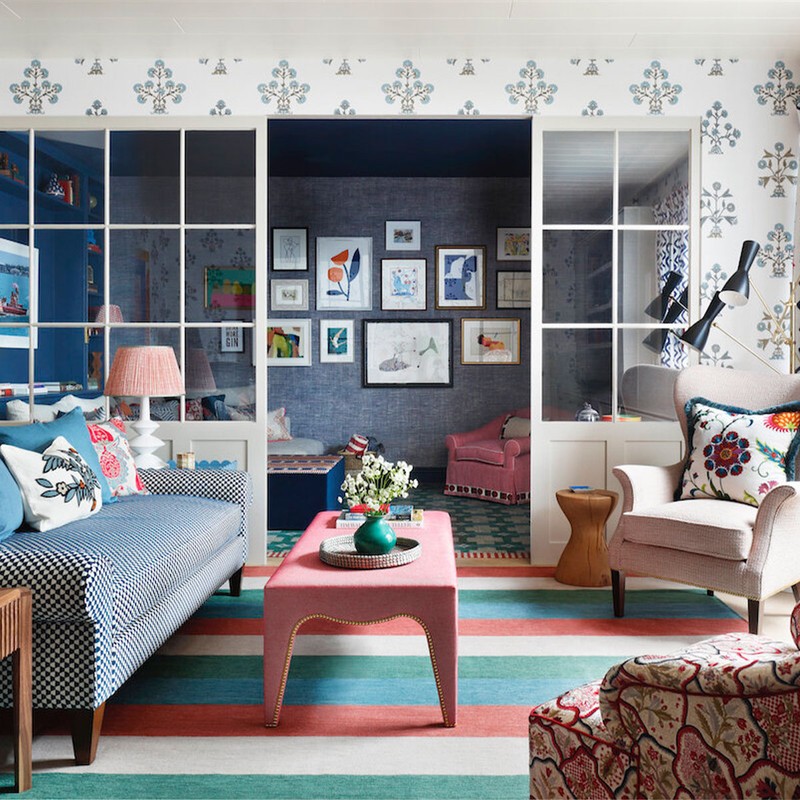
Start with one thing you love. Whether that's a patterned rug, wallpaper or fabric, once you have that first motif, you can build the rest of the scheme around it. There are many ways you can go: you could stick to patterns which are relatively complementary and break them up with plain tones, or you could go for ones that clash (in the 'right' way). It all depends on the look you're going for.
Mix both the type and scale of the pattern. Perhaps that’s a stripe, a geometric pattern or a large-scale floral. The key is to make the various patterns different enough so that they work with, rather than against, each other. Contrast and conflict are your friends when it comes to using patterns.
Make patterns work together by separating them with plain colours. This helps define and place the patterns in context. A block-coloured plain next to a pattern works almost in the same way as a frame around a piece of art would. Sometimes, if I have a lot of patterns in one scheme, I might add some definition with a fringe on a cushion or a leading edge of a curtain to create a clean break between the two. It also helps add a bit of structure, which makes multiple patterns easier to comprehend.
Colour is so important. It can help to unify patterns and make them feel like they belong (or not) in the same space. Often, I will pick out a colour in a patterned fabric and use that same colour elsewhere in the room to create a sense of consistency. Or, if I want something to stand out, I’ll use a clashing block colour to differentiate it from the rest of the palette.


Try to experiment with scale. Use a large-scale pattern on walls or curtains; it can trick the eye into thinking the room is bigger. In a room with multiple patterns, if you use different scales it can help to make them work with, rather than against, each other. You also have to think about where in the room you are using which pattern. If you have a large scale and bold pattern on a big curtain on one side of the room, then I would balance it out with some tall joinery or something else with equal 'presence' on the other side of the room. It’s so important to foster both balance and tension between the different elements in any design.
Using a single colour palette can make a room feel harmonious. That said, I would only ever see that as a starting point from which to layer other colours – I love to find one patterned rug or fabric which has multiple colours in it, so I can use it as a base for the scheme. You can then pick up the various colours throughout. It’s also important to have a few things in scheme that 'jar' or feel unexpected – it’s what gives it a more personal touch.
There is such a thing as too much pattern. Remember, plain fabrics and colours play a vital role in dialling down the intensity of a space and can act as a helpful backdrop against which to frame your favourite patterns. For example, if you have lots of fun patterned cushions you want to use on a sofa, then make sure the sofa itself is upholstered in a plain fabric or consider alternating the plain and patterned cushions. The key is not to allow the space to become overwhelmed.

Layout and form are as important as colour and pattern. Decide early on which aspects of the room are 'non-negotiable' – for example, an antique writing desk or a favourite rug. You can then ensure the other elements of the room, including the pattern and colour scheme, are in harmony with that piece. It helps if you can identify one or two colours that can be picked up throughout a space, be it in the wallpaper, cushion fabric, upholstery – the 'echo' should be subtle, but it helps to give a space a sense of balance. A room might look beautiful and have the perfect combination of pattern and colour, but if it isn't comfortable or practical, then it won't feel right.
Consider how patterns will look in different lights. Patterns may also contain a variety of colours that may look different depending on the time of day, or in natural or artificial light, so it’s crucial to try these things out. As an aside, I love to use patterned fabrics on lampshades. It’s often a subtle way to bring more pattern into a scheme if you think it’s a bit lacking. 'Gathering' also works to diffuse a pattern and makes it blend into the room, if you think it’s necessary.


On that note, don’t forget texture. Varying the textures of the fabrics you use (whether they’re patterned or not) will create a bit of interest for the eye, without overdoing it. There’s sometimes no need to introduce more pattern – a bit of texture is all that’s needed. Different textures on plain fabrics are key – I love using a bouclé as upholstery or a warm sheepskin cushion against a crisper, printed linen.
Visit StudioPeake.com
Or continue to comment as a Guest below
DISCLAIMER: We endeavour to always credit the correct original source of every image we use. If you think a credit may be incorrect, please contact us at info@sheerluxe.com.
/https%3A%2F%2Fsheerluxe.com%2Fsites%2Fsheerluxe%2Ffiles%2Fwebsite-images%2F2025%2F03%2Fsign-up-pop-up.jpg)
