The New Paint Launch To Know About
CREATED IN PARTNERSHIP WITH DULUX
Classic Colour, Reinvented:
The Heritage by Dulux range is a curated collection of 112 luxurious colours, which aims to combine the finest colours from decorating history with the most stylish contemporary hues to create a truly versatile selection. Classic shades associated with British architecture and design have been brought up to date by the Dulux colour experts to make them completely at home in today’s modern interiors.
Renowned for its technical and colour expertise, the Heritage by Dulux collection not only comes in a selection of classic colours, it's also designed to stand the test of time. Developed in partnership with professional decorators, the range is specially formulated using the finest ingredients to ensure it applies smoothly and continues to perform once it’s on the wall.
The Three Formulations:
Velvet matt: designed for use on walls and ceilings, this delivers a luxurious, velvet smooth finish, as well as delivering unbeatable durability.
Eggshell: this is considered a mid-sheen product ideal for woodwork such as doors, skirting and architraves.
Undercoat: this will will act as ideal base for your Eggshell, and achieve a perfectly smooth and robust finish.
Using the highest quality materials and technology, these paints are suitable for use by both professional decorators and DIY-ers. After all, it’s the unique Dulux blend of colour expertise and technical innovation which sets the range apart.
Read more about six of our favourite shades below…
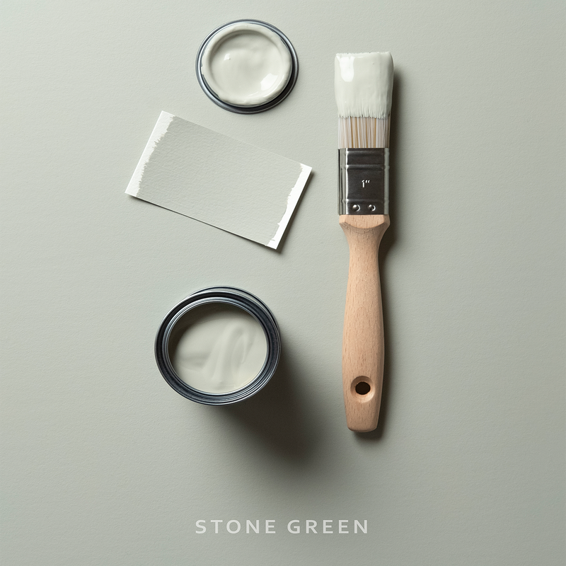
Stone Green
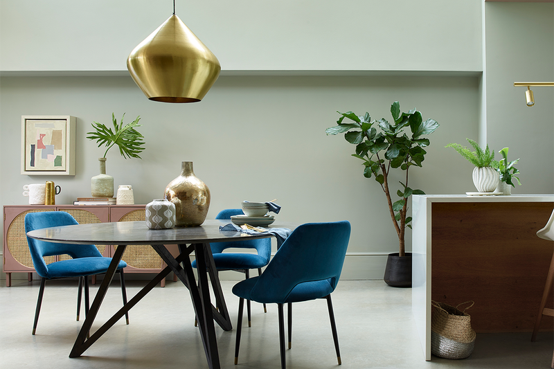
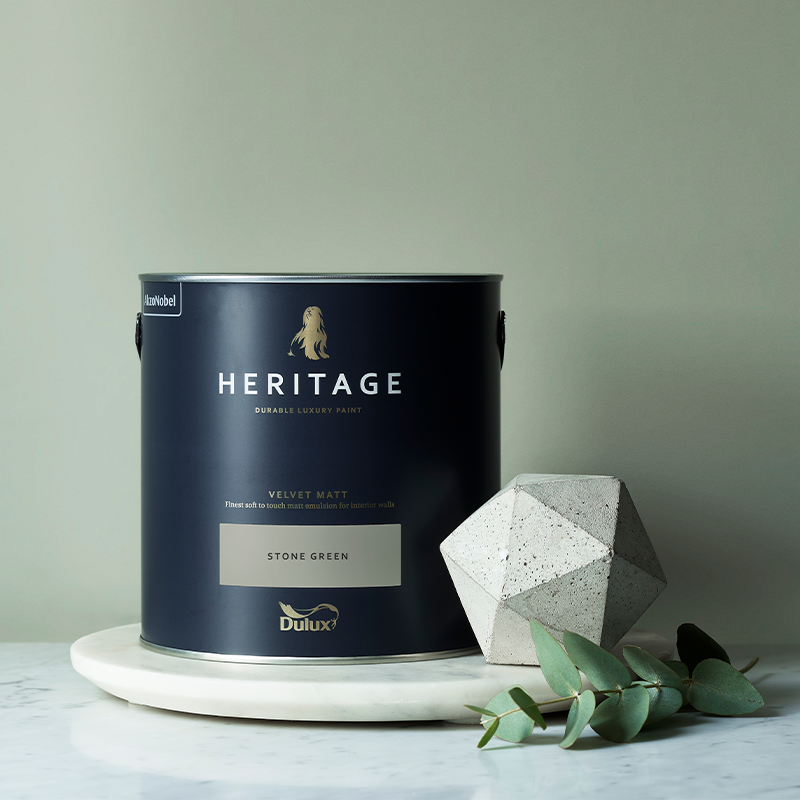
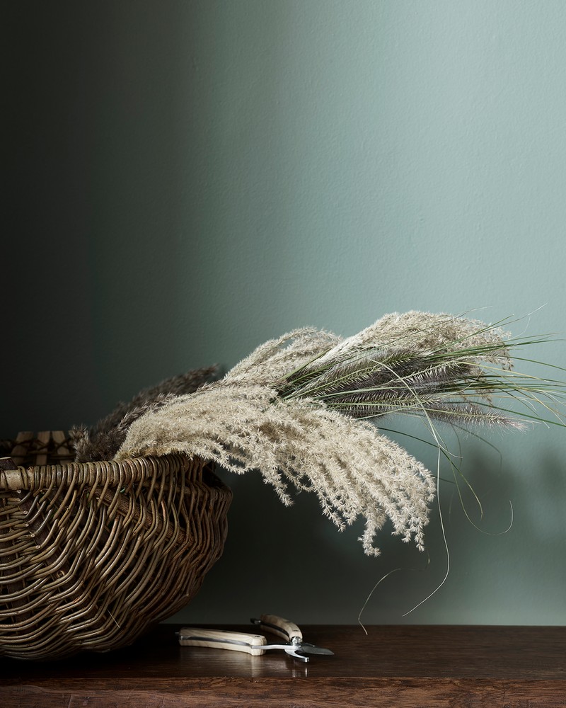
Stone Green is the kind of mid, grey/green with a natural connection to materials such as granite and marble. Plus, its more muted tones, which are reflected in the various flecks and seams of colour, make it ideal for use in a dining room. Easy to use and equally versatile, Green Earth and Waxed Khaki are good tonal partners, while China White and Mid Umber are a complimentary fit. Finally, Lead White and DH Blossom will help elevate the space with a more designer-style palette.
Find out more here
Romney Wool
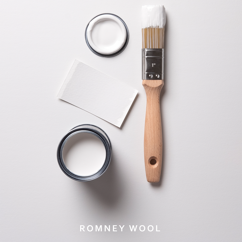
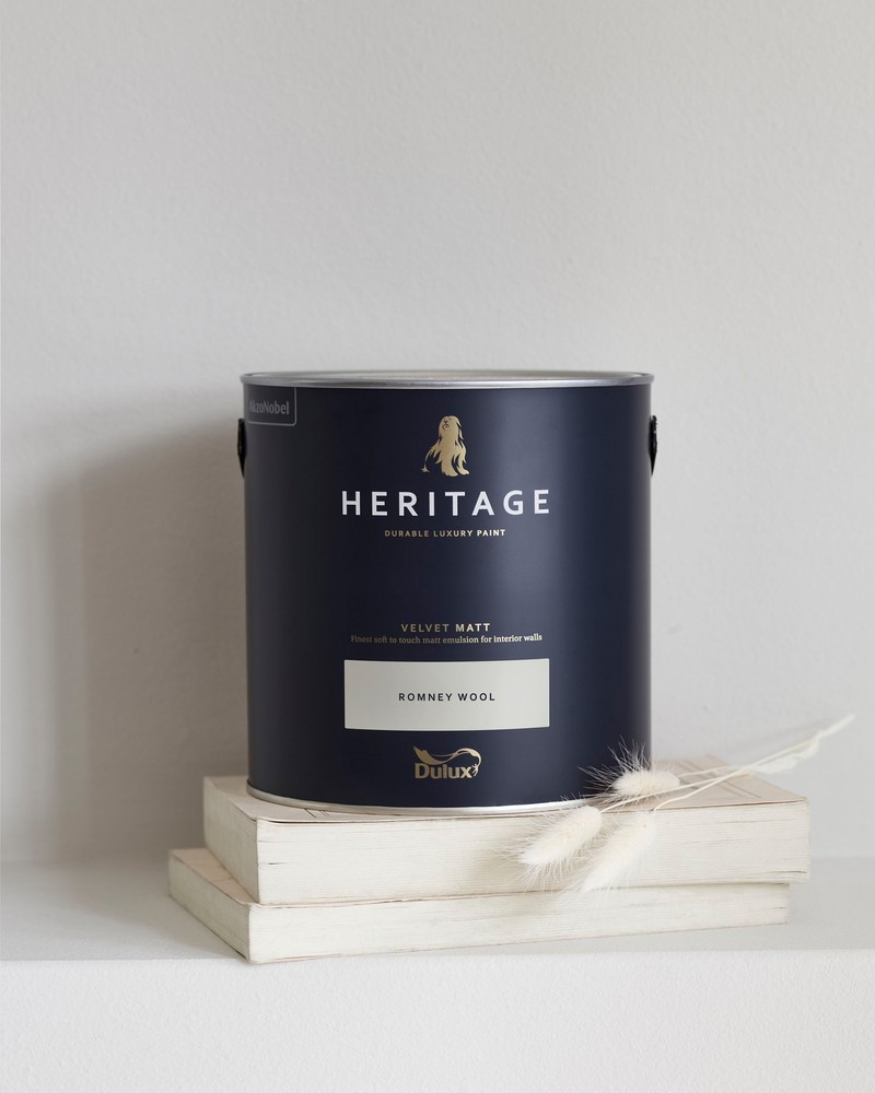
For an immaculate pale neutral, try Romney Wool. Acting as a very pale taupe, it gives off a cooler appearance than cream, and is therefore far more flexible in terms of pairing it with other colours. It also offers a strong foundation from which you can build the rest of your furnishings in any living space, and would work well on dining room walls, especially against painted units and decorative tiles. Try teaming this all-round gem with Ravens Flight and Pebble Grey for a tonal scheme, or Mallow White and Mauve Mist for an alternative winning combination. Finally, Dusted Heather and Midnight Teal offer a more dramatic choice.
Find out more here

DH Oxford Blue
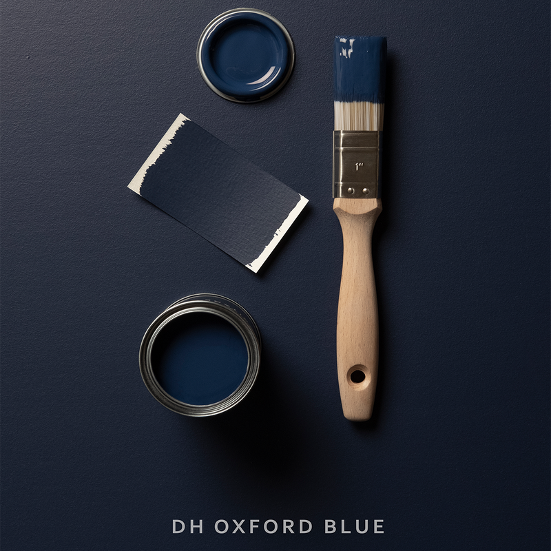
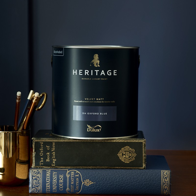
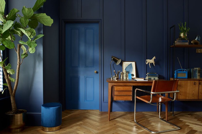
Historically, a deep, sumptuous navy like DH Oxford Blue would have been exceptionally expensive to create. Luckily for the Georgians, Prussian Blue was created in 1704, offering a far more affordable alternative and the first step towards the decadent blues we enjoy today. Wonderful in a study, it’s best to embrace a dark, rich colour such as this is a small space. For a tonal scheme, try it with Blue Ribbon and Boathouse Blue, or team it with neutrals such as Edelweiss White and Quartz Grey. For a more eye-catching partnership, try it with Potters Pink and Setting Stone.
Find out more here
Potters Pink
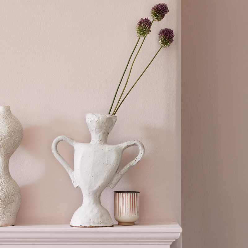
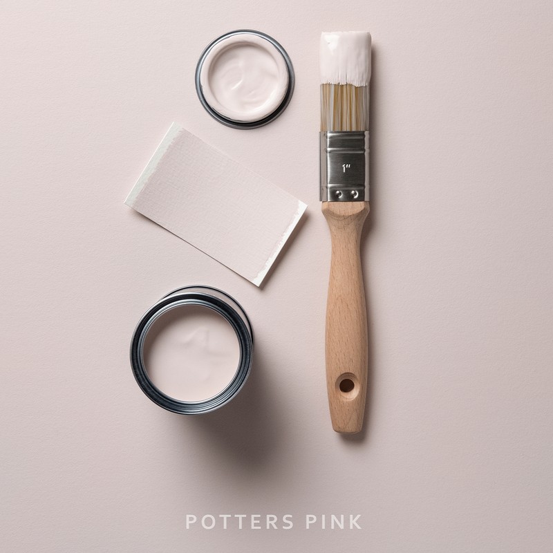
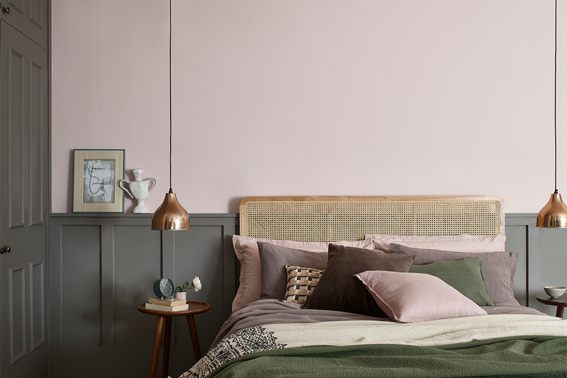
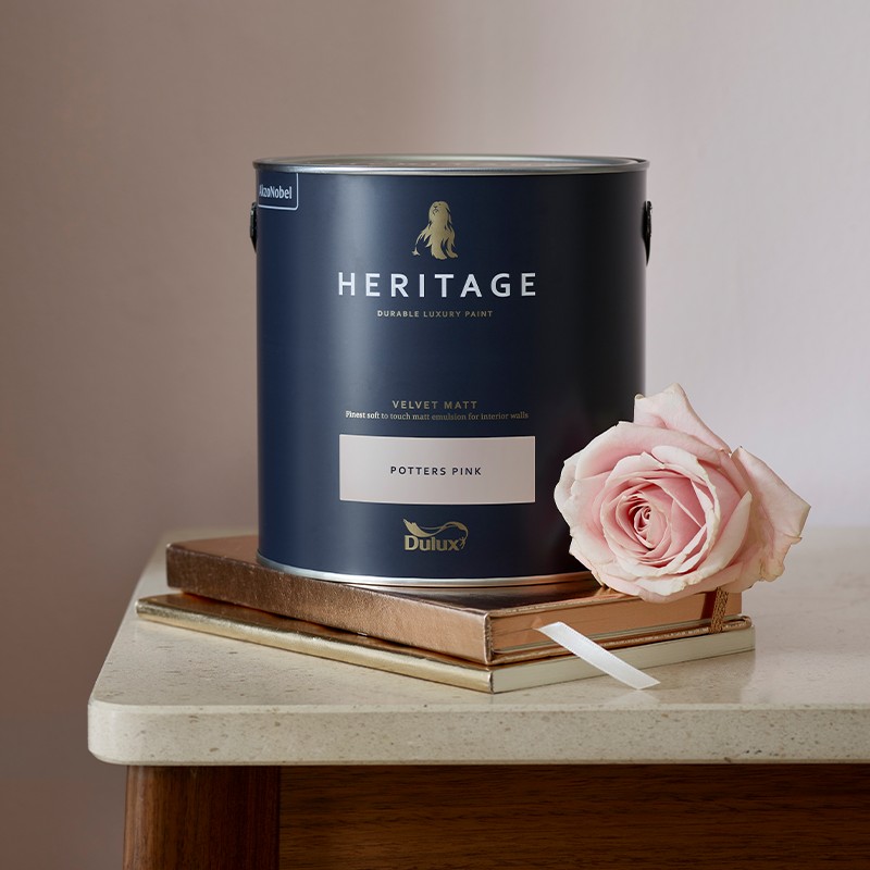
Think of this as a pale, but warm, feminine shade encapsulating the fragility of Edwardian cottage garden flowers. Petal pinks were a favourite for interiors at the time, but are still very much enjoyed today. Designers will tell you to treat it as a neutral, in the same way you would a plastered wall, and it works particularly well in bedrooms and hallways. Team it with DH Blossom and Coral Pink for a tonal scheme, or Marble White and Turtledove Grey for a restful look. Alternatively, opt to pair it with DH Drab and Mud Lark to make more of a statement.
Find out more here
Cherry Truffle
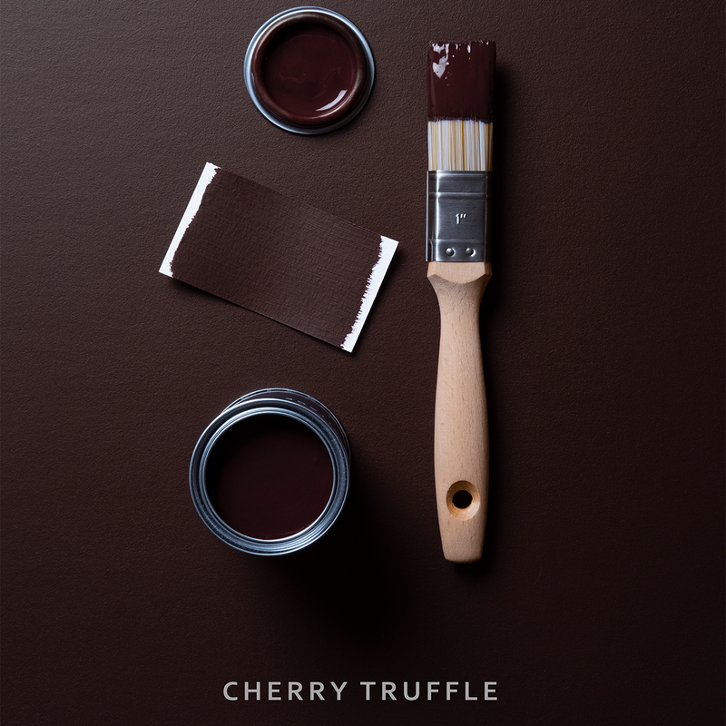
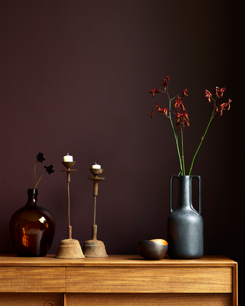
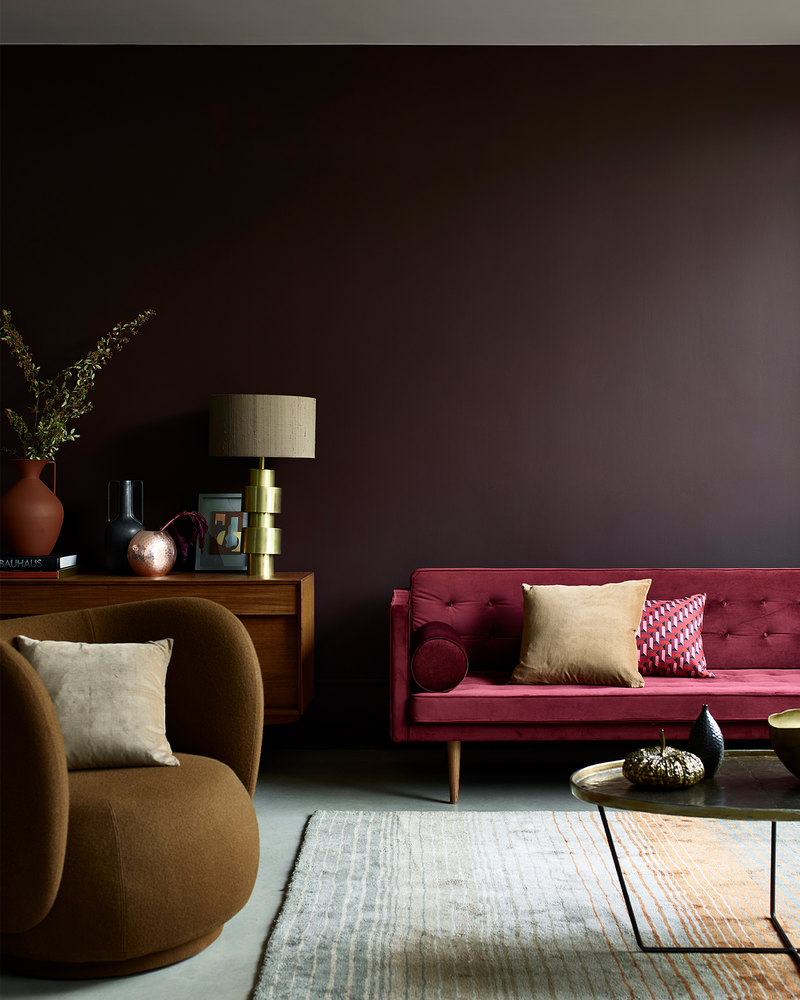
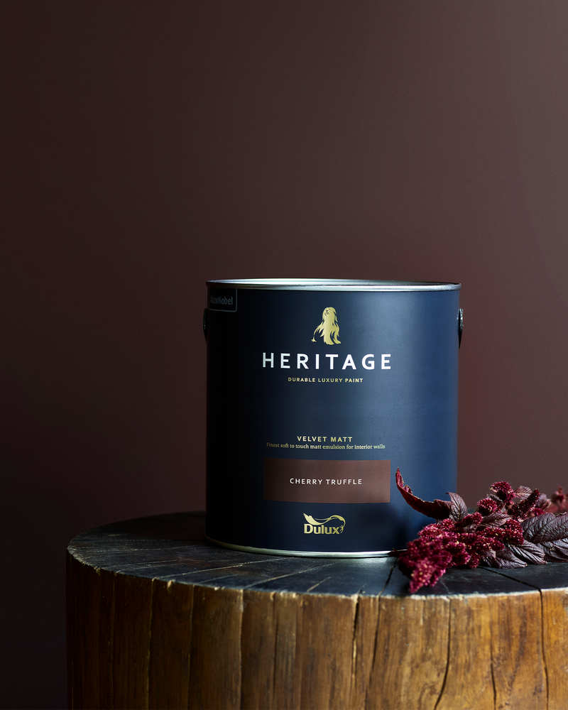
Think of this as a deep bitter chocolate, where a hint of red gives the colour some extra, decadent warmth. It works equally well as a mirror glazed gloss or velvety soft matte, lending any room some well-deserved richness. Pale Walnut and Candle Cream offer paler, but still complimentary accents, while Roman White and Mud Lark won’t fight against or challenge the colours’ existing depth. Alternatively, Red Sand and Green Earth offer a warm and balancing combination.
Find out more here
Waxed Khaki
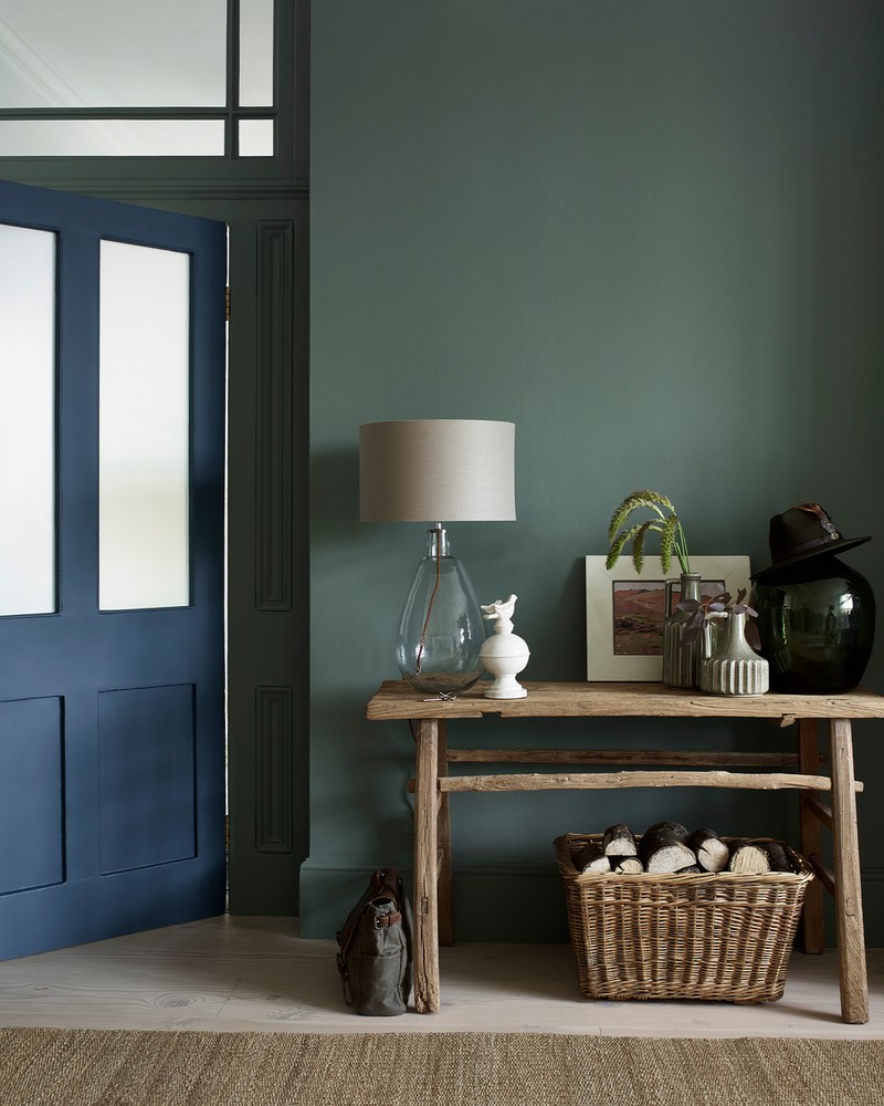
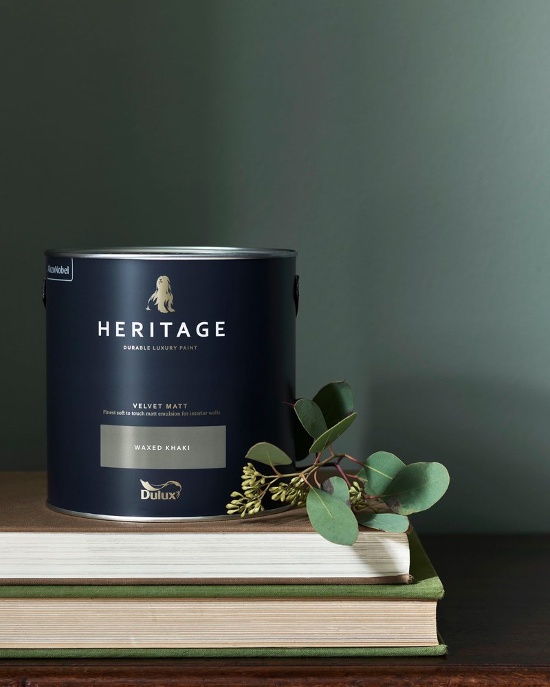
This distinctive, deep grey/green combines the beauty and versatility of a cool neutral with the calming qualities of lush botanical gardens. In the late Victorian period, such shades came back into fashion, as bolder colours made way for increasingly muted, restful colours. No less fashionable now, in today’s homes we continue to appreciate the reference to nature these shades offer, especially in hallways or a home office. Try matching it with Stone Green and Green Slate, or combine it with China White and Forest Grey for a completely neutral palette. For something bolder, team it with Midnight Teal and Pale Cream.
Find out more here
To find out more about the range, and to see the full spectrum of colours before choosing your perfect combination, visit DuluxHeritage.co.uk
DISCLAIMER: We endeavour to always credit the correct original source of every image we use. If you think a credit may be incorrect, please contact us at info@sheerluxe.com.
