One Australian Designer Shares Her 3 Favourite Projects
Style & Ethos
I would definitely call myself a maximalist. I can’t help but be surrounded by cosy, beautiful layers. By that, I don’t mean living with lots of clutter as items need to be beautiful or serve a purpose, but I certainly lean towards a more layered interior – a space that looks and feels lived in. To do this, I like to use existing pieces of furniture, art and the client’s collection of homewares to style a space so it really feels like it belongs to them, and that it’s not straight out of a showroom.
Design & Inspiration
Our inspiration always starts with the architecture of the space and the client’s likes and dislikes, followed by the colour palette and, most importantly, how we envision the home will ‘feel’ once it’s complete. The feel is what is most important if you ask me; it encompasses everything – from who lives there to how they live and what they do.
Inspiration for the look of the project can come from anywhere – the client’s travels, their existing furniture or art collections and how they plan to live over the next few years. As for design, it's working out how to match the client’s preferences with the intended function of the space and of course, the budget. I love sourcing unique pieces or having something made which is specific to each project. That’s how you create a timeless interior that can be loved and lived in properly.
Colour Palette
One of the first things to consider is the colour palette – it would be awful to suggest plaid, for example, if a client has a real aversion to them. I love working with colour and am not afraid to push the limits if the client is happy. The aspect of the room and its intended use usually determine which way we go, and we always ask ourselves what mood we’re trying to create.
Right now, I’m having a yellow moment – bold buttercup tones are drawing my attention most. Many people love greens or blues, but there’s no colour I personally dislike – except grey, perhaps – I never really did the greige thing!
I also tend to lean towards raw materials but will ultimately select finishes based on the client’s preferences rather than my own. If people don’t like to see marks on their bench or countertops, then I would choose the appropriate material for them. If you ask me, though, I prefer the look of things that age over time.


Finishing Touches
We always have a walkthrough of the client’s home so they can show me the items they’ve maybe hidden away in their cupboards that we may now be able to use. I make it a priority to be present at the installation and styling of each room – I like to have control over everything from the cushions and throws to the bedlinen and decorative items on the tables and shelves. A home is never complete without the finishing touches and it’s where my personal style really comes through. You’ll always see some greenery and plants, too, as I love the texture and life they bring to a space. The same can be said of photos and candles.
Instagram Accounts I Love For…
Shopping – @MarinMontagut
Inspiration – @ReathDesign
Sourcing – @KeptLondon
Travel – @TheFifeArms
Fashion – @SJCMadeForTravel
01: MY FORMER COUNTRY HOME
Photography by Maree Homer

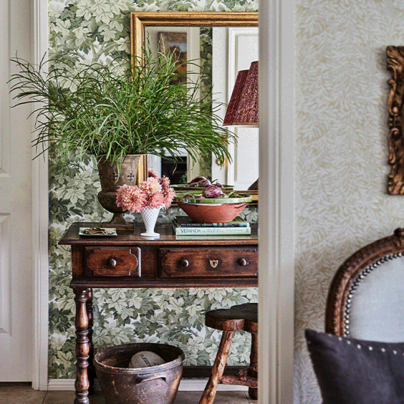
Set on five acres and two hours out of Sydney, this was a lovely weekend home for my family and me. I didn’t have the budget to renovate a completely new kitchen and set of bathrooms, so I decorated it throughout with new wallpaper, window coverings, furniture and art – most of which was sourced in either England or France. Using a mix of vintage pieces from antique stores and flea markets really gave it a family feel.


The home did need to be able to cope with lots of people coming in and out, however, as we always had others to stay, so the upholstery and fabrics were selected more for their worn look, such as strie velvet for the sofa and curtains in the living and dining room, backed onto a dirty base cloth so they could cope with the wear.
The colour palette also had elements of green throughout to blend with the gardens outside. I also brought elements of the outside in by filling vases with foliage from the trees in the garden and bowls with fruit we grew on-site.

02: A 1900s BUNGALOW
Photography by Maree Homer

This property has been in the same family for 40 years, but the owners wanted to update it for their now-adult children and grandchildren, as they usually get together at weekends. The client insisted on keeping the green carpet and the black trim throughout the house, so I had to work with it rather than fight it. In doing so, I decided to paint the joinery in the en-suite bathroom a similar shade of green, before adding black and white chequerboard floor tiles so it flowed, rather than stood out. The owners loved floral fabrics, which gave us so much scope to use colour elsewhere.
The cabana on the ground floor leads out to the swimming pool. It’s a fully self-contained space away from the rest of the main house, and features a sofa and banquette seating area, a bar with a fridge, sink and storage for entertaining, and there’s also a separate bathroom. We added rattan to the ceiling to inject some warmth into the room, and we recovered the banquette seating with panelling and an upholstered back cushion on the wall. The new seat cushions were all upholstered in an outdoor fabric so people could come in from the pool and sit down without worrying about damaging it.


03: A CONTEMPORARY CITY HOME
Photography by Anson Smart

The brief for this contemporary re-build and decoration project in Sydney was “not too much clutter”, while the colour palette took inspiration from the client’s existing art collection.
Luckily, I had worked with these clients before, and together with architect Jorge Hrdina, we created a contemporary home with plenty of softness and colour throughout. The owners requested lots of joinery to alleviate the clutter issue, and with three teenage daughters who like to spread themselves out, they wanted everything to be seamlessly concealed when they entertained. All the joinery design and selections were done by Jorge, with interior decoration down to me.


One of my favourite elements of the kitchen is the sliding shelves where various oils and spices are kept for ease when cooking. There is a separate preparation area which can be concealed with sliding doors, too, and this is where the breakfast and coffee area is, as well as most of the appliances.

To see more of Lisa’s work, visit LisaBurdus.com
Or continue to comment as a Guest below
DISCLAIMER: We endeavour to always credit the correct original source of every image we use. If you think a credit may be incorrect, please contact us at info@sheerluxe.com.
/https%3A%2F%2Fsheerluxe.com%2Fsites%2Fsheerluxe%2Ffiles%2Fwebsite-images%2F2025%2F03%2Fsign-up-pop-up.jpg)
