Three Inspirational Colour Schemes
“These three room schemes showcase the diversity of the Heritage by Dulux range,” explains Orla. “The strong green, a rich maroon and grown-up pink are great examples of the assortment of colours on offer. They're also interesting and fun, without being overwhelming or too bold. Our contractors love using Dulux, too – it’s practical, affordable and on-trend. Strong or subtle, you’ll find the colours all have one thing in common – timeless appeal.”

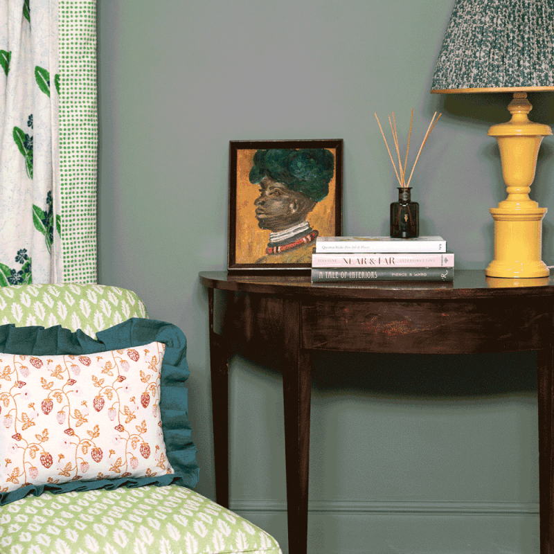
LOOK ONE
A Hallway Featuring Waxed Khaki
“Waxed Khaki is a great backdrop to work with, and can be used in either modern or classic spaces. It’s also a very warm grey/green to live with – it’s timeless and calming, and comes with an intriguing depth. You’ll also find it’s a versatile shade to mix with other colours. We chose a lighter shade of green on the armchair in this hand block printed fabric by Molly Mahon, with little hints of blues and yellows. Hallways often don’t have much furniture in them, so by using a stronger colour on the walls, it allows the furniture and art you do have on display to really stand out. Natural materials also tie in with the green, so using wood felt like the right choice.”
“Waxed Khaki is a good transitional colour, too. When you use a richer, warmer colour in a hallway it offers a change of tempo – especially when you move from the entrance hall to a light kitchen, for example. I could also see it working well on joinery or on kitchen cabinets. The depth of it on an island with the lightness of a marble worktop would be very striking, too.”

LOOK TWO
A Bathroom Featuring Potter's Pink
“There’s no doubt grown-up pinks are enjoying a huge renaissance and, finally, it’s no longer a shade only considered to be feminine. It’s a warm, inviting colour that works in bedrooms, hallways and family rooms.”
“Potter’s Pink is particularly suitable for a bathroom, as it contrasts gently with white sanitary ware and brass fittings. Here, the colour is elevated by a contrast with Romney Wool on the Orac dado and skirting, which keeps the space feeling warm and light, as well as the stunning double Buttermere vanity sink from Drummonds. The turquoise in the Vanderhurd fabric is a bluey green that sets off the pink in a warm and balanced way, and stops it feeling too pretty. It’s a happy combination.”


LOOK THREE
A Living Room Featuring Cherry Truffle
“The depth of Cherry Truffle allows you to be brave. Strong colours can be intimidating, but they add such character to a space. Panelling also worked perfectly in this instance, allowing the colour to talk. But it was important not to introduce a secondary colour on the relief or beading, so we used furnishings to let the colour speak for itself."
“The patterned fabrics offer a change of pace in the room, with playful spots and stripes from Molly Mahon, while the bright red lacquered table from Howe injects a bright accent of colour as well. The blue on the Vanderhurd Dhurrie rug works so well – this scheme demonstrates the principle of working with three main colours in a room – Cherry Truffle, bright red and steely blue. Nothing competes, it’s all beautifully strong and harmonious.”
“If you’re aren’t feeling brave enough to use Cherry Truffle on the walls, try it on your window frames or doors. Dark colours draw the eye out to the nature beyond and this shade would be a lovely way to do that. To use this colour in a more contemporary setting, use it on the floor – with off-white walls and a mid-century chair, it would look particularly striking.”


Visit DuluxHeritage.co.uk to find out more
Follow Orla @OrlaRead
Or continue to comment as a Guest below
DISCLAIMER: We endeavour to always credit the correct original source of every image we use. If you think a credit may be incorrect, please contact us at info@sheerluxe.com.
/https%3A%2F%2Fsheerluxe.com%2Fsites%2Fsheerluxe%2Ffiles%2Fwebsite-images%2F2025%2F03%2Fsign-up-pop-up.jpg)
