Why Interior Designers Love Pink & Green
FIRST, A COLOUR EXPERT EXPLAINS…
…Why They Work Together
To understand the science behind this classic combination, we turned to Dulux creative director Marianne Shillingford. “Opposites are always attracted to each other and it’s no different with colour. All colours that lie opposite each other on the colour wheel have chemistry that sparks the most beautiful and dynamic decorating schemes. Pink is just a light red, and red lies opposite green on the colour wheel, which explains why they work beautifully together – in fact, pink and green are probably the most successful colour partners in the history of art and decorating.”
…How One Balances The Other
“Make sure one colour is stronger than the other, using that stronger shade of pink or green more sparingly in details and accessories, with the other as a broad wall treatment,” Marianne continues. “Don’t put equal amounts of pink and green in the same space, either. Contrasting colours do all the work for you, so you don’t have to overdo it. Instead, use a paler tone of one colour for the walls and a bolder shade of the other for the accents.”
…Why Natural Materials Complement Them
Because these colours are so prevalent in nature, both work well with natural textures and materials. As Marianne says: “They work well with stone and warm wood, in particular, as well as neutrals, copper, bronze and a little bit of gold here and there.”
NOW, FOUR INTERIOR DESIGNERS EXPLAIN HOW TO USE THEM…
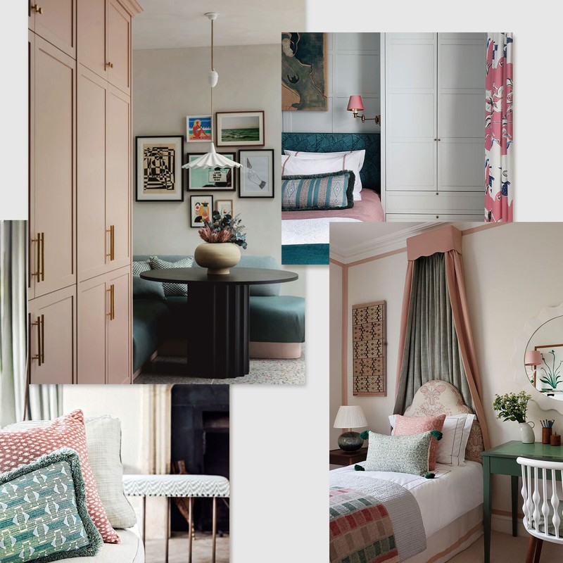
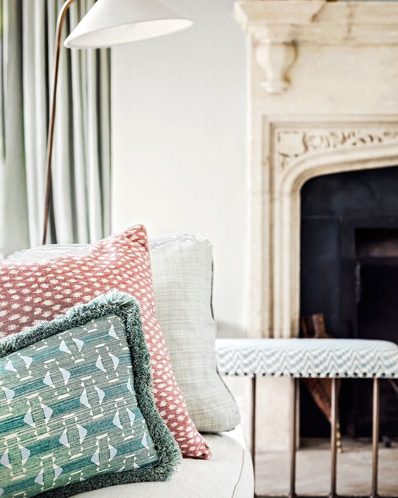
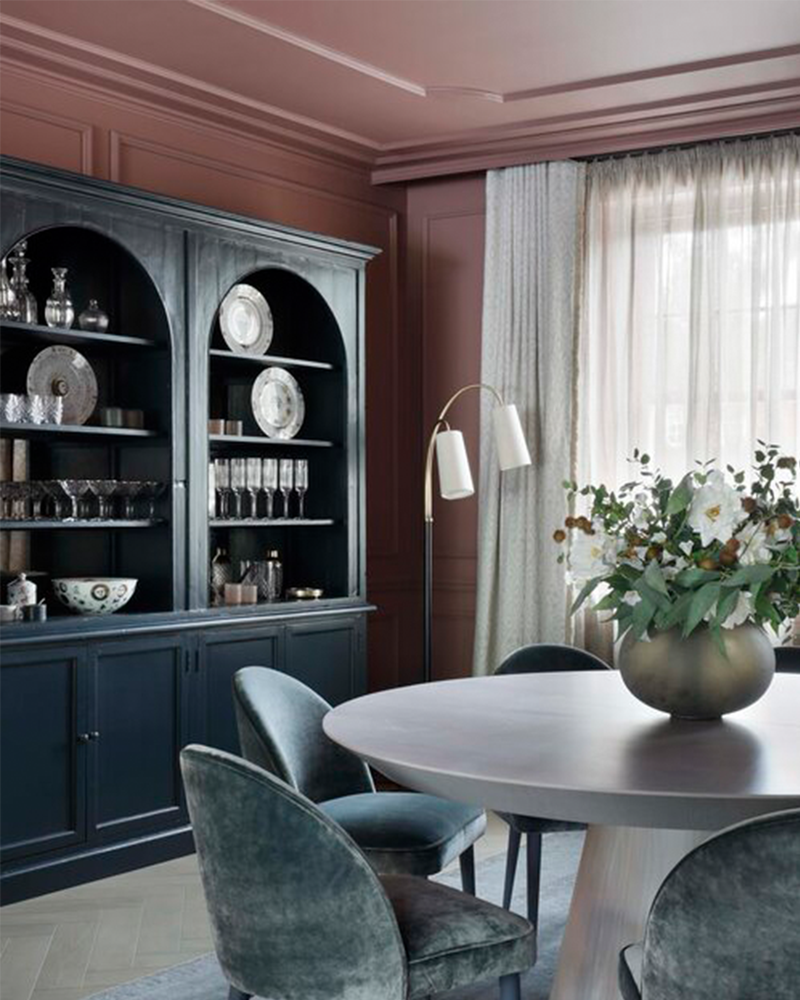
For a bold celebration of colour, Lucy Barlow from Barlow & Barlow says…
“Pink and green schemes feature in a lot of Barlow & Barlow projects – it's one of our favourite combinations. When you can amp up the saturation, suddenly it looks young and fun, and sometimes kind of tropical. It's such a happy colour combination.
“We love using a soft pink on the walls and adding accents of green with cushions or on the leading edge of your curtains for example, and this is a great starting point if you are new to colour. We always encourage clients to be brave with colour and patterns, and for those who are keen to explore, there are some fabulous green and pink patterned wallpapers which use gentle hues to create a soft, elegant feel.
“Another really effective technique is to use a green gloss on woodwork – it's a great way to elevate a space, adding an extra texture, and offers contrast against a more muted, matte wall finish. Secondary spaces, such as guest bathrooms and cloakrooms, are not used as regularly, making them great places to experiment with bolder colour choices – often a client will feel more confident to choose brighter colours or patterns that they may not feel brave enough to use elsewhere.”
Visit BarlowAndBarlow.com
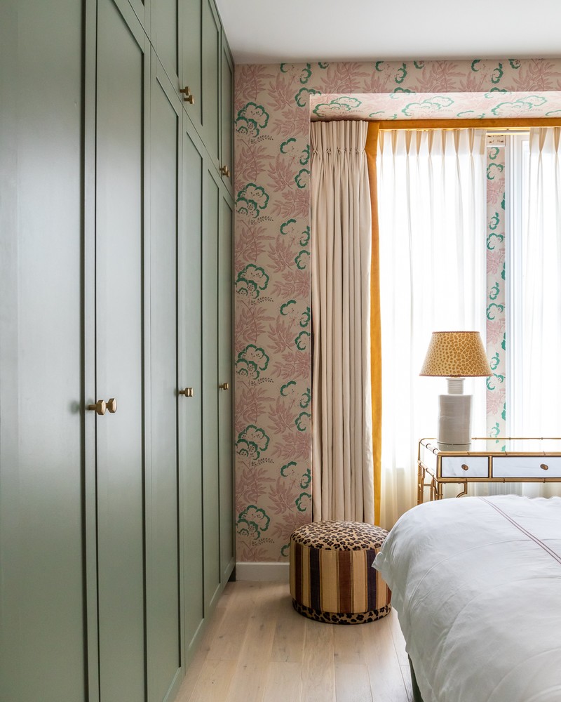
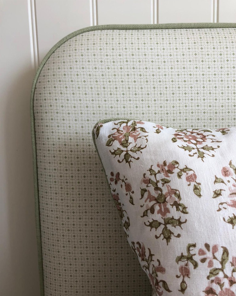
For an English country house aesthetic, Fi Crole from Eadie and Crole says…
“A general rule of thumb is that stronger pinks are more modern and softer tones are more traditional and tranquil. For stronger pinks, look at fabric houses like Ottoline, who use strong, contrasting colours to lift the colour. In a hallway, you could still use the above paint colours, just with stronger, darker accents or contemporary artwork.
“Pink and green is a timeless combination originally associated with English Country houses, but with so many different paint colours and fabrics available now, it can be used in a modern way, too. Use grown-up pink on the walls – our favourites include Temple from The Paint and Paper Library or Jonquil from Edward Bulmer to create a fresh, modern feel that’s cosy and warm. Then, contrast the pink with off-white woodwork. Keeping the tones quiet and unchallenging or using washed-out colours always helps channel some calmness and serenity into a space, especially a bedroom environment.
“You can also add texture with flooring like Crucial Trading Aztec or Tim Page Claremont Natural. Balance blush pink walls with dark and warm furnishings and accessories and complete the palette with earthy greens, burnt oranges, yellows and soft neutrals for a scheme that feels timeless and sophisticated. Again, add texture with eclectic cushions and finish the look with contemporary lighting solutions and brass finishes.”
Visit EadieAndCrole.com
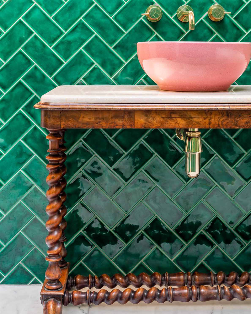
For a modern, cool interpretation, Tiffany Duggan from Studio Duggan says…
“Green and pink is one of my all-time favourite colour combinations. You can go bold and somewhat tropical, or pair it back with sludgy, muted shades – either way, it’s a combination that’s hard to get wrong. For a pink wall I love Setting Plaster by Farrow & Ball, Jonquil by Edward Bulmer or Stony Plaster by Atelier Ellis. It looks great with green accents – perhaps a sludgy khaki on the skirting boards, or deep emerald-hued Zellige tiles. Even a collection of cabbage plates as decoration in a kitchen can look amazing against a pink wall. As a wall colour, it can be really neutral – almost nude.”
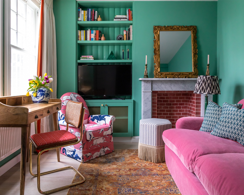
For subtle accents within complex schemes, Sarah Peake from Studio Peake says…
“Pink and green, in all their infinite variety of shades, are thoroughly timeless. The trick is how you use them in a scheme. For me, too much pink can risk evoking candy floss, so I like to use it sparingly against a backdrop of more muted ‘anchor’ colours like off-white.
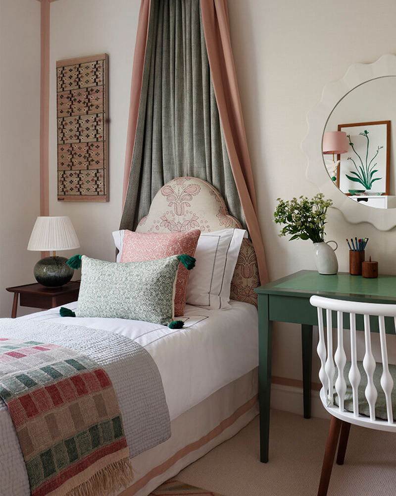
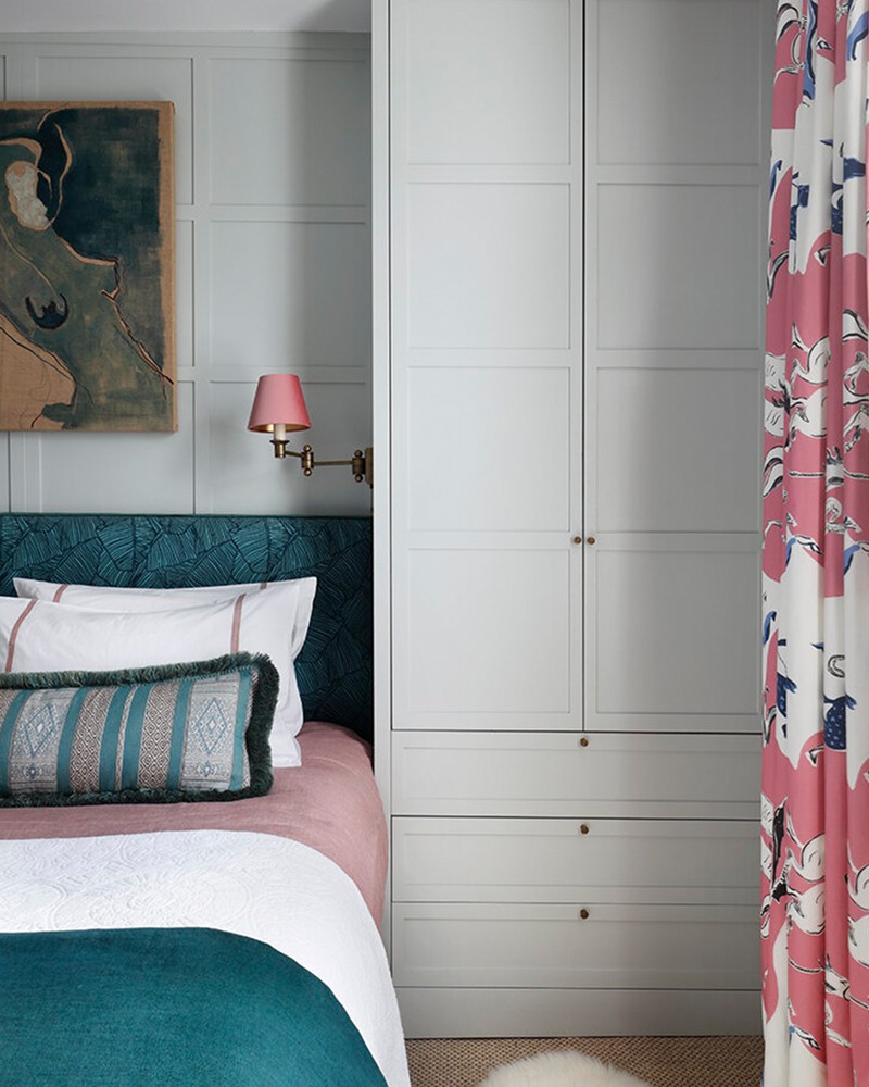
“Depending on the shade of pink, it can gently warm or electrify a space. Green works wonders when paired with pink, and again, in all its shades, it can do everything from anchoring to animating a scheme. In this little girl’s bedroom, I went for a soft, old-fashioned pink tone in the fabrics against a muted green, together with neutral colours to help foster a calm atmosphere, but with a hint of grandeur.
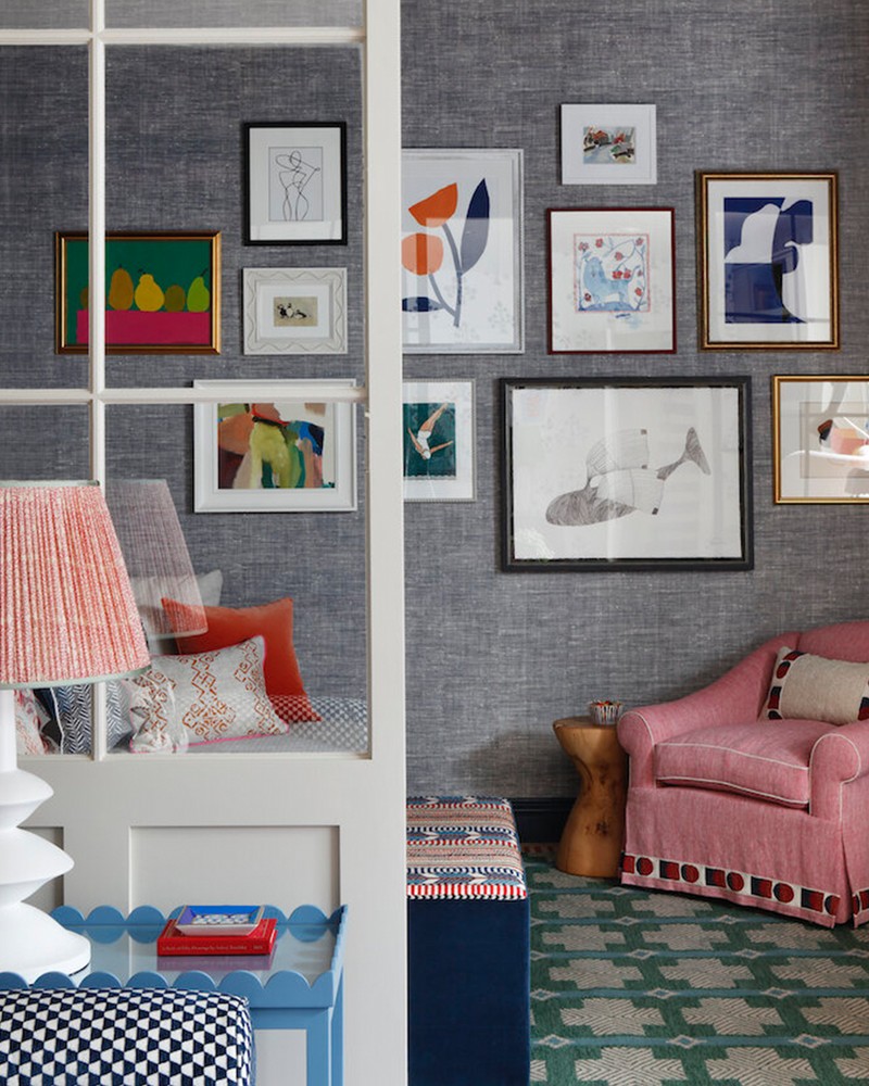
“Then, in this basement living space we went much bolder, with more assertive shades of pink and green in the armchair from Susie Atkinson and the rug from A Rum Fellow. I like placing muted, old-fashioned pinks in more modern contexts, as with this Pierre Frey Vincent Darre fabric in the master bedroom from our Vauxhall project.”
Visit StudioPeake.com
Or continue to comment as a Guest below
DISCLAIMER: We endeavour to always credit the correct original source of every image we use. If you think a credit may be incorrect, please contact us at info@sheerluxe.com.
/https%3A%2F%2Fsheerluxe.com%2Fsites%2Fsheerluxe%2Ffiles%2Fwebsite-images%2F2025%2F03%2Fsign-up-pop-up.jpg)
