
How An Interior Designer Brought Colour Into This Family Home
All products on this page have been selected by our editorial team, however we may make commission on some products.
The Property
The property is a mid-terrace, four-bedroom Victorian house, owned by a young professional couple who live there with their one-year-old daughter. For a terraced house, it is deceptively big, being wider and deeper than typical mid-terraces, but it required a total overhaul and redesign to bring in line with modern living.
The Brief
The clients wanted the house to spark joy. Both their jobs are demanding, so home had to feel like a place of pure happiness. We talked through their routines, from first thing in the morning to switching off the lights at bedtime. First, they wanted the morning shower to make them feel happy, and at the end of the day they wanted that feeling of being totally cocooned for cosy evenings on the sofa in front of the TV.
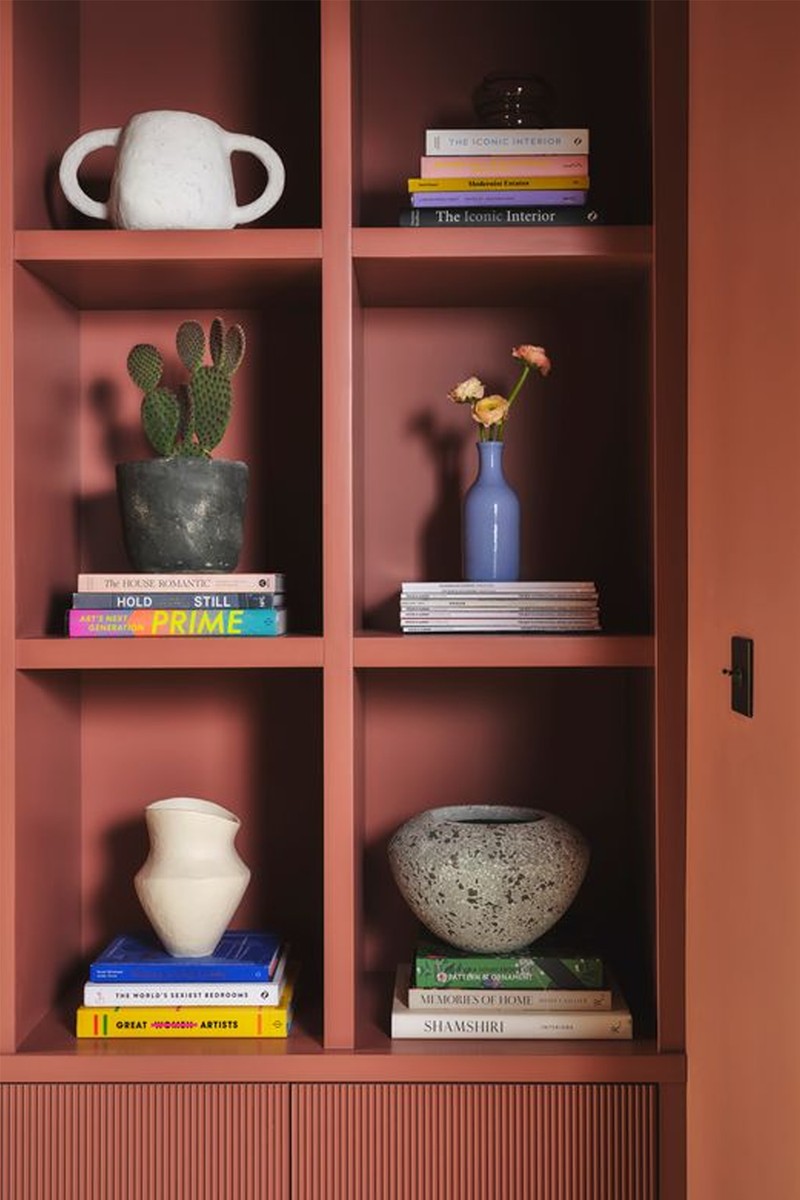
Each design decision was carefully chosen based on nostalgia, places they had been, where they had grown up or their happy holidays. A photograph of Bondi’s Icebergs was the starting point for the kitchen, with different tones of blue of the sea and sky, punctured with tiny colourful surfboards. That formula of one dominant colour punctured with small amounts of colour became the formula for the property. We used a blend of vintage or inherited furniture, bespoke pieces and some that were new to help make the space feel carefully curated and not overly ‘done’.
TAKE THE TOUR
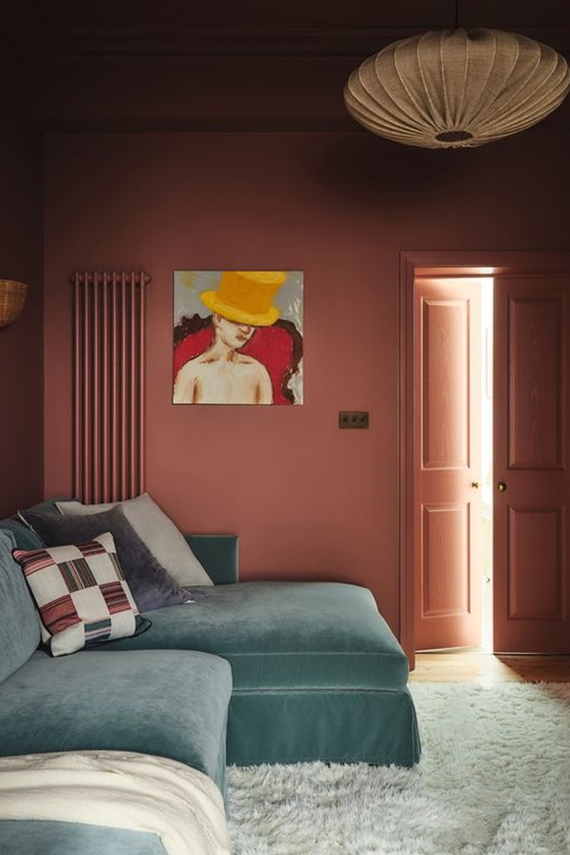
The Snug
This had to feel extremely cosy, a place to watch films and feel super comfortable, so we went for a deep burgundy that is rich and warm. In future, this space will also have to double up as a playroom, so storage was key. We decided on a generous chaise sofa, so someone can either lie out or lots of people can pile on it together, and the sheepskin rug is shaggy and soft underfoot, but also washable and very practical. Lighting in here had to be minimal and soft to maintain that cocooning feeling.
WALL LIGHTS - Anthropologie
SOFA - OTTILLIE IN SOFT BLUE - Love Your Home
RUG - Ruggable
WALL COLOUR - Little Greene
The Living Room
In here, the walls are brighter and lighter. A dark navy sofa faces the fireplace where the clients’ close friend’s painting hangs above the fireplace, which was refurbished with small tiles in a checkerboard pattern, pulling through the burgundy from the snug. The same pattern is echoed in the window bay curtains.
WALL PAINT - Little Greene
CURTAINS - Susie Atkinson
/https%3A%2F%2Fsheerluxe.com%2Fsites%2Fsheerluxe%2Ffiles%2Farticles%2F2024%2F08%2Flizzie-green-ivydale-road-7382-7390.png)
The Cloakroom
The inspiration here was taken from the clients’ love of visiting chapels in Italy and being in awe of the starry vaulted ceilings. We reached out to the amazing Queenie Ighams who worked her magic using Bauwerk in the most incredible blue and real gold leaf, over which she hand-painted tiny star sketches.
WALL LIGHT - Dyke And Dean
MIRROR - Made In Design
WALL PAINT - Bauwerk
/https%3A%2F%2Fsheerluxe.com%2Fsites%2Fsheerluxe%2Ffiles%2Farticles%2F2024%2F08%2Flizzie-green-ivydale-road-7435-7492.png)
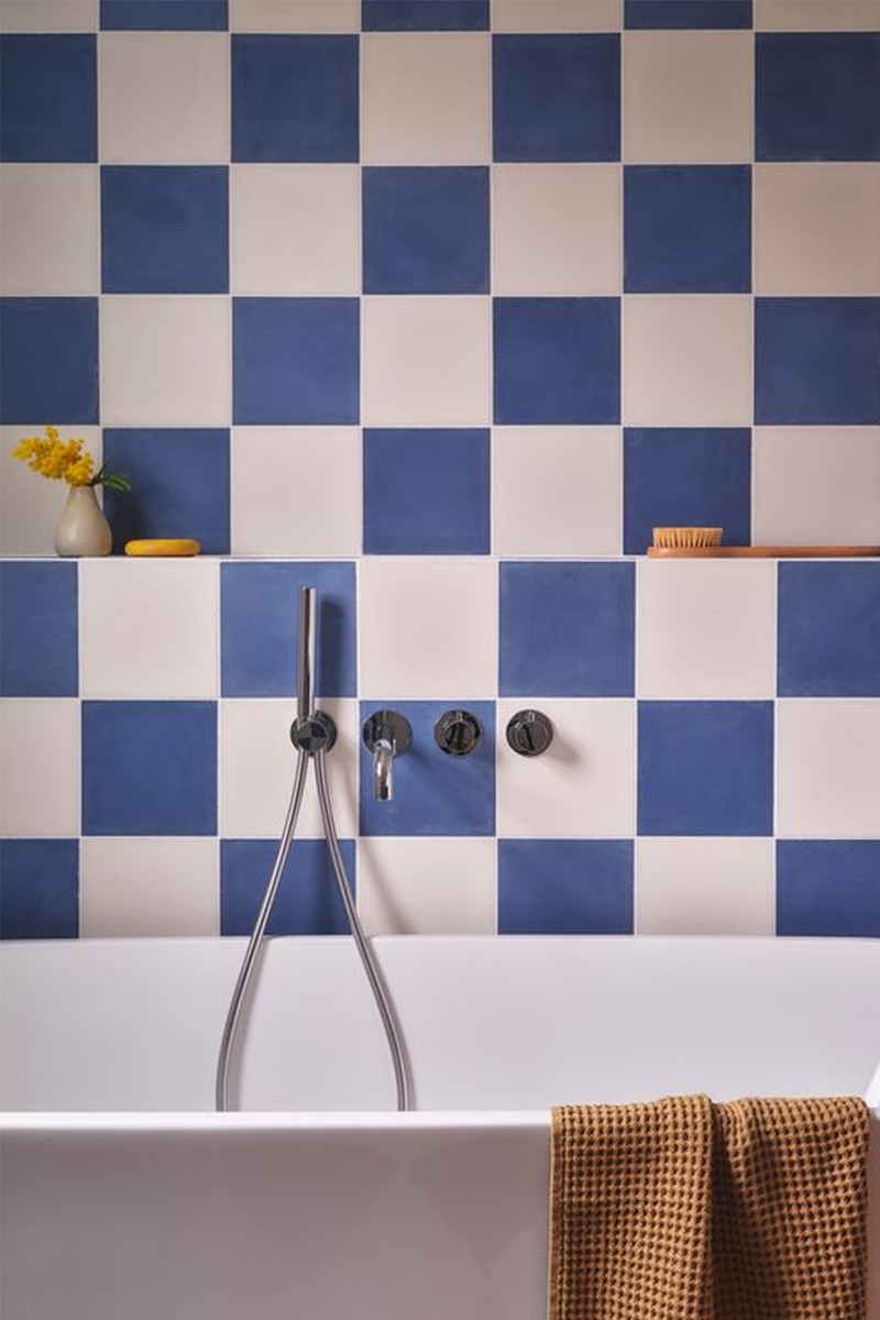
The Family Bathroom
The client wanted this space to be the children’s bathroom, and to therefore have some fun with it. We went for a navy and milky white checkerboard encaustic tile that ran from the walls onto the floors for maximum impact.
TILES - Bert & May
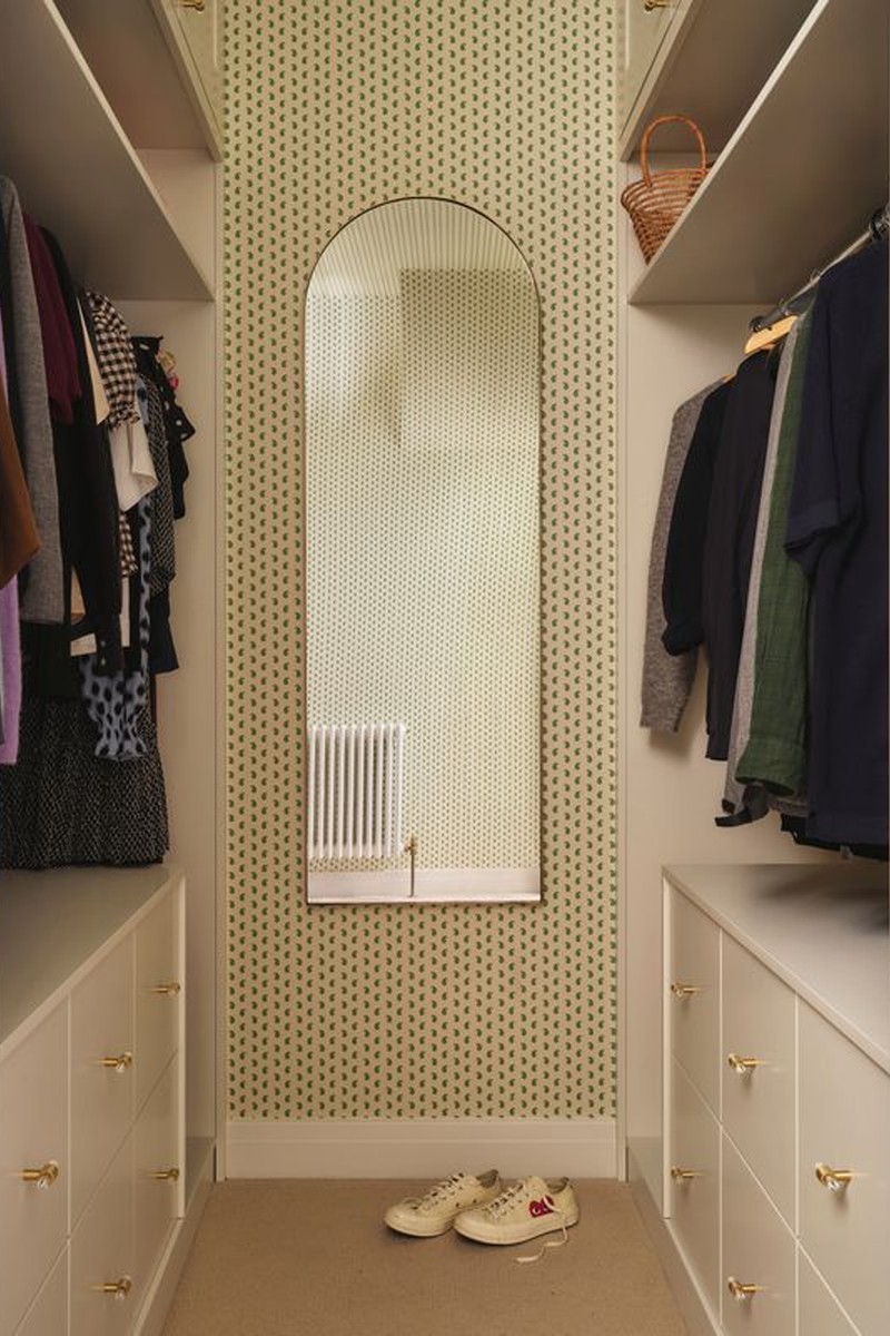
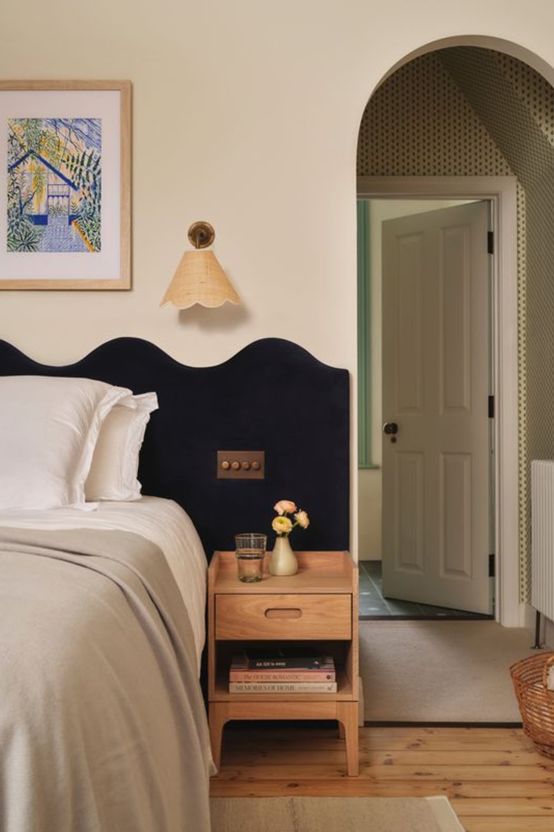
The Main Bedroom & Walk in Wardrobe
This had to feel very pared back and serene, but we wanted to ensure it still felt connected to the rest of the house. We went for a bespoke soft wave navy velvet headboard, which spanned the width between the hallway door and dressing room door, and we echoed the wave in the rattan wall lights and kept everything else in here relatively neutral.
The bedroom had a large bay window which felt like the perfect spot for a little curved sofa, and we found the perfect one on Pamono, upholstered in golden yellow velvet tying in with the bathroom. The curtain material was chosen to bring in a light element of pattern for some interest. In the walk-in wardrobe, the client chose the same wallpaper used in her bedroom in her parent’s house.
WALL LIGHTS - Matilda Goad
SOFA - Pamono
SOFA FABRIC - Sanderson
WALLPAPER - Howe
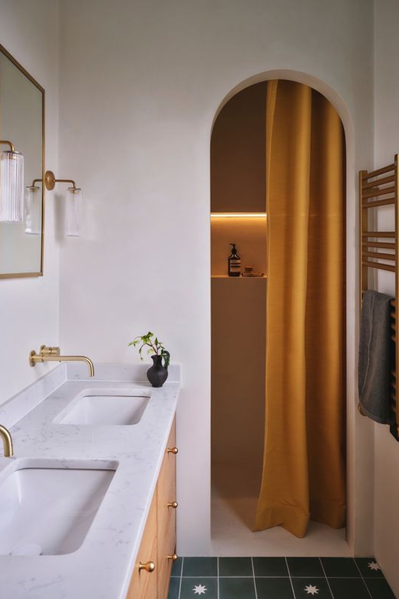
The En-Suite
The interiors had to feel energetic but not overly stimulating. We went for a simple patterned green floor tile, bespoke oak vanity and micro-cement wall finish in a milky white. We had a few different lighting layers in here to be able to switch up the mood depending on the time of day. The decision to go for the sunny shower curtain was to give that kick of energy that they both needed to start their day.
TILES - Bert & May
MICROCEMENT - C Ferri Used Forcrete In Little Greene
FITTINGS - Crosswater
SHOWER CURTAIN - Perennial Fabrics
Visit LIZZIEGREEN.COM
Photography JASPER FRY
Or continue to comment as a Guest below
DISCLAIMER: We endeavour to always credit the correct original source of every image we use. If you think a credit may be incorrect, please contact us at info@sheerluxe.com.
/https%3A%2F%2Fsheerluxe.com%2Fsites%2Fsheerluxe%2Ffiles%2Fwebsite-images%2F2025%2F03%2Fsign-up-pop-up.jpg)
