Look Around This Practical & Stylish Family Home
The Property
The property is a beautiful Grade-II listed building known for its Italianate style on a square in Primrose Hill. It is a six-bedroom house spread across five floors with a courtyard garden. When our clients bought the property, it had been partly renovated, but not to the taste or level of quality our clients wanted. It was quite tired, lacked practical storage and flow, and many of the period features had been stripped away.
The Brief
We were delighted to work with a young family whom we'd worked with on several projects before. Relocating to London from the country, they wanted a relaxed, inviting and comfortable family home that made the most of the natural light and period features – but one that would stand up well to the demands of daily family life. They wanted lots of neutral tones with textured layers to maximise the light throughout the house.

Entry/Boot Room & Powder Room
The entry hall had a really grand door and beautiful period-stained glass windows, but it was covered in access panels. We designed a timber-panelled door lining to differentiate the lobby from the hallway and create a sense of grandeur. We then painted everything in ‘Charbone’ from Paint & Paper Library, a deep almost-black to contrast with the neutral hallway and make the stained glass pop.
The main kitchen had four different openings, so we closed one up to create space for a proper boot room. We added joinery for shoes and hooks along this wall, then installed a separate cupboard for hanging coats, while ensuring there was still enough room to park the pram.
This room leads to a powder room with walls and ceiling painted in a specialist finish of ‘Panel’ by Paint & Paper to give some character and interest.
/https%3A%2F%2Fsheerluxe.com%2Fsites%2Fsheerluxe%2Ffiles%2Farticles%2F2023%2F04%2Fkitchen.png)
The Kitchen & Breakfast Nook
When our clients first viewed the property, the room off the kitchen was filled with a 12-seater rectangular formal dining table. We felt this wasn’t practical for a young family and they needed a living room or snug area on the same floor (in addition to the formal reception room on the first floor) so we created a breakfast nook in the kitchen. We designed a bespoke banquette in nova suede, so it is practical for young children but still looks smart. We sourced the Italian antique pendants from an old Venetian brasserie.
/https%3A%2F%2Fsheerluxe.com%2Fsites%2Fsheerluxe%2Ffiles%2Farticles%2F2023%2F04%2Fsnug.png)
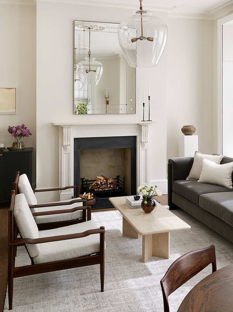
The Snug
Next to the kitchen is the snug, which came with one request: a U-shaped sofa. We designed this bespoke piece, which is covered in a practical but sumptuous cotton velvet in a deep sludgy green by Zimmer & Rhode. All the walls have a textured weave wall covering by Vescom, plus a Slim Aarons print, and the windows have cosy wool blinds. There is also lots of bespoke joinery to house all of the tech and family games.

The Formal Dining Room
This room was originally presented as one big dining room that had been stripped of its period features. We changed the layout for a more relaxed feel, with a new seating area and round dining table. We added ceiling roses and cornicing to amplify the period feel of the property and mid-century antiques. We also painted the walls in ‘Chaste’ by Paint & Paper Library and reinstated period plaster work and ceiling roses. To keep the space feeling restful and elegant, we used sheer roman blinds, which also maximise daylight. The chairs and tables are antique with a rug from Wool Classics.
/https%3A%2F%2Fsheerluxe.com%2Fsites%2Fsheerluxe%2Ffiles%2Farticles%2F2023%2F04%2Fstudy.png)
The Study
The study was filled with natural light so we thought it could take some punchy, deep colours. We designed a cosy nook for watching TV, layered in different deep green fabrics. The desk is an art deco antique.


The First Floor Reception
In here, all the armchairs and sofa are bespoke, but we mixed them with antiques to create interest by combining old with new. The timber and marble console table, and the pair of eglomises, are antique, as is the chandelier.
/https%3A%2F%2Fsheerluxe.com%2Fsites%2Fsheerluxe%2Ffiles%2Farticles%2F2023%2F04%2Fmaster-bwph418.png)
The Main Bedroom
We had to reconfigure all the storage to maximise a walk-through dressing space. We retained the original wardrobe carcasses, but the doors now have a specialist limewash paint, which adds texture and interest. The headboard of the bed had floor-to-ceiling panels in a cream fabric and there are bespoke wall lights above neat bedside tables to keep the scheme simple. We love the antique dressing table and stool, which anchor the whole room.
/https%3A%2F%2Fsheerluxe.com%2Fsites%2Fsheerluxe%2Ffiles%2Farticles%2F2023%2F04%2Fnursery.png)
The Nursery
We created additional storage and a window seat in the nursery, and made the most of the quirky ceiling by painting it in the same blue. The wallpaper was a light stripe by Cole & Sons with bespoke joinery in Farrow & Ball ‘Skylight’.
/https%3A%2F%2Fsheerluxe.com%2Fsites%2Fsheerluxe%2Ffiles%2Farticles%2F2023%2F04%2Ftwin-room-bwph080.png)
The Twin Room
The twin room was designed for teenage nieces coming to visit, so we opted for fresh stripes and ochre tones. We especially love the scalloped bedside lamp.
Visit BradyWilliamsStudio.com
DISCLAIMER: We endeavour to always credit the correct original source of every image we use. If you think a credit may be incorrect, please contact us at info@sheerluxe.com.
/https%3A%2F%2Fsheerluxe.com%2Fsites%2Fsheerluxe%2Ffiles%2Fwebsite-images%2F2025%2F03%2Fsign-up-pop-up.jpg)
