
Look Around This Renovated Regency Townhouse
All products on this page have been selected by our editorial team, however we may make commission on some products.
The Property
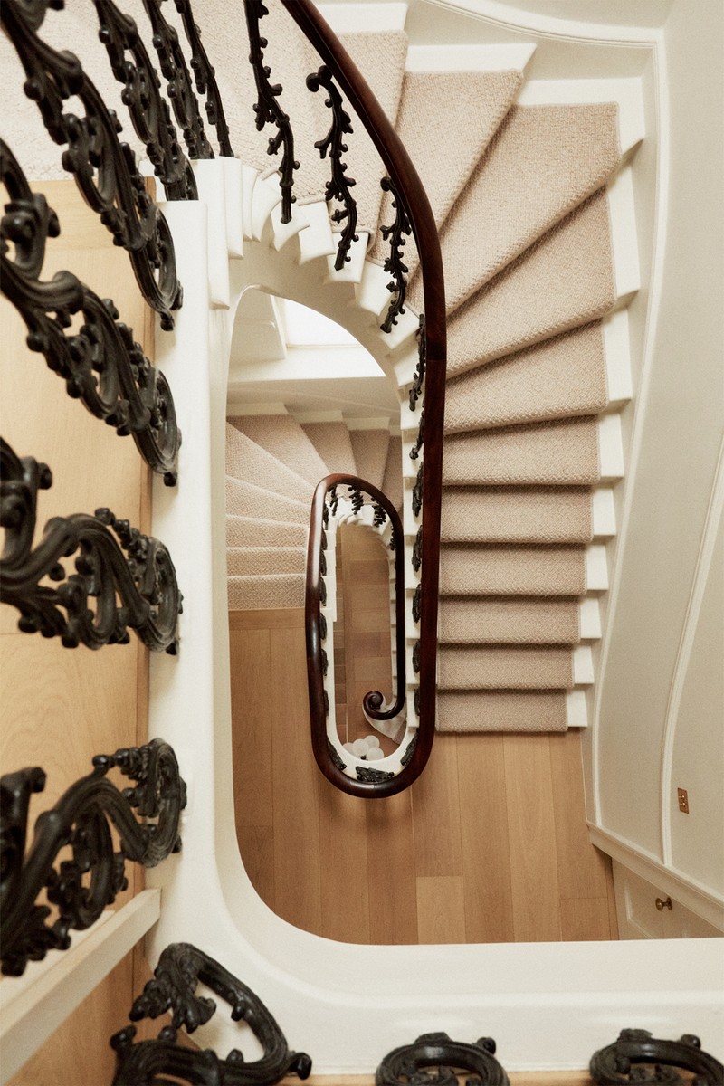
The house was built in 1860 by the Wyatt family, which owned a prominent architectural firm at the time. When we purchased the property, it had been converted into apartments but our vision was to restore it back into one coherent home and reconnect the entire house.
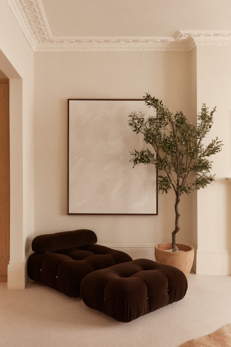
The first time we walked into the property, we were so excited – the bones were incredible, there was still original cornicing throughout and the ceiling height was very generous.
The Regency style, semi-detached building also backs onto beautiful private gardens. It has an unusual layout on the ground floor but with a few renovations, we’ve made the best of the space and it now works well for our family.
The Brief
When we bought the house, we undertook a full renovation which I managed. It wasn’t a small job – we had to restructure and reshuffle the flow of the house by moving some walls around but seeing as the entire house is spread over 5,000 sq. ft. it was important to maintain a sense of calm throughout, with each room serving a primary and useful purpose.
My aesthetic is very natural – which is why you see lots of textures and fabrics in earthy tones throughout the property. I really feel my home is my sanctuary which offers respite from our busy London life.
The Hallway
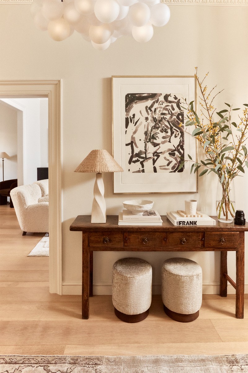
On entry, you’re greeted by a beautiful wooden console table that we found at a flea market and had restored. Its effectively used by us to drop everything on when we walk in the front door. There’s also a mirror for that last-minute check before you leave, and a beautiful piece of artwork by Elizabeth Peyton – I love the colour palette.
CEILINGS: Wimborne White Farrow & Ball
WALLS IN HALLWAYS, LIVING ROOM, KITCHEN & MAIN BEDROOM: Portland Stone Pale Little Greene
The Office
There’s a Crittall glass door on the entrance to my home office, which sets a more masculine tone for this room. The walls were painted dark green to evoke the feeling of earth-friendly tones, while the darker palette creates a sense of elegance and sophistication. The burl wood desk in here complements the bedside tables in our bedroom – I like to use similar materials throughout a house to give it the right flow.
The Living Room
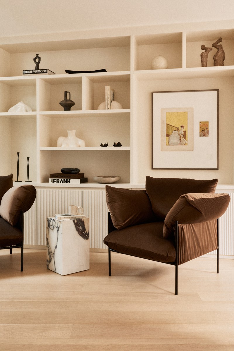
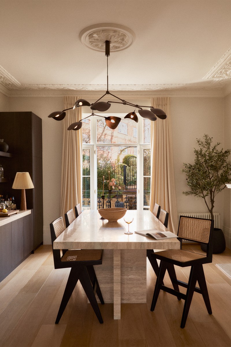
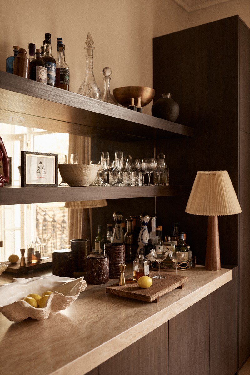
The aim with this room was to create a cosy but elegant space that could also be informal and flexible when needed. With floor-to-ceiling windows on both sides, the light streams through. We incorporated a bar in the living room, and it’s a wonderful place to entertain without having to go up and down to the kitchen. The doors also open into the garden, which is lovely on summer evenings.
I chose a range of contrasting but complementary fabrics for this room, including linens, bouclés, velvet and rattan. We also matched the existing travertine from the fireplace to make a bespoke high seating bar table and stone top bar.
CHANDELIER: 101 Copenhagen
BAR STOOLS: Six The Residence
SIDE TABLE: Gubi
RUG: Nordic Knots
COUCH: Andrew Martin
The Kitchen
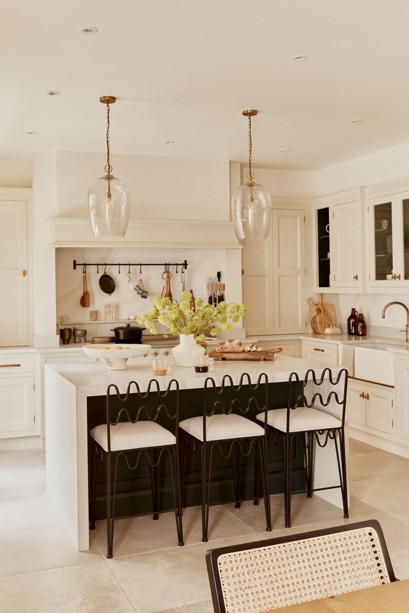
It’s a cliché but the kitchen really is the heart of our home. I wanted to choose materials that allowed us to make mess, and the quartzite countertop is very durable. There’s also a pantry with open shelving – I love to have glass jars on display, and the La Cornue cooker is the focal point; the utensils above evoke the feeling of an old English cottage.
At the breakfast island you’ll find Rachel Donath bar stools, while at the wooden breakfast table there are rattan dining chairs which complement the bar stools in the living room.
Off-white walls are matched with a slightly darker shade on the cabinets to create a bit of contrast and the hardware finishes throughout are brass, all sourced from Corston Architectural.
KITCHEN CABINETS: are in Portland Stone Little Greene.
WALLS IN OFFICE: painted in Cogsworth Graham Brown, including skirtings
SWITCHES AND SOCKETS: throughout the house are Corston Architectural Detail
in antique brass
HARDWARE: Corston Architectural Detail; TAP is the Quooker Fusion Patinated Brass
BAR STOOLS: Rachel Donath
COOKER: Lacanche Cluny range cooker
PENDENT: (above breakfast table) Lights And Lamps Ruzo four-light,
matt warm white
BREAKFAST TABLE: Le Redoute
DINING CHAIRS: Six The Residence
VELVET ARMCHAIRS: Six The Residence
MARBLE PLINTH: Menu
The Main Bedroom
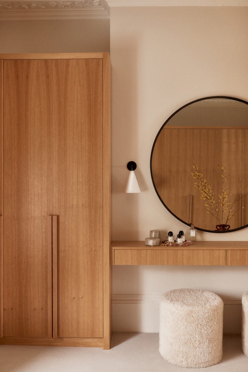
This is my favourite room in the entire house. We combined two rooms together to make one big open concept of dressing room, bedroom and living room. It’s somewhere I come to escape the chaos and enjoy that second cup of coffee.
The brief for the dressing room was minimal but not cold – so the colour palette is warm, with lots of browns, reds and creams. I didn’t want to see the clutter in the dressing room, so there’s beautiful handmade oak joinery throughout to hide the mess. I love the Abigail Ahearn oversized armchair that looks out over the garden – the arched legs replicate the arched side table from Ferm Living. In the middle of the dressing room is an old pig’s bench with a few of my favourite books on display – I found it at a pop-up that was showcasing different pieces which had been found and then restored.
BED: Rowe Super King Winged Bed by The English Bed Company
LAMPS: OKA
CHANDELIER: Soho Home
RED ARMCHAIR: Abigail Ahern
SIDE TABLE: Ferm Living
WALL LIGHTS: Rose Uniacke
BOUCLE STOOLS: The White Company
RED VASE: Ferm Living
POND TRAY: Aesthetic Label
Follow @Riley. Uggla & @TheCondoStudio on Instagram & visit TheCondo.Studio.
Photography credit: TrishaWard.co.uk
DISCLAIMER: We endeavour to always credit the correct original source of every image we use. If you think a credit may be incorrect, please contact us at info@sheerluxe.com.
/https%3A%2F%2Fsheerluxe.com%2Fsites%2Fsheerluxe%2Ffiles%2Farticles%2F2023%2F06%2Fsl-riley-uggla-full-bleed.png)
/https%3A%2F%2Fsheerluxe.com%2Fsites%2Fsheerluxe%2Ffiles%2Farticles%2F2023%2F06%2Fsl-riley-uggla-house-tour-main-bedroom.png)
