Meet The Interior Designer: Cat Earp
Style & Inspiration
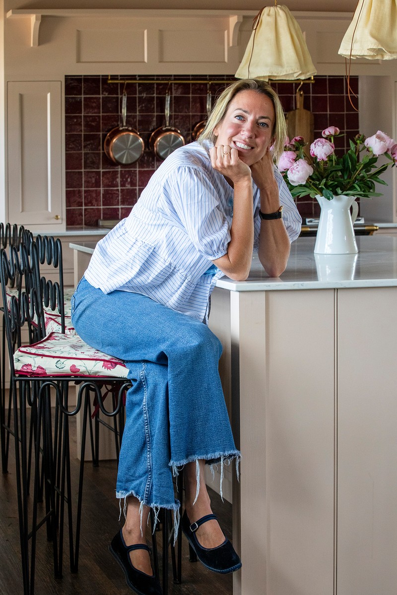
My background was fashion PR. I worked for brands like Gucci, Prada and Mulberry, but I’ve always been creative and had a passion for interior design. It’s always been very important to me to have a lovely home to come back to.
My main inspiration always comes from the fabrics and pieces I love. That said, I also find interior designers like Elizabeth Hay, Lucy Barlow, Laura Stephens, Beata Heuman, Emma Ainsborough, Sarah Southwell, and Sean Symington really inspiring.
The huts were the first project where I could put my own stamp on something. I never really had the confidence to do interiors, but with the huts, we had no other choice than for me to do it – and I loved it. We started with two and then a year later created two more. Each of them is unique in their design. There’s no real or specific inspiration behind them – I just start with a colour, beginning in the kitchen, then with a fabric I love and build everything from there.
The response to Aller Dorset and my design work not only propelled me to start selling my designs. It’s also the reason I’m launching The Aller Studio, a new service catering to any interior design needs. No matter how big or small, I am excited to support people with their own projects.
Favourite Brands & Products
Some of the brands I love include Alice Palmer, Bettina Ceramica, Matilda Goad, Beauvamp, Hum London and Hastshlip.
My favourite item in our home is a bespoke plate Harlie Brown made for us. It has pride of place on the mantelpiece in our kitchen. I’m also really loving our new wavy footstool from Isabelle Baldwin – it’s completed our kitchen perfectly.
Locally, I like to shop in Aitta in Sherborne. It’s run by Nora from Projektityyny and it’s full of gorgeous homeware. You can also find some real gems in the curiosity store in Dorchester – I’m still kicking myself for not buying a beautiful set of eight vintage, bamboo dining chairs I saw there recently. Elsewhere, there’s a great reclamation centre in Glastonbury, and Glassette has such an amazing edit of independent homeware brands.
The brand I’ve recently discovered is Birdie Fortescue. The lamps and lampshades are brilliant and so well priced.
The Family Home
Our own house is a 16th-century thatched farmhouse. I am delighted to say it was a project, a huge project, which we’ve recently completed. Changing the flow, putting in a new kitchen, new bathrooms… You name it, we’ve done it! It’s been a real labour of love, but we couldn’t be happier with the outcome.
We worked closely with an architect and had to apply for planning permission as it’s a listed building. He helped us work out what we could and couldn’t knock down, where the waste would go, and how we could get an electrical supply to certain areas. We had to work with the very old, thick walls and make sure that we maintained parts of the original farmhouse.
I created a moodboard and saved ideas I had – mostly through Instagram. I then got fabric samples, paint samples and set up an area in our sitting room to put together different schemes. I wanted there to be a good flow throughout the house – particularly with the colour schemes.
If you’ve seen Aller Dorset, you know Ant and I love colour. A friend once told me you will never be disappointed with going bold, and I tend to agree. I also pride myself on paying attention to the details, so the finishes are extremely important to me.
Take A Look Around Cat’s House
The Hallway
The paint colour was the starting point, followed by the terracotta marble tiles, but I always knew I wanted to use this wallpaper somewhere in the house, and this was the perfect opportunity. The scalloped built-in-bench is one of my favourite details in the house. Everyone is always impressed when they walk in, which is exactly what I wanted. I’m also totally obsessed with Beata Heuman’s paper bag gong pendant which is the centrepiece of the hallway – so much so I’ve also got the exact same pendant at the top of our stairs as well.
UNIT COLOUR PAINT: Farrow & Ball
PENDANTS: Beata Heuman
WALL LIGHTS: Bettina Ceramica
The Kitchen
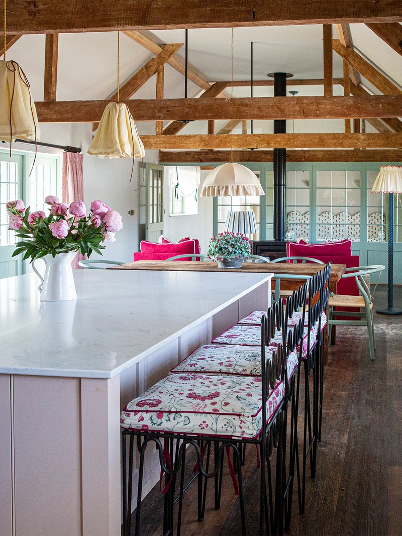
This was one of the biggest parts of the renovation. It used to be Ant’s playroom when he was growing up and beyond it was an old, rundown barn. We’ve extended it, adding on a utility room, pantry and a dog’s room. We’ve done extensive work to it, and we couldn’t love it more.
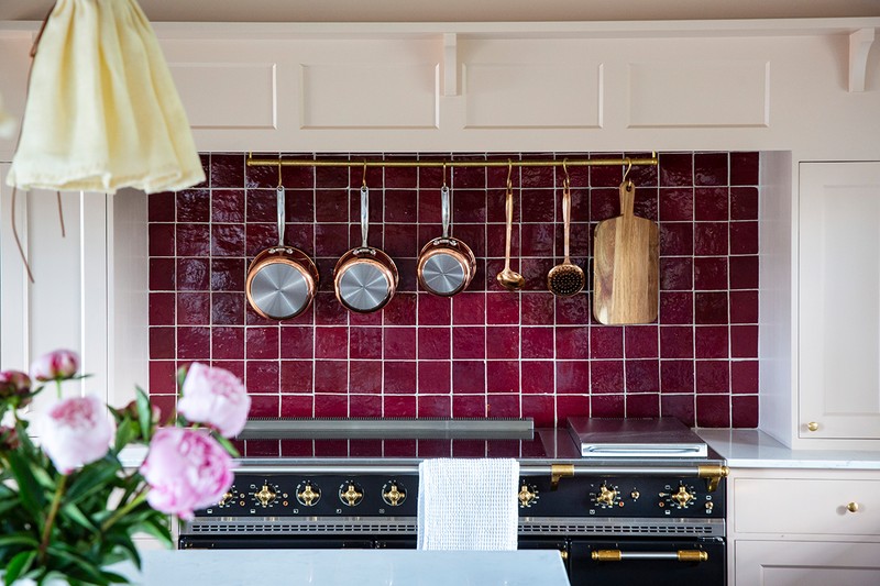
The starting point was the kitchen unit colour, and I love blue and burgundy as well, so I knew I wanted to get lots of pattern and colour in there. The kitchen was made by The Dorset Kitchen Company who I couldn’t recommend more highly. They were recommended by a friend in London, but they travel all over the country. They were fantastic from start to finish, and we really do have our dream kitchen.
KITCHEN: The Dorset Kitchen Company
PAINT: Farrow & Ball
PENDANT (OVER ISLAND): Beata Heuman
PENDANT (OVER KITCHEN TABLE): Beauvamp
TILES: Otto Tiles
COPPER PANS: John Lewis & Partners
ARMCHAIRS: Love Your Home
SIDE TABLES: Birdie Fortescue
LAMPSHADE: Birdie Fortescue
WOODWORK: Little Greene
STOOLS: Etsy
FOOTSTOOL: Isabelle Baldwin
FLOOR LAMP: Birdie Fortescue
LAMP SHADE: Alice Palmer
Cloakroom
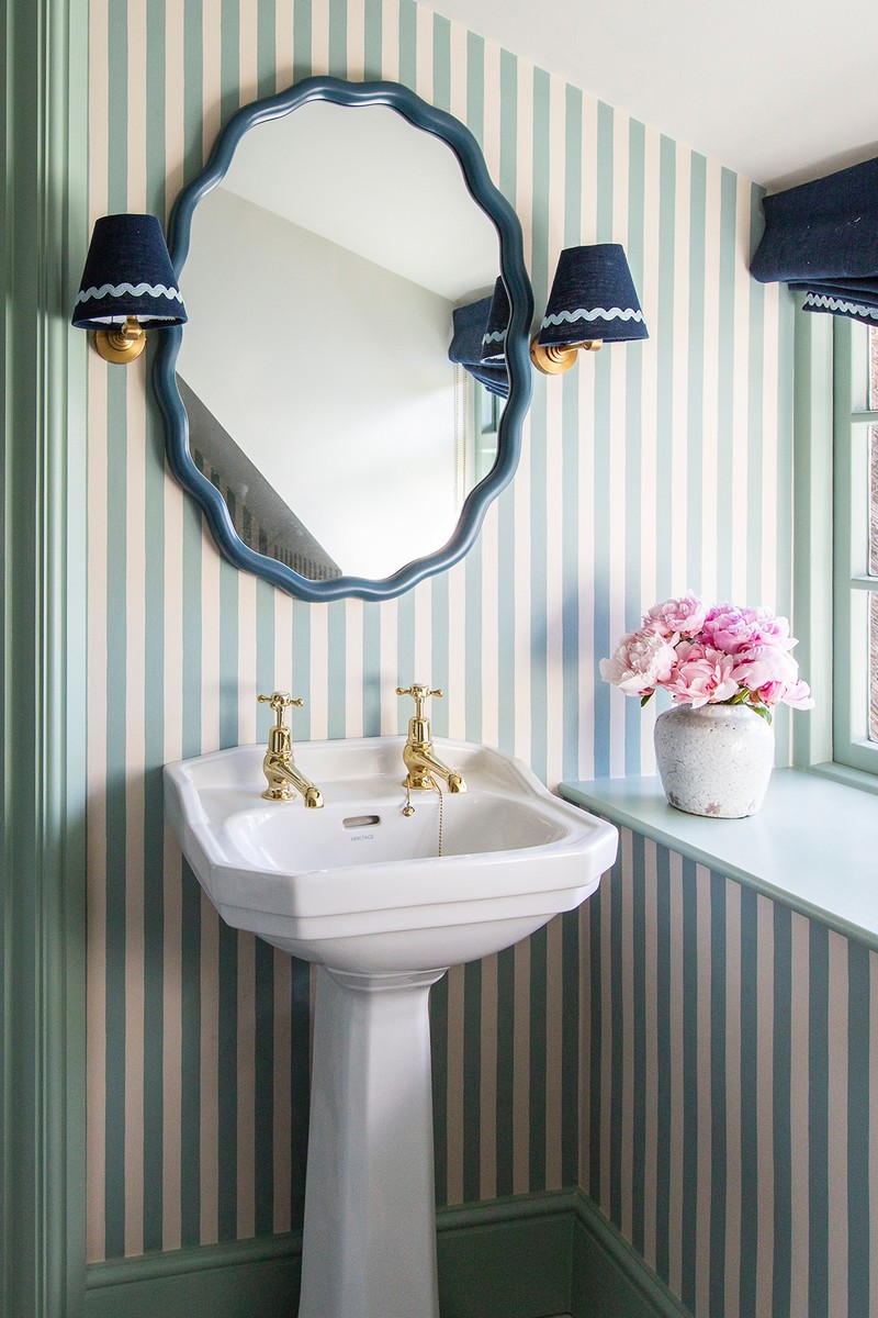
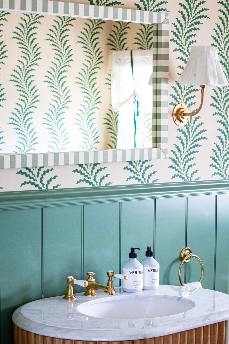
I couldn’t be more obsessed with this wallpaper, or the room in general. I’ve got a sweet sheer blind with a green ribbon and then a café curtain below. The mirror really finishes it all off – and not forgetting the amazing vanity, I love the ribbing.
WALLPAPER: Soane
WALL PANELLING: The English Panelling Company
FLOOR TILES: Mandarin Stone
VANITY UNIT: Soho Home
LAMP SHADES: Alice Palmer
WALL LIGHTS: Pooky
MIRROR: Alice Palmer
The Pantry
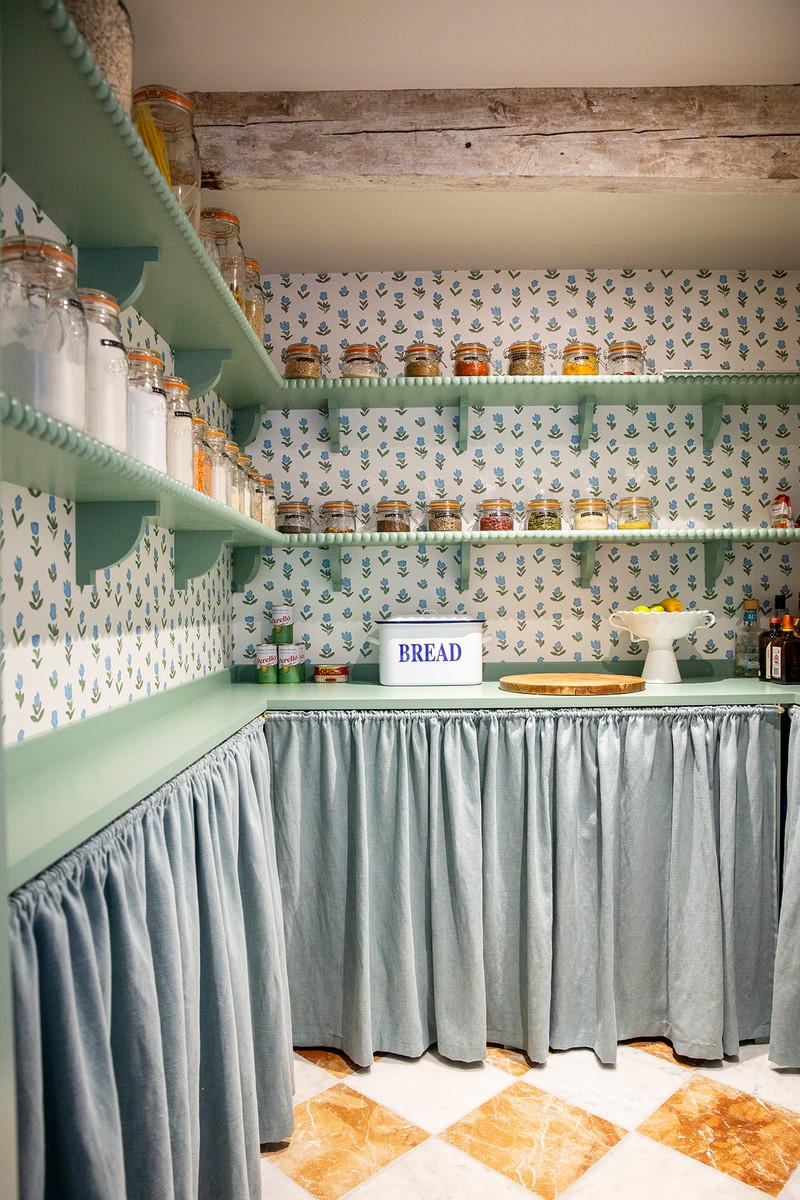
This is one of my favourite rooms in the house – it just makes me smile every day.
WALLPAPER: Ottoline
FLOOR: Mandarin Stone
BOBBIN TRIM: Decora Mouldings
The Utility Room
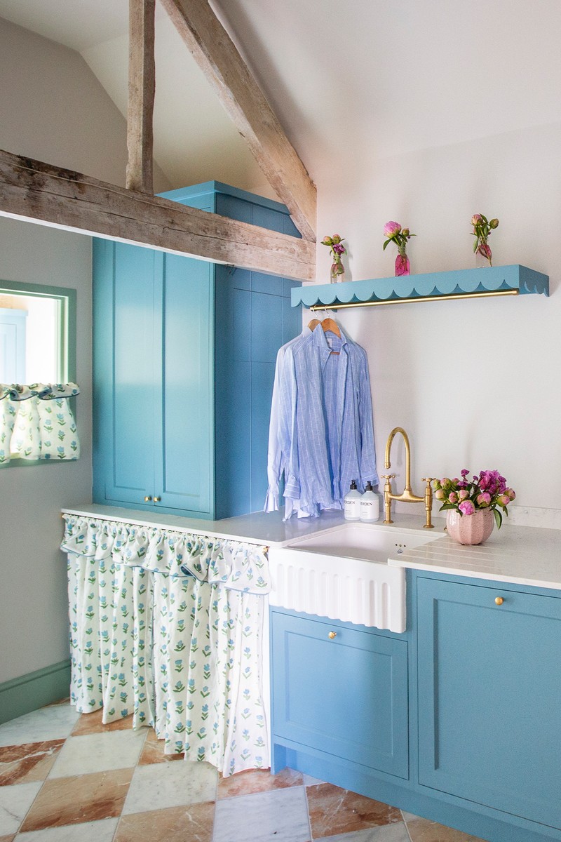
As you can probably tell, I love blue. We were toying with using blue in our kitchen and after we decided to go with pink we thought we’d put it in here. It also follows on nicely from our pantry as well. I wanted the room to be practical but still look nice. I really enjoy using the rail to dry delicate items of clothing. There's also a pull-out laundry bin in one of the cupboards. Lastly, I decided to add a curtain to cover the white goods.
PAINT: Farrow & Ball
UNITS: The Dorset Kitchen Company
FLOOR: Mandarin Stone
CURTAIN: Ottoline
The Main Bedroom
Soane’s scrolling fern fabric was the starting point here. It’s one of my all-time favourite fabrics. I wanted the bedroom to feel timeless, calming and grown up.
PAINT: Farrow & Ball
BLINDS & CURTAINS: Soane
LAMPS: Vaughan
BEDSIDE TABLES: Clockhouse Furniture
DRESSING TABLE: The Trove
CHEST OF DRAWERS: The Trove
BIN: Addison Ross
TISSUE BOX: Alice Palmer
LAMPS & SHADES: Alice Palmer
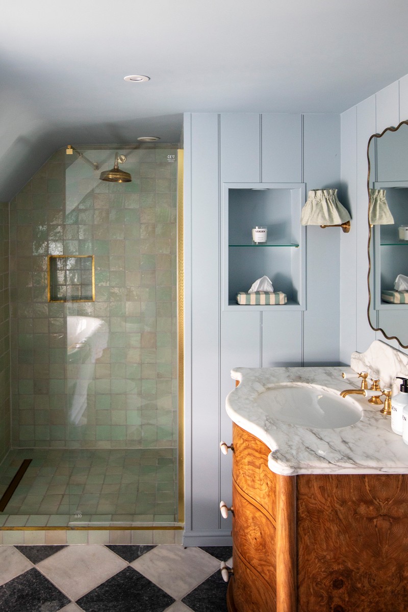
The Main En-Suite
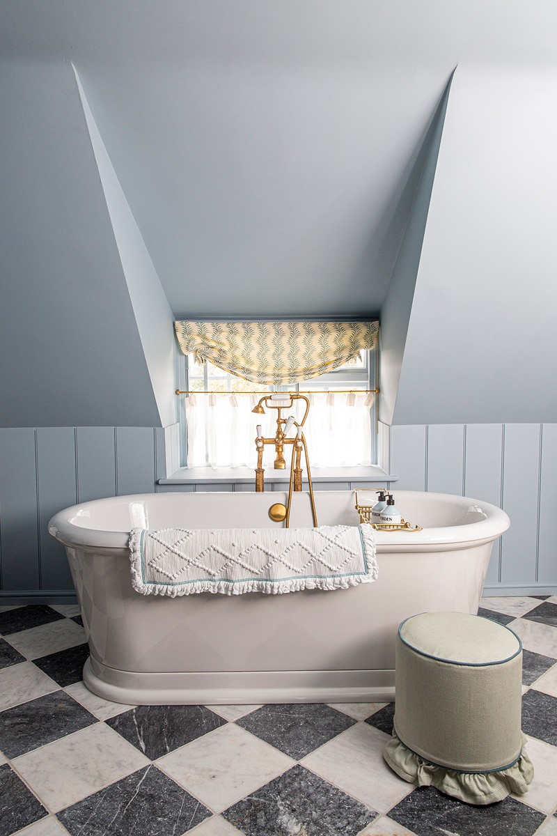
The starting point was the panelling and the blue – it's my favourite blue. I also love a check and marble, so the floor was also always going to be that. I wanted the en-suite to feel calming and have a great bath. It’s a tricky room, so it took a lot of working out with our architect. There are also his and hers sinks – they feel very grown-up.
CHECKED FLOORING: Mandarin Stone
ZELLIGE TILES: Otto Tiles
PANELLING: The English Panelling Company
PAINT: Farrow & Ball
MIRRORS: Sourced from Etsy
VANITY UNITS: Soho Home
LAMPSHADES: Alice Palmer
WALL LIGHTS: Pooky
Daughter’s Bedroom
The Schumacher tiger-palm print wallpaper was the main inspiration for this room. I matched it with blinds and headboards in a linen from Lewis & Wood, with a pop of colour from a ric-rac trim. I also used a bobbin trim on the shelves to add a fun touch.
BOBBIN TRIM: Decora Mouldings
LAMPSHADES: Hum London
TABLE LAMP: Birdie Fortescue
PAINT: Farrow & Ball
Son’s Bedroom
My inspiration for this was really the huts. I wanted to panel one bedroom completely top to toe. I used The English Panelling Company – I went for wider-groove Georgian panelling.
PAINT: Farrow & Ball
BEDSIDE TABLE: John Lewis & Partners
CUSHIONS: Schumacher
HEADBORTH: The Aller Studio
CUPBOARD HANDLES: Matilda Goad
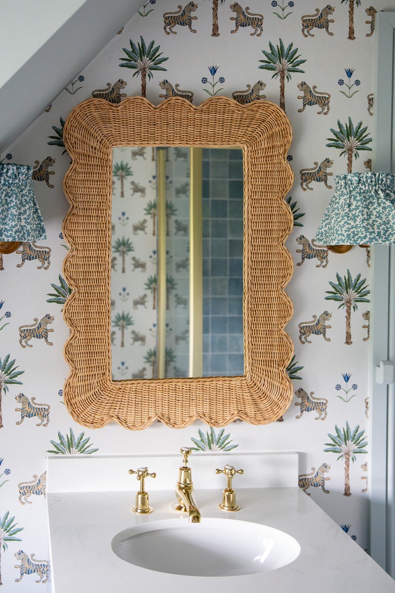
Son’s Bathroom
The whole scheme in here hung on the wallpaper, which is playful and fun. I had the vanity made by Holly Oak House and I love the rattan mirror, too.
LAMPSHADES: Alice Palmer
WALL LIGHTS: Pooky
MIRROR: Hastshlip
Guest Bedroom
The starting point was Ottoline’s little wild tulip print in light blue – I’m obsessed with this fabric. I first used it in one of our huts.
HEADBOARD: The Aller Studio
BEDSIDE TABLES: Clockhouse Furniture
CUSHIONS: The Aller Studio
LAMPSHADES: Hum London
LAMPS: Birdie Fortescue
Guest Bathroom
We wanted all our guest bedrooms to have a loo or a bathroom so it would be comfortable for people to stay. I wanted to use this striped wallpaper somewhere in the house and so I did it here. I love a stripe. The checked floor tiles were left over from our bathroom and the mirror is extremely reasonably priced. I had the blind and lampshade made, and I love the ricrac trim from Schumacher.
WALLPAPER: Alice Palmer
BIN: Alice Palmer
MIRROR: John Lewis & Partners
Visit TheAllerStudio.com & AllerDorset.com
DISCLAIMER: We endeavour to always credit the correct original source of every image we use. If you think a credit may be incorrect, please contact us at info@sheerluxe.com.
/https%3A%2F%2Fsheerluxe.com%2Fsites%2Fsheerluxe%2Ffiles%2Farticles%2F2024%2F06%2Fsl-house-tour-aller-dorset-hallway.png?itok=JvX1y6I8)
/https%3A%2F%2Fsheerluxe.com%2Fsites%2Fsheerluxe%2Ffiles%2Farticles%2F2024%2F06%2Fsl-house-tour-aller-dorset-kitchen-3.png?itok=EY70PSC5)
/https%3A%2F%2Fsheerluxe.com%2Fsites%2Fsheerluxe%2Ffiles%2Farticles%2F2024%2F06%2Fsl-house-tour-aller-dorset-master-bedroom.png?itok=gEVV-Sdg)
/https%3A%2F%2Fsheerluxe.com%2Fsites%2Fsheerluxe%2Ffiles%2Farticles%2F2024%2F06%2Fsl-house-tour-aller-dorset-daughters-bedroom.png?itok=p6IbE2Ft)
/https%3A%2F%2Fsheerluxe.com%2Fsites%2Fsheerluxe%2Ffiles%2Farticles%2F2024%2F06%2Fsl-house-tour-aller-dorset-sons-bedroom.png?itok=Rb4tsTx3)
/https%3A%2F%2Fsheerluxe.com%2Fsites%2Fsheerluxe%2Ffiles%2Farticles%2F2024%2F06%2Fsl-house-tour-aller-dorset-guest-bedroom1.png?itok=SDeMXZFi)
