
Take A Tour Of This Cool Country House
All products on this page have been selected by our editorial team, however we may make commission on some products.
The Property
Wood Farm House, built in 1877, was purchased by our clients (who are brother and sister) in 2021, with the idea of transforming it into a beautiful home they could share with their families, as well as a holiday home they could rent out when they weren't using the property. The property underwent a comprehensive remodel, seamlessly integrating an expansive open-plan kitchen/living and dining area with the new orangery on the back to square off the ground floor. Another big change was relocating the staircase to the attic, optimising the space on the first and second floors, and reconfiguring the family bathroom.
Now, the house has five bedrooms and three bathrooms, with plans underway for an additional bedroom and bathroom through the conversion of the existing outhouse. In the picturesque village of Whichford, the property enjoys proximity to renowned destinations such as Daylesford Farm and Soho Farmhouse, as well as charming Cotswold villages like Stow-on-the-Wold. Just a stone’s throw from the English village green complete with a local pub, the location couldn’t be more idyllic.
The Brief
From the outset, there was an instant connection with the clients in terms of design vision. The brief was for the house to have a cosy and homely feel. We wanted to create a space that welcomed guests and helped them feel at home. Embracing our signature style – a contemporary twist on English traditionalism with pops of fun and colour – we focused on integrating natural elements like marble, wood, linen and jute to fill the property with a character.
TAKE THE TOUR
Dining & Living Area
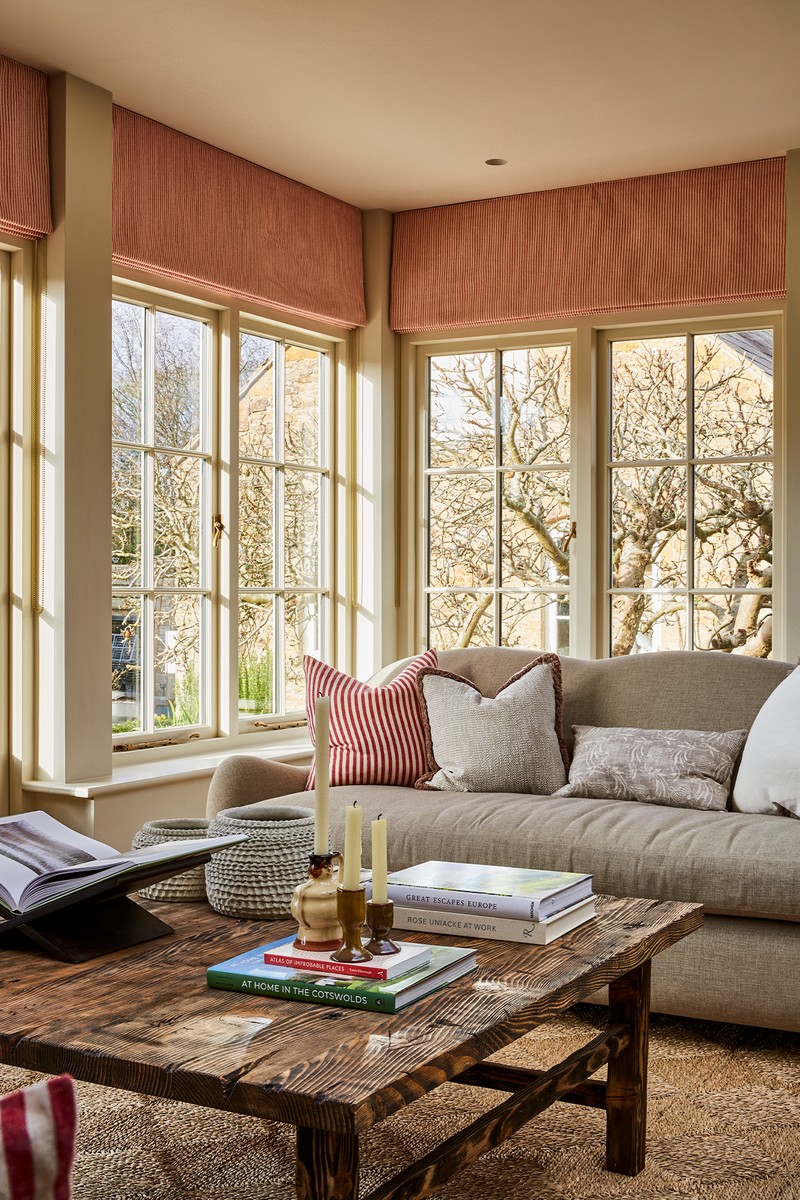
In designing this open-plan space, our primary goal was to integrate it with the original character of the house. Attention to detail was paramount. To maintain the property's original charm, we preserved the authentic brickwork, blending it into the orangery's design with carefully curved plasterwork. Understanding the clients' desire for a sizeable dining area and comfortable lounge seating, we planned the layout meticulously. The design of the orangery revolved around a stunning fabric selection, Lewis & Wood Bukhara. Drawing inspiration from this fabric, we co-ordinated accents of red for the blinds and cushions, and spent hours sourcing the perfect plain green/grey fabric for the sofas to colour match the Bukhara fabric.
PAINT: Shadow White Farrow &Ball
FLOORING: Ted Todd Husk
LIGHTING: The Barn Ingleton Pendant
ARTWORK: Studio HÁM
Kitchen & Utility Room
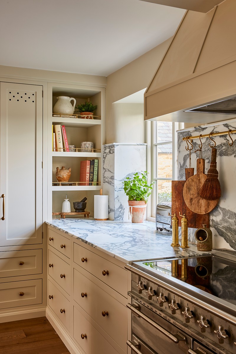
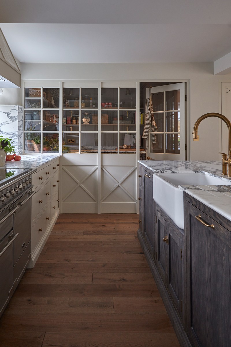
The kitchen and utility room underwent a complete transformation. We introduced an internal window screen between the two spaces, not only to enhance the openness but also to create a distinctive feature. Given the property's purpose as a holiday rental, we had the luxury of not having to factor in the typical clutter associated with daily living that may build up in a utility. Hours were dedicated to refining the kitchen cabinetry, ensuring precise alignment with the central line of the windows and experimenting with various stains until the ideal one was found for the island. The kitchen is the heart of any home, so we needed to ensure this was a welcoming space suitable for cooking and socialising. Early in the process, the clients expressed a desire for marble, so we visited multiple warehouses in search of the perfect slabs. Taking your flooring and cabinet colours with you when choosing marble is a great way to find the perfect match.
WALLS & KITCHEN CABINETRY PAINT: Shadow White Farrow & Ball
WALLS & UTILITY CABINETRY PAINT: Charleston Grey Farrow & Ball CABINETRY HARDWARE: Armac Martin Bakes Collection
BAR STOOLS: Discontinued in Black, this is a natural wood version, Zara Home
MARBLE: Cullifords Arabescato Corchia
ISLAND STAIN: Fumed, Rubio Monocoat
FLOORING: Ted Todd Husk
LIGHTING: Felix Carter Wall Lights (kitchen), Jim Lawrence Club Wall Light (utility)
Downstairs WC
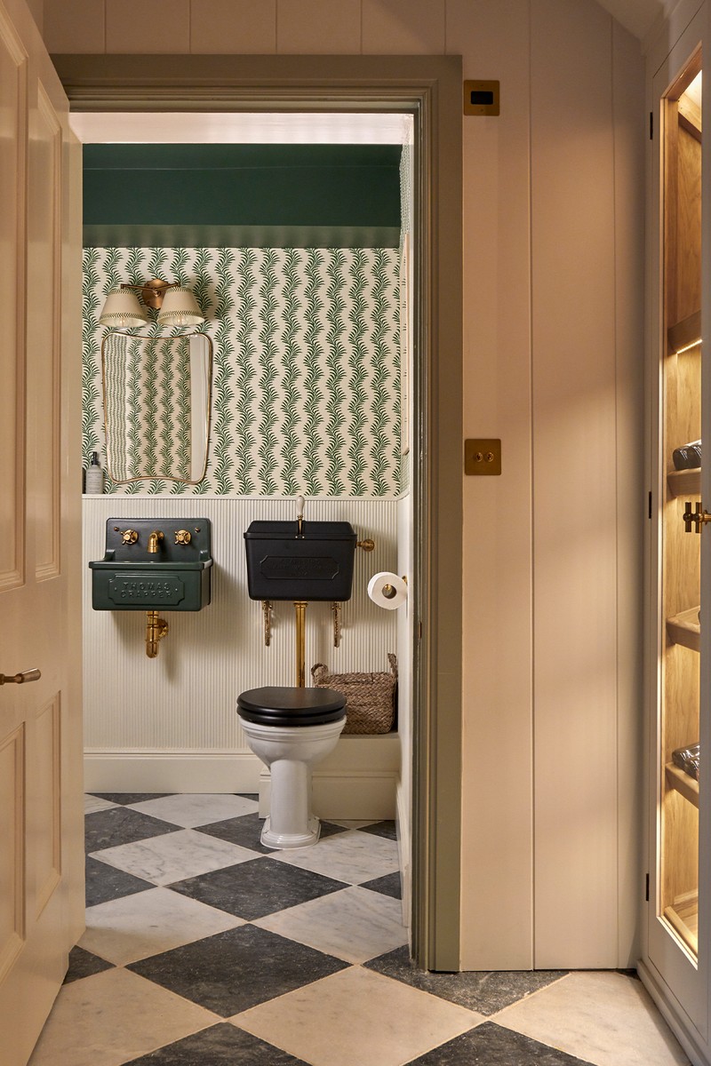
The downstairs WC is a new room in the house – with the addition of the orangery, the entrance to the kitchen changed position, allowing us to create a WC in the position of the previous doorway. From the outset, we were set on incorporating a Thomas Crapper WC. When we discovered the Thomas Crapper green Horton sink, it immediately felt like the perfect match for the Soane wallpaper. To ensure cohesion, we colour-matched the paint for the panelling with the white tones in the wallpaper, and likewise, the green on the ceiling paired with the sink and wallpaper.
PAINT: White Lead Mid Little Greene (panelling), Beverly Farrow & Ball (ceiling)
WALLPAPER: Soane Scrolling Fern Silhouette
TOILET & SINK: Thomas Crapper Horton Sink, Matt Black Low Level Cistern, Venerable Back-To-Wall WC
FLOORING: Mandarin Stone Di Scacchi 40x40
LIGHTING: Pooky Double Insignia Wall Fitting, Pooky Verdant Arrows Pendant Shade
Hallway
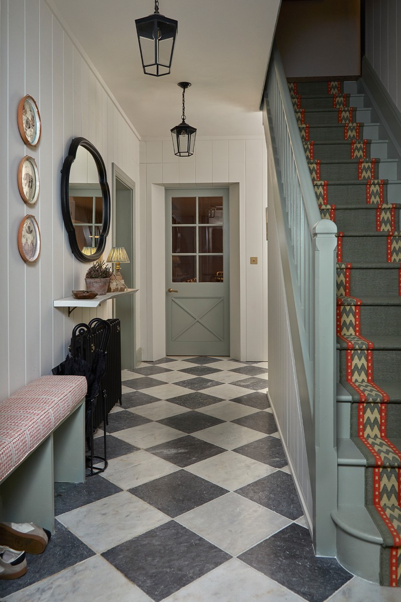
The stair runner steals the show in the hallway – from the moment we saw it, we knew it would be the perfect addition to this project. To further personalise the space, we commissioned bespoke paddles with colours and patterns that echo those of the stair runner. These paddles serve as a unique and personalised feature, visible from the top of the stairs. Moreover, when looking down the stairs at the runner, the chosen pattern features a repeating 'W' symbolising the 'W' from Wood Farm House, adding a meaningful touch to the design.
PAINT: Portland Stone Pale Little Greene (walls & ceiling), Blue Grey Farrow &Ball (skirting, doors, architrave & stairs)
MIRROR: OKA Seamair Mirror
FLOORING: Mandarin Stone Di Scacchi 40x40
LIGHTING: Vaughan Bentworth Lanterns Bronze
BENCH CUSHION FABRIC: Rapture & Wright Banderole Cinnabar
STAIR RUNNER: Sophie Cooney Thora Moss Green
Living Room
In the living room, we decided to preserve the original built-in cabinetry, making slight modifications to accommodate the TV discreetly. Our goal was to create a sophisticated adult living space while maintaining a warm and inviting atmosphere to ensure the room would be well used. We introduced marble elements by commissioning a bespoke fire surround paired with a Chesneys log burner, and sourced antique pieces from the Turkish rug to the coffee table. The clients shared our love for artwork from Studio HÁM, so it was a natural choice to incorporate several pieces into the room's décor, as well as around the house.
PAINT: Portcullis Mylands, Normandy Grey Little Greene
FLOORING: Ted Todd Husk
LIGHTING: Andrew Martin Morris Antique Zinc Medium Pendant, Pooky Lautrec Picture Light Bronze, Antero Floor Lamp
MIRROR: William Wood Isla Gold Mirror
ARTWORK: Studio HÁM
Snug
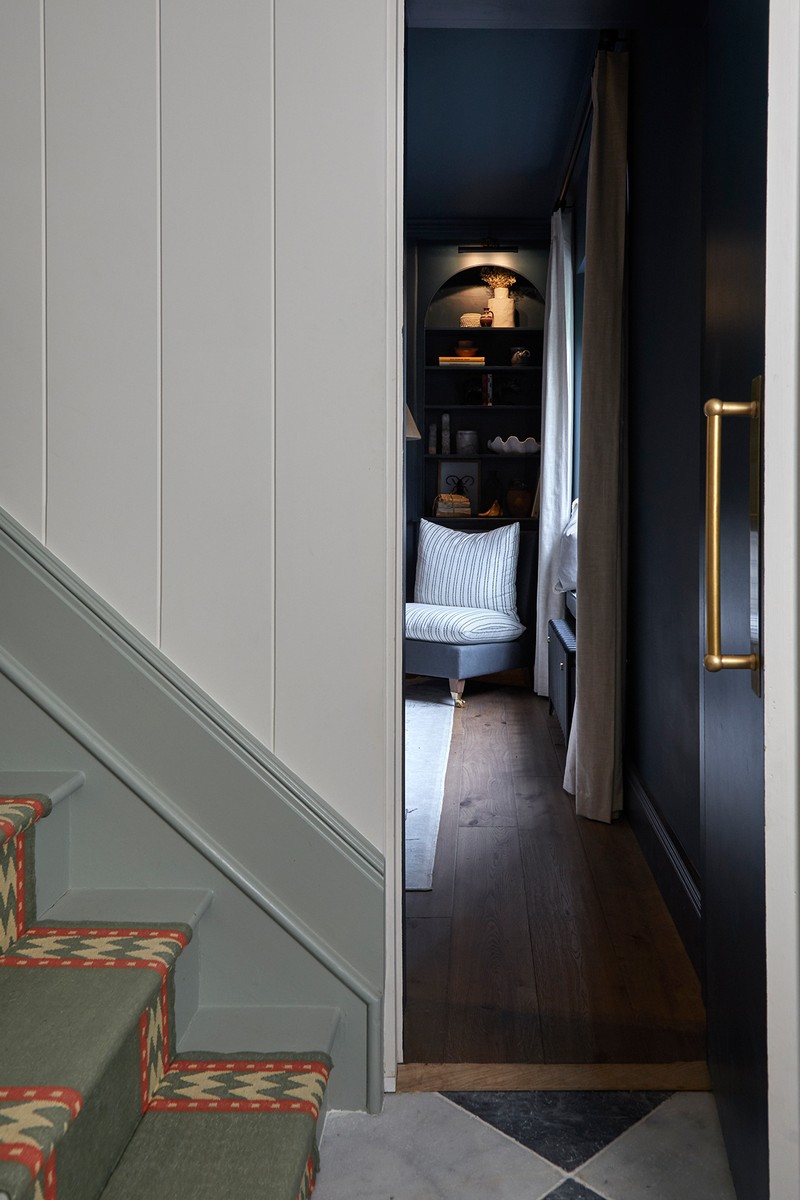
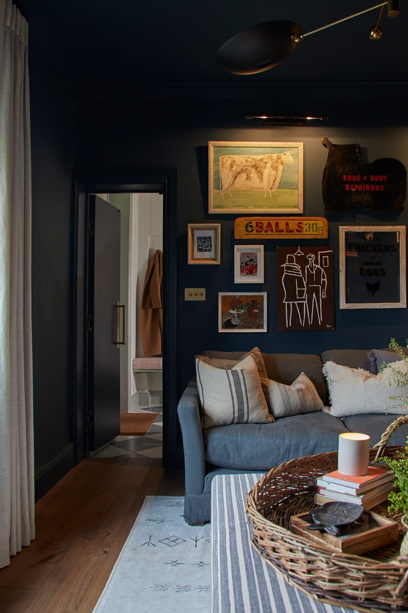
The original entrance to the snug was through the kitchen, but with the reconfiguration of the kitchen and utility areas, we had to relocate the door to the hallway. This posed a challenge as the new doorway ended up being smaller than standard, limiting the size of furniture we could fit inside. To overcome this hurdle, we had to plan ahead. Before closing up the original doorway, we ordered the sofa and arranged for it to be delivered and securely wrapped inside the room. We transformed the room into a hidden snug/cinema room, concealed behind V groove panelling in the hallway. To enhance the snug ambiance, we opted to colour drench the entire room in a rich, dark blue. The pièce de résistance of the room is undoubtedly the expansive gallery wall. Our team scoured antique fairs across the country from Ardingly to Newark, sourcing art and signage to cover the walls, creating a focal point that ties the room together.
PAINT: Hague Blue Farrow & Ball
FLOORING: Ted Todd Husk
SOFA: Sofa.com Otto Corner Sofa Flint Linen
LIGHTING: Pooky Pitcheroo Bronze
Primary Bedroom & En-Suite
The en-suite was a recent addition to the primary bedroom. To make it look like it was an original feature, we curved the exterior wall. This design choice extended to curving the skirting and cornice, nodding to the curved plaster detail around all the windows in the house. Despite the compact size of the en-suite within the primary bedroom, we went for a cohesive look by maintaining a consistent colour scheme throughout. The double-aspect windows afforded us the opportunity to play with darker tones for the joinery in the bedroom, which we complemented with a luxurious deep red velvet on the bed. This allowed us to create a space that feels both cosy and bright, thanks to the abundance of natural light.
PAINT: Portland Stone Pale Little Greene (walls & ceiling), De Nimes Farrow & Ball (skirting, doors, architrave, wardrobes & panelling)
LIGHTS: Mullan Kent Wall Light Antique Brass
ARTWORK: Lucy Mahon
Bunk Room
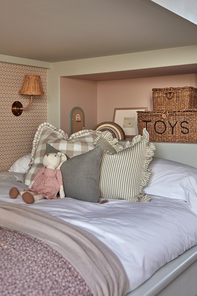
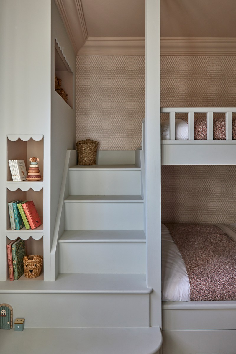
From the beginning, the clients were adamant about incorporating built-in bunk beds into this room, which presented an exciting design opportunity for us. However, just before finalising the production plans, we had the idea to transform the beds into small doubles instead of singles. This decision not only maximised the use of space but also ensured versatility, catering to kids and adults alike. To add a touch of charm and personality to the bunk beds, we added the scalloped edging details, and curved the base step to mirror the curved wall opposite, creating a cohesive and visually pleasing aesthetic.
PAINT: Setting Plaster Farrow & Ball, Cromarty Farrow & Ball
WALLPAPER: GP & J Baker awkbury Red/Green
LIGHTS: Visual Comfort & Co. Star Flush Mount
Front Guest Bedroom
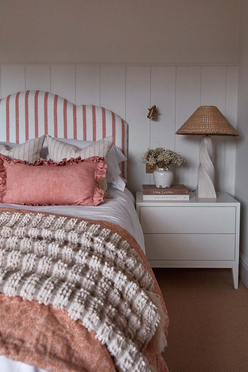
The design for this room was the only scheme that had a significant change from our first draft. At the last minute, the clients opted for an even bolder approach. The vibrant pink paint on the wardrobes is a striking focal point. However, by maintaining the same tones of pink on the headboard, blind and stool – and keeping the surrounding elements neutral – we were able to strike the perfect balance. This thoughtful combination allows the pink to stand out as a fabulous feature without overwhelming the room.
PAINT: Portland Stone Pale Little Greene (walls & ceiling), Jaipur Pink Paint & Paper Library (wardrobes & desk)
LIGHTS: Soho Home Twist Table Lamp
BEDSIDE TABLES: CP Lighthing & Interiors Elegance Bedside Table
Family Bathroom
With the bedrooms in the house showcasing vibrant colours, we made the deliberate choice to take a more subdued approach in the main bathroom by opting for a neutral colour palette. The wooden vanity and natural terracotta floor, complemented by the marble bath surround, fill the space with warmth and texture, ensuring it remains rich in character without feeling bland. The built-in shower and bath layout was designed to maximise space in the narrow bathroom, offering both functionality and style.
PAINT: Shadow White Farrow & Ball
LIGHTS: Felix Teardrop Wall Light
MIRROR: Sweetpea & Willow Eloise Mirror
TILES: Ca'Pietra Picket Terracotta, Zellige 1018
ARTWORK: Studio HÁM
Rear Guest Bedroom
Originally, the staircase leading up to the attic was accessible only through this room. By relocating it, we transformed this space into a functional guest bedroom. Similar to the primary bedroom, the room is always flooded with natural light thanks to its double-aspect windows. We had fun experimenting with patterns and textures here. The headboard fabric was sourced from a supplier in the US, adding a unique touch to the space. To introduce a pop of colour against the blue/green/grey tones of the room, we opted for pink accents in the blinds, chair and stripe cushion. The dressing table, featuring a bobbin leg design, was custom made to complement the room's aesthetic, and we sourced a mirror with bobbin details to tie everything together.
PAINT: Portland Stone Pale Little Greene (walls & ceiling), Pigeon Farrow & Ball (wardrobes, skirting, door & desk)
LIGHTS: Zara Home Tripod Table Lamp
MIRROR: Hudson Home Bellagio Black Mirror
BEDSIDE TABLES: Olivia's Witley Bedside Table
ARTWORK: Studio HÁM
Attic Bedroom & Bathroom
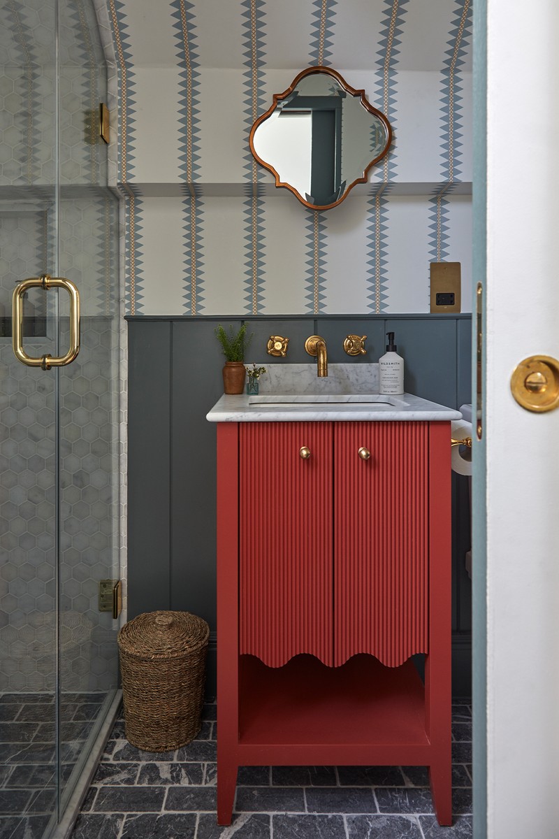
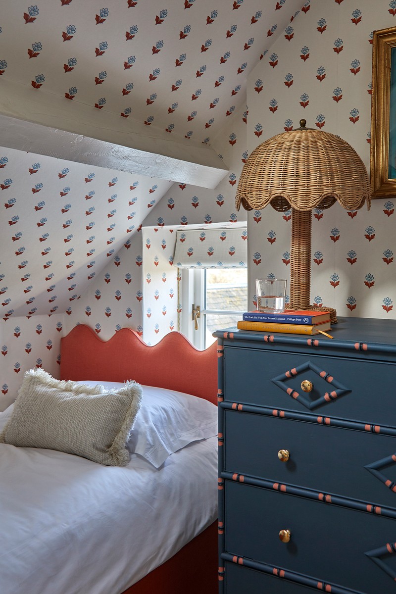
The top floor underwent a complete makeover when we decided to relocate the staircase, allowing us to redesign the entire layout. This change gave us the opportunity to create a cosy twin bedroom and a compact yet practical shower room. Right from the start, we knew the attic bedroom had to be cute – the size of the room with the beams and the small windows lends itself to a Mary Poppins style bedroom. We fully embraced this whimsical theme by covering the walls and ceiling with delightful wallpaper, with matching fabric on the roman blinds. One of the challenges we faced was finding the right balance between comfort and preserving the natural light from the small windows. To solve this, we designed wavy headboards for the beds, adding a playful touch to the room's décor. To tie everything together, we had a chest of drawers commissioned, matching the room's colour scheme perfectly. We wanted to continue the playful scheme into the bathroom with more fun wallpaper and bold colours
BEDROOM WALLPAPER: Ottoline Indian Tulips Brown/Blue
LIGHTS: Soho Home Lila Table Lamp
FLOOR TILES: Mandarin Stone Nero Marquinia Rectangular
SHOWER TILES: Starel White Marble Hexagon
BATHROOM PANELLING PAINT: Livid Little Greene
BATHROOM VANITY PAINT: Bamboozle Farrow & Ball
BATHROOM WALLPAPER: Jane Clayton Reno Stripe Spa Blue
Follow @MillieTurnerDesigns on Instagram ; to book this cottage to stay in, visit SandAndStoneEscapes.com
Photography by Sarah Griggs and Nikolas Dost.
DISCLAIMER: We endeavour to always credit the correct original source of every image we use. If you think a credit may be incorrect, please contact us at info@sheerluxe.com.
/https%3A%2F%2Fsheerluxe.com%2Fsites%2Fsheerluxe%2Ffiles%2Farticles%2F2024%2F04%2Fsl-house-tour-wood-farm-cottage-2.png)
/https%3A%2F%2Fsheerluxe.com%2Fsites%2Fsheerluxe%2Ffiles%2Farticles%2F2024%2F04%2Fsl-house-tour-wood-farm-cottage-5-new.png)
/https%3A%2F%2Fsheerluxe.com%2Fsites%2Fsheerluxe%2Ffiles%2Farticles%2F2024%2F04%2Fsl-house-tour-wood-farm-cottage-9.png)
/https%3A%2F%2Fsheerluxe.com%2Fsites%2Fsheerluxe%2Ffiles%2Farticles%2F2024%2F04%2Fsl-house-tour-wood-farm-cottage-11-new.png)
/https%3A%2F%2Fsheerluxe.com%2Fsites%2Fsheerluxe%2Ffiles%2Farticles%2F2024%2F04%2Fsl-house-tour-wood-farm-cottage-15.png)
