Take A Look Around This City-Meets-Country London Apartment
The Property
The apartment occupies the top two floors of a classic terraced building in Belgravia built in the 1840s, with fantastic views over the city. This was the first property for the owner, with two bedrooms and two bathrooms and a great open-plan living space. There was no structural work needed, but we did do a thorough redesign of the layouts, removing existing built-in joinery and stripping out both bathrooms to make the most efficient use of the space.
The Brief
Since lockdown, our homes have become so much more to us than just places we sleep, so the aim was to create a flexible space that suited both work and play. My client wanted the home to be elegant and calming, but with a few fun elements thrown in and an interesting use of colour throughout. They wanted the vibe to strike the right balance between a sophisticated London townhouse and traditional English interiors, so we combined sleek materials with more organic, decorative textiles.
/https%3A%2F%2Fsheerluxe.com%2Fsites%2Fsheerluxe%2Ffiles%2Farticles%2F2023%2F04%2Fsl-pandora-taylor-house-tour-2.png)
The Living Area
This room gets fantastic light from the roof lights, and we wanted to maintain the relaxed loft vibe. The first thing we ordered was this contemporary sofa, which fills the living space and separates the living and dining areas. Given the tight budget, we couldn’t do fitted joinery, so we used these floating shelves in an asymmetric layout to echo the lines of the sloping ceiling. For the base unit we placed two media cabinets next to each other to look like one large unit. The colour scheme is simple, the main palette being determined by the sofa and rich timber tones. The shaggy rug softens the space a little, while the earthy tones from the black stained coffee table ensure the space feels comfortable and inviting.
WALLS Farrow & Ball Pointing
SOFA Bo Concept Amsterdam Sofa
BLIND FABRIC Fermoie Flag
RUG Nordic Knots
COFFEE TABLE Indor Gear Low Table in Earth
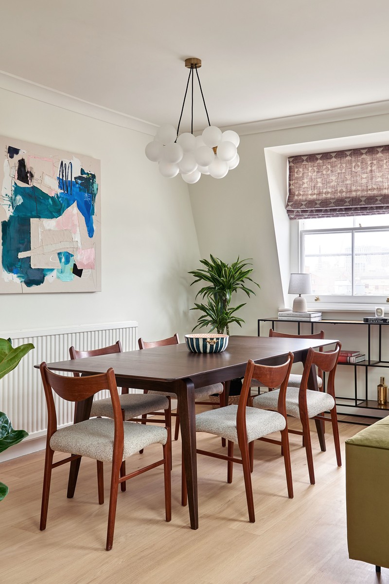
The Dining Area
Being on the top floor in an old building, access was an issue, so we had to think carefully about moving in any large pieces of furniture. The client wanted a large table for entertaining but to get it up the stairs we had to find one that was extendable and came in two pieces. The chairs are vintage and came covered in the original woven fabric. The modern glass pendant adds a bit of glamour and the artwork was sourced by the client. It brings a needed punch of colour to the otherwise neutral scheme.
TABLE Ercol Lugo Extending Table
PENDANT Dowsing and Reynolds Bubble Chandelier
CONSOLE TABLE Cox and Cox Textured Gold-topped Storage Console
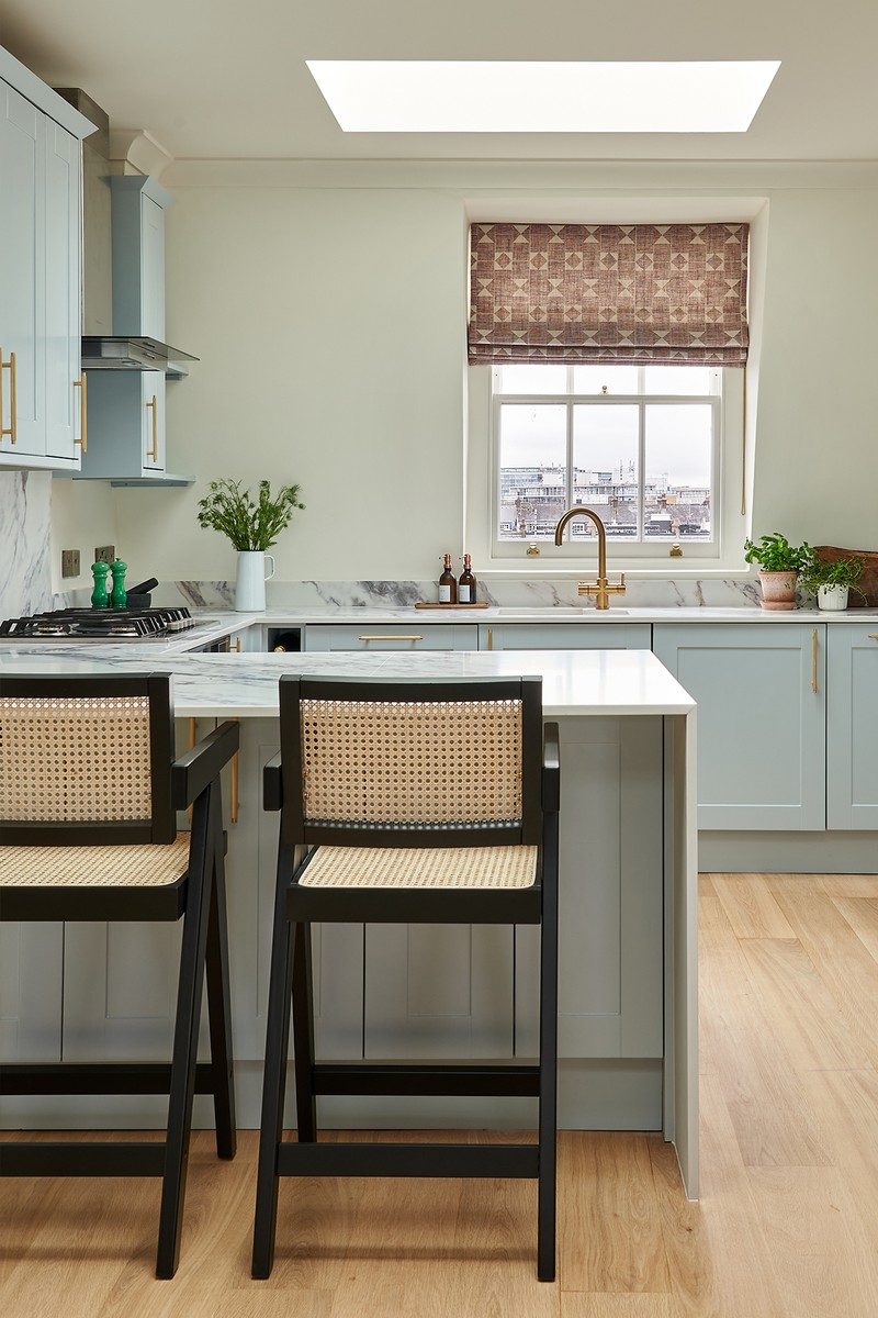
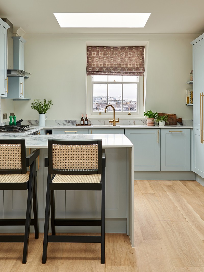
The Kitchen
The original kitchen was beige with an ugly brown granite top. We brought it up to date by painting the units sky blue, paired with a boldly patterned quartz worktop. We brought the worktop further out to create the breakfast bar and added the waterfall edge to show off the material and make the space feel more high end. The new brass handles add to that London townhouse feel, as does the brass boiling water tap.
BAR STOOLS Daals Jeanne Black Cane Rattan and Beech Counter Stool
CABINET COLOUR Little Green Bone China Blue
TAP Lusso Stone Four in One Boiling Water Tap in Brushed Gold
/https%3A%2F%2Fsheerluxe.com%2Fsites%2Fsheerluxe%2Ffiles%2Farticles%2F2023%2F04%2Fsl-pandora-taylor-house-tour-5.png)
The Main Bedroom
While the client was largely drawn to bold and colourful interiors, they wanted their bedroom to be somewhere they could switch off. To achieve this, we used a sophisticated, muted tone on the walls and introduced small areas of block colour or simple patterns. We also teamed smarter elements such as the wall colour, headboard and sleek cupboard handles with loose floral curtains and fabric lampshades.
The first thing we chose was this hanging headboard, which we covered in a simple but vibrant claret velvet. We knew the curtains would have to be darker – it’s so important to have depth in any space so it doesn't feel too washed out. We toyed with a few scenarios but, as the headboard is plain, I pushed to have some sort of pattern here. When the client went to see the fabric in the showroom on a larger scale, they fell in love with it too. The art above the bed adds a sense of drama and I like how the black ink picks out the other black details in the headboard and curtain rails.
WALLS Edward Bulmer Cerullian Blue
CURTAIN FABRIC Soane Coquelicots
BEDSIDE TABLES Graham and Green Loki
WALL LIGHTS Pooky Colombari Wall Fitting in Brass and Cane
VANITY Atkin and Thyme Quinn Console Table
ARTWORK Stephanie Forrest
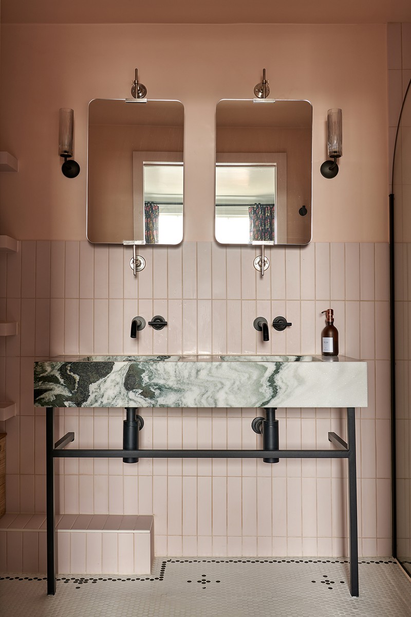
The Main Bathroom
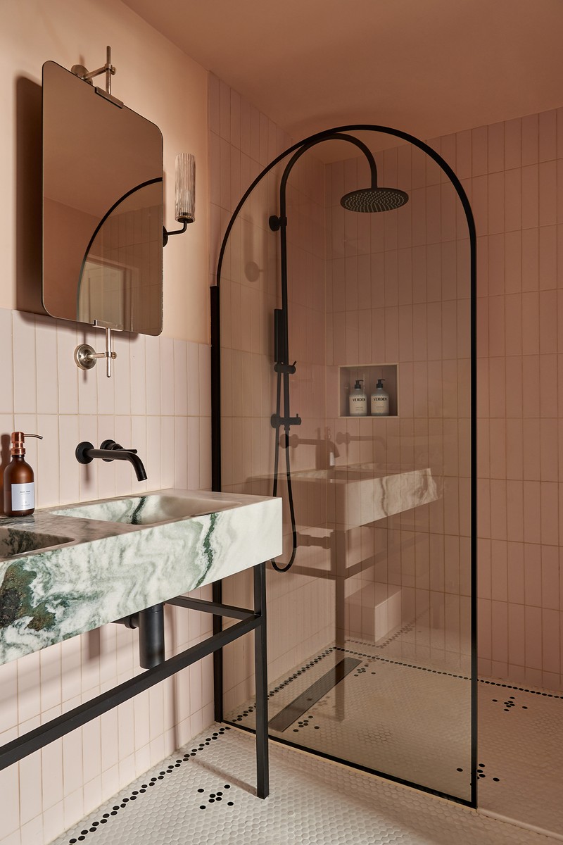
The original inspiration for this space was a Moroccan spa vibe, so the plan was to Tadelakt the whole space in a plaster pink. However, due to budget, we had to pare this idea back, so we kept the muted pink and used tiles and matching painted walls instead. We kept the same layout, however the shower space was originally divided with a wall. As the room is small with zero natural light, we wanted to make the space feel as big as possible, so we removed the wall and installed this fun, arched shower screen.
The marble double basin with its black legs is so dramatic – and we matched it with the sanitaryware. I also couldn't resist bringing more pattern into the space with this custom penny tile floor; it helps liven up the block colour. We weren’t able to remove the boxing out on the floor under the vanity as it covers pipes, so we created these chunky shelves above it. As well as being great storage, it means the vanity can be decorative as well as functional.
WALLS Farrow & Ball Calamine
WALL TILES Mandarin Stone Oska in Powder Pink Porcelain
VANITY Lusso Stone Vernante Vanity Unit with Panda Marble Basin
MIRRORS Graham and Green Orwell Swivel Mirrors
WALL LIGHTS Corston Claremont Wall Light
SANITYWARE Abi Interiors
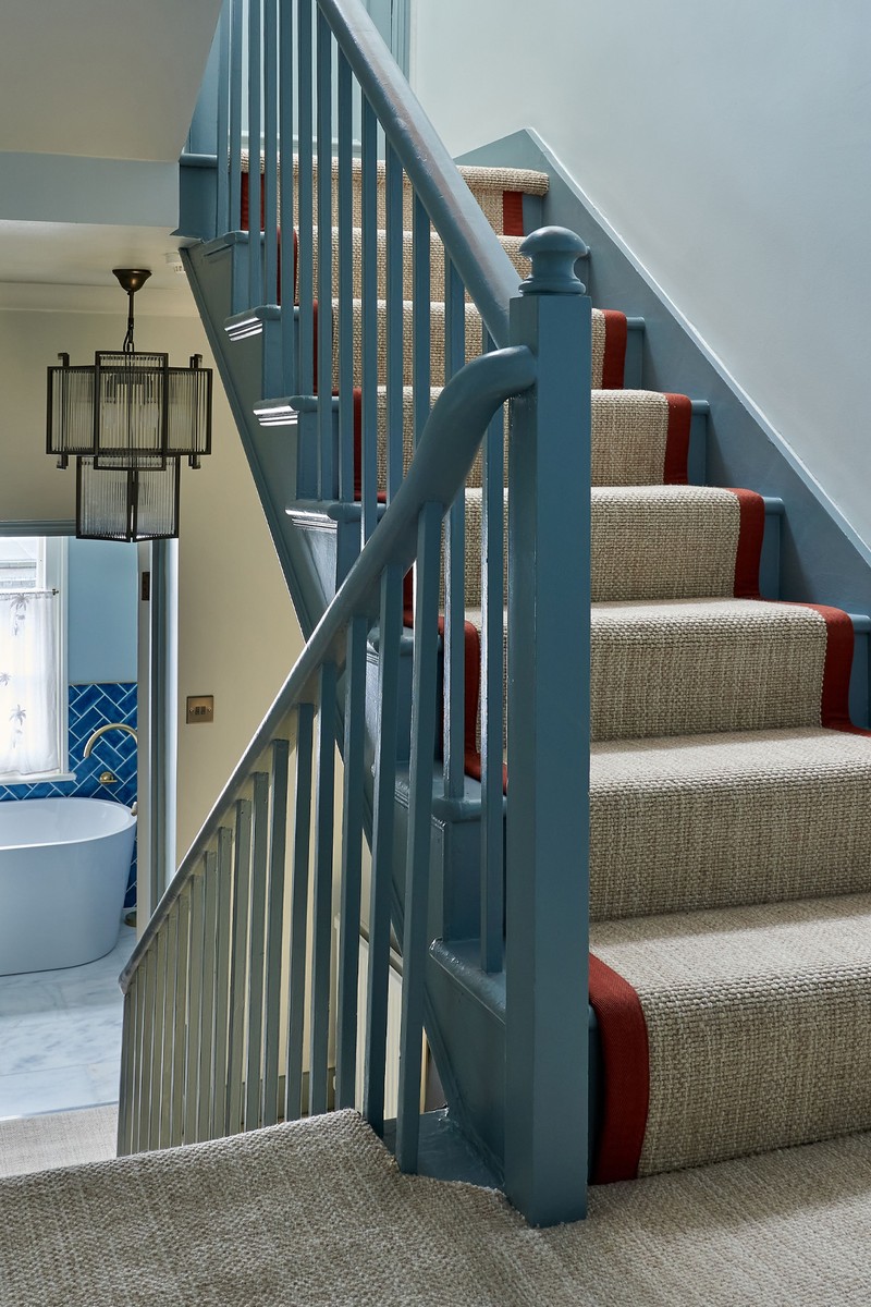
The Hallway
I wanted the immediate impact to be smart and elegant, but with a touch of fun. The stair runner is a lovely neutral wool weave, which runs into the bedrooms, but we jazzed it up in the hallway with a rust-coloured edge tape. We added further interest by having a darker contrast on the woodwork, and keeping the walls light and fresh with a blue-ish grey. Hallways and landings can be challenging, as they need to flow seamlessly into each space while also having their own individual character. The first landing is quite tall, so we took the opportunity to use a large pendant; it looks a bit like a reconstructed traditional lantern, taking those classic London townhouse elements and giving it a contemporary twist.
WALLS Farrow & Ball Dimpse
WOODWORK Edward Bulmer Cerullian Blue
PENDANT Pure White Lines Monte Carlo Piccolo Chandelier
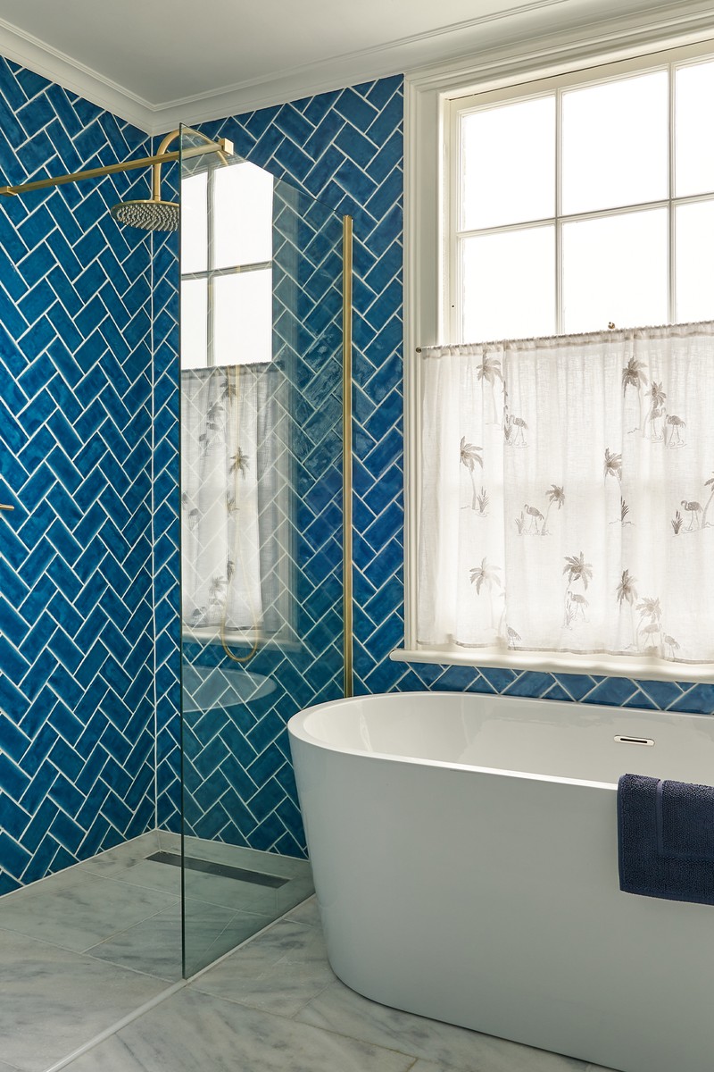
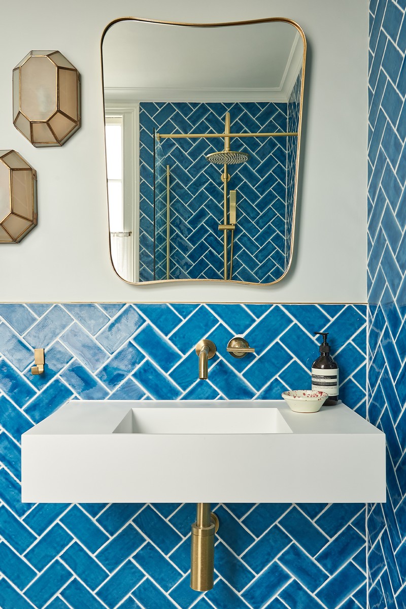
The Guest Bathroom
This is the first space you see when you enter the property, so we wanted to create immediate impact. Originally, this room had a shower over a bath against one wall, but the client really loved the elegant look of a bath under the window. It was a tight squeeze but, by using a small bath and by compromising on having the basin quite close to the shower, we were able to fit in both a bath and walk-in shower.
We chose bold colour-blocked tiles that have a natural patina to the glaze, which provides a bit of movement, keeping everything else fresh, clean and white with a contemporary bath and basin. The floor is an elegant tumbled Calacatta, the veining in the marble picking out the blue of the tiles, with brushed brass fittings warming up the otherwise cool tones. The view out of the window wasn't the best, so we made this little café blind to make the space feel a bit cosier, while also allowing for plenty of light. With its subtle flamingo embroidery, it also adds a bit of whimsy to the space. I love an asymmetrical light placement; because space was at a premium, we weren’t able to put a wall light either side of the mirror, so we put two next to it at an angle. Not only does this bring lots of light to the space, it works as a point of interest.
WALLS Farrow & Ball Skylight
WALL TILES Tiles Direct Crackle Glaze in Chelsea Blue
FLOOR TILES Mandarin Stone Calacatta-Honed Marble
BASIN Lusso Stone Aura Wall-hung Stone Basin
WALL LIGHTS Pooky (discontinued)
SANITARYWARE Abi Interiors
MIRROR Graham and Green Ozzy Gold Mirror
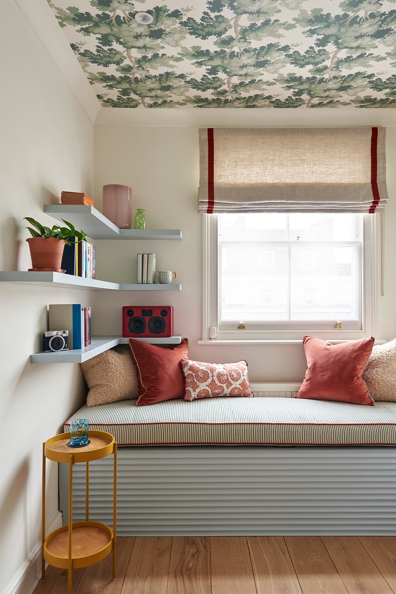
The Study
The client wanted something fun and unusual in here, but was worried a busy wallpaper would be distracting when working. I had used wallpaper on the ceiling in a previous project and the client loved the idea. Putting the paper on the ceiling meant the walls could be bright and fresh – perfect for staying focused. While there is a desk, the client also wanted to be able to use this room to relax – the other living space is all open plan, so it’s great to have another calm space without a TV or noisy kitchen. Hence we created this built-in day bed and shelves as a reading nook, overlooking the street below.
WALLS Farrow & Ball Pointing
WALLPAPER Sandberg Raphael Green
CUSHIONS Also Home Unar Rust Velvet Cushion
Visit PandoraTaylor.co.uk
Photography by Mike Garlick
DISCLAIMER: We endeavour to always credit the correct original source of every image we use. If you think a credit may be incorrect, please contact us at info@sheerluxe.com.
/https%3A%2F%2Fsheerluxe.com%2Fsites%2Fsheerluxe%2Ffiles%2Fwebsite-images%2F2025%2F03%2Fsign-up-pop-up.jpg)
