Take A Look Around This Family Townhouse
The Property & The Brief
Harley House is a Regency period building in Marylebone, home to a growing family with children of all ages. The renovation started out as just the living and dining room, then grew to cover the whole house. We initially started with two main rooms which were disjointed. The living space was used in an awkward way and the window dressings blocked a lot of the natural light. There was originally a wall between the two spaces with a small door, and it was important to the client to improve the connectivity between the spaces.
Once the client saw the possibilities for these two rooms, the project soon expanded to the entire home. The brief was to create a light, bright, liveable home in which the family can relax. I wanted to create a timeless space that felt lived in and reflected the family’s love of travel. The first must-do was to sand all of the timber flooring and stain it a very particular shade of orange. This made a huge difference to the way light fell in the property.
The Living Space
There are large trees right outside the property which cast a green glow throughout the space. My client’s favourite colour is green, so I was mindful to incorporate this without it being over bearing. We chose timeless finishes that also reflected the period of the house, but I wanted to incorporate antiques from a range of periods to make the space feel eclectic and lived in.
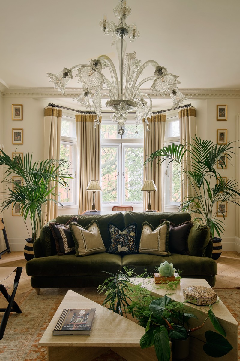
The desk in front of the window is the client’s own, as is the large antique rug, and I put the original candle wall lights back as I thought they were so pretty. I really like the detail at the top and bottom of the curtain – I wanted to accentuate the height of the ceiling and the mustard silk band worked well. It was difficult to get my client to commit to a patterned or coloured fabric, so this was a good way to add a little colour.
ARTWORK sourced by Apsara Studio
WALL COLOUR Wimborne White by Farrow & Ball
CUSHIONS Paolo Moschino
LAMP Grisewood Lamp, OKA
WOODEN CHAIR Olavi Hanninen via Goldborne 44
ARMCHAIR Agatha by Arlo & Jacob
STOOL Artemest Elicia Luggage Rack
COFFEE TABLE Studio + Store
CURTAINS Romo Linara in Cream
CURTAIN TRIM Orissa Silk Fabric by James Hare in Amaretto
SOFA Smithy Sofa in Green
/https%3A%2F%2Fsheerluxe.com%2Fsites%2Fsheerluxe%2Ffiles%2Farticles%2F2023%2F05%2Fsl-anahita-rigby-house-tour-4.png)
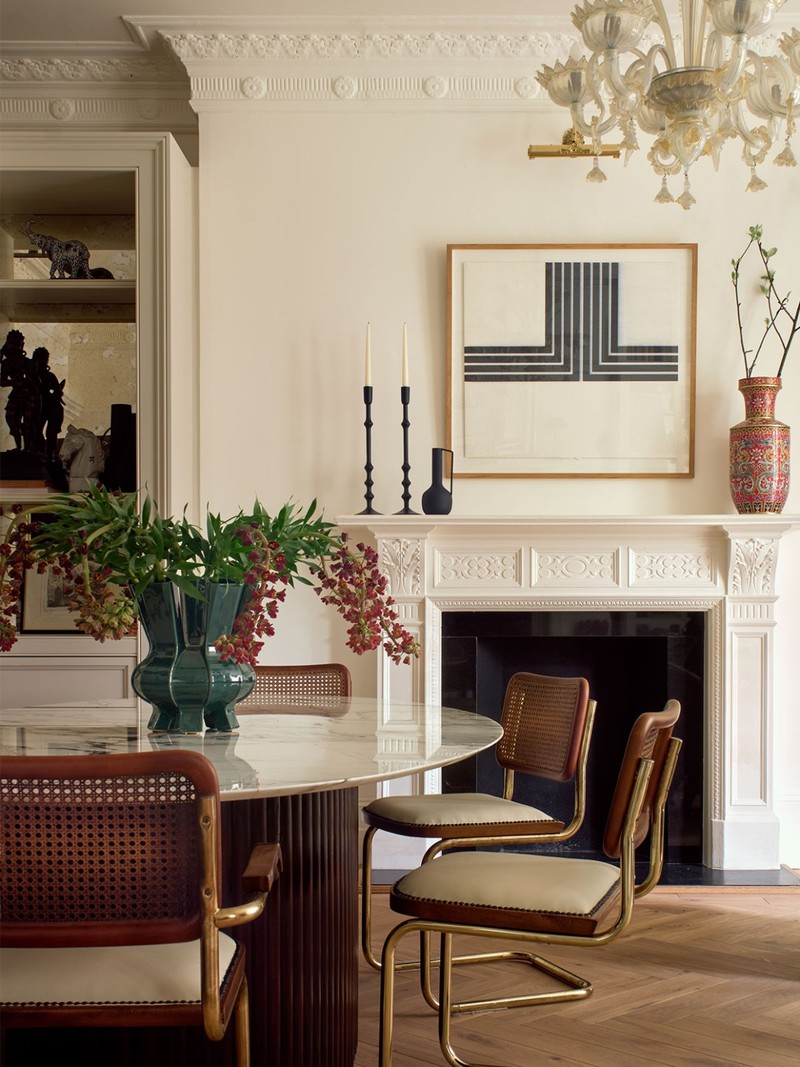
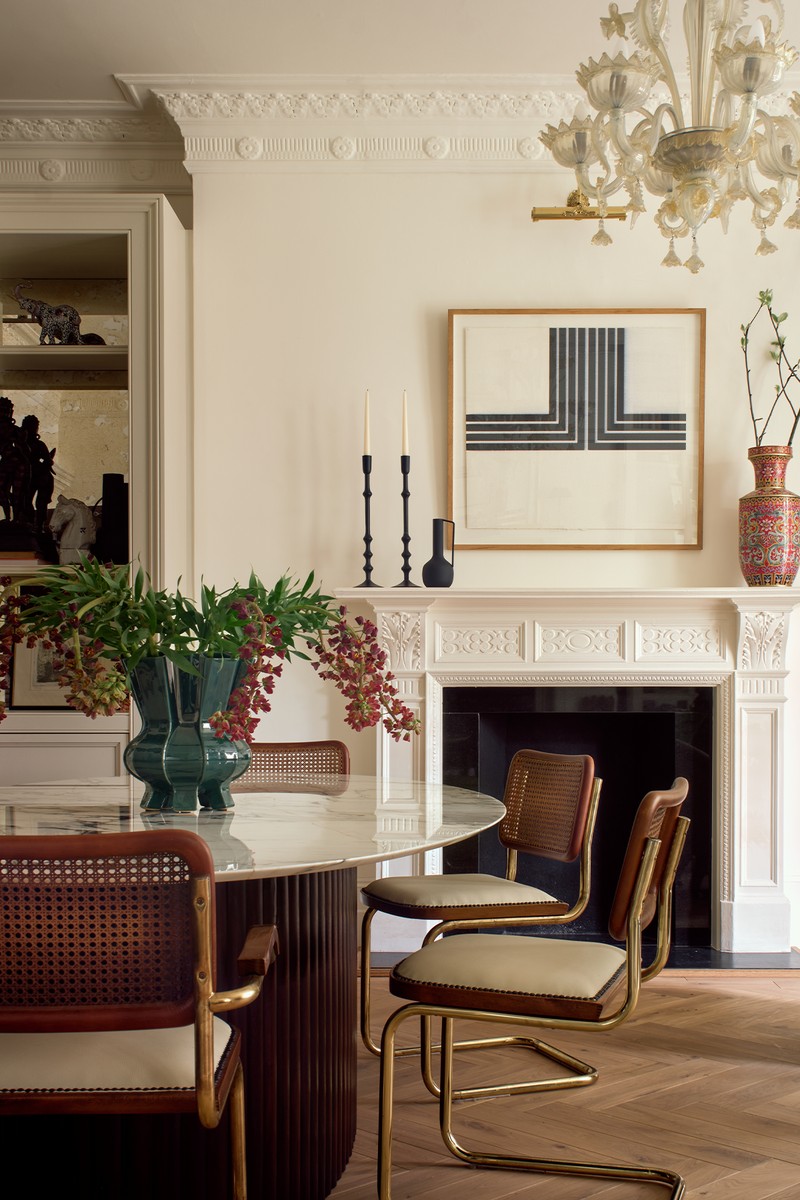
The Dining Space
I designed the table in this room as there was nothing on the market that suited the client’s requirements. We went through nine samples of stain matching on the base of the table to match the original doors. LF Custom Carpentry and Paragon Stone assisted in making this. The artwork behind is by Beatrice Hasell McCosh and the 1920s floor lamps were bought by the client on a trip to Sunbury Antiques Market.
DINING TABLE Anahita Rigby & made bespoke by L F Custom Carpentry & Paragon Stone
CHAIRS Original Marcel Breuer upholstered in leather
FLOOR LAMP 1920s film tripod, converted into a lamp
SIDE TABLE Pols Potten Zig Zag Stool in Cream
RUG Nordic Knots Untitled 2 in Cream/Almond
CHANDELIER Existing Murano chandelier
VASE Pols Potten Puyi Vase in Copper
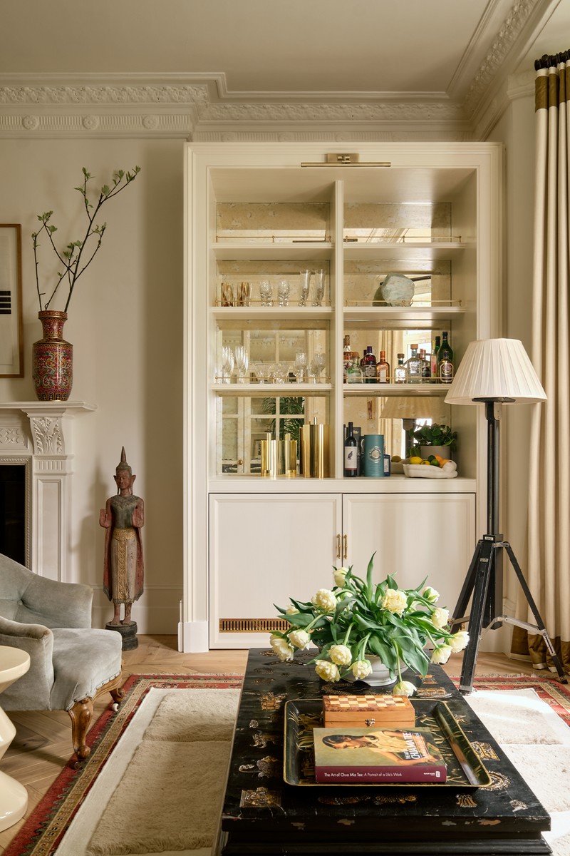
The Kitchen
The kitchen, made by DeVol, had to be functional, as we were unable to enlarge the room. The breakfast table in the kitchen is used daily, so it was important it was extendable, and there is a dining bench (just out of shot). The ceiling had been lowered here with a lot of downlights and I wanted to see if there was anything hiding within it – we ended up discovering some original beams.
WOODEN CHAIR Olavi Hanninen via Goldborne 44
WINDOW BLIND The Cloth Shop Block Print 18
/https%3A%2F%2Fsheerluxe.com%2Fsites%2Fsheerluxe%2Ffiles%2Farticles%2F2023%2F05%2Fsl-anahita-rigby-house-tour-7.png)
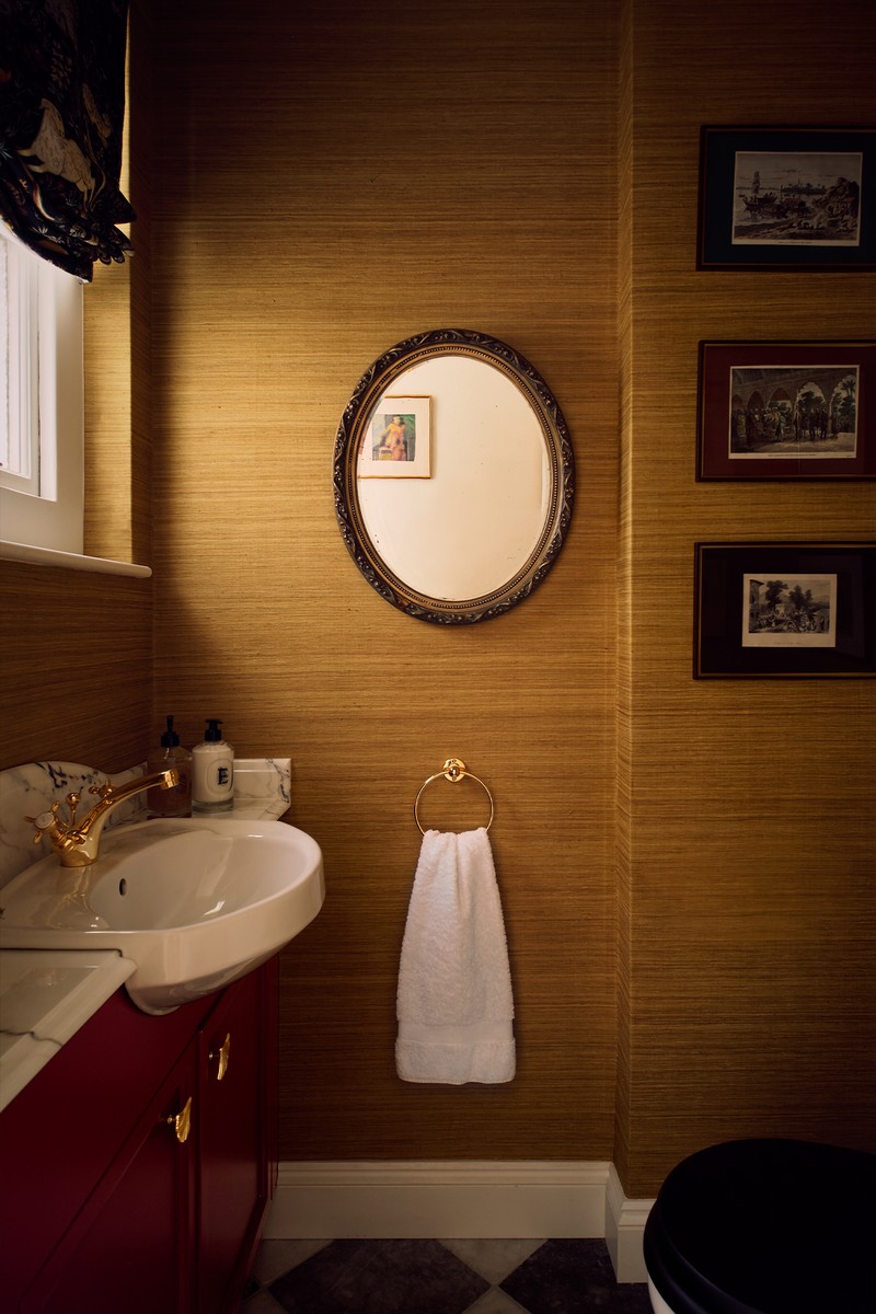
The Downstairs Loo
We kept the original sink as the size was perfect, but I wanted this room to be more colourful and fun. What we achieved was a warm and interesting design.
WALLCOVERING Phillip Jeffries, Amalfi silk in Tuscan Sun
TAP LeFroy Brooks
VANITY UNIT PAINT Zoffany
MIRROR Antique
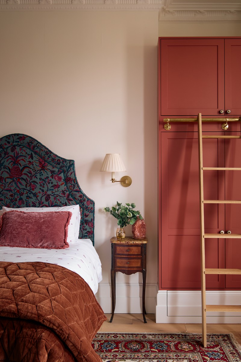
The Main Bedroom
My client is a doctor who works around the clock, so it was very important to her that the bedroom and en-suite was a calming space. I wanted to incorporate more colour into this room and we spent a long time finding the perfect shade of pink for the wardrobes – we added the ladder to make use of the high ceilings. The antique rug acted as the base of the colour palette, and I found the Pierre Frey fabric to pick out some of the bolder colours.
HEADBOARD Upholstered in Pierre Frey Branquenie Alizon Canard
WALL LIGHT Vaughan Cromer Swing Arm Wall Light
WARDROBE Zoffany Venetian Red
FLOOR LAMP base Anna Unwin; shade OKA
PAINTING Tomo Campbell
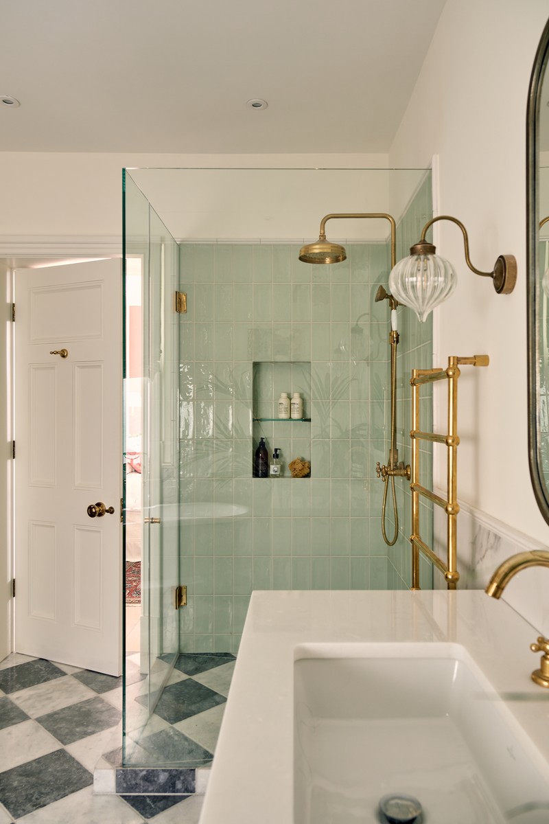
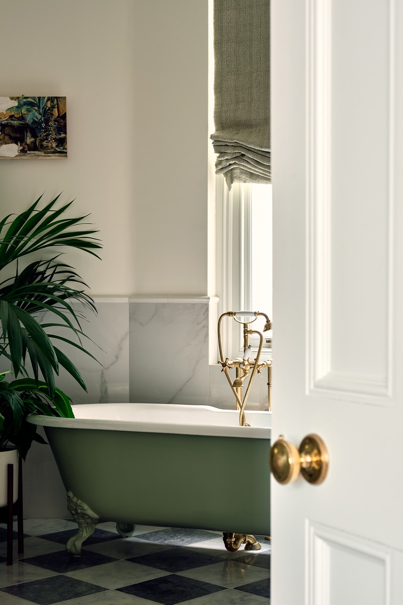
The Bathroom
We incorporated my client’s favourite colour, green, in the bathroom. I also reconfigured the walls and doors to make the bedroom format work better.
BATH C.P. Hart
PAINT Calke Green Farrow & Ball
TAPS Bespoke Taps
WALL LIGHTS Jim Lawrence
VANITY UNIT Custom made by Paragon Stone & Hannaford
SHOWER Bespoke Taps
FLOOR TILES Mandarin Stone Di Scacchi Tumbled Marble
WALL TILES Mandarin Stone Paintbox Gloss Tiles
Visit AnahitaRigby.com
Photography by Ollie Tomlinson.
DISCLAIMER: We endeavour to always credit the correct original source of every image we use. If you think a credit may be incorrect, please contact us at info@sheerluxe.com.
/https%3A%2F%2Fsheerluxe.com%2Fsites%2Fsheerluxe%2Ffiles%2Fwebsite-images%2F2025%2F03%2Fsign-up-pop-up.jpg)
