

10 Unexpected Designs That Proved To Be Perfect Finishing Touches
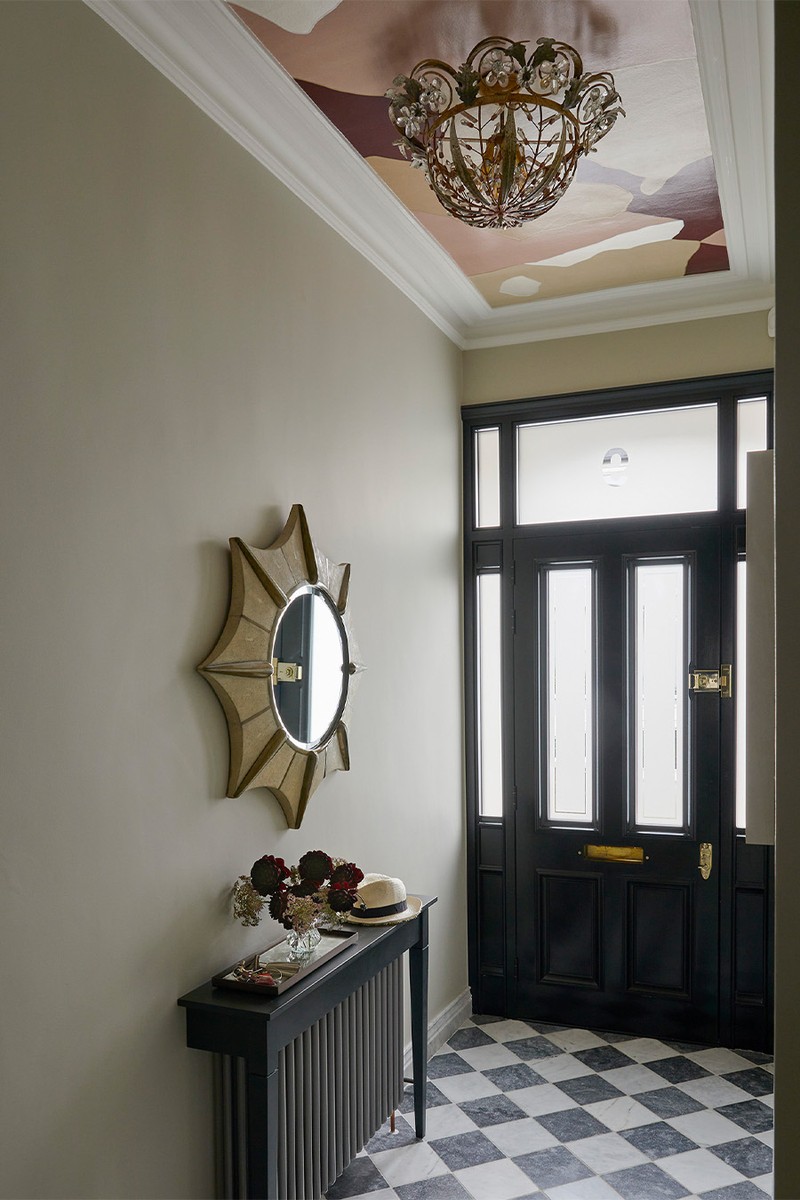
A Mural Ceiling
Olivia Emery
We were coming to the end of this project, and the original plan for this hallway had been wallpaper but that had been scrapped. I suggested this wonderful Fromental Rexine Roan wall covering, which feels like a work of art. The colours go really nicely with the wall colour and the burgundy adds a nice contrast.
Visit OLIVIAEMERY.COM
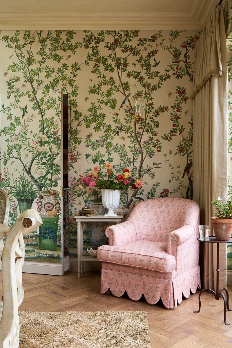
A Hidden Door
Laura Stephens
We knew we’d have to work out how to create a discreet entrance from this dining room to the adjacent downstairs loo and utility room. At first, we discussed a standard door and even a curtain, but when the client chose this beautiful chinoiserie wallpaper from Watts 1874 it seemed wrong to disrupt it, so we chose to create a ’secret’ or ‘jib’ door, which you can barely tell exists. The client loves how ‘finding the door’ is a major taking point for guests. It also allows our client to enjoy the pattern of the wallpaper to its fullest effect.
Visit LAURASTEPHENS.CO.UK
/https%3A%2F%2Fsheerluxe.com%2Fsites%2Fsheerluxe%2Ffiles%2Farticles%2F2025%2F04%2F2-sl-020425-interior-designers-favourite-discoveries-wedekind-1-spencer-wedekind-interior.jpg)
A Bold Wallpaper
Sophie & Nicholas Spencer
During a conversion of two houses into one, we uncovered some unexpectedly inspiring design elements of the last century. In the study, once the old lining paper was removed, we discovered a beautiful but sadly damaged original William Morris wallpaper underneath. Although it couldn’t be salvaged, it sparked a new direction for the design. Inspired by its charm and heritage, we chose a new William Morris wallpaper that now adds character that is in the spirit of the room’s origins.
Visit SPENCERANDWEDEKIND.COM
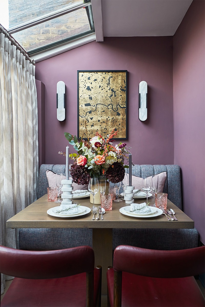
A Versatile Dining Nook
Henry Prideaux
This living room opens up onto a lateral glass-roofed conservatory with views over the landscaped garden, which we thought would be perfect as a cosy dining snug. Designed within a flexible scheme that incorporates symmetrical banquette seating at either end of the room and a pair of square bespoke pedestal leg dining tables, the space can be adapted to be used with a single table positioned at one end of the space for intimate suppers, or both tables pushed together and dining chairs added when hosting a larger number of guests at a dinner party.
Visit HENRYPRIDEAUX.COM
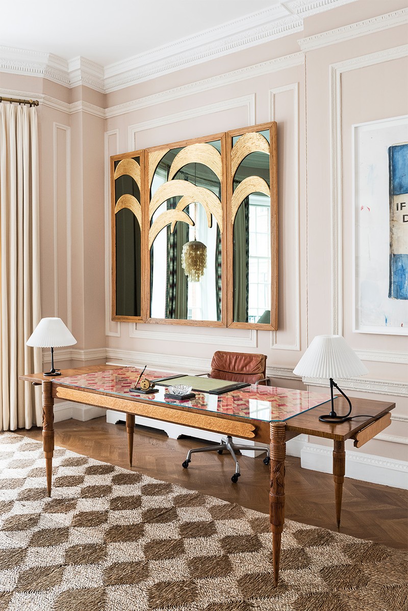
An Unusual Screen
Olivia Outred
We had almost finished the design for this special office where we had drawn an elevation of each wall, carefully mapping out where each piece of art would be placed. Our client is an art collector and wanted a good view of her favourite pictures from her desk. Then we found this screen, with its palm leaves and frame made from beautifully placed split cane. But the project was 99% finished, and screens take up a lot of space – space we didn’t have. It was my idea to hang it behind her desk, to reflect the view and act as a backdrop. Screens usually sit on the floor, so we decided on split batons to spread the weight evenly, and it worked. The screen has become a much-loved addition to this room and looks absolutely right.
Visit OLIVIAOUTRED.COM
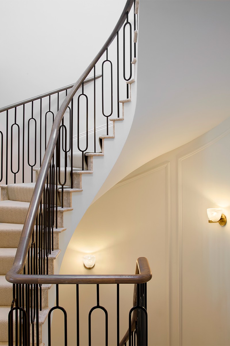
A Bespoke Staircase
Andrea Benedettini
Before the renovation, the staircase was quite basic – a standard timber structure with little architectural interest. We saw an opportunity to turn it into something much more sculptural. The result exceeded our expectations: the combination of the fluid curve, bronze detailing and tactile finishes completely transformed the space. Featuring a fluid, elegant curve that contrasts beautifully with the grey marble steps, this design is embellished with bronze detailing and a tactile timber handrail. To elevate the overall look, we introduced plaster mouldings on the curved walls, adding a subtle sense of architectural rhythm, and the space is further enhanced with jewel-like wall lights in textured glass and rich brass finishes.
Visit ANDREABENEDETTINI.COM
/https%3A%2F%2Fsheerluxe.com%2Fsites%2Fsheerluxe%2Ffiles%2Farticles%2F2025%2F03%2Funs-hobbs.jpg)
A Decorative Pelmet
Uns Hobbs
One of the most rewarding discoveries in a recent project was the addition of a pelmet to the window treatment – something that was almost an afterthought but became a defining feature of the space. The client had always envisioned a traditional and ornate window dressing, but the challenge lay in the age and unevenness of the Georgian walls. An earlier maker dismissed the idea as too difficult, but we found someone who created something really special. The pelmet was designed to echo the intricate mouldings in the room, and the result is a tailored treatment that frames the windows and adds a sense of history to the space. It’s a perfect example of how the right craftsmanship can turn an obstacle into an opportunity.
Visit UNSHOBBS.CO.UK
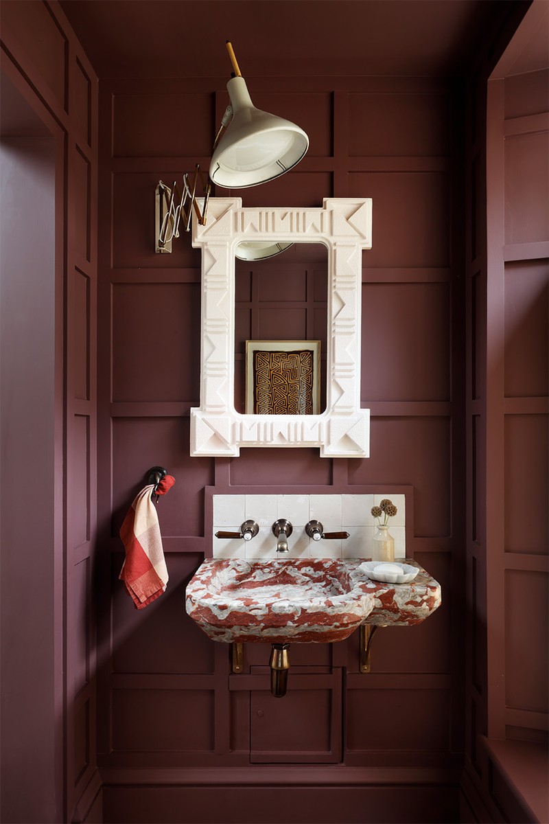
A Reclaimed Sink
Christian Bense
We have been working with a supplier of reclaimed marble sinks for quite a while. Like the new marble ones you can get made off Etsy, they come with a certain level of risk. You get what you’re given in a way, so clients have to be open to making it work if things aren’t quite right. In a project in Knightsbridge, we weren’t quite prepared for how asymmetrical the sink was, so we had to rejig the bathroom a little to balance out the elevation, but we were happy to pivot the design of the room. Part of the charm of these reclaimed sinks is that they aren’t perfect, so you need to lean into that and just embrace it.
Visit CHRISTIANBENSE.COM
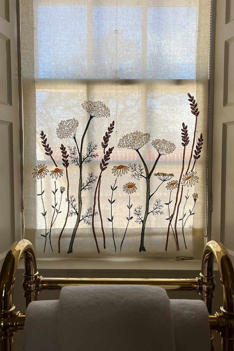
A Hand-Embroidered Blind
Sarah Peake
During this recent Scottish farmhouse project, we wanted to create a bespoke window treatment that paid homage to the striking landscape beyond. I commissioned Lora Avedian to embroider the blind on our fabric, inspired by flowers and grasses found in the fields that surround the house. It turned out even more beautiful than I could’ve imagined. I love how the light filters through the weave of the linen – it’s a really special addition.
Visit STUDIOPEAKE.COM
A High Gloss Ceiling
Tolu Adẹ̀kọ́
At The Scullery at Cambria House in Camden, a collaborative project with The Salvation Army, one of the most striking elements turned out to be the high-gloss painted ceiling. Initially an experimental choice, it exceeded all expectations. The glossy finish created a stunning reflective surface that amplified natural light, adding depth and dimension to the space. Not only did it make the room feel significantly larger, it introduced a dynamic interplay of light and shadow, elevating the overall ambiance in a way I hadn’t anticipated.
Visit ADEKO.CO
DISCLAIMER: We endeavour to always credit the correct original source of every image we use. If you think a credit may be incorrect, please contact us at info@sheerluxe.com.
/https%3A%2F%2Fsheerluxe.com%2Fsites%2Fsheerluxe%2Ffiles%2Fwebsite-images%2F2025%2F03%2Fsign-up-pop-up.jpg)
