How The Experts Work With Colour
STYLE & INSPIRATION
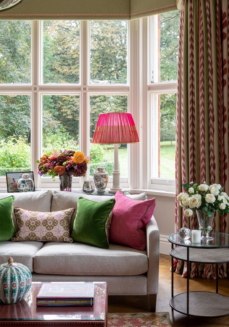
In the UK, we are too constrained by what other people think. At Kelling, our style is most definitely big and colourful. We don’t shy away from colour and we would almost find it impossible to design a fully beige or grey scheme. If people are new to colour, we try to introduce them gently with larger items of furniture in more neutral shades and then pops of colour in the cushions, rugs and smaller decorative items.
My greatest inspiration is India – specifically, the freedom with which they use colour without worrying what anyone else thinks. I’ve spent a lot of time there learning about the culture, as well as the local craftsmanship. In fact, one of my favourite projects was a beautiful house in Delhi we helped build with Adam Architecture.
Our clients always ends up embracing colour. Our ethos is to give them what they want, but try to lead them to places they may not have been bold or brave enough to go without the help of a designer.
I’m inspired by a number of other designers. Kit Kemp – her use of colour and pattern is just the best – Anna Spiro, and I love the work of Jessica Buckley, Sarah Van Renen and Penny Morrison, too. I also follow so many people on Instagram, which often leads to a raft of new discoveries.
PLANNING & DESIGNING
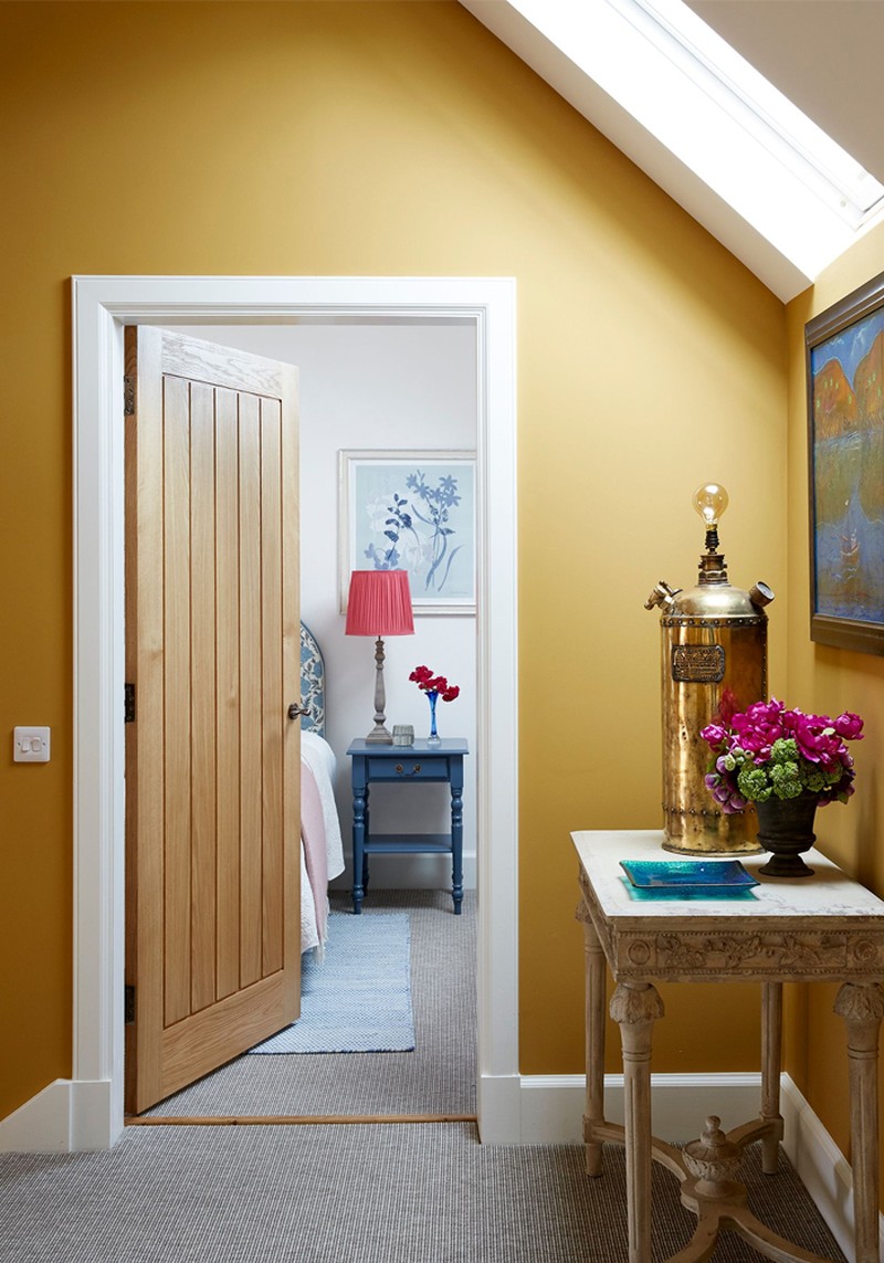
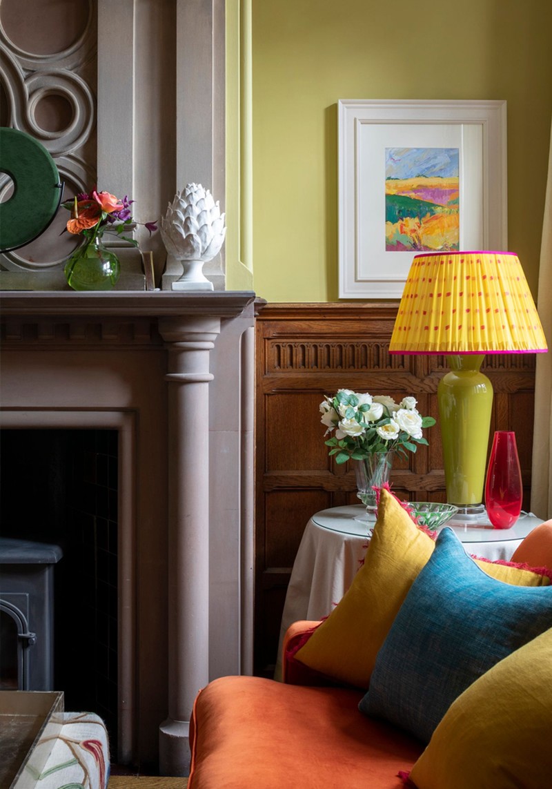
My favourite colours to use are orange, teal, acid greens and pinks. But when designing a room, the creative trigger could be anything – a picture, a piece of fabric, something which encapsulates the colour or feeling I think the client will love.
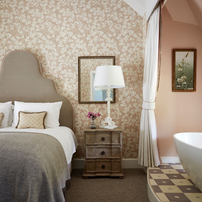
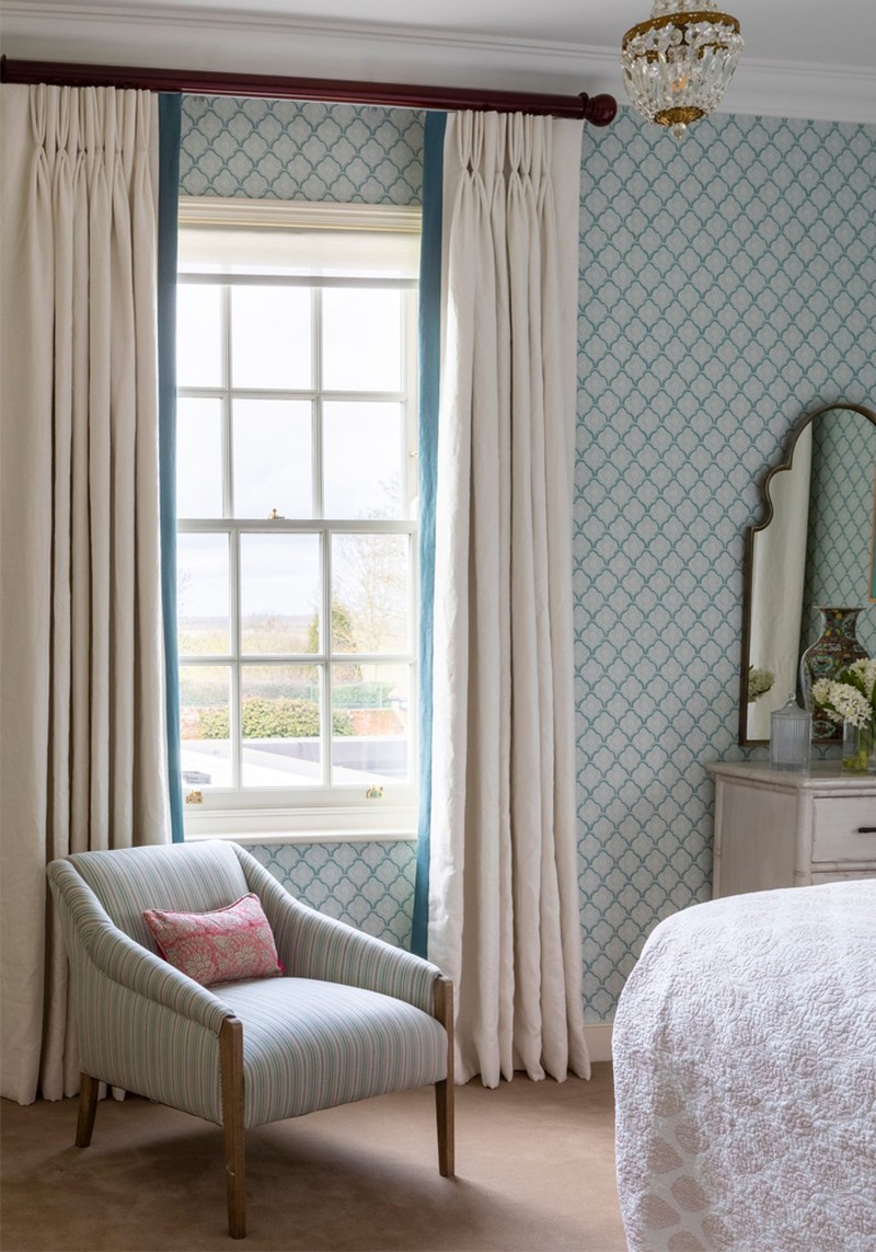
Bedrooms are my favourite room to design. You can’t beat the drama of a statement headboard when it comes to creating the focal point of a room. I also love being able to use colour in the bedroom – it proves brighter colours and patterns can be just as restful as muted tones.
When it comes to enhancing small spaces, go bold. With that said, try to be as symmetrical and tailored as possible. With large open-plan spaces, it's all about zoning. Break up the space into smaller areas for different tasks, dividing it with big pieces of furniture and interesting objects. There’s no reason to be afraid of big spaces – as long as they’re done well, it can be as comfortable and cosy as a small one.
COLOUR & PATTERN
When you’re creating a colour scheme or mood board, start with a piece of artwork. It’s an easy way to form an idea of what you like.
There are no rules when it comes to using multiple colours. Indeed, our ethos is to use as many colours as it takes, but to wend the colours throughout the property. On a ground floor, if you can pick any piece of furniture and it works in another room, then you’ve done a good job. It should all flow and connect.
For people who are nervous about using colour, be brave. Countless clients have said they were scared to death beforehand, but are so happy they kept the faith. Trust your designer – they usually have the skills to pull it off, so let them do their job. With pattern, use what you like and what you think looks fun and interesting.
DECORATING & BUDGETS
There’s no reason to follow trends, but you can’t deny the recent rise of sustainability. Brown furniture is also making a comeback – hurray! – and there are some beautiful pieces which cost less than an Ikea chest of drawers.
Always go for the comfiest bed and sofa you can afford. The more you invest in your home, the longer everything will last. You can sometimes bag a bargain, but on the whole, the more expensive fabrics and furniture reflect the craftsmanship and quality. You can always tell the difference.
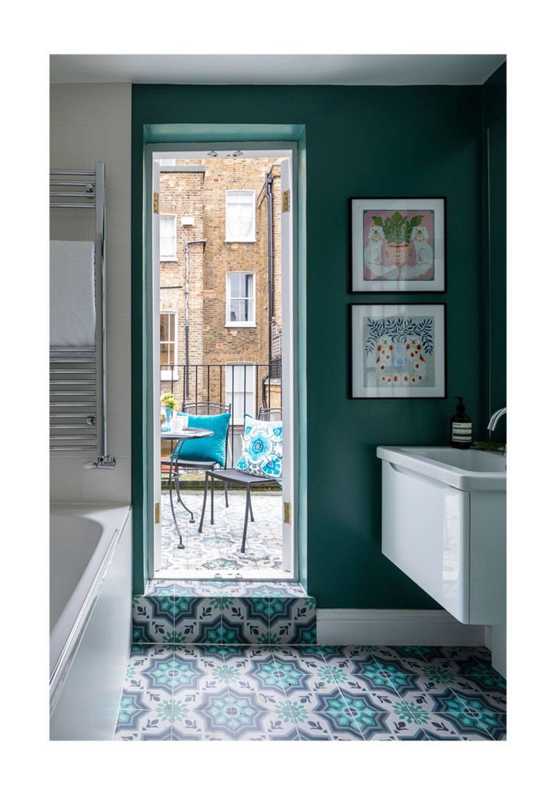
There are ways to cut down on maintenance. By using a lot of glass and mirrors in bathrooms rather than tiles, you can prevent endless hours spent cleaning grout. It's also more sustainable. Another tip would be to use a good off-white linen with a beautiful trim as curtains – it’ll make any room look fabulous. If you're on a tight budget, prioritise bold coloured paints and opt for more neutral furnishings. Dress the space well with good accessories and no one will be able to tell the difference.
KITCHEN DESIGN
The most important thing to do when designing a kitchen is to buy the best you can afford – you’ve got it for a long time. Think about who is using the space and how it'll be used. You want your kitchen to look the part, but it should also be functional and come with enough storage.
If you have an open-plan space, consider hiding appliances behind cabinet doors to create a sleek look when you’re not using it. If you don’t have the budget for a beautiful handmade kitchen, go for solid work tops and glass splash backs to make it look super smart.
As for the floor, tiles are much easier to keep clean. Some of the ceramic tiles are so good now you’d barely know they weren’t real stone. Use water-based resin rather than grout – it’s more expensive, but you’ll cut down on cleaning time. Nothing really beats natural stone, but if you’re keen to be more sustainable, some of the modern composite alternatives are just as good.
LIGHTING
When lighting a room, it’s all about creating layers. Think about the various tasks you'll be doing in each room and try to set as many scenes as you can. By supplementing your main ceiling light with table lamps you’ll be able to change the ambience with the flick of just a few switches – dimmer controls are an absolute must, too.
Artificial lighting is what will change colours most. Remember to look at colour samples in different lights in the space they will be used in. Interior designers usually know to check these things, so you should be in good hands if you’re using a professional.
Too much overhead lighting is the biggest mistake you can make. Lamps are softer and more gentle, but you should still install a decent light where you need it – for instance, in a reading nook or over a desk.
The Suppliers Kelling Designs Rely On Time And Again…
Furniture – Julian Chichester, Tom Faulkner, Robert Langford
Fabrics – Christopher Farr, Colefax and Fowler, Rapture and Wright, Bethie Tricks, Bernard Thorp
Kitchens – deVOL Kitchens, Naked Kitchens, Howdens
Bathrooms – CP Hart, West One, Chelsea Plumbing and Heating
Wallpaper - Rapture and Wright, Phillip Jefferies, Christopher Farr, KD Loves
Paint – Graphenstone, Farrow & Ball, Little Greene, Papers and Paints
Lighting – John Cullen, Porta Romana, Vaughan
Flooring – Walking on Wood, The Natural Flooring Company
Tiles – Topps Tiles, Mandarin Stone
Kitchen hardware - Chloe Alberry, Beardmore
Visit KellingDesigns.com
DISCLAIMER: We endeavour to always credit the correct original source of every image we use. If you think a credit may be incorrect, please contact us at info@sheerluxe.com.
