A Look Around This Family Home In London
The Property
We bought the house in 2012 and moved in without doing much work. The house was divided into two flats, and we used the basement flat for four years while we obtained planning permission and finalised the floorplan for the rest of the property. After four years, we moved out and started the works. These were extensive – we changed everything except for the original staircase. Now, there are two reception rooms (one is the library), a main bedroom with an en-suite, four further bedrooms, three bathrooms and two smaller loos. The biggest challenges were my en-suite bathroom and the floor which houses the kitchen, dining room and playroom – where there’s also a laundry room and a separate loo.
I live with my husband and our three young children. I wanted to make the house functional for our family, while also staying true to the property’s original features and maintaining that traditional, timeless feel throughout. The furniture is a real mix – including two Louis XV-style chairs I bought at Lots Road. In the past I’ve tried pairing them with traditional English furniture, but it wasn’t right – you need a contrast. That’s why a lot of our other furniture is funkier and more contemporary, with some mid-century and antique pieces thrown in. Beautiful antiques can add weight and character to a house. If everything is new, it looks too contrived.
/https%3A%2F%2Fsheerluxe.com%2Fsites%2Fsheerluxe%2Ffiles%2Farticles%2F2022%2F02%2Fnina-litchfield-home-tour-280222-nlw-03.jpg)
Kitchen
I designed this kitchen with my business partner Blanca. It’s completely bespoke and everything was made by our joiner. I had collected lots of images of soft blue kitchens and knew I needed something uplifting on the lower ground floor. It’s painted in Edward Bulmer’s Garter Blue. I designed the scalloped hood with Lulu, another of my old business partners. In Brazil, where I’m from, you have more than one sink in a kitchen – one for washing your hands and one for food prep. If you have the space, I find it’s always very useful.
I used marble everywhere – including the splashback. It’s quite porous and therefore not ideal, but if you look after it, it ages wonderfully. For the bar area, I used a lot of walnut. Again, I wanted to warm up the space and wood was the easiest way to do this. Otherwise, it could have quickly turned into a very cold space. On that note, we needed lots of different lights to achieve different moods. The pendants I found at a dealer from the Battersea Antiques Fair, and we used directional spotlights as well. In a kitchen you always need task lighting for cooking and ambient lighting for entertaining.


Library
The walls are covered in a Schumacher grasscloth called Hakuri Sisal in Sage. It’s a moody green, and so elegant. The bookshelves are painted in Paint & Paper Library Hunter Dunn. It’s my version of an English racing green and another beautiful colour I use often in my projects. I kept the bookshelves matte and added some glamour with the velvet on the sofa.
When I designed the ground floor, I had to make this room smaller to fit the coats in on the other side. I brought the wall in at the window end and painted the woodwork – the shutters, frame and the skirting – white. The room feels light and fresh as a result – if I had painted these walls green as well, it might have made everything too dark to withstand those grey London days. It’s all about striking the right balance between moody and cosy in the evening, and bright and airy during the day.
/https%3A%2F%2Fsheerluxe.com%2Fsites%2Fsheerluxe%2Ffiles%2Farticles%2F2022%2F02%2Fnina-litchfield-home-tour-280222-fb-05.jpg)
Living Room
The living room and library are supposed to work together and stand on their own. During lockdown, my husband was in the library all day and the house functioned like normal. The living room is white because I knew the colour would have to run all the way up the stairs. It’s also the perfect backdrop to all the artwork. The wool green curtains have no lining and are quite clean and minimal, while the busy wallpaper entices you to move downstairs.
I designed the kidney-shaped sofa with Blanca. We drew it on the floor with tape to make sure the size was right! We also sampled lots of fabrics before making a final decision. It’s a leopard print, but it doesn’t look like one. It’s the perfect conversation starter – and it’s made by George Smith.
My aunt, Helga de Alvear, is well known in the art industry. She’s always inspired me to take art seriously and only buy pieces I love, never because of the resale value. It’s my philosophy to this day. The central piece in this room is by Anna Skladmann; it brings the entire space together. I love her work and went to her studio to choose this piece. The exotic plants remind me of my Brazilian roots.
The chandelier came from a dealer on Golborne Road. I love Alexander Calder’s mobiles, so when I saw this, I knew I had to have it. I needed something big and statement that gave off enough good lighting but wasn’t too new looking. The fact it is vintage makes all the difference. If it was a new, modern chandelier it would take the space in a totally different direction.
The guest loo is straight off the living room and it’s my Alice In Wonderland moment. I had it encased in a pineapple wallpaper and the paint colour is Rhubarb by Paint & Paper Library. It helps bring the wallpaper into the 21st century. Beyond is the hallway, which has a beautiful hand-painted mural on the ceiling by Tess Newall – a bespoke design we developed together. The lights are from an American company called Urban Electric.
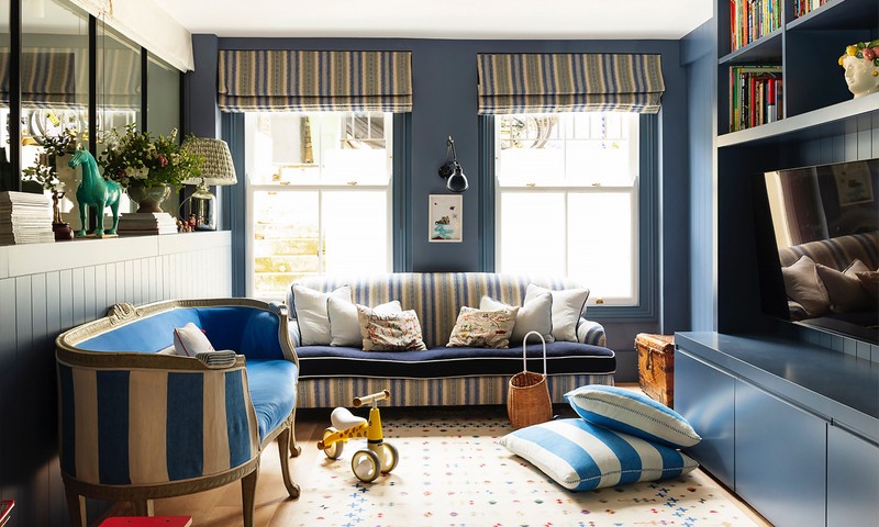
/https%3A%2F%2Fsheerluxe.com%2Fsites%2Fsheerluxe%2Ffiles%2Farticles%2F2022%2F02%2Fnina-litchfield-home-tour-280222-nlw-playroom.jpg)
Playroom
I knew this was a dark corner in the house, so I didn’t want to try and hide it away any more. I wanted to embrace it and play with a different blue from Edward Bulmer. As I’ve mentioned, wood always makes a room feel warmer, and I’ve always loved the idea of using tongue and grove, so I combined the two in the joinery in here. Once my children are older and the toys start to disappear, I want to buy a sofa that goes the whole way around the room so they can hang out with their friends and watch TV.


Guest Bathroom
I bought the mirror at the Decorative Fair in Battersea – it’s a simple rattan mirror with a lovely teardrop shape. I like bathrooms to feel like proper rooms, so opposite the sink there’s an old chest of drawers with lights, family photos, candles and flowers on it, always. The wall lights are made from Venetian glass. They’re very dainty and emit a lovely light.
Main Bedroom
The bedroom is all white above the panelling, which is painted in Hague Blue by Farrow & Ball. I have been dreaming of encasing the top half in a linen-backed wallpaper, but my husband doesn’t like the idea. The curtain fabric is by Schumacher and one of my all-time favourite designs. It’s called Lotus Garden – a flower that’s a symbol of purity, enlightenment, self-regeneration and rebirth in the eastern world. I also used a pink wool lining by Tissues d’Helene called Grapefruit and the pompom trim is another of my favourites by Samuel & Sons.
The rug is by Tim Page Carpets – it really brings adds depth to the space. The wall lights by the bed are Besselink & Jones and the shell light was a great find from an antiques shop on Church Street. The chandelier is from Alfie's Antiques Market. Most of the furniture in here has been collected over time. I bought the bed from D’Erlanger and Sloan over a decade ago. It’s a timeless French antique. The chest came from my previous home and my bedside tables came from the Golborne Road Friday market.
/https%3A%2F%2Fsheerluxe.com%2Fsites%2Fsheerluxe%2Ffiles%2Farticles%2F2022%2F02%2Fnina-litchfield-home-tour-280222-fb-07.png)
Benedict's Room
The wallpaper in this room is called Toile de Lapin by Nicholas Herbert. The vintage bed was upcycled for us. The wall lights are by Besselink & Jones again.
Girl’s Bathroom
I went with a feminine look and chose pink walls in Edward Bulmer’s Cuisse de Nymphe Emue and the Flora mirror by Balenium. My go-to for bathroom lights is always Original BTC.
Visit NinaLitchfieldStudios.com to see more of Nina’s work.
DISCLAIMER: We endeavour to always credit the correct original source of every image we use. If you think a credit may be incorrect, please contact us at info@sheerluxe.com.
/https%3A%2F%2Fsheerluxe.com%2Fsites%2Fsheerluxe%2Ffiles%2Fwebsite-images%2F2025%2F03%2Fsign-up-pop-up.jpg)
