Meet The Interior Designer: Turner Pocock

Background
We met when Emma was an interior designer and Bunny had left the commercial art world to work for a central London developer. We made a pact over a glass of wine one evening to start a company together, and about a year later we did. There are definitely things one of us is better at than the other, but our design approach is very similar and we’re both very involved in every project.
We have a team of 12. We like to keep it at that size so we can be directly involved – it’s a promise we make to clients. We take on six or seven projects each year and have up to 16 on the go at any one time. These days, we only take on whole house refurbishments – we believe designing an entire property is the only way to achieve the right flow and feel.
Ethos
We spend a lot of time going talking to clients to understand how they plan to live in and use the house. We make sure they don’t compromise on the day-to-day functionality, because that’s what makes a property really work. In lockdown we had so many messages from clients saying how well their homes were working for them, which was the greatest compliment.
Comfort is also key – we don’t create show homes, we create environments that reflect the personalities of our clients. There are some signatures in our work – for example, the joinery and architectural detailing are always very strong – but the actual aesthetic can vary considerably.
We were both raised in English country style houses by mothers who were interested in interior design. It’s amazing how the environment you’re raised in can really influence your aesthetic. We have never designed anything in a beige way. When we started out, our approach was probably different to what everyone else was doing – minimalist and clean – but we’ve always tried to embrace colour and pattern.
Style Traits
Bunny was one of the first designers to saturate a room with such a dark colour when she painted her living room in Farrow & Ball ‘Hague Blue’. We then used it regularly in our projects… until everyone else started doing the same thing. Similarly, Bunny installed a Crittall screen in her house and now we resist them unless it’s pertinent to the project. Back then, it was a useful way to divide or ‘zone’ an interiors space – again, we were rallying against the open plan living space that everyone had realised wasn’t an easy to way live – but it’s now so mainstream and is often used incorrectly.
We also used a lot of strong, coloured patterns from the very start even though it was rare for people in England to decorate this way – it was quite an American look. We also used braids a lot, especially plain braids to inject pops of colour. We were really influenced again by American designers – so in a way it was a nod to their traditional methods, but with a modern spin.
/https%3A%2F%2Fsheerluxe.com%2Fsites%2Fsheerluxe%2Ffiles%2Farticles%2F2022%2F03%2Fintro-bunny-turner-emma-pocock-portrait.jpg)
Finishing Touches
Apart from our obsession with cashmere blankets, a drinks tray is another nice addition – it’s so welcoming for guests. Quality bedlinen is also important and while vintage textiles can be tricky to track down, they can also bring a room together – on the back of a sofa, over an ottoman or framed on a wall. They add pattern, colour and texture, and they’re often works of art in their own right. Rooms can sometimes feel overdone or too matchy-matchy. We want ours to feel reflective of our clients’ lives – which often comes down to balancing the old with the new.
Bunny’s background in art has also really influenced us both. We find people are much more personal about their art than their interiors – they’re so frightened of making a mistake. But the less art you have on the walls, the more emphasis there will be on each piece. It’s better to fill your house with things you love – they needn’t be expensive or precious. We also like to create gallery walls – around dining tables, above desks and running along stairwells are all good places. We often ask clients to give us the pictures and we then get the works reframed if necessary. Start with one picture you love and work around it.


Collaborations
We have our own range of upholstery pieces with Lorfords – they’re the most comfortable sofas out there in our opinion. We’ve also loved bobbin beds for a long time but were frustrated by how difficult they were to find in the UK. That’s why we approached Chelsea Textiles to develop our own range – you can use them in children’s bedroom and grown-up spaces, and they can be painted in all sorts of colours. We’ve also done a table linen range with The Sette and recently re-coloured the Christopher Farr Raoul Dufy fabric and wallpaper collection, which comes out later this year.
Inspiration
The most important designers who have influenced are work are: Kelly Wearstler, David Hicks, Louis Bustamante and Steven Gambrel.

01
Battersea Apartment
This lovely mansion flat, with its high ceilings and great proportions, overlooks Battersea Park. Originally very white and modern, our Swedish client didn’t feel the minimal look matched the Victorian heritage. The brief was to keep it light and airy but make it feel a bit more English. Almost all the walls stayed in an off-white, but we used traditional and mid-century pieces throughout to add depth. The clients also had a lot of art – think bold Harland Millers and Anthony Gormley sketches. The colour palette is natural throughout – burnt oranges, ochres, dark green, dirty teal, muted olives – with some pops in some of the kids’ rooms.
There were some challenges along the way, including a modern joinery unit covered in a large mirror which they wanted to keep. We changed the mirror to an antique finish, which made a huge difference. There was another wall of joinery in the main bedroom and when you opened the door, all you saw a wall-mounted TV surrounded by joinery. We persuaded them to get rid of it so that what you see is a beautifully made bed instead.
/https%3A%2F%2Fsheerluxe.com%2Fsites%2Fsheerluxe%2Ffiles%2Farticles%2F2022%2F03%2Fbattersea-apartment-turner-pocock-pow-sitting-room.jpg)
02
Chelsea Family Home
This Chelsea house is home to a couple and their three boys. At first it was a rabbit warren of rooms that weren’t very functional, so we spent time planning to turn it into independent spaces for them all to spend time in. The boys needed space to do their homework on the lower ground floor – so we needed three workstations there. The family like to entertain quite a lot, too, but a dining room is often a waste of space in London house this size, so we created a dining area in the kitchen that could easily turn into a smarter set up.
Despite the small square footage, we created a layout that really worked hard for them. On the ground floor we reintroduced a wall between the two living rooms, so you have a smarter one at the front and a smaller TV room beyond – we put in a large window in the wall between the two to make the darker back room brighter and more inviting.
/https%3A%2F%2Fsheerluxe.com%2Fsites%2Fsheerluxe%2Ffiles%2Farticles%2F2022%2F03%2Fchelsea-townhouse-masseyturnporedburn0108v2.jpg)
Throughout, we wanted the furniture to feel like a genuine collection of pieces – some of which may have been handed down. There’s an old French farmhouse style dining table matched with bobbin chairs, so it feels comfortable and inviting and not too put together. Banquettes also solve all sorts of space issues in London. If it’s deep enough, we like to add bolsters and cushions.


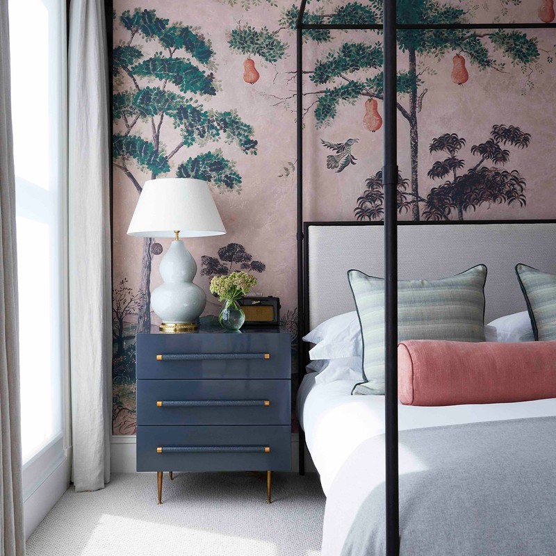
This family wanted a luxurious master suite on one of the floors, which is where we used a dramatic Kit Kemp wallpaper and installed a four-poster bed (shown at the top of the page). The kids’ rooms are on the top floor, and the built-in beds with trundles underneath mean they can have lots of sleepovers. We used wallpaper on the ceiling, too – it’s a nice way to introduce pattern. People don’t often think of it, but we also made a design point of the ceiling in the downstairs loo by lining it in metro tiles.
03
Crans Montana Chalet
The client inherited this flat from her grandfather and it hadn’t been touched since the 1950s. The layout didn’t work at all. The challenge was to reconfigure the flat to include three bedrooms and two bathrooms, as well as plenty of storage. The brief was that it should feel like a boutique hotel – chic and grown up – not a traditional chalet.
We worked with Italian architects in Switzerland, but still had to import lots of things from the UK, such as the antique mirror and the joinery. The kitchen was by Hyde + Gallagher, who are based in the Cotswolds. We used Farrow & Ball ‘Black Blue’ on one wall in the living room to emphasis the view beyond – if you use a colour enough in a house you stop noticing it.
The client also wanted the flat to feel glamorous, so we used lighting and metal work to achieve that. Above the kitchen island is a Lindsey Adelman light – they’re almost like sculptures – and there are Gubi lights above the dining table, which are really fun.

/https%3A%2F%2Fsheerluxe.com%2Fsites%2Fsheerluxe%2Ffiles%2Farticles%2F2022%2F03%2Fchalet-livingarea.jpg)
A Final Word On…
TP Caring Spaces
Both of us knew we wanted to give back – we work in a luxury sector, and it’s sometimes not that good for the soul. First, we were approached by a client who was also a patron of Cancer Research in Cambridge. She had a cottage she wanted to refurbish for recovering cancer patients to use as a respite facility and we jumped at the chance. It turned out to be one of our most joyful projects.
We were also approached by some of the nurses at Guys and St Thomas’s gynaecological department who told us their respite room was dire. It didn’t serve its purpose at all, and they were all very stressed. It was pretty bleak, so we pulled together a furniture package, some fun, tropical blinds, and a brightly coloured Smeg fridge to turn it into a more cheerful space.
/https%3A%2F%2Fsheerluxe.com%2Fsites%2Fsheerluxe%2Ffiles%2Farticles%2F2022%2F03%2F20210626-tp-caring-spaces-guys-break-room-02-159-se-lo.jpg)
These two projects were what led to TP Caring Spaces. There was never a better time to launch it than after the pandemic. It’s building momentum, and we have a big fundraising initiative launching in September, as well as two more projects on the slate – a care room for Mencap in Dunstable and the palliative care rooms at Great Ormond Street.
Visit TurnerPocock.co.uk for more information.
DISCLAIMER: We endeavour to always credit the correct original source of every image we use. If you think a credit may be incorrect, please contact us at info@sheerluxe.com.
/https%3A%2F%2Fsheerluxe.com%2Fsites%2Fsheerluxe%2Ffiles%2Fwebsite-images%2F2025%2F03%2Fsign-up-pop-up.jpg)
