

Meet The Interior Designer: Rebecca Hughes
My Background
After graduating from university, I felt dissatisfied working in advertising. I longed to have a more creative career, so I started to think about pivoting. I got married relatively young and my husband was a musician at the time. While his career was incredibly challenging, I felt inspired by the fact that he was following his dream and doing something he loved.
As a child, I would often rearrange my room and I began to realise just how important my surroundings were to me. Interior design felt like a natural progression of that. I love receiving a brief, really getting to know a client, understanding a building – its limitations as well as its potential – and then starting to build a vision. I find that parameters in design actually fuel my creativity – each project is an exciting challenge that is incredibly rewarding in return.
My Style & Ethos
We are a London-based, luxury design studio that provides bespoke services from project conception to completion. I believe interiors should reflect those who inhabit them, and as a studio, we really enjoy getting to know our clients and what motivates their choices and personal style.
I tend to embrace classic English influences with a relaxed, layered approach – creating spaces that feel effortless and comfortable yet still beautifully curated. I often mix a variety of periods, materials, textures and patterns to create a layered look, making a space feel like it has organically evolved over time. I’m a firm believer that design should have longevity, rather than feeling too trend driven. My end goal is always to create a space that feels authentic to its owner.
Decorating DNA
I like mixing a range of materials to create engaging, tactile spaces – such as polished plaster, silk wall coverings and gilded antique mirrors – and I’m a firm believer that natural materials are timeless. Aged timber, antique brass, linen and wool, for example, create that sense of refined and understated Luxury.
In my own home, I love soft and earthy neutrals with an injection of rich moody hues, such as chocolate and oxblood red, but for our projects we’re always led by the client’s preferences and the setting. We're currently working on a project in Norfolk and nearly every room has some brown or green tones to reflect the lush, leafy surroundings of the estate.
I love pattern mixing and playing with varying scales in a scheme, whether that be large prints, small ditsy florals, bold stripes or solid expanses of colour. Currently, we are using a lot of hand-blocked prints and vintage floral wallpapers, creating a playful look. We often mix eye-catching printed fabrics with plain linens, velvets or wools to prevent a space from feeling too busy.
Three Of Rebecca’s Favourite Projects
PROJECT 1:
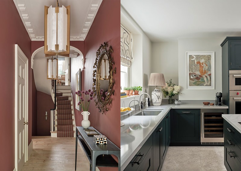
Kensington Town House
This home is owned by a passionate and glamorous foodie who has just relocated from California to London. She wanted her grey, dark townhouse to be filled with colour and to represent her bright, bold personality. She also loves to host and cook, so she wanted her house to be a space loved ones would enjoy visiting.
Initially, our schemes were colourful but not saturated enough, so we kept adding more colour and drama at every stage. Our client fell in love with fabrics by textile house Schumacher and these bold prints became key anchors for each room. We also made some structural changes, adding an internal window to let in more light. The goal was to create an uplifting, energising space.
We used Little Greene's 'Hammock' paint colour in the main hallway as the thread that linked all the schemes together. We also used a lot of the client's original furniture and artwork that she had collected over the years. The home features a lot of greens, pinks, yellows and blues.
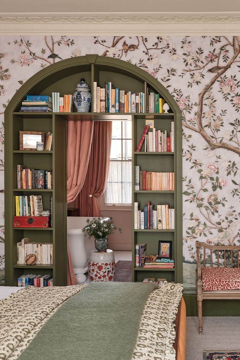
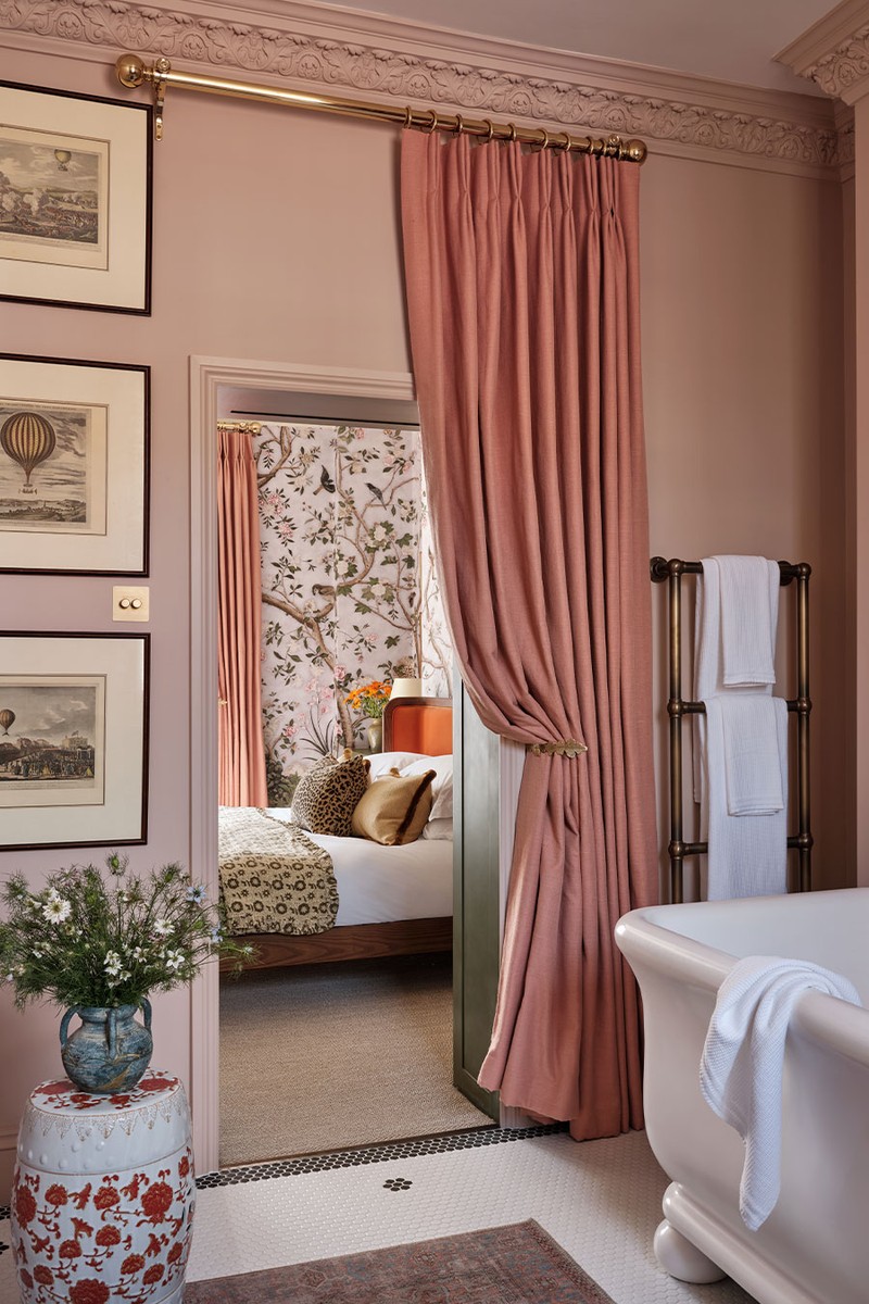
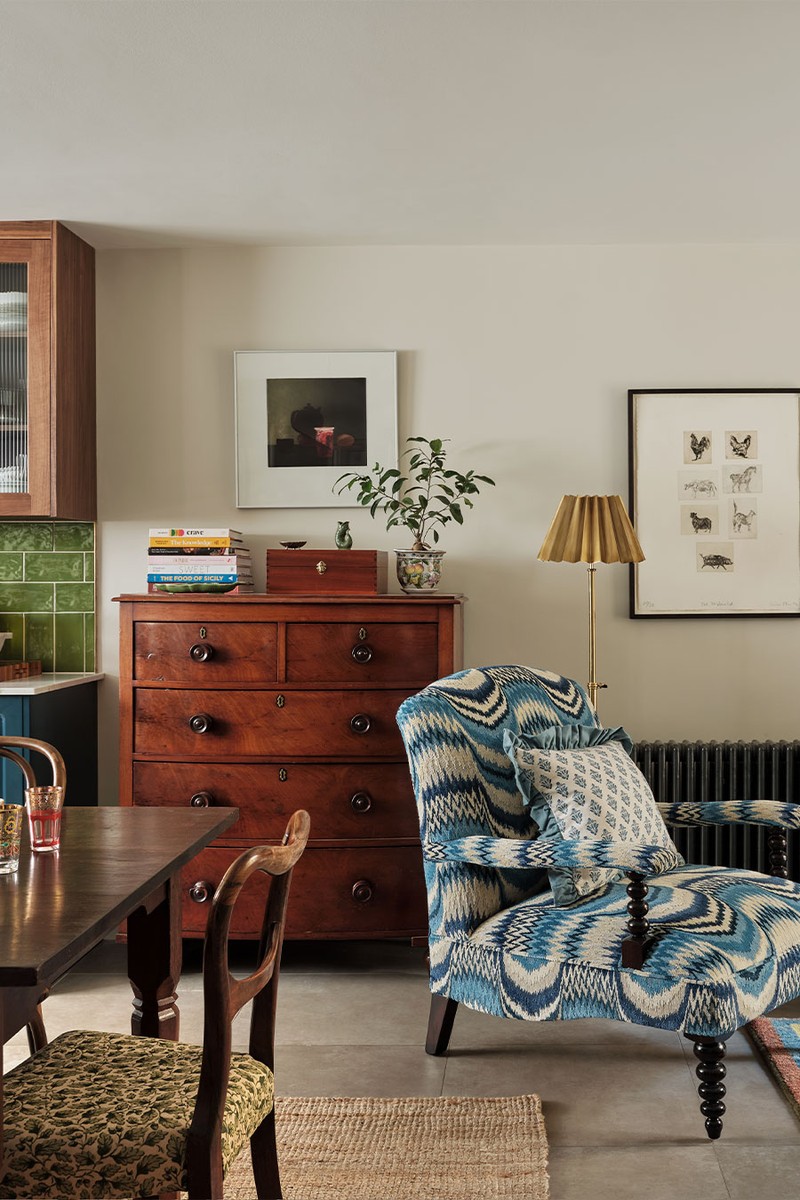
The house works because it reflects the client – everything from the bold front door (and external steps) through to the living room with its bright pink sofa, down to the olive-green kitchen. My favourite room is the primary bathroom. This was originally a box bedroom, but we blocked the original door and created an arched opening from the bedroom through to the bathroom. Our client had a wonderful bookcase reference image that we drew inspiration from, choosing a sage green to go with the blooming wallpaper. The bathroom features a tall pink curtain, French mosaic daisy flooring, and an oversized clawfoot tub.
PROJECT 2:
St John's Wood Townhouse
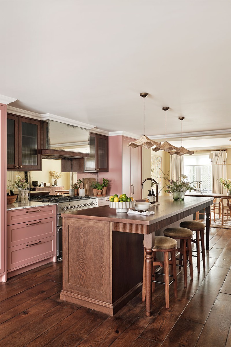
This young, growing family moved from an apartment to a townhouse and wanted to create a welcoming, personal home. When they bought the house from a developer it had no character, grey walls and a very awkward layout on the lower ground floor. We worked closely with an architect to reconfigure the lower ground floor and first floor to create one large suite, including a dressing room and bathroom.
The couple came with a few key ideas: a pink kitchen and a deep love for Bennison floral fabric (which we subsequently used in their bedroom). Other than that, they let us run with the schemes. We introduced mouldings from Orac to create beautifully traditional panelling in the drawing room and worked closely with the contractor to move fast.
/https%3A%2F%2Fsheerluxe.com%2Fsites%2Fsheerluxe%2Ffiles%2Farticles%2F2025%2F03%2Fsl-rebecca-hughes-interiors-st-johns-wood-fb-1.jpg)
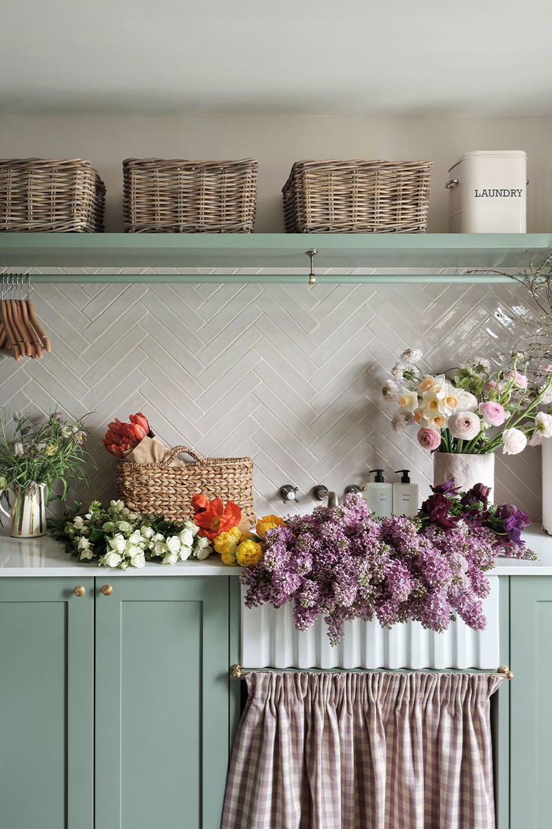
We used Edward Bulmer 'Nicaragua' in the kitchen and blue linen walls in the main bedroom, and Bennison fabric on the curtains and bed tester. I personally love the bedroom. It’s so calm and serene – exactly the kind of place you want to retreat to after a long day. The only furniture we kept from their previous apartment was a green rich olive sofa, which influenced the whole scheme on the ground floor. We also created a sage-green boot room on the lower ground floor that is practical and also really pretty.
PROJECT 3:
Islington Townhouse
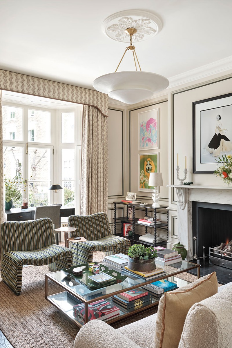
We designed this home for an older couple who had both been previously married – this is their first home together. They wanted the space to feel contemporary without losing its period property character, and we assisted them with all aspects of the project, right down to the selection of artwork and accessories.
The living spaces feature soft, muted neutrals like creams, light greys and earthy greens, while the bedrooms introduce a pop of colour with pastel pink, blue and yellow. We brought in a range of textures through the brass light fixtures, bouclé textiles and warm oak furniture. My favourite room is the study, located in a tiny box room off the half landing. The space was incredibly tight but we were able to create a home office with ample storage and beautiful view of the garden below.
/https%3A%2F%2Fsheerluxe.com%2Fsites%2Fsheerluxe%2Ffiles%2Farticles%2F2025%2F03%2Fsl-interiors-study-and-bedroom.jpg)
The property was Grade II-listed, which presented some challenges. We wanted to keep the existing cornicing but could not touch the original chimney breast. This meant that creating a bespoke, fitted wardrobe in the primary bedroom was very difficult but, with the help of our joiner, we created a piece that seamlessly blends into the room without impacting the architectural features.
Visit REBECCAHUGHESINTERIORS.COM
Photography Astrid Templier
DISCLAIMER: We endeavour to always credit the correct original source of every image we use. If you think a credit may be incorrect, please contact us at info@sheerluxe.com.
/https%3A%2F%2Fsheerluxe.com%2Fsites%2Fsheerluxe%2Ffiles%2Fwebsite-images%2F2025%2F03%2Fsign-up-pop-up.jpg)
