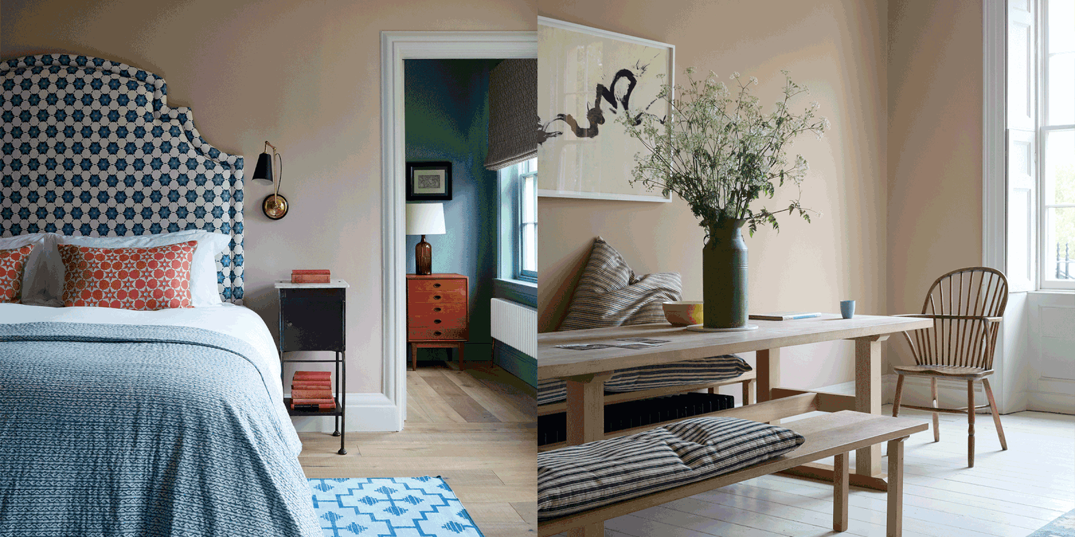
Meet The Interior Designer: Nicola Harding
Background
Having moved around a lot as a child, I’ve always been interested in creating homes which evoke a sense of place and belonging. I came into interior design slightly sideways, having first trained in garden design and working with Arne Maynard for five years. After creating several homes for myself, I was starting to be asked by friends to help them design their own homes. As such, my business largely grew through word of mouth, and my career as an interior designer has largely evolved organically.
Style & Ethos
A fundamental part of my process is understanding the personal lives of my clients. It informs me how they want their home to feel and how they want it to serve them. A sense of meaning usually comes from putting together unique collections of furniture, fabrics and craftsmanship that have a particular significance – for example, a supplier who works in a village near where a client grew up or antiques from local dealers.
Design Inspiration
Historic buildings and set design fascinate and inspire me – both evoke such a specific feeling and lots of nostalgia. I'm often inspired by the feel of place, and I love how the different physical interior elements interact to create a particular atmosphere, whether they’re in harmony or direct contrast. I’m always asking my clients how things feel – and on Instagram I find lots of inspiration by following @BibleOfBritishTaste.


Approach To Colour
I don’t have a go-to colour palette because colour is something so personal to the individual and the property. It really has the power to unlock the potential of a space and transform the mood.
Use Of Materials
I always gravitate towards natural dyes and materials. They stand the test of time, wear beautifully and improve with age. Wool is also a really interesting material to work with; it’s hard wearing, takes colour well and is inherently stain and fire resistant. It can also feel right in a contemporary or historic setting, and it is a sustainable material to work with as it’s easily recyclable.
Favourite Finishing Touches
You can never have too many lamps! They are like punctuation points in a room and a brilliant way of weaving additional colour and pattern into a scheme.
Beaverbrook Hotel, London
/https%3A%2F%2Fsheerluxe.com%2Fsites%2Fsheerluxe%2Ffiles%2Farticles%2F2022%2F01%2Finterior-profile-nicola-harding-beaverbrook-hotel-nlw_0.jpg)
I wanted to give the hotel a glamorous Great Gatsby or art deco vibe. I love the myriad tiles and textures; the playful blend of old and new furniture; the vibrant block colours and pattern; and the selection of prints, photographs and memorabilia.
We wanted to evoke a feeling of arriving at the private home of Lord Beaverbrook, who was a well-travelled man about town. With hotels you can imbue a sense of mischief, so nothing feels too formal. I sourced fabrics, furnishings, and fittings from an array local artisans and London-based suppliers, including cushion maker Penny Worrall and antiques from Howe, ironmongery by Joseph Giles and trimmings from Samuel & Sons. All of them complement the hotel’s celebration of historical London.


The bedrooms are generously proportioned and decorated to create both drama and comfort with four-poster and half-tester beds, art and antiques, opulent trimmed drapes, and bespoke rugs. While there is a common theme, each room is defined by its own rich palette of colour, pattern and texture, alongside a thoughtful collection of artwork. The contemporary Japanese restaurant and bar has turquoise lacquered walls, hand painted pinstripe panels, amber and raspberry stained glass (now a Beaverbrook trademark) and pink seating. Tables are topped with vintage matchbox covers, which were sourced from Japan. It all makes for an inviting and intoxicating setting that guests will want to return to.
Bath Townhouse
/https%3A%2F%2Fsheerluxe.com%2Fsites%2Fsheerluxe%2Ffiles%2Farticles%2F2022%2F01%2Finterior-profile-nicola-harding-bath-townhouse-nlw_0.jpg)
Originally subdivided into student accommodation, the brief was to transform this Grade I-listed Georgian townhouse and garden into a comfortable family home. The challenge was to make a grand, five-storey building feel approachable, warm and uplifting.
As the bedrooms are filled with natural light, we used similarly light, airy colours to create a serene feeling. By contrast, the lower ground floor has much lower levels of natural light, so we chose rich, dramatic colours to give the space a greater sense of identity. The hallways were very imposing, so we used a darker colour to bring the walls in and make the space feel more intimate. The colour palette repeats in different ways throughout the house to make things feel coherent.


We used a number of vintage textiles to upholster new pieces to give them a sense of history, depth and richness. We also worked closely with Howe and used a combination of antique and bespoke pieces from Vanderhurd.
The lighting in this project is very low key – there are no spotlights, but rather lots of wall lights and lamps. We wanted the spaces to feel warm and intimate, so we worked hard to bring the lighting level down; for instance, we used low hanging pendants in the kitchen to create a warm glow that would draw people into the space rather than flood the whole area with light. We also used antique light fittings in a contemporary way and included a number of industrial fittings to ensure nothing felt overly grand or intimidating.
Berkshire Country House
/https%3A%2F%2Fsheerluxe.com%2Fsites%2Fsheerluxe%2Ffiles%2Farticles%2F2022%2F01%2Finterior-profile-nicola-harding-berkshire-country-house-nlw_0.jpg)
This generous Georgian country house was completely redesigned for family living. We did very little structural work, but we did reimagine what each room was used for and how they were laid out. We reconfigured the master bedroom suite, adding his and her dressing areas, a generous master bathroom with a double shower – but we didn’t move any walls. This meant work could start quickly. We always give a lot of thought to how we can make the existing space work rather than being quick to add new additions or eliminate structures. People all too often add large extensions to old houses and neglect the pre-existing space. By making the pre-existing space work hard, the budget also goes further.
Similar to the townhouse, where the natural light levels were lower, we mainly used a stronger colour palette with lighter touches in the rooms with greater natural light. We also wanted to enhance the connection with the garden, which is why you’ll see lots of green paint tones in the rooms that looked out onto the outdoor space. We also used darker tones on the window frames to better frame the views. Upstairs, soft greys, soothing pinks and pale blues are teamed with patterned textiles to banish any sense of stuffiness. We also wanted different rooms to evoke different moods at different times of day or at different points in the year.


We mixed patterns and plains, vintage and new. To keep costs down we went for some unexpected choices such as corduroy, which is a versatile and family-friendly textile. It is tactile yet hard-wearing and less precious than velvet or mohair. We used white corduroy for the master bedroom curtains and a double-sided corduroy in an electric blue for an internal hallway curtain to keep any drafts at bay. We also used some mixed stripes for a more relaxed vibe. True to form, we used lots of lamps; many of them antiques, so that in these large spaces, we could keep these pools of light around the seating areas to make the area feel intimate and atmospheric.
Visit NicolaHarding.com
Photography by Paul Massey
DISCLAIMER: We endeavour to always credit the correct original source of every image we use. If you think a credit may be incorrect, please contact us at info@sheerluxe.com.


