An Interior Designer Shows Us Around His Home
The Property
The building is a Victorian mansion block; I was drawn to the amazing location, sandwiched between two parks; it was one of the few properties on the road that had been divided into flats. It had strong architecture and great views from all of the rooms.
That said, the property was really run down (the previous owner had rented it out long-term), and while it had some salvageable features, it required a complete makeover. Luckily, there wasn’t any major structural work to be done, apart from opening up the space. We did this by adding a large, glazed partition between the kitchen and living room. Now it also has two bathrooms and two bedrooms – one of which is used as a dressing room.
The Colour Palette
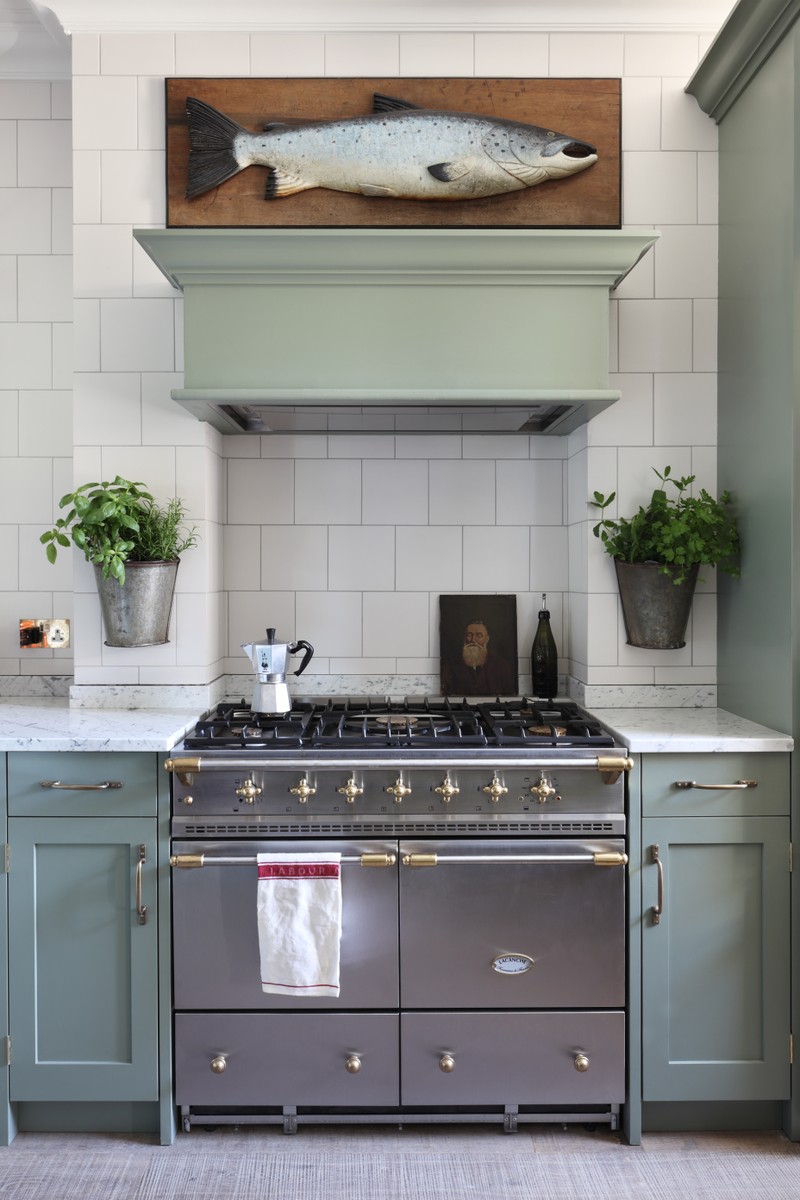
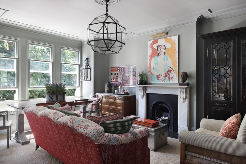
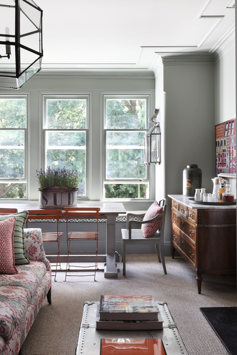
The apartment had so much natural light thanks to the large windows – it allowed me to be bold with the colour scheme, which created a great atmosphere within the property. I used a palette of complimentary colours throughout, starting with Pigeon by Farrow & Ball in the living room. I wanted something lighter in the bedroom, but with a similar feel, so I chose Hardwick White. In the kitchen I wanted an even lighter feel – so I used Brilliant White by Dulux but chose darker greens for the cabinetry (Card Room Green by Farrow & Ball) and antique dresser which tied everything together.
The Kitchen
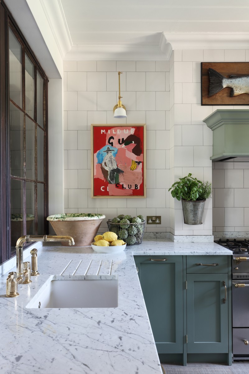
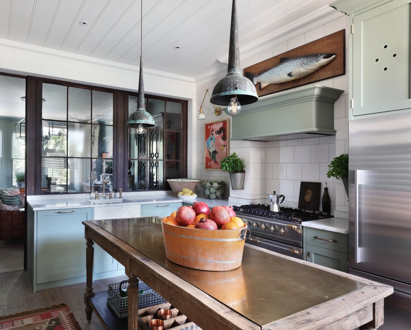
Kitchen design is an integral part of our business, and something I’m really passionate about. For my own home, I designed the kitchen and our in-house team installed it. The antique drapers table works as an island. Originally, it quite wasn’t tall enough (I’m 6ft 5in, so needed some extra height) so I had some antique castors added to raise it up, which was also great from a practical point of view. I wanted to add a bit more edge and practicality to the piece without using marble, so I had a custom piece of unlacquered brass sheet made, which we inlayed into the top. I found the lights above the island at an antiques fair.
The tiles are a very simple matte glazed finish – similar ones are available from Fired Earth. I love Liebherr fridges for their utilitarian, simple design, and Lacanche cookers – they have some great colours and I love the metal finishes. Waterworks are good for kitchen taps – I like the RW Atlas range. For china, I love Miranda Berrow mugs and Laguiole cutlery.
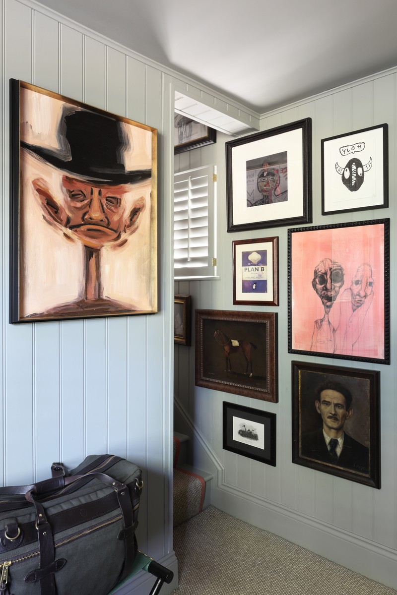
The Artwork
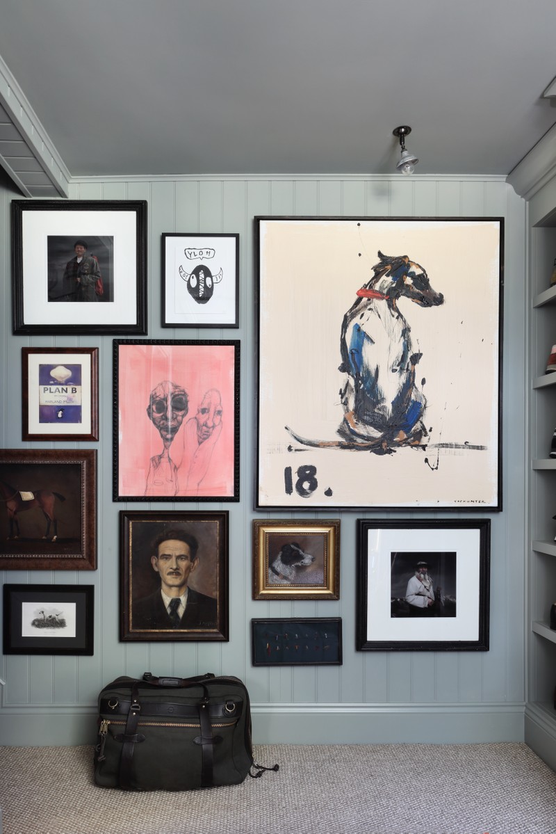
I am a huge art collector, and try to source pieces regularly. When travelling, I often seek out exhibitions and galleries and through my work as a designer for HÁM, I’m always looking for pieces in antique shops and flea markets. We recently launched an online store where we source and create artwork. Favourites in my own collection? The earlier work of Sidney Teodoruk (formerly known as Brad Teodoruk) is hard to beat.
Remember, the framing is a really important part and shouldn’t be underestimated. It’s a great way to add colour and texture, and I always use a mix of materials, pairing antique frames with sharper more contemporary styles to create an eclectic feel. We always use picture lights in our schemes where we can – it’s a great way to add ambient light and to pick out the detail and colour in paintings. Other times, we use a ceiling-mounted directional spotlight from the ceiling to flood the picture with light.
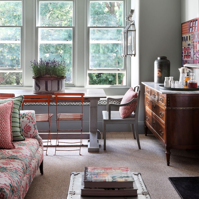
The Living Room
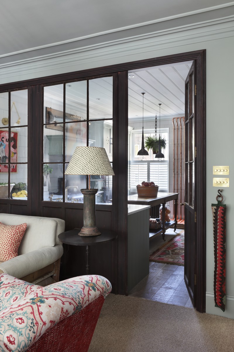
In the living room I wanted to create a feeling of more space by using glass partitions; I found a collection of old glazed panels at a reclamation yard. They were originally used as part of a shop front and we adapted them in our workshop to fit the space. I then had them hand painted in a distressed finish to keep some of the character.
The ceiling light is by an American company called Circa Lighting, which is available on our online store. The dining table is something I’ve had for years, and I had the base made and painted to fit an old farmhouse top that I’d been storing for ages. The armoire is a great bookcase and whisky cabinet – it was from a really cool Dutch supplier which used to produce great antique reproductions – sadly they’re no longer around. The antique chest of drawers in the living room is from one of our favourite dealers, Jorge at Brownrigg. In terms of fabrics, the sofa fabric is William Yeoward, the window seat is Christopher Farr and I used Fermoie cushions, too. I’m surrounded by cool fabrics in our studio and often like to change up the cushions.
The Bedroom & En Suite
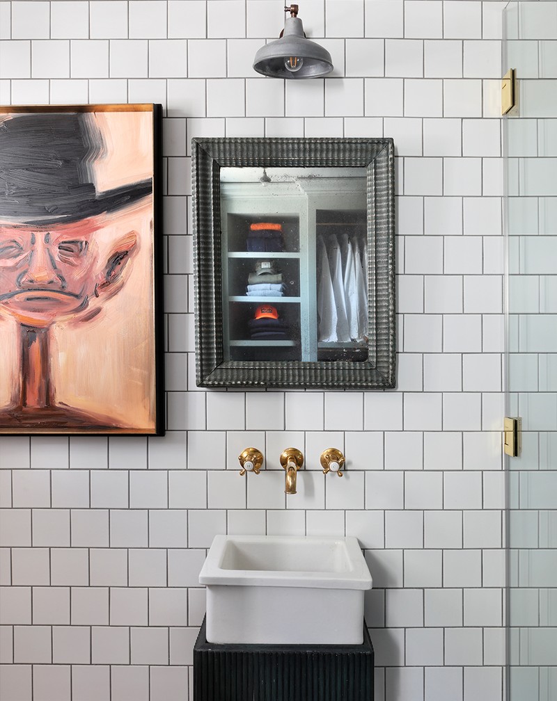
I wanted to create a cool, calm space where the bedroom was connected to the bathroom. The ceiling heights are very high, which allowed us to build a three-quarter height wall between the bathroom and bedroom with an opening with no door on it. This improved the feeling of light and space in the small bathroom, as well as allowing for views of the reclaimed vanity and antique mirror from the bedroom.
I love the subtle detail that tongue and groove gives to a space, and in the bathroom, I love the depth of colour in the shower tile against the texture of the marble sink and reclaimed vanity.
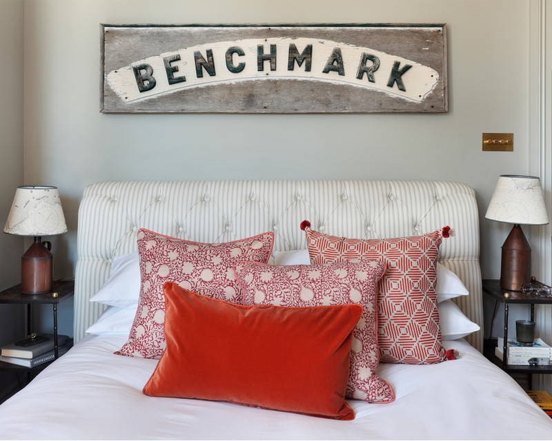
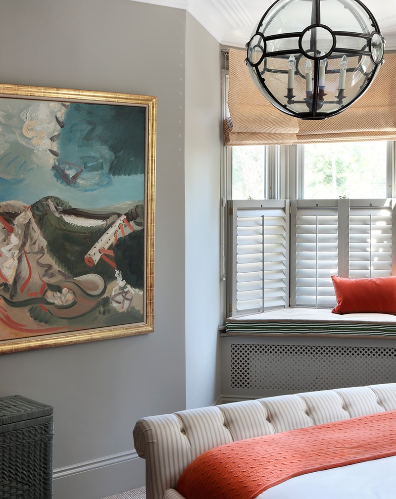
The bed is from Soho Home – ticking fabric is part of our company’s DNA, which explains why I was drawn to this piece. I used two globe lanterns from JAMB, in the bedroom and bathroom. The large painting is by Maurice Cockerill, a well-known British artist. I love his use of colour. The trumpet piece is by David Shrigley, and the sign above the bed is a reclaimed piece I bought in Somerset.
The Dressing Room
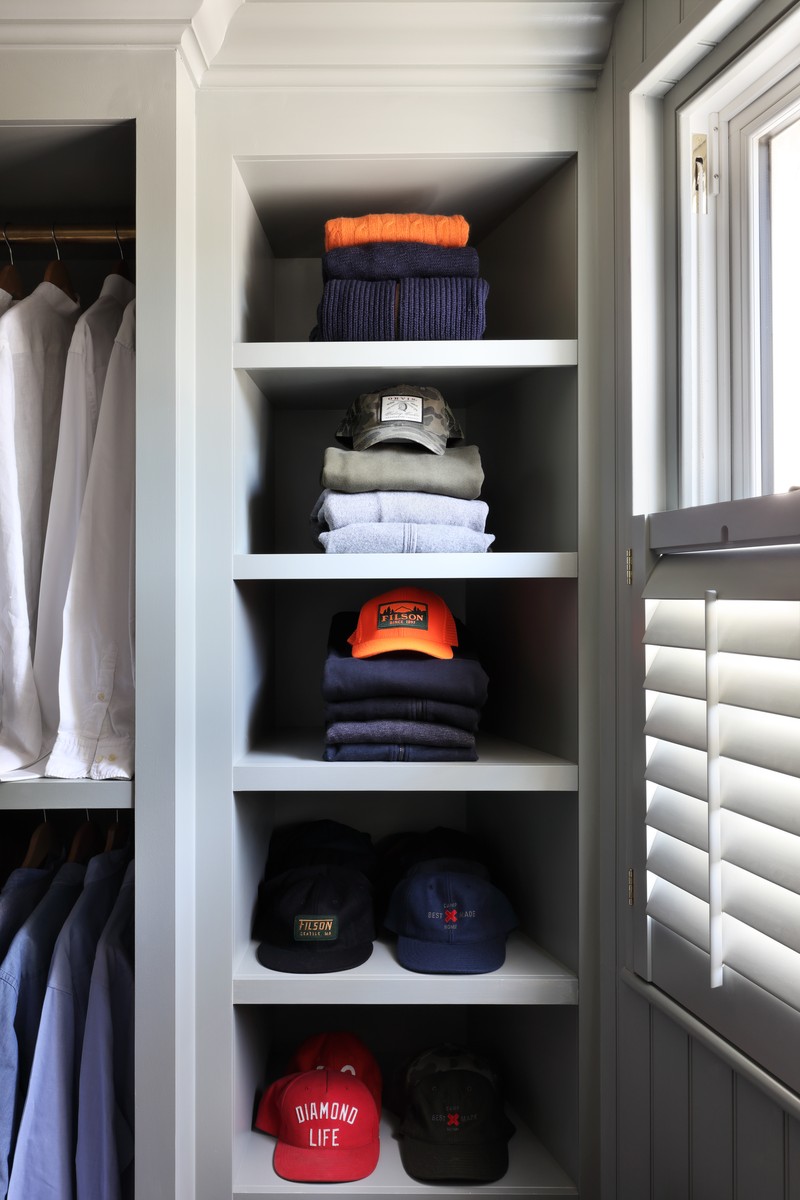
When designing joinery in a small space I always take it right up to the ceiling, but incorporate the same skirting details around the base of the units, which helps it feel part of the room. I also painted the walls, windows, ceiling and joinery in one colour which unifies the space; this is important because you rarely look at a piece of joinery, but rather the room as a whole. It was also a great place to display some of my ever-growing art collection...
Visit StudioHÁM.co.uk to explore the shop and visit HÁMInteriors.com for the interior design studio.
Photography by Alexander James & Styling by Ali Heath
INSPIRATION CREDITS: Alexander James; Ali Heath
DISCLAIMER: We endeavour to always credit the correct original source of every image we use. If you think a credit may be incorrect, please contact us at info@sheerluxe.com.
/https%3A%2F%2Fsheerluxe.com%2Fsites%2Fsheerluxe%2Ffiles%2Fwebsite-images%2F2025%2F03%2Fsign-up-pop-up.jpg?itok=zlMvamfa)