Look Around This Cool London Apartment
The Property
The property is a Grade II-listed Georgian townhouse in one of Marylebone’s private squares. Through many different renovations over the years, the property had lost a lot of its character, with each refurbishment stripping more of its original features. The very few Georgian features that remained had become damaged and needed restoration.
Our client purchased the central apartment, with the highest ceilings, so it benefits from a lot of natural light and a view of the square below. We did a full renovation and refurbishment of the property, taking it back to its structure to reintroduce the character and grandeur such a property would have traditionally had. There are now two double bedrooms – a large master en-suite and a guest double bedroom – and a study that can be transformed into a guest room or nursery in the future.
The Brief
The client is a busy investment banker. He was single at the time, so the property had to reflect his nomadic and international lifestyle, while providing flexibility for the future and starting a family there. He wanted an easy, warm home – his pied-a-terre when in town – where he could spend time with friends and family. Welcoming and convivial, it needed to allow him to entertain without much preparation.
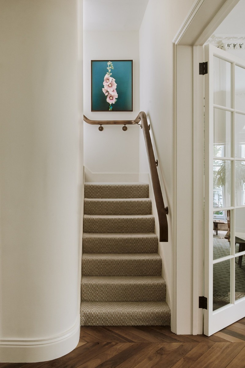
One of the key goals was to work within the design principles of Georgian architecture, including creating a hierarchy between the rooms and their features. By reintroducing the original architectural details, we were able to breathe new life into the property and add back the character that had been lost over time.
The walls and ceilings have traditional features, such as skirtings, mouldings, cornicing and ceiling roses. They provide a neutral yet ornate blank canvas for the client’s art collection. We wanted to use natural materials for all other elements, in calming tones, such as a reclaimed smoked oak floor, light marbles, Danish cord, wools and linens. All the pieces used in the apartment have taken inspiration from nature – from the timber selection to the veining in the marble.
As every project is unique, we always anchor our projects in a strong narrative to drive the design, often taking inspiration from the surrounding landscape, hidden architectural details and history of a space. It’s a golden thread that weaves through all aspects of the design, all the way down to the furniture and accessories. Here, we created a narrative about a British man who purchased the property for his French mistress. It’s actually quite close to the original story of the first properties on the square, which was amusing.
The Living Room
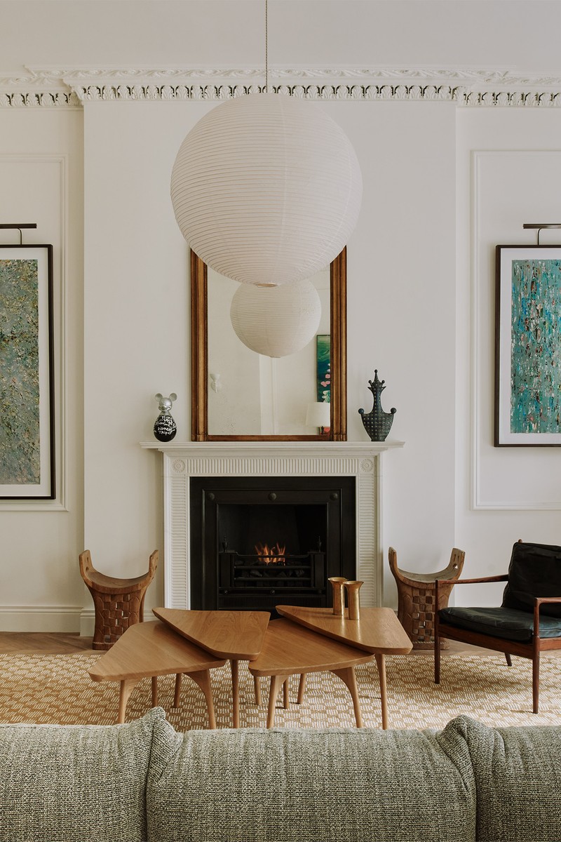
This is the main entertaining and ‘gallery’ space. In the living room, the cornicing was badly damaged – many sections were broken and layers of paint had been added through various renovations which detracted from the intricate pattern. A specialist plasterer created a mould from the best section, which enabled us to replace others like for like. The delicate leaf details had to be installed one by one. It was a painstaking process which has had an incredible result. A large ceiling rose in the living room brings the space to life, highlighting the generous height of the room. The central focal point is the fireplace – this was another detail that had been removed over time. We selected a Georgian design with a marble surround, grate and fire basket. The contrasting marble hearth can be seen as a more contemporary detail, grounding the fireplace in a more modern era.
FLOOR: Reclaimed timber
WALLS & CEILING: Pointing, Farrow & Ball
PLASTER CEILING ROSE: Stevensons of Norwich
ARMCHAIR: Easy Chair designed by Ib Kofod Larsen (1960) from Dagmar
SOFA: Marenco designed by Mario Marenco (1970) from Arflex
STOOLS: Wooden Carved Stool from M.A.H Gallery
RUG: 5689 by Lila Valadan
BLINDS: Pierre Frey
BENCH: Design by Hans J. Wegner for Johannes Hansen from Modernity
PICTURE LIGHT: John Cullen
TABLE LAMP: Laura Gonzales from Invisible Collection
ARTWORK: Tim Braden & Luke Elwes
The Dining Room
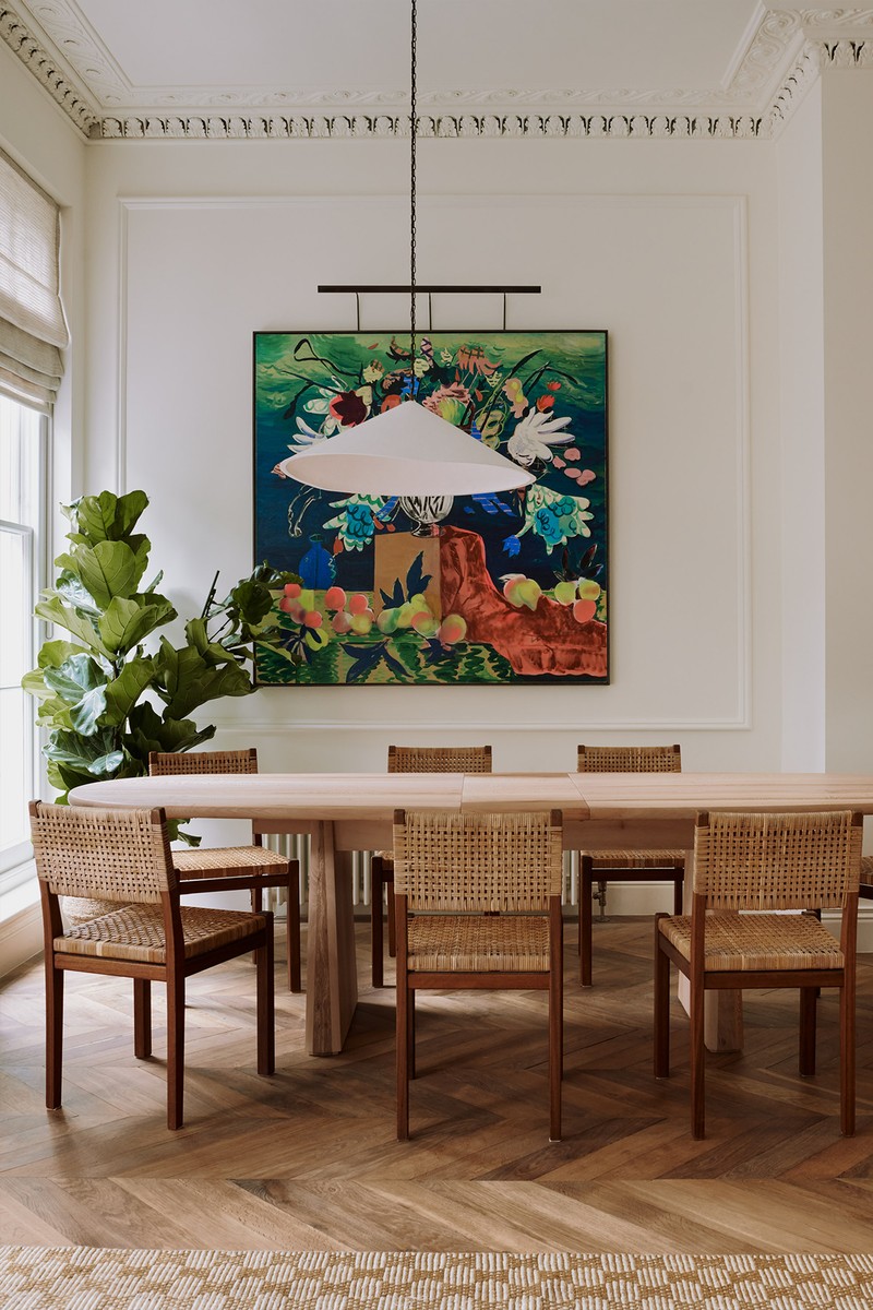
This space is a continuation of the living room. It’s a relatively small area with a bespoke extendable dining table to cater for small groups or large dinner parties. The dining table was specifically designed for this room, made from London plane timber that was crafted in the city. It has been perfectly paired with these chairs created by Aino Aalto in the 1950s. On the wall behind is an eye-catching artwork by David Price. This statement piece offers a beautiful contrast to the simple white walls – again, we used a neutral colour palette to really show off our client’s striking art collection.
TABLE: Bespoke design by Pirajean Lees
PENDANT LIGHT: Wobble by Alexandra Robinson from The New Craftsmen
WALL SCONCE: Hilary Sconce by Stephen Antonson at Invisible Collection
PLINTH: Vintage Smoked Italian Mirrored Plinth, M.A.H Gallery
SCULPTURE: M.A.H Gallery
DINING CHAIRS: Designed by Aino Aalto from Modernity
ARTWORK: David Price
The Kitchen
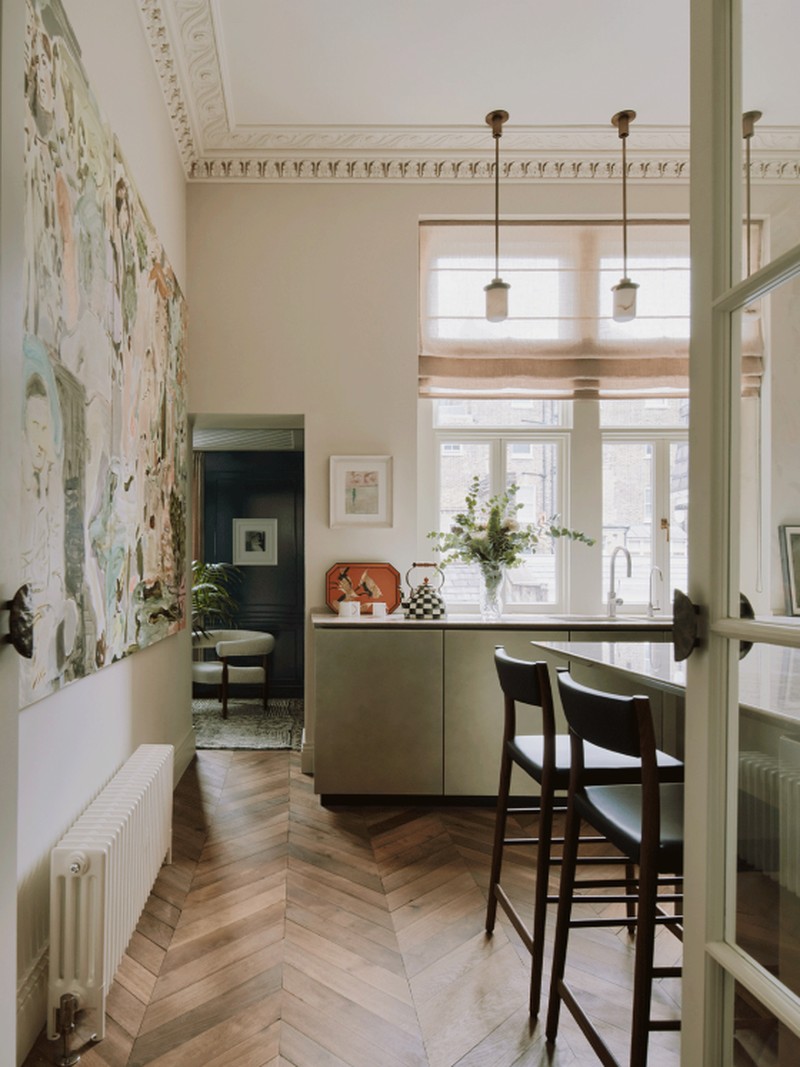
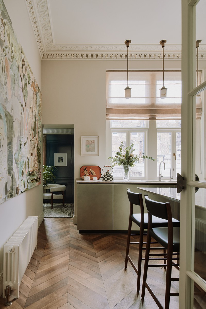
We wanted to design a room that didn’t feel obviously a kitchen. The same mould from the living room was used to create a new cornice which had been completely removed. As the room is fairly small, it needed to be functional, with as much storage space as possible – so we moved all the main appliances out of sight, behind the island or the bespoke doors. The finishes are a mix of timber, marble and metal. The client loves to cook and entertain, so his guests can gather around one side of the island, where they can all chat while he’s busy on the ‘prep’ side.
FLOOR: Reclaimed timber
KITCHEN UNITS: Boffi
BAR STOOLS: Avery Bar Stools, Pinch
PENDANT LIGHT: Soren Light, Pinch
ARTWORK: Adam Jeppesen, Tomo Campbell and Davina Jackson
The Guest Cloakroom
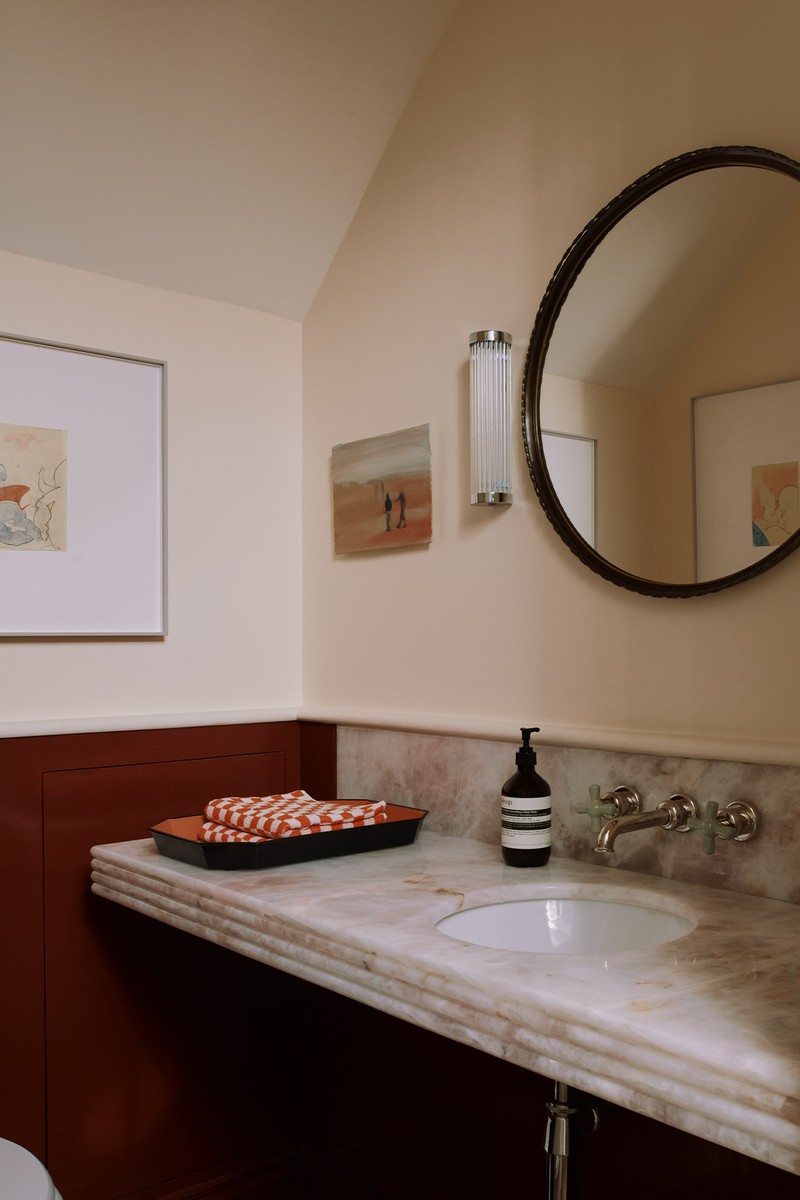
We wanted to create a little gem of a room, with the bespoke pink quartz vanity, beautiful taps from The Water Monopoly, red panelling and artwork.
TAPS: Rockwell, The Water Monopoly
VANITY UNITY: Bespoke design by Pirajean Lees
WALL LIGHTS: Original BTC
The Main Bedroom
Simplicity was key in the main bedroom, which needed to be a calming, airy space to showcase artwork and store clothes. The materials are lighter, again to emphasise the great natural light. By keeping the tones neutral, we could add plenty of interest with texture, like on the headboard.
BLINDS: Pierre Frey
BED: Overtime by Ivano Redaeli
PENDANT LIGHT: Anders Light, Pinch
WALL LIGHTS: Apparatus
ARTWORK: Adam Jeppesen
The Main En-Suite Bathroom
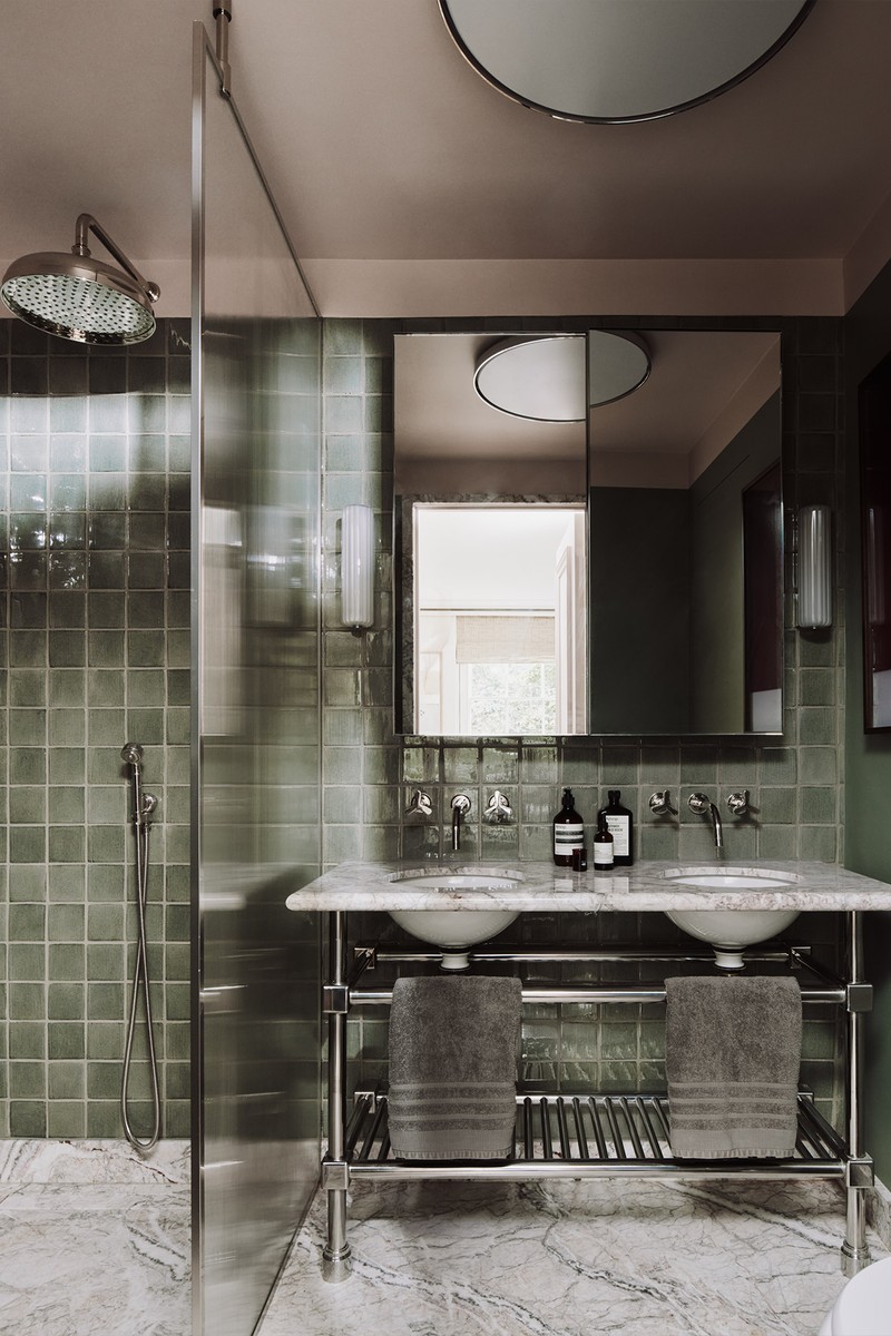
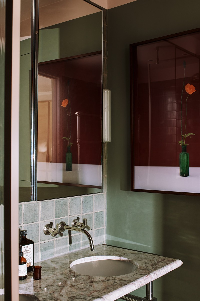
The calming tones continue with this nod to nature – green tiles and a marble floor create a grounded, soothing space which blends the traditional with the modern, masculinity with femininity. The wall features bespoke green hand-painted tiles, balanced by the pink ceiling to emphasise the height of the room.
VANITY & BASIN: Bespoke vanity by Pirajean Lees, basin from Alape
TAPS: Anika, The Watermark Collection
WALL LIGHTS: Zeppelin, Hector Finch
The Guest Bedroom
We wanted this room to be a neutral sanctuary, where guests felt instantly welcome and comfortable. It’s all about texture and nowhere is this more evident than in the headboard. Chunky weaves on the rug and blanket give it plenty of character, without interfering with the clean lines and calmer elements.
HEADBOARD: Bespoke by Pirajean Lees
WALL LIGHTS: Apparatus
SIDE LIGHTS: Derome, Pinch
BLINDS & CURTAINS: Pierre Frey
WARDROBES: Custom design by Pirajean Lees
The Guest Bathroom
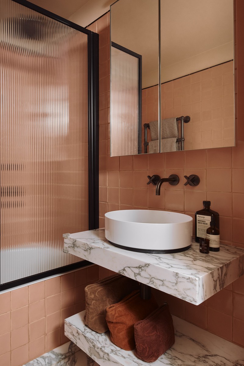
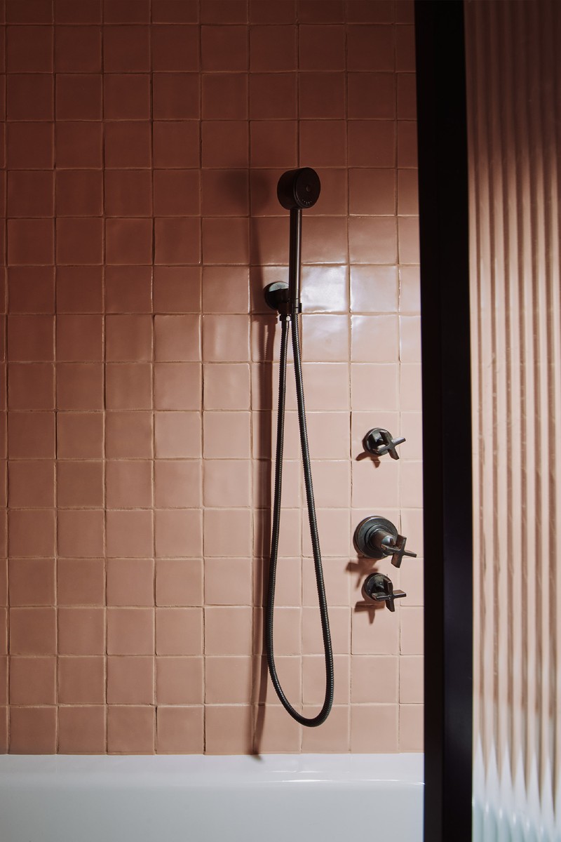
Like with the other en-suite, this bathroom is a welcome pop of colour, and like the main bathroom, it’s a play on masculine versus feminine, and more playful with colour – specifically pink with black accents and dark bronze fittings. There’s a real focus on materiality from the reeded-glass shower screen to the veining in the marble of the floor and vanity.
TILES: Blush Tiles, New Terracotta
TAPS: Brooklyn, The Watermark Collection
VANITY & BASIN: Bespoke vanity by Pirajean Lees, basin from Alape
ACCESSORIES: Toiletry cases, Lalla
The Study
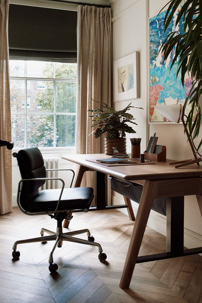
This is a room that can be transformed into a smaller guest room or nursery in the future. It follows the neutral design principle of the main bedroom to provide plenty of flexibility in terms of use and style.
BLINDS: Pierre Frey
DESK: Sage Sit-Stand Desk, David Rockwell at Benchmark
CHAIR: Eames Soft Pad Chair, Vitra
DESK LAMP: Armitage Desk Lamp, Joe Armitage
ARTWORK: Cat Roissetter
Visit PirajeanLees.com
Photography by: Michael-Sinclair.com
DISCLAIMER: We endeavour to always credit the correct original source of every image we use. If you think a credit may be incorrect, please contact us at info@sheerluxe.com.
/https%3A%2F%2Fsheerluxe.com%2Fsites%2Fsheerluxe%2Ffiles%2Farticles%2F2023%2F07%2Fsl-pirajean-home-tour-living-dining-area-full-bleed.png)
/https%3A%2F%2Fsheerluxe.com%2Fsites%2Fsheerluxe%2Ffiles%2Farticles%2F2023%2F07%2Fsl-pirajean-home-tour-master-bedroom.png)
/https%3A%2F%2Fsheerluxe.com%2Fsites%2Fsheerluxe%2Ffiles%2Farticles%2F2023%2F07%2Fsl-pirajean-home-tour-guest-bedroom-full-bleed.png)
