Take A Look Around This Fresh & Fun Country Cottage
The Vision
Charlotte’s Folly was an opportunity to create a home brimming with personality and drama. The quirky character of the property allowed for some interesting spatial planning and we made various structural changes to provide better flow through the small space. The rooms have been changed on the ground floor to feel more open plan, while log burners have been reintroduced throughout to create a cosier atmosphere. Knowing it was destined to be a short-term rental property, we wanted to create that notion of ‘experience’ – turning it into a fantasy world that felt separate from the day to day. There are plenty of unusual and colourful details throughout – I’ve used lots of wallpaper to create whimsical scenes and vignettes, and really embraced the small spaces where possible. This, paired with beautiful fabrics and antique furniture, has helped create that unique, inviting space.
/https%3A%2F%2Fsheerluxe.com%2Fsites%2Fsheerluxe%2Ffiles%2Farticles%2F2022%2F08%2Fsl310822-emma-ainscough-house-tour-1.jpg)
The Property
The house dates back to the late 1880s, and it hadn’t been touched for many years – it was in dire need of an overhaul. Everything was incredibly run down so we stripped the entire house back to its bones, which gave me a relatively blank canvas in terms of the design.
The ground floor layout was very pokey, so we opened up the dining room, kitchen and living room, which now run seamlessly together. We also took out some of the chimney breasts and reinstated open fireplaces and log burners throughout.
The first floor had three bedrooms, as there are now, but the proportions were very small, so we set about moving doorways to improve the layout. There was just one family bathroom upstairs, which again we changed the layout of, and we added an en-suite to the first bedroom.


The Brief
The brief was to create a spectacular home-from-home rental which felt high end and beautifully curated, without being too formal or precious. The client was keen to inject plenty of character personality, so colour and pattern played a huge role in the design.
Antiques only added to the charm – for me, there’s nothing like a piece of furniture that has a history and tells a story. These pieces were crucial in creating a home that felt lived in and reflected the history of the area. Using one-off finds also helped with the budget; there are areas which needed big-ticket items, but others could make do with antiques and vintage pieces.
The real challenge was to make each room characterful in its own right and create special moments throughout the house. At the same time, I wanted to ensure the whole thing didn’t feel overwhelming and that everything sat cohesively together, so different colour palettes had to translate well throughout. Often, the schemes were anchored by the walls – hence the use of lots of wallpaper to pull out the colours and complementing patterns.


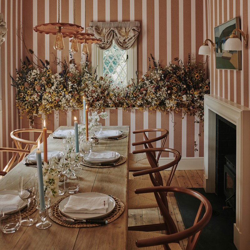
The Dining Room
This room was always going to be striped – at least in my mind. Originally, I was going to panel the entire space in tongue and groove, and paint the alternate boards, but from a construction point of view it got too complicated, so we compromised on Hamilton Weston's Brown Paper Stripe in ‘Off White’ which felt like a wonderful backdrop for everything else going on. I especially love the variation in the thickness of the stripe. I also played with tones and textures rather than introducing more colour. I collaborated with Claire Wyon of Myrtle Fox & Maude to create the dried flower installation – the dining room was somewhere we could introduce some real drama and these flowers were the perfect way to do it.
The artwork above the fireplace is a vintage piece sourced via Tarn London. I love how the subtle colours feel at home on the wallpaper. The wall light is from Soho Home, the dining table is a Lorfords antique, while the wishbone chairs and pendant lights are from Straw London.

The Kitchen
I reconfigured the layout of the kitchen to make it more functional, with one stretch of units housing the oven, sink and storage, and a central island for prep. There’s a pantry housing the fridge/freezer, dishwasher, washing machine, larger sink and additional storage. The kitchen isn’t that big, so it was a challenge to fit everything we needed. It was designed by me and made locally in Shropshire. The wall units are painted in Farrow & Ball ‘Yonder’ and the island is painted in ‘Eating Room Red’, with a solid oak top. The ironmongery is from Mark Lewis, the tiles are from Grestec Tiles and the tap is Perrin & Rowe. The pendant above the sink is a vintage French glass shade, and the artwork is also antique, mounted on walls painted in Farrow & Ball ‘Slipper Satin’.
/https%3A%2F%2Fsheerluxe.com%2Fsites%2Fsheerluxe%2Ffiles%2Farticles%2F2022%2F08%2Fsl310822-emma-ainscough-house-tour-7.jpg)

The Living Room
With so much colour and pattern in the adjoining spaces, I kept the living room calm. To differentiate it, I played with textures rather than introducing too much more. I worked with different shades of blue to create a relaxing atmosphere and the cream bouclé sofa from Arlo & Jacob gives the space warmth. We reinstated the open fire (adding a bespoke mantel) and I added a pair of fireplace fenders for extra seating. The armchairs are French antiques, which I reupholstered in a blue velvet from Hackney Draper, and I curated a collection of artwork from various antiques markets and online stores, many of which were reframed. The large-scale photography above the fireplace is by Tom Allport and the wall lights are from Nocturne Lighting. The slipper chair is antique and recovered in Soane’s Osmunda Frond in Azure, while the coffee table is from Dorian Caffot de Fawes and the cushions are by Eldorado Studio and Katy Takla.

The First Bedroom
None of the bedrooms were supposed to jar with one another. With it being a rental, neither did I want to create a master bedroom – I wanted each one to feel special in its own way. The first bedroom is the simplest. I wanted to use pattern but to keep it feeling beautiful and sophisticated. We reinstated a log burner for the ultimate cosy bedroom experience, with a beautiful marble top dressing table and antique mirror above. The headboard fabric is the main statement – a floral design with a traditional vibe – and the fabric is Pierre Frey Le Manach Palmyre Bis 1. The walls are painted in Farrow & Ball ‘Dimity' and the wall lights are Vaughan with Rosi de Ruig shades. The bedside tables are antique, and the pressed flowers are by Rosannagh Stratton (via @CloveAtHome on Instagram). All the bedding is from The White Company, dressed with cushions by Rebecca Udall.


I also panelled the walls and ceiling in tongue and groove panelling, before painting them in Edward Bulmer ‘Milk White’, and because the space was tight we used a bath with a shower above to save on space. All the sanitaryware is Burlington Bathrooms and the bath has been painted in Farrow & Ball ‘Olive’. The bespoke shower curtain was designed by me using fabric from Aleta and the mirrors are antique. The wall lights are Rose Uniacke Spot Wall Lights in ‘Black’ and the side table is from Zara Home. The striped vase is from Petersham Nurseries.

The Second Bedroom
This room is very long but I knew my client wanted to use as big a bed as possible. The only way to do that was to embrace the small space and make a feature of it. I used a super king-sized bed and created a ‘nook’ by adding a dividing wall with an arched opening, so the bed was fully set back. I wallpapered that area in Howe’s Folies Bergere ‘Ribbon’ paper to make it feel magical and added a tented ceiling for a whimsical vibe. The idea is that, as you go through the dividing wall archway, you climb into bed from the end, rather than walk around the side as usual. It’s a bit different.
There was also a chimney breast we had to work with, so I added in-built shelves to a dead-space alcove above to make this part of the room more functional. We also put a free-standing log burner at the other end, and there’s a vintage dressing table and stool. The wall lights and star pendant are both from Vaughan, the dressing table is vintage, sourced on Vinterior, matched with a stool from Ceraudo.


The Third Bedroom
This is probably my favourite room. When I first saw the property, it was incredibly dark – it has low ceilings throughout but most of this room is in the eaves, leaving little choice but to have a pair of single beds either side of the window. I wanted to embrace the low ceilings and brighten up the space by using a wallpaper all over the walls and ceilings, and preferably a busy pattern to really make an impact. I have loved Living Quarters designs since they launched last year and this was the perfect space for their ‘Creeping Toadflax’ paper. I pulled out the green and pink tones in the woodwork, which is painted in Edward Bulmer ‘Pea Green’, the blind which is Sibyl Colefax & John Fowler’s ‘Squiggle’, and the bedlinen by Sophie Conran which has a scalloped green edge. The dressing table is vintage from eBay, and I had it reupholstered in a green stripe from The Cloth Shop, with a bespoke matching stool.
I wanted to make these beds feel special, so I spent a long time looking for these wonderful antique bed frames; I added the upholstered panel to the headboard to brighten them up slightly. The ceiling pendant light is also antique, sourced on Instagram, and the wall lights are Vaughan, with shades by Rosi De Ruig. The dressing table mirror is antique, and the table lamp is from Soho Home.


Family Bathroom
This bathroom was small, but my client felt it was important to include a free-standing bath and separate shower, so we had to make it all work. The layout had a slight L-shape, so I introduced an extra wall with an archway to conceal the shower area, thereby squaring off the rest of the room. I tiled the shower area in Pinstripes Blue Porcelain by Your Tiles, essentially creating a wet room within that section.

The main area of the bathroom is panelled in tongue and groove (painted in Farrow & Ball ‘Pointing’) with a striped wallpaper above – Farrow & Ball ‘Closet Stripe’. The wall lights are Schwung Odyssey Wall Sconce in Natural Brass and the artwork above the bath is a series of antique prints which I had framed. The fun pink and white checkerboard floor tile formation (from Bert & May x Fired Earth) gives the space more character and drama.
Visit Emma Ainscough & click here to arrange a stay in Charlotte’s Folly.
Photography by Christopher Horwood
DISCLAIMER: We endeavour to always credit the correct original source of every image we use. If you think a credit may be incorrect, please contact us at info@sheerluxe.com.
/https%3A%2F%2Fsheerluxe.com%2Fsites%2Fsheerluxe%2Ffiles%2Fwebsite-images%2F2025%2F03%2Fsign-up-pop-up.jpg)
