Meet The Interior Designer: Taylor & Turner
Our Background
Harriette graduated from London College of Fashion and after a brief stint in the fashion industry, moved across to interiors. After working for Todhunter Earle and the development firm Finchatton, she set up independently. Anneke, meanwhile, went to Inchbald School of Design, having started her career working in marketing for luxury interior design brands, de Gournay and Alidad. Despite having many mutual friends, we actually got to know each other through the industry and initially collaborated on a large project. It was such a success and we worked so well together that we decided to formalise the partnership, setting up in an official capacity under Taylor & Turner in 2017.
Style & Ethos
Our general ethos is that good design should be timeless and it should last – that’s the bottom line. We don’t follow trends and we believe everything we create should be both aesthetically and practically pleasing. The majority of our projects are residential, for private clients, and it’s important to us that each and every home should be tailored to the individual we’re designing for, reflecting their personality and style as much as possible, while also being practical and functional – rather than feeling ‘interior designed’.
Colour, Pattern & Materials
In terms of materials, we always try to use those that feel authentic to the space. For example, working on an older house or home calls for beautiful timbers, marbles and authentic colour schemes. If we’re working in a more modern space, we have a bit more scope to use more contemporary materials and finishes. Wherever we can, we try to use natural and sustainable materials, as well as non-toxic paint and finishes.
There’s certainly a signature Taylor & Turner colour palette that runs through all our projects. We’re quite often drawn to the celadon blues, running through to the teals and malachite greens. It’s that contrasting, and possibly unexpected, colour that often creates the essential ‘pop’ in a room to bring it together.
We’re advocates of creating a timeless ‘base’ in any room, then layering up with fabrics and furniture, and adding unexpected colours through decorative items such as cushions and shades. It really helps bring a room to life and ensures that nothing feels overdone.
We love pattern – it stops a room feeling flat. We start from the bottom up. There will always be the linchpin ‘plain’ fabrics – albeit a mix of different textures to add depth – and then we layer patterns on top to bind the scheme together. We also introduce pattern through wallpaper, and appreciate how doing so can fundamentally change an entire space; putting a bold pattern in a small space opens it up and makes the whole room feel bigger.
/https%3A%2F%2Fsheerluxe.com%2Fsites%2Fsheerluxe%2Ffiles%2Farticles%2F2023%2F02%2Ftaylor-turner-eclot-house-living-room.png)
01
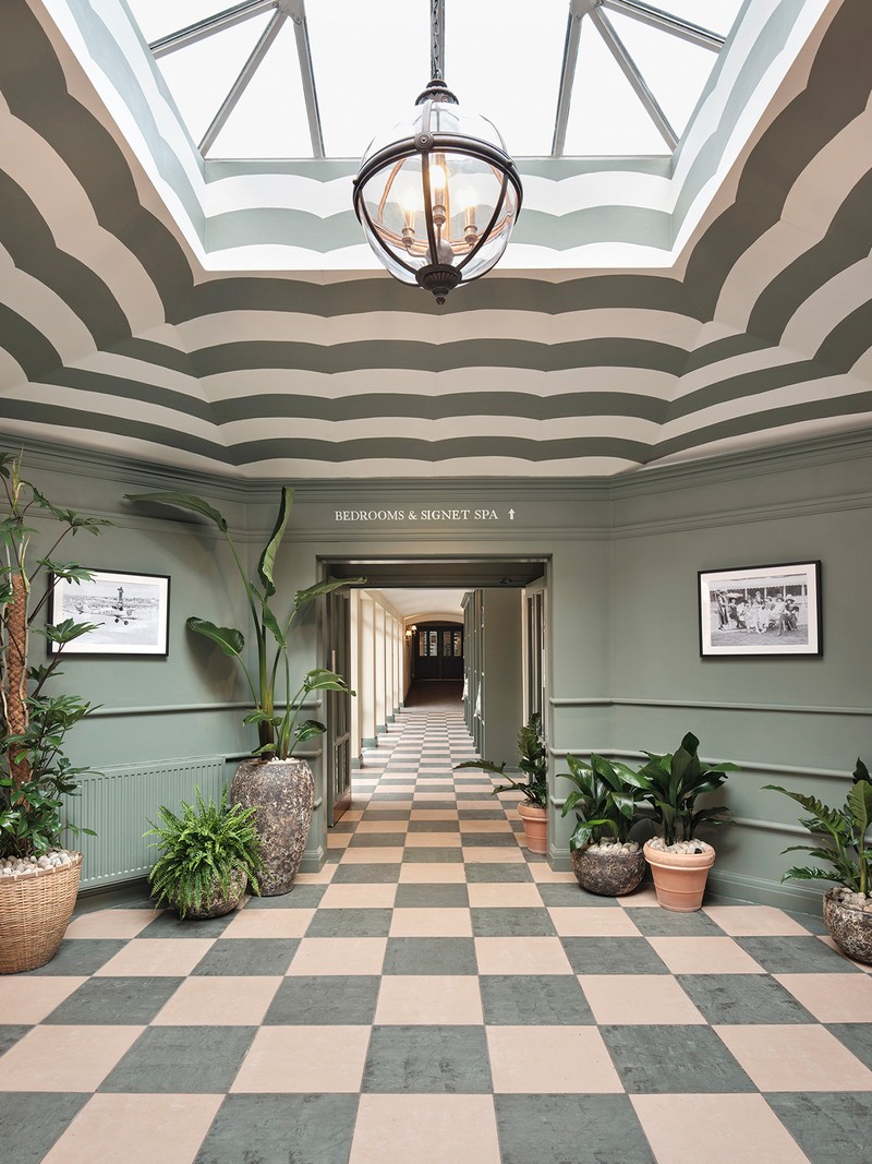
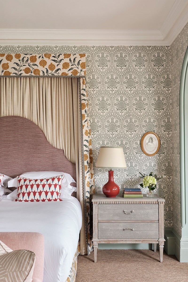
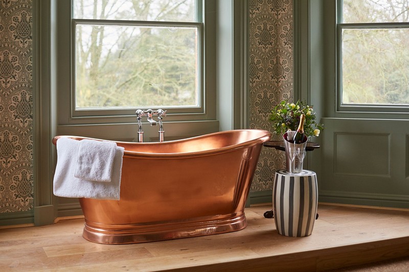
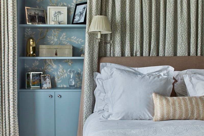
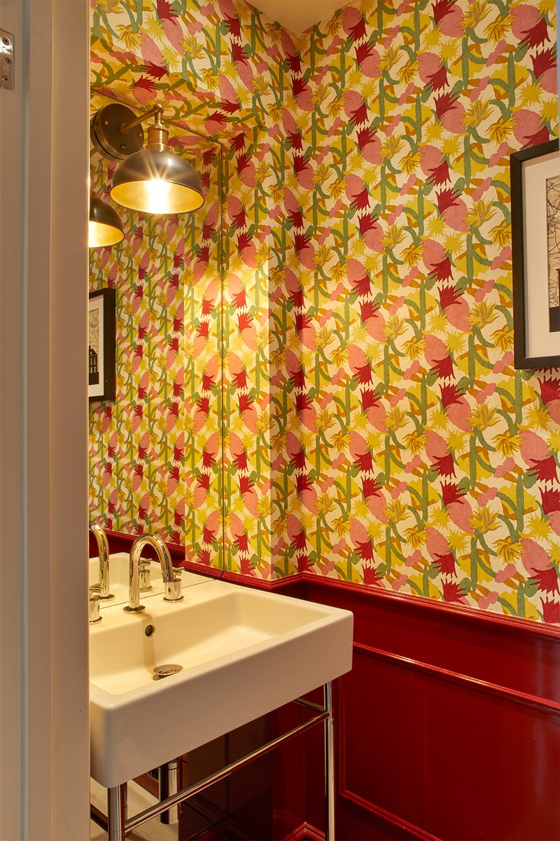
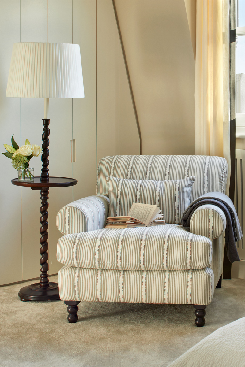
Country Boutique Hotel
This beautiful boutique hotel, called The Retreat at Elcot Park, sits in the rolling hills of West Berkshire. It is the second hotel for the Signet Group after The Mitre in Hampton Court. The main property is a beautiful Georgian country house. It has two restaurants, along with 55 bedrooms, including three large suites, and was designed to be an escape.
Our brief was to create a hotel which felt like a beautiful country home with an unexpected touch here and there. Signet gave us considerable scope to use colour and pattern, which allowed us to create a playful aesthetic that was still in keeping with the fabric of the building. It was a fantastic brief, with the freedom and scope to create something really special.
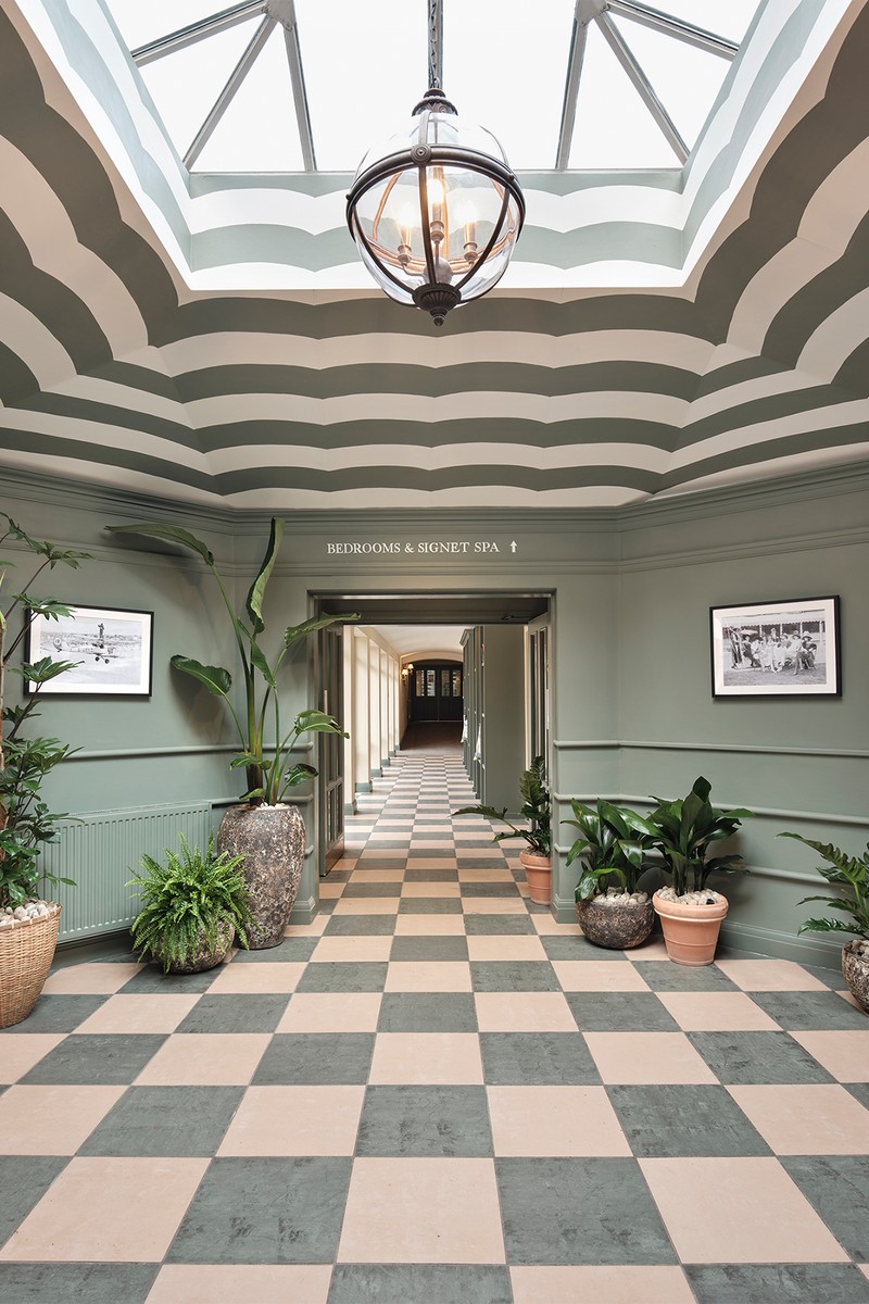
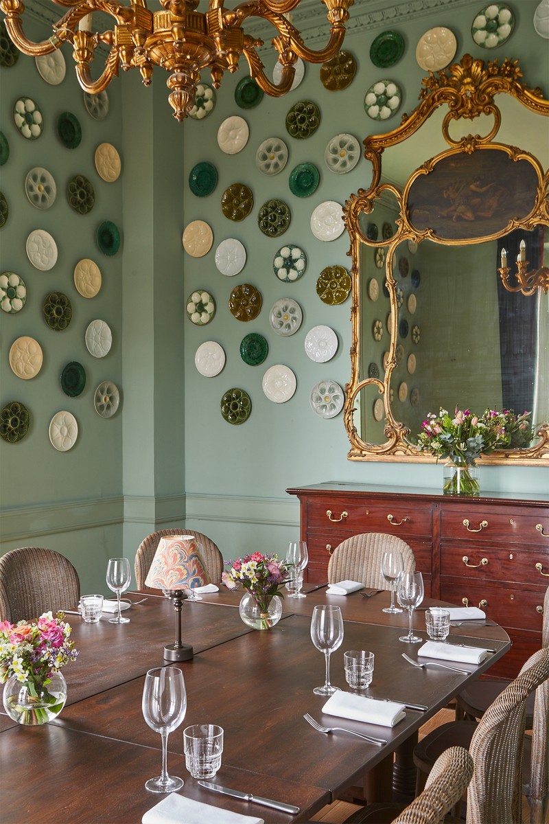
Our approach was to create spaces that tell a story and have a strong identity. We also worked with some lesser-known suppliers as we wanted to use fabrics and papers which hadn’t been seen before. We really wanted it to be a space where you could feel as comfortable in trainers and jeans as you could dressed up.
Signet is known for its love of colour and pattern, so colour was the starting point for most of the schemes – either through a bold wallpaper or a particularly special fabric. Furniture-wise, we mixed bespoke pieces with antique finds to give depth. We also used low-level lighting almost everywhere; wall lights and table and standing lights create a relaxed and intimate atmosphere.
/https%3A%2F%2Fsheerluxe.com%2Fsites%2Fsheerluxe%2Ffiles%2Farticles%2F2023%2F02%2Ftaylor-turner-bedroom-eclot-house-landscape.png)
02
Kensington Family Home
This was originally a shared house for four boys in their 20s, so it needed a full overhaul to transform it into a family home. There was plenty of existing furniture, but the space itself was reimagined entirely. The ‘bones’ of the house needed attention: the walls were not in great shape and the wiring and plumbing had to be updated. We extended the loft and added the kitchen extension, which made a huge difference. Now it’s a family home that works for day-to-day living, but it’s also incredibly easy to entertain in.
The brief was to make every space purposeful. It also needed to work as the young children grew up. We only had six months to fully design and complete the build due to an imminent new arrival for the family, and in hindsight this worked well. Every room had to be designed quickly and completely – we had to commit early and fully. It was nerve wracking but proved to be incredibly effective.
Lighting was key. The house, especially the ground floor, needed to be flooded with as much natural light as possible, so we opened up the ground floor, using internal windows and openings to unite the living spaces and let the light flow through. The upstairs landings and staircases were altered, having originally eaten out a lot of space on the floors. We reduced the landings and changed the upper staircase, allowing the bedrooms to be larger and as much storage as possible.
The bedroom at the top was created for a young girl. It is a ‘half room’ under the eaves, so we built in a fabric-lined ‘nook’ bed and bookshelf. The space kept on having to be reduced due to various structural issues, but we ended up with something incredibly special.
/https%3A%2F%2Fsheerluxe.com%2Fsites%2Fsheerluxe%2Ffiles%2Farticles%2F2023%2F02%2Ftaylor-turner-kensington-house-kitchen.png)
03
Notting Hill Bachelor Flat
This maisonette apartment, occupying the three top floors of a beautiful white stucco period building, belongs to a client who bought it as a 'buy to let'. However, when he made the decision to return to the UK, it needed work to make it comfortable. The client is a keen cook and entertaining is important to him, but we were also very conscious of designing a space for just one person to live in.
/https%3A%2F%2Fsheerluxe.com%2Fsites%2Fsheerluxe%2Ffiles%2Farticles%2F2023%2F02%2Ftaylor-turner-notting-hill-bedroom.png)
Originally our brief was just decoration, however it developed into a complete refurb of the main staircase, sitting room, and master bedroom and bathroom. The client wanted a versatile and dynamic space which worked as well for just him at home as for when he’s entertaining a large group of friends.
We had to strip the building right back to make the most of all the incredible natural light and then build back up again. It felt unloved and ‘bitty’ but it needed to feel cohesive and purposeful. For example, an unused landing space was transformed into an office, with a desk looking straight out over the rooftops of Notting Hill. It also had to fulfil all the necessary criteria of easy modern living.
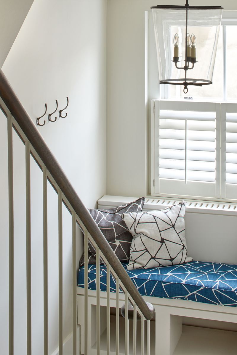
We wanted the home to feel unfussy and masculine. We achieved this through the use of strong colour and a lot of bold, geometric pattern and stripes. The home needed to be practical too, so we used the existing flooring, painting it throughout, adding finishes that were easy to maintain and hard wearing.
The apartment itself was beautiful but the overall space felt sparce and unhomely with clumsy bathrooms and a staircase. Through the redesign of the staircase and landing we elevated the common parts, which helped to unify all the rooms, and allowed them to be enjoyable spaces in their own right. The main living space was the biggest change: by ‘zoning’ the areas it gave the room multifunctional purpose, while also keeping a cohesive feel and, most importantly, making it feel like a home. For example, the living room area at one end of the space has the most beautiful deep green grass paper, which allows it to feel cosy and warm, right next to the dining area which is airy and open. It is the perfect multifunctional space.
Visit TaylorAndTurner.com
Photography by Astrid Templier
DISCLAIMER: We endeavour to always credit the correct original source of every image we use. If you think a credit may be incorrect, please contact us at info@sheerluxe.com.
/https%3A%2F%2Fsheerluxe.com%2Fsites%2Fsheerluxe%2Ffiles%2Fwebsite-images%2F2025%2F03%2Fsign-up-pop-up.jpg)
