

Meet This Cool & Classic American Interior Designer
How did you get started in interior design?
It all began in a small town in the 80s, long before I even knew what interior design was. Back then, I was just a creative kid with a deep love for art, a surprising talent for maths and a passion for helping others. Little did I know that these seemingly disconnected interests would eventually lead me to my true calling.
Even as a child, I felt a strong urge to connect with people, to understand their needs and guide them toward achieving their dreams. Creativity was in my blood, so when I went off to a large university, I gravitated toward fine arts, but interior design wasn't even on my radar at first. That all changed halfway through my time at university. I had what I like to call my ‘lightbulb moment’. Suddenly, it all clicked – interior design was the perfect blend of everything I loved. Without hesitation, I pivoted from fine arts to interior design, diving headfirst into this exciting new field. And from that moment on, there was no looking back.
How would you describe your style and ethos?
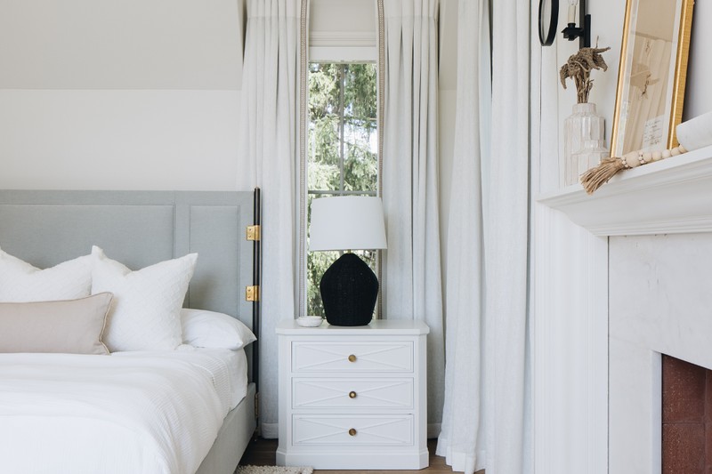
Timeless and classic, with a strong emphasis on texture. I believe texture adds depth and warmth to a space, making it feel lived in and welcoming. It’s about layering materials, mixing the old with the new, and ensuring every element has its place and purpose.
At the core of my ethos is a commitment to understanding my clients on a personal level. I strive to create environments that not only meet their needs but also elevate their everyday lives. Whether it’s a serene retreat or a vibrant family home, my goal is to craft spaces that tell a story – one that resonates deeply with the people who inhabit them, all while standing the test of time.
What materials do you like to work with?
I gravitate toward materials that have a natural, timeless quality to them. Because texture plays a significant role in my designs I often lean into elements like reclaimed wood, natural stone and linen. These materials bring a sense of warmth and authenticity to a space, grounding it in a way that feels both organic and refined.
I also love incorporating materials that tell a story – whether it's aged brass that develops a beautiful patina over time or vintage textiles that add character and history to a room. For me, it's about creating a tactile experience that resonates with the senses, making a space feel truly lived in and loved.
Do you have a go-to palette of colours you like to work with?
I find myself consistently drawn to a palette that is both calming and timeless. Soft, neutral tones like warm whites, gentle greys and earthy beiges are the foundation for many of my designs. These hues create a serene backdrop that allows texture and architectural details to shine.
I also love to incorporate deeper, richer tones – like moody blues, forest greens and charcoal greys – to add depth and sophistication to a space. These colours bring a sense of grounding and contrast, ensuring the overall design feels balanced and cohesive. For me, it’s about creating a palette that is versatile, elegant and enduring, allowing the space to evolve over time.
What is your attitude to pattern?
Pattern, for me, is like the spice in a well-balanced dish – it's all about having the right amount and the right blend. I believe patterns should complement a space, adding visual interest without overwhelming the senses. Whether it’s a subtle stripe, a classic herringbone or a bold geometric, I use patterns to enhance the overall design rather than dominate it.
Incorporating pattern is about finding harmony with the other elements in the room – textures, colours and materials. I often lean towards timeless patterns that have stood the test of time, allowing them to add character and dimension to a space without feeling trendy or overbearing. It’s all about creating a balanced environment where patterns play a supportive yet impactful role.
Do you have any signature motifs?
Yes, one of our defining elements is the Kate Marker Home collection, which features a carefully curated selection of fabrics, textiles, tiles and wallpapers. These motifs reflect our design philosophy – timeless, classic and rich in texture. They bring a unique, signature touch to the spaces we create, blending seamlessly with our overall approach to design.
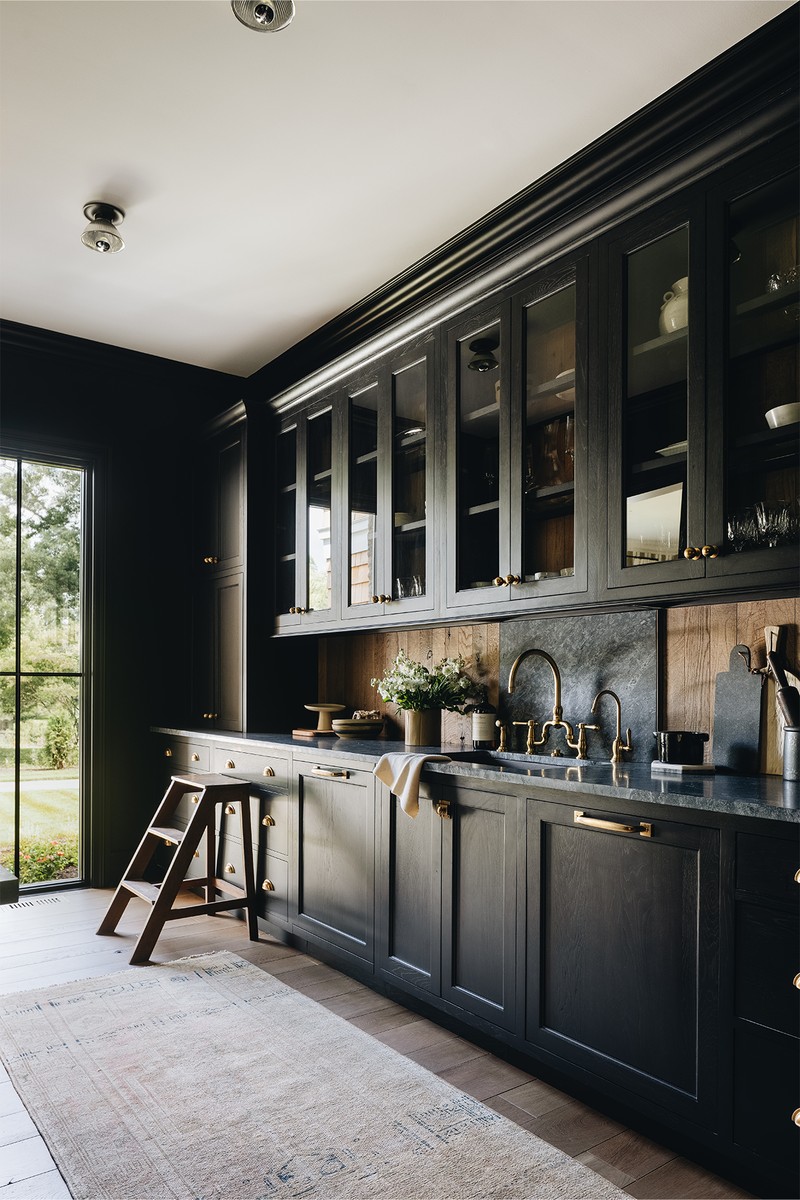
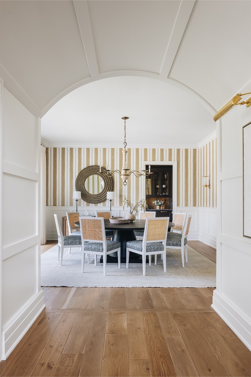
Three Of Kate’s Favourite Projects
A family home fit for entertaining
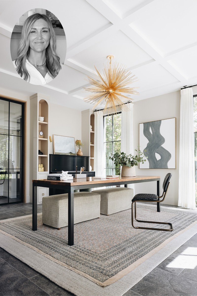
The project is in Arlington Heights, a charming suburb just north of Chicago, chosen because of its proximity to school, downtown, the train and work. Our clients are a down-to-earth family of four, who have a genuine love for entertaining and a keen eye for meaningful design elements. The brief was to create a family home that blended English modern style with industrial elements, such as exposed pipes.
The colour palette is warm and inviting, with standout moments like Farrow & Ball’s ‘Green Smoke’ in the office. We incorporated a mix of materials, including rich woods, rustic steel and unique tile work, as seen in the kitchen backsplash and the children's bathrooms. The furniture selection balances comfort with style, featuring pieces like the swivel chairs in the family room and vintage-inspired elements throughout. Lighting plays a crucial role, with statement pieces like the beautiful, heavy chandelier in the upstairs hallway, and thoughtfully placed fixtures that enhance both functionality and ambiance.
This home is a true reflection of the family's personality and lifestyle. The layout seamlessly blends areas for family life with spaces that are perfect for entertaining. Unique features like the craft room for the children and wine room cater to both everyday living and social gatherings. The integration of meaningful moments, such as the music room with framed piano sheets, adds personal touches that make the house feel like a true home.
/https%3A%2F%2Fsheerluxe.com%2Fsites%2Fsheerluxe%2Ffiles%2Farticles%2F2024%2F10%2Fsl-091024-interior-designer-profile-kate-marker-downtoearth-margaret-rajic-6.png)
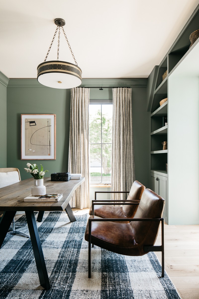
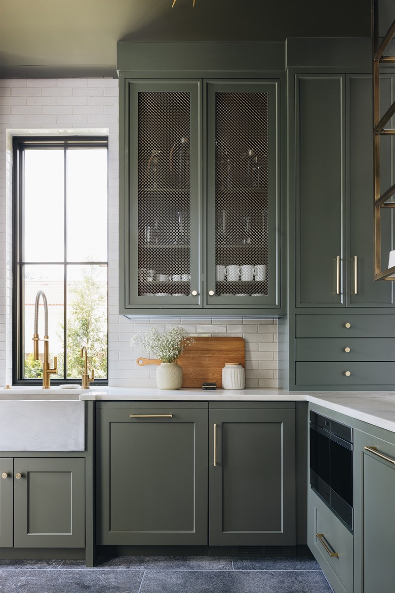
A light-filled home blending style & function
This brief presented a fun challenge: to craft a home that seamlessly blends sleek, European-inspired modernity with the warmth and practicality needed for family life. The client envisioned a space filled with light, featuring expansive windows, an open-concept living area and thoughtful touches like a mudroom with personalised cubbies – a perfect blend of style and function. Our strategy was to push boundaries while ensuring every decision served both form and function. We played with unexpected elements like bluestone flooring and vintage rugs, using them to add depth and character to the clean, modern lines.
/https%3A%2F%2Fsheerluxe.com%2Fsites%2Fsheerluxe%2Ffiles%2Farticles%2F2024%2F10%2Fsl-091024-interior-designer-profile-kate-marker-livingthegreen-stoffer-photography-4.png)
The heart of our colour scheme is the client's preferred shade of green, which we artfully incorporated in surprising ways throughout the home. In terms of materials, we balanced modern elements with touches of warmth and texture. The furniture selection prioritised clean lines and comfort in equal measure. Lighting was carefully chosen to enhance the home's architectural features and create ambience. As a special touch, we incorporated tiles from our own Kate Marker Home collection in the powder room, adding a bespoke element to the design.
The success of this project lies in its harmonious contradictions. It's a space that feels both expansive and intimate, modern and timeless, sophisticated and welcoming. The open-concept layout fosters family togetherness, while thoughtfully designed private spaces offer retreats for individual family members. By introducing unexpected elements like vintage rugs against the backdrop of sleek, modern design, we created a home that tells a unique story – one that will continue to unfold as the family grows.
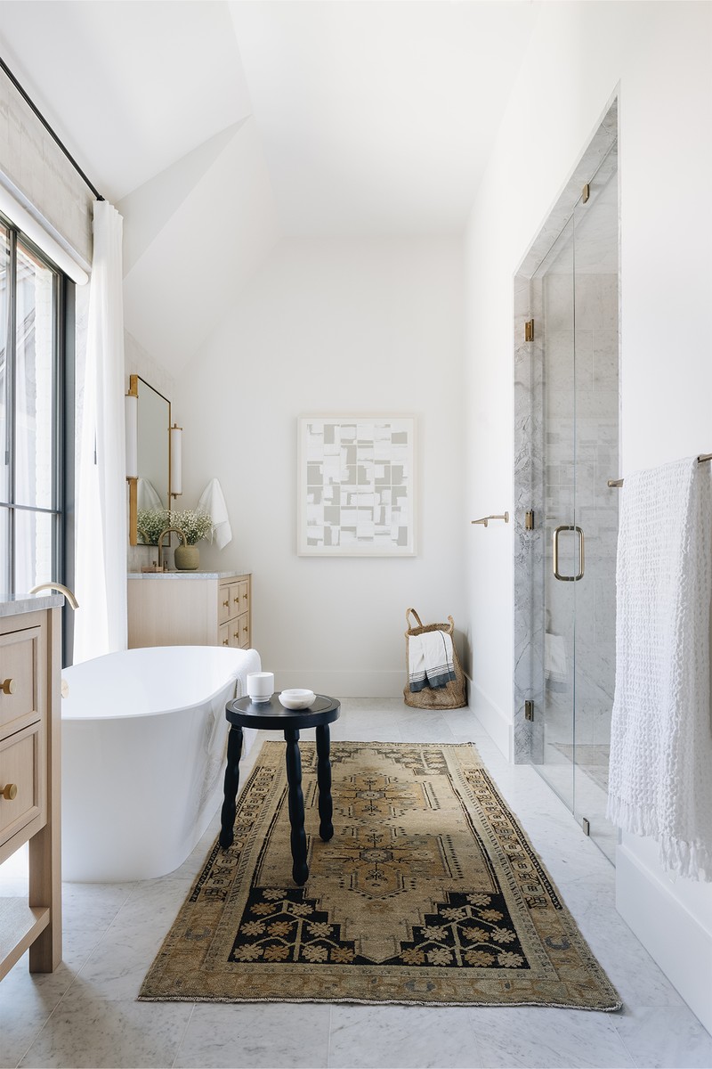
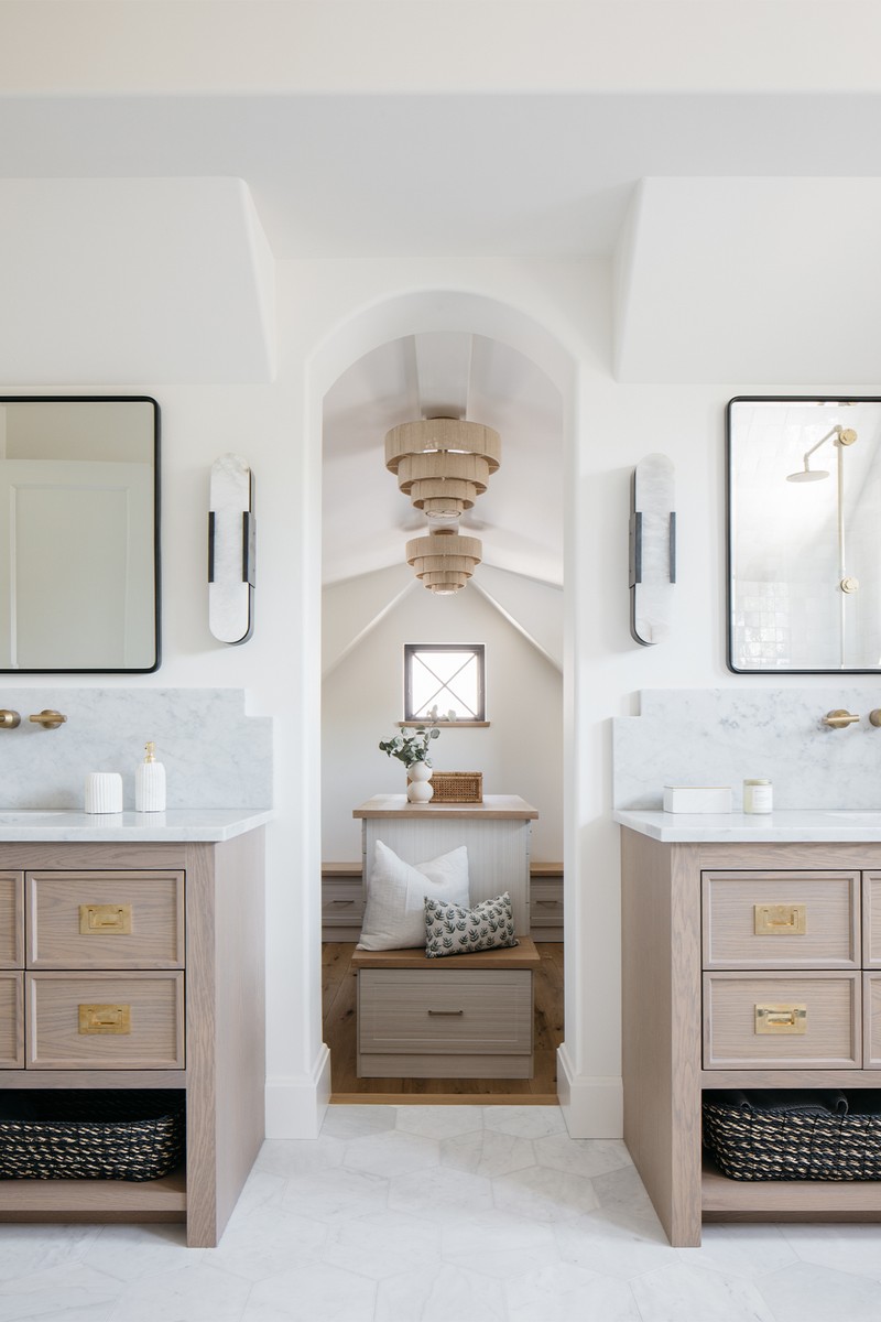
A considered, harmonious, inviting home
This sporty, outdoorsy family of five wanted a home that feels like a warm embrace – cosy, inviting and effortlessly liveable, yet still refined. We focused on using warm tones, rich textures and layered lighting to build an atmosphere that feels timeless but is also perfectly suited to contemporary living. The design is both intimate for family gatherings and open for hosting friends, reflecting the clients' social and active lifestyles.
The home’s colour palette is a masterclass in contrasts. The sunroom, bathed in natural light, features a soothing blend of light creams and soft whites that amplify the panoramic views of the pond, creating a tranquil retreat within the home. In contrast, the family room – where life buzzes with activity – is infused with warmer tones and deeper contrasts, setting a welcoming backdrop for both everyday moments and larger gatherings. We chose rich wood finishes, natural textiles, and classic furniture pieces that offer a mix of comfort and elegance. The lighting – a carefully curated blend of ambient, task and accent layers – enhances each space's functionality and mood.
This home is built around the unique rhythm of this family’s life. It creates both connection and separation where needed, providing spaces for relaxation, recreation and reflection. Every element is considered, from room layout to finishing details, to create a harmonious home that feels as if it has always belonged to them.
Kate’s book, For The Love Of Home, is available now.
Visit KATEMARKERINTERIORS.COM
Or continue to comment as a Guest below
DISCLAIMER: We endeavour to always credit the correct original source of every image we use. If you think a credit may be incorrect, please contact us at info@sheerluxe.com.
/https%3A%2F%2Fsheerluxe.com%2Fsites%2Fsheerluxe%2Ffiles%2Fwebsite-images%2F2025%2F03%2Fsign-up-pop-up.jpg)
