Look Around This Renovated London Home
What state was the property in when you bought it?
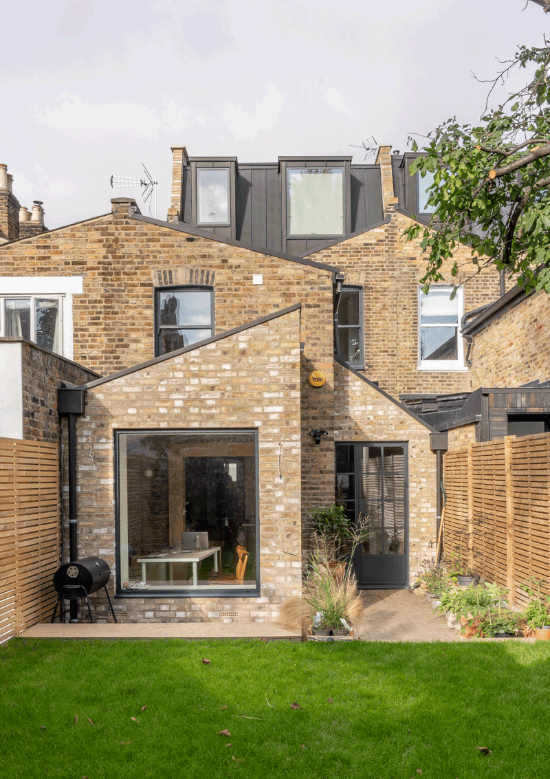
One thing that immediately drew us to this property – an 1850s Victorian terraced house in north-east London – was how well it presented, at least on the surface. Completely unfurnished, the walls were freshly painted white, and it came with the original pine flooring and period features, including two beautiful cast-iron fireplaces. It was the perfect empty canvas where my husband and I could build a life together. Of course, the surprises came later: the roots of the lovely big lime tree at the back of the garden caused an undetected crack in one of the party walls; the wooden joists underneath one of the roofs were rotten. They were all things our buyer survey wouldn't have uncovered, but you have to expect such things with period properties.
Did you make any major structural changes?
The two main areas of intervention were the kitchen, where we created a side return and a 3m partial extension at the front (which now houses our dining room) and a loft extension, which now encompasses our bedroom and ensuite.
Did you work with an architect?
I found BVDS on Instagram, which had a ton of experience with Victorian terraced houses in our area, so we knew they’d be familiar with council restrictions. We worked closely with George, one of the partners, on all the structural aspects of the new building, while I took the lead on all interior design-related decisions. George has been great to work with – he always brought with him a ‘can do’ attitude, and total flexibility to help us realise our vision – and he introduced us to our builder Edi from Optimal, who in turn introduced us to our carpenter Vini from Tekton. I tend to be quite hands-on, so having a team of hard-working people made the whole experience feel easier.
How did you envisage the final result?
With difficulty! This was my first experience with interior design, so it was definitely a learning curve. I found a free online tool called HomeByMe incredibly useful when it came to visualising spaces in 3D and getting a better understanding of the proportions. 2D floorplans can be fun to play with, but they can also be very deceiving.
How did you try to make the property feel more personal to you?
I was very conscious of the house feeling too much like a period property, but I still wanted to respect its bones and history. At the same time, I believe a home should mirror the people who inhabit it: my husband is English and I'm Italian. Adding a little Italian flair was inevitable. For me, that manifested mainly in the choice of materials: terrazzo floors (a quintessentially Venetian material that is all the rage now in London), natural marble, wood and unlacquered brass. The other thing that felt more personal was the walk-in pantry – it was a long-standing dream of mine. I wanted our kitchen to feel like a slightly cooler version of an old Italian grandma’s house.
What were some of your key sources of inspiration?
Aside from Italy, I take a lot of inspiration from places I visit during my travels, or things I experience in my everyday life. For example, the inspiration behind my pantry doors was the exterior of the old Circus Bakery in Paris. The arched French doors that lead into our ensuite were also inspired by my favourite Parisian hotel – Hotel des Grands Boulevards. Their French doors are actually rectangular, with just a curved detail carved into the wood. I remember loving the feeling of opening those doors to enter the bathroom – it felt very romantic.
Did you use moodboards or Pinterest boards?
I started pinning ideas for the house years before we actually bought it, and it was quite interesting for me to look back at those early references and realise how much my style had evolved. I still use Pinterest quite a lot – here’s a link to my board.
/https%3A%2F%2Fsheerluxe.com%2Fsites%2Fsheerluxe%2Ffiles%2Farticles%2F2023%2F10%2F2new-kitchen-dual-room-tvp.png?itok=oLj31cBj)
What was the most challenging part of the renovation?
I would say the thing I struggled with the most was mainly the wait. I am an impatient person by nature, and I remember feeling like we'd never move in. The time between buying the house and actually moving in took almost two years – nine months spent on the building site alone, with a month of stand-by due to Covid. It was all worth it in the end though.
Did you manage to stick to your budget?
Absolutely not. I think very few people do, especially when they are dealing with their first renovation. Luckily for us, we had a contingency budget we had set aside specifically for multiple eventualities.
Looking back, is there anything you would do differently?
For the most part, I feel incredibly proud of what we’ve created, and I still pinch myself when I think that we actually get to live here. The things I would change with the benefit of hindsight are minor – things like more hidden, in-built storage behind our bathroom mirror, for example. It’s not the end of the world, but it would have been handy.
Is there anything left to do?
It truly feels like a never-ending story with this house. At times it can be frustrating, but it also gives me new things to be excited about or to look forward to. The main project left is the front garden – which is an absolute pit. I always joke that it has kept us safe from burglars so far. We are currently in the process of sorting out our den, too, which until recently was nicknamed the ‘monster room’ as it was a bit of a dumping ground. We have just now, after three years, started using it as a proper room. Our carpenter is building us some much-needed cabinets for the living room, where we'll also be installing a wall-hung picture TV at some point. We also need upholstery for our dining room and a picture window in the loft, and the stairs need re-painting and a runner... It seems the list goes on and on!
/https%3A%2F%2Fsheerluxe.com%2Fsites%2Fsheerluxe%2Ffiles%2Farticles%2F2023%2F10%2F2tvp-kitchen-dining-room.jpg?itok=h6oHH21u)
What’s your favourite room in your home?
Does a sub-room count? If so, it would be the pantry. It is still the one thing that brings me the most joy, together with a sense of calm, abundance and good health. I love to cook and host, and I love to watch our guests interact with the pantry, whether it's for the first time or the tenth. It's something people are not very used to having in their homes, so I think it always provokes conversation. I am a big tea drinker and have a whole section dedicated to various tea infusions. I always encourage our guests to help themselves to their favourite blend, or explore new flavours. In case we have friends coming over, I always have a selection of snacks that I can quickly assemble while we all chat around the kitchen island. Give me a walk-in pantry over a walk-in wardrobe any day.
What are your favourite colour combinations?
I would say my favourite colour combination is pink and olive green – it reminds me of Venice, my favourite city in the world (it’s about an hour away from my hometown). There is a crumbly plaster wall we uncovered in the kitchen during the renovation, which mixes those hues in a beautiful patina. I was so excited when we discovered it, and decided to keep it exactly how it is, much to my builder's astonishment. I think it adds so much character to the kitchen. I also have lots of olive-green accents peppered throughout the house – mostly in the soft furnishings.
Where did you source the furniture from?
We have a real mix of high street brands and a couple of designer statement pieces, but I'd say most of our furniture is second-hand. I love antiques because they add personality to a space, and I am fascinated by the stories those pieces tell, and the lives they lived before coming into our home. I have a couple of antique dealers I love to visit (the more expensive antique pieces we own come from them), but I also love the thrill of finding a good bargain in a flea market. Nothing beats the feeling of finding a gem buried in a sea of tat! Rye is one of my favourite towns to visit for antiques: Soap & Salvation, The Confit Pot and The Green House are among my go-to shops. Deal and Bruton are also lovely towns to visit if you are into antiques, and Home Barn in Oxfordshire is another favourite. If you are after true bargains and want the ultimate antique shopping experience, Sunbury Market is the place to be, but you have to be prepared for a very early start, as most of the best pieces are gone by 8am.
/https%3A%2F%2Fsheerluxe.com%2Fsites%2Fsheerluxe%2Ffiles%2Farticles%2F2023%2F10%2Fnew-kitchen.png?itok=TUJJ7Uje)
Kitchen
The kitchen was built bespoke by our carpenter.
FLOORING: Botticino Terrazzo, In Opera
WALLS: Stone, Bauwerk
DINING TABLE: Antique, Home Barn
WALL LIGHTS: Spark & Bell
COUNTERTOPS: Calcutta Amber, Mandarin Stone
BRICK STEPS: Westminster pavers, London Stone
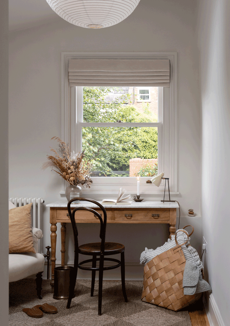
Den
CHAIR: Brentwood chair, La Boutique des Antiques
ANTIQUE DESK: Victorian wash stand, La Boutique des Antiques
ANTIQUE DESK LAMP: Soap & Salvation
RUG: Rowen & Wren
ROMAN BLIND: Stitched
/https%3A%2F%2Fsheerluxe.com%2Fsites%2Fsheerluxe%2Ffiles%2Farticles%2F2023%2F10%2Fnew-living-room-tvp.png?itok=Zq4YQ_Zn)
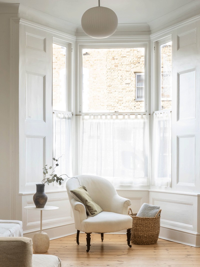
Living Room
SOFA: Frighten, Ikea, with a Bemz cover in Brera Lino from Designers Guild
RUG: Adeline Ivory, Ruggable
PENDANT: John Lewis & Partners
ANTIQUE ARMCHAIR: Cart House
WALLS: Strong White, Farrow & Ball
VELVET PILLOWS: Ellei Home
SIDE TABLE: Lato table by Luca Nichetto via Twentytwentyone
/https%3A%2F%2Fsheerluxe.com%2Fsites%2Fsheerluxe%2Ffiles%2Farticles%2F2023%2F10%2Ftvp-the-loft-bedroom.jpg?itok=bK9-fokR)
Loft Bedroom
BED: Gervasoni Ghost, Paola Navone
PENDANT: Tempo Vivace by Arturo Alvarez, Heals
WALLS: Stone, Bauwerk
FLOOR: Whinfell Planks, Ted Todd
BEDSIDE SCONCES: Rose Uniacke
/https%3A%2F%2Fsheerluxe.com%2Fsites%2Fsheerluxe%2Ffiles%2Farticles%2F2023%2F10%2Fartboard-1-copy-6.jpg?itok=-CeIoCS-)
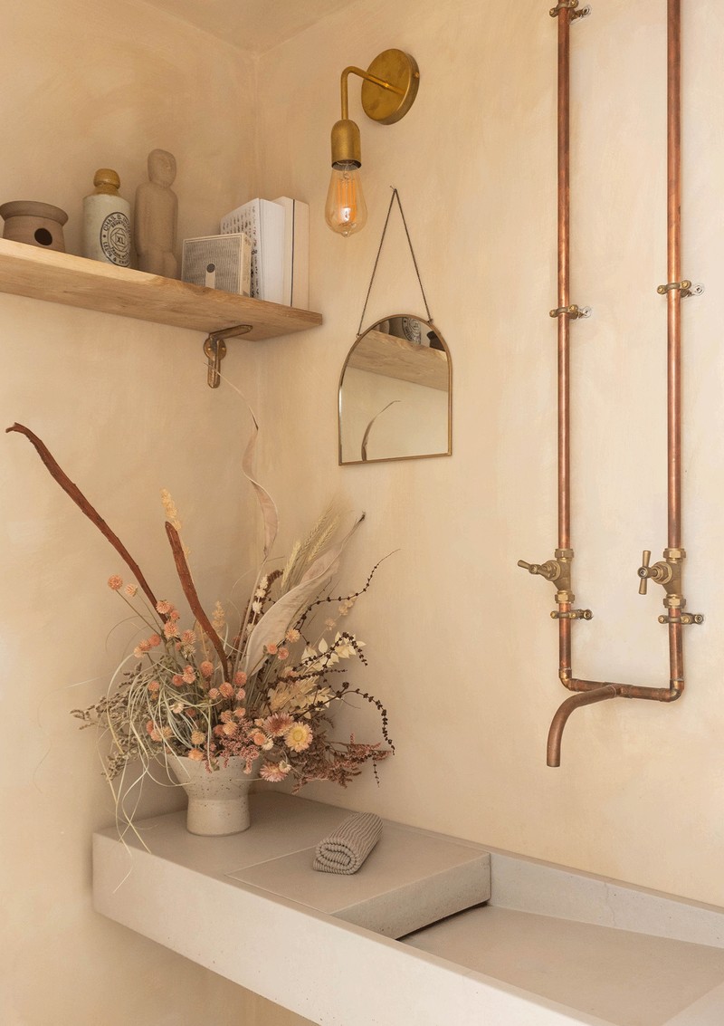
Loft Bathroom
BATH & MARBLE SINK: Lusso Stone
SHOWER TILES: Calacatta Amber, Mandarin Stone
WALL LIGHTS: Spark & Bell
WALLS: Stone, Bauwerk
UNLACQUERED BRASS TAPS: Crosswater
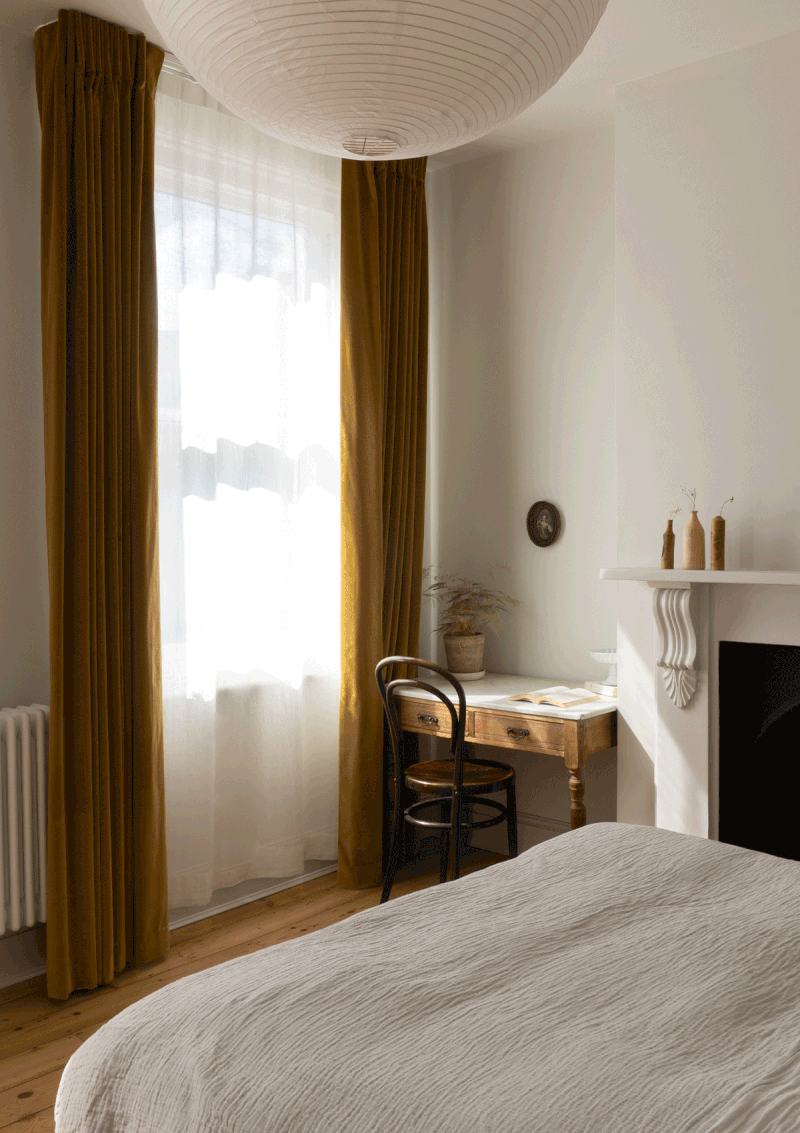
Master Bedroom
ANTIQUE DESK: Victorian wash stand, Facebook marketplace
ANTIQUE MIRROR: The Confit Pot
WALLS: Strong White, Farrow & Ball
VELVET CURTAINS: The Hackney Draper
SHEER CURTAINS: Att Pynta
VINTAGE TAPESTRY: May + Co
/https%3A%2F%2Fsheerluxe.com%2Fsites%2Fsheerluxe%2Ffiles%2Farticles%2F2023%2F10%2Ftvp-the-guest-room.jpg?itok=Z-YcWdAf)
Guest Bedroom
TONGUE & GROOVE: Added with the renovation, painted in Skimming Stone, Farrow & Ball
VINTAGE CLIP LIGHT & SIDE TABLE: Local flea markets
PENDANT: Flowerpot lamp, Nest
/https%3A%2F%2Fsheerluxe.com%2Fsites%2Fsheerluxe%2Ffiles%2Farticles%2F2023%2F10%2Fartboard-1-copy-9.jpg?itok=-U-_f_jh)
Shower Room
WALLS: Skimming Stone, Farrow & Ball
WALL LIGHTS: Spark & Bell
SINK: Lusso Stone
SINK UNIT: Crosswater
Follow Martina @TheVenetianPantry on Instagram.
DISCLAIMER: We endeavour to always credit the correct original source of every image we use. If you think a credit may be incorrect, please contact us at info@sheerluxe.com.