

Explore This Impressive Cotswolds Conversion
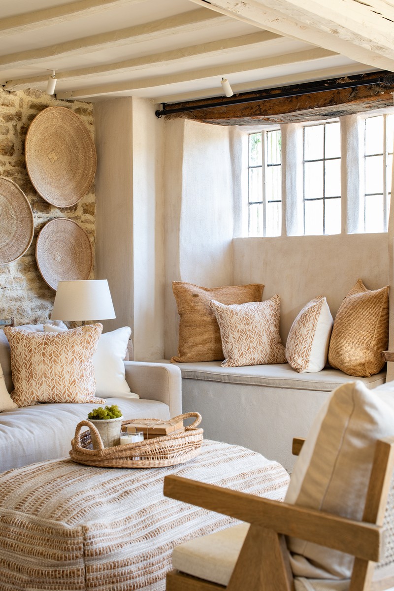
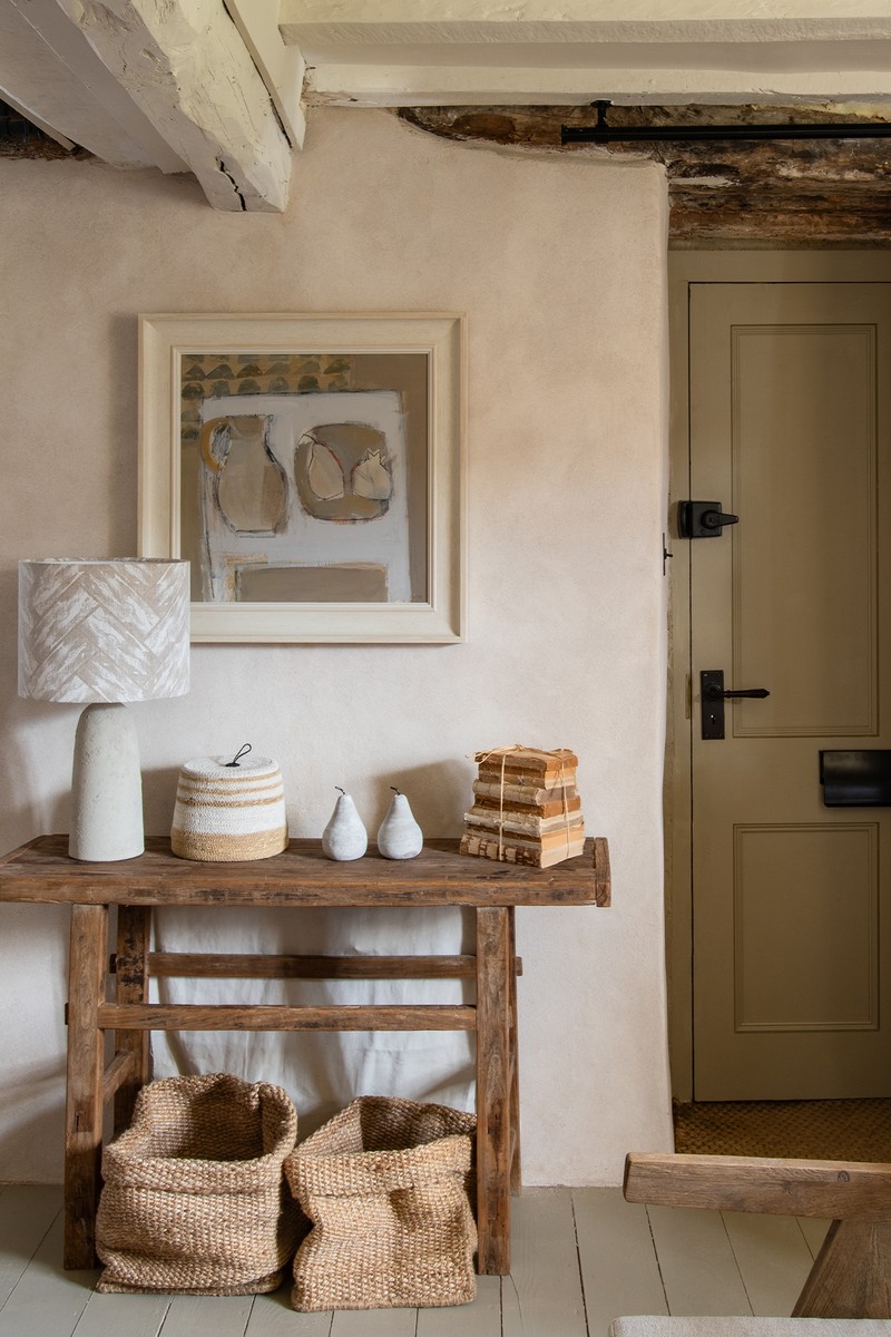
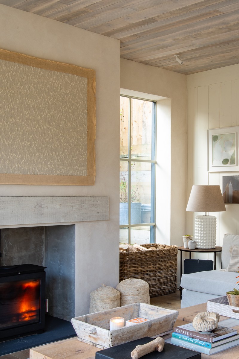
The Entrance/Front Sitting Room
When we bought this property, there was water dripping down the walls, which were partly covered in concrete. In this entrance, which is also a sitting room, I covered some parts of the walls in lime plaster and some stayed as exposed stone. I wanted to keep it simple and by adding furniture made from natural materials and woven accessories – I think it brings an Ibiza vibe to the Cotswolds.
FLOOR PAINT: Fenwick & Tilbrook
OTTOMAN: Osborn Interiors
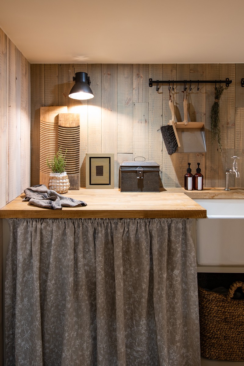
The Utility Room
Tucked away under the front sitting room is this small utility room and storage area, which is accessed via a compact, twisting staircase. In here there’s a downstairs loo and all the laundry facilities, plus it’s a practical place to wash the dogs after muddy walks. Functional spaces can still be pretty, though, and I used this fabric from my collaboration with Zoe Glencross for the curtain.
CURTAIN FABRIC: Zoe Glencross
The Dining Area
Entering this part of the house, we had to make a big decision about how to create the head height that was needed, which took up a large part of the budget. Due to planning regulations, the new cottage had to sit in the parameters of the old cottage, so to increase the space, we added volume. We had to dig down two metres – 50 trucks of mud were removed! There are no windows along one entire side of the cottage, because it’s built into the bank, and you’re actually underground, but you don’t feel it. When it was dug out it looked like a swimming pool, but now you don’t feel it due to the large doors and glazing running along the other side. I love symmetry – it brings balance to a space and you don’t need lots of room to do it. I think these armchairs and lamps flanking either side of the sideboard really elevate the space.
TABLE, BESPOKE: Osborn Interiors
/https%3A%2F%2Fsheerluxe.com%2Fsites%2Fsheerluxe%2Ffiles%2Farticles%2F2024%2F06%2Fsl-bee-osborn-cottage-tour-dining-room.png)
The Kitchen
I really wanted this not to look like a kitchen, because it’s on the middle of the main space, with dining at one end and a sitting room the other. There are various ways I achieved this, through lamps on the island rather than pendants, and textured natural finishes, such as on the cupboard frontage. I love using open shelving to display accessories, such as ceramics and chopping boards (I’m an avid collector). I think they bring character and personality to a kitchen, which can be hard to do, and of course they add lots of texture and act as talking points.
KITCHEN: Osborn Interiors
CUPBOARD FRONTAGE: Philip Jeffries
LAMPS: Porta Romana
/https%3A%2F%2Fsheerluxe.com%2Fsites%2Fsheerluxe%2Ffiles%2Farticles%2F2024%2F06%2Fsl-bee-osborn-cottage-tour-kitchen2.png)
The Sitting Area
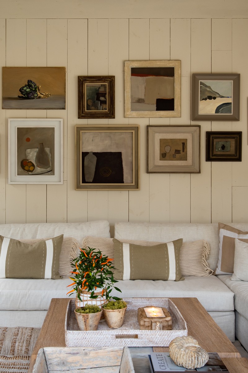
What I really wanted here was enough space to accomodate my ever-expanding family as I have three grow-up daughters, two of whom are married and visit with their husbands regularly, and a teenager who often has friends over, so despite this being a small cottage, it was a non-negotiable that we had a place where we could all come together. The sofa was made bespoke and covered in plain linen with plenty of cushions to add interest. There are also windows seats, tucked away, which I love to look at as much as sit in.
My daughter runs a gallery called Art Untamed and a lot of the work on the gallery wall is from there – alongside pieces I have collected over the years. There’s a huge TV above the fireplace which I didn’t want to look at when it’s not in use, so it’s hidden behind this linen blind.
All the doors are Crittall but painted in a pale colour, which is very unusual – I just wanted the frames to blend into the walls, and especially as there are no windows on the other side, I think it balances the room.
PAINT: Fenwick & Tilbrook
RUG: Osborn Interiors x Peter Page
SOFA FABRIC: Thibaut
CUSHIONS: Osborn Interiors
COFFEE TABLE: Osborn Interiors
POUFFE: Osborn Interiors
SIDE TABLES: Osborn Interiors
LAMP: Porta Romana
SIDEBOARD: Chelsea Textiles
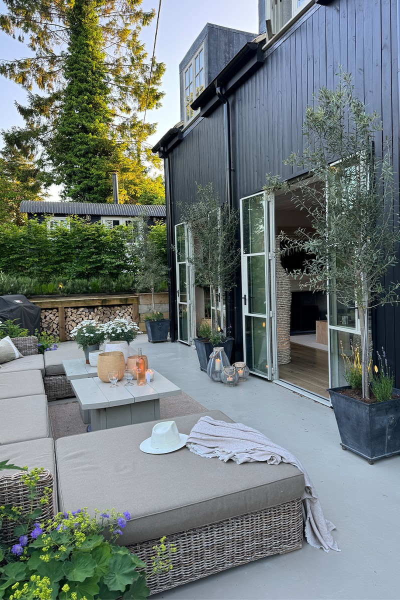
The Outdoor Area
I went for low seating and tables so you can sit and eat here, but also sunbathe and relax – I wanted one area that could do both and this is such a sun trap, so it works really well – we get both the morning and evening sun.
RUG: Wayfair
PLANTS: Paramount Plants
RECLAIMED SCAFFOLDING BOARDS: Linnells
The Main Bedroom & En-Suite
Through a secret door in the kitchen is a new extension where I have my room. I don’t think I’ve ever had such a big bedroom and I had a list of things I wanted – a bath at the end of the bed, a sofa area where I could relax and read and a brushed concrete shower. We used sisal on the floor which was a real treat – it’s expensive but cheaper than timber and rugs, and this one is actually really soft.
BATH: BC Designs
BED: V Spring
FABRICS: Zoe Glencross
VANITY UNIT, BESPOKE: Osborn Interiors
BASIN: Duravit
TAPS: Samuel Heath
/https%3A%2F%2Fsheerluxe.com%2Fsites%2Fsheerluxe%2Ffiles%2Farticles%2F2024%2F06%2Fsl-bee-osborn-cottage-tour-main-bedroom-ensuite2.png)
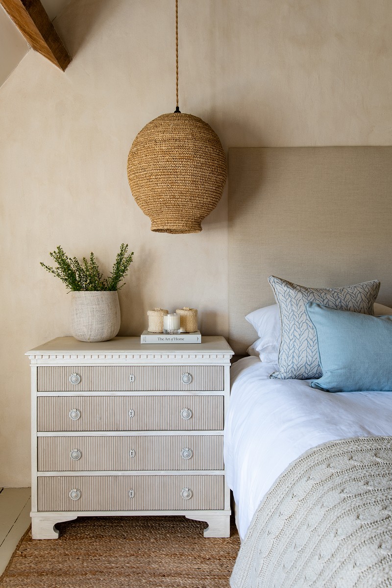
The Teenager Daughter’s Room
The walls in here were stone and I debated what to do with them, but I decided I wanted a clean look, so I lime plastered it and left it bare. I wanted to each bedroom to have its own bathroom – no-one wants to creep down a corridor at night to use the loo, especially grown-ups – so I squeezed a loo, shower and basin in here.
BED: V Spring
BEDDING & CUSHIONS: Amurelle Home
PAINT ON FLOOR: Fenwick & Tilbrook
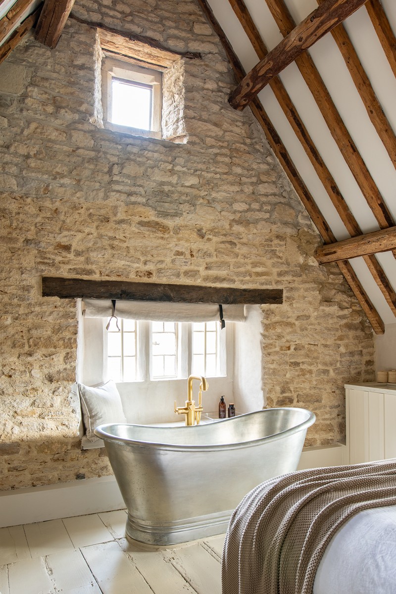
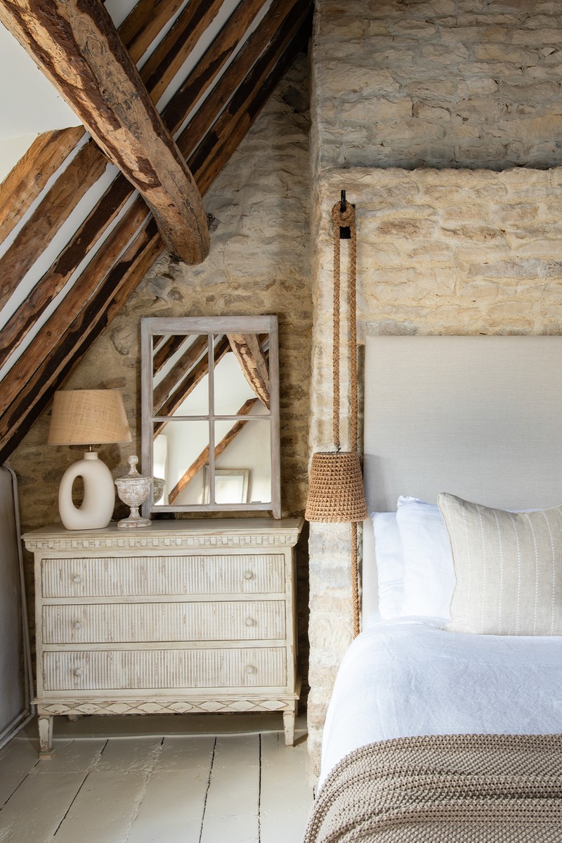
The Guest Room
Both in this room and my daughter’s room, we took the ceilings out to reveal these amazing beams. You could tell from the pitch of the beams, and the fact there was no guttering, that this had been a thatched roof (water just runs off the thatch). I had to build a new roof and add the thatch on top to keep the planners happy, and the result is spectacular. Again, there’s a hidden loo and a basin, and a huge freestanding bath which gives it a real sense of luxury. I love to create vignettes within a home and this room has many.
BATH: BC Designs
LAMP: Birdie Fortescue
BEDDING & CUSHIONS: Amurelle Home & Zoe Glencross
MIRROR: The Old Flight House Antiques Centre
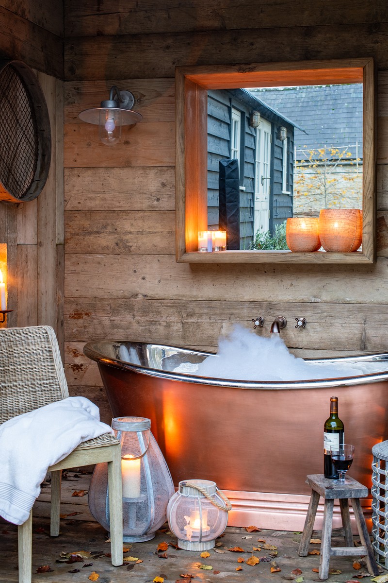
The Outdoor Bath
I always wanted an outdoor bath, and this one sits next to the shepherd’s hut, which we use as another guest room when we have a full house. I also lived in the shepherd’s hut when I was renovating the cottage. I’m tempted to use this all year round – it’s such a fun thing to have at home.
BATH: BC Designs
HUT SUPPLIER: Arbor Shepherds Huts
LANTERNS: Osborn Interiors
Visit OsbornInteriors.com
Or continue to comment as a Guest below
DISCLAIMER: We endeavour to always credit the correct original source of every image we use. If you think a credit may be incorrect, please contact us at info@sheerluxe.com.
/https%3A%2F%2Fsheerluxe.com%2Fsites%2Fsheerluxe%2Ffiles%2Fwebsite-images%2F2025%2F03%2Fsign-up-pop-up.jpg)
