

Explore This Small Holiday Home That’s Big On Design
All products on this page have been selected by our editorial team, however we may make commission on some products.
The Property
This property was a full-time family home on the coast of Devon, and our client bought the house from his parents with the intention of making it a holiday home for his young family and a welcome escape from busy London life – given its intended usage, we could really push the boundaries with colour, pattern and decoration.
The fisherman’s cottage is in the picturesque and unique location of Torcross, which has incredible views of an inland lake and the sea, with only a road separating them. The house hadn’t been touched for a few decades, so we undertook a complete refurbishment. The number of rooms didn’t change, but there was some rejigging to open up the family bathroom and create a principal en-suite on the top floor.
The Brief
We were lucky enough to work with these clients for the second time, having already helped them with their primary home in London. When we discussed this project, our clients were excited for it to have a strong character. They wanted something fun, and they were open to us designing without a strong design brief — we were so grateful to them for the trust they put in us.
TAKE THE TOUR
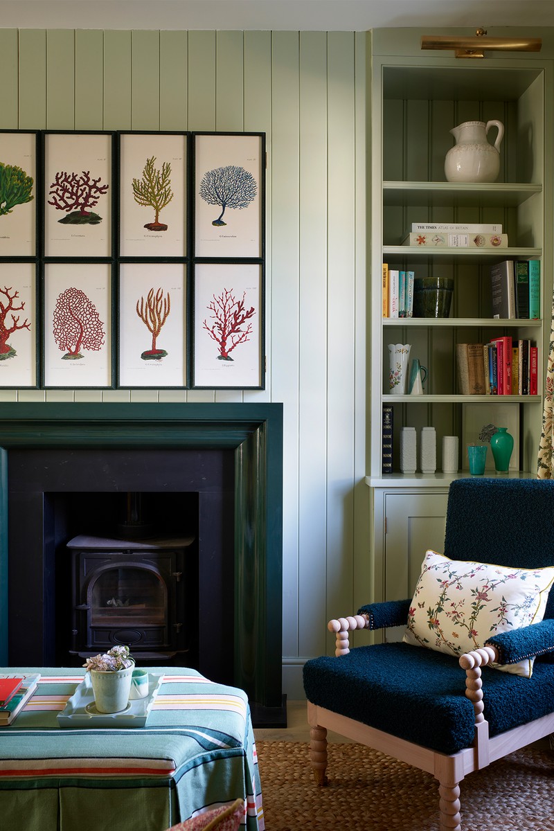
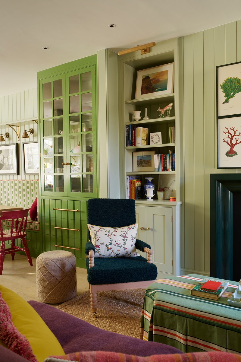
The Living Room & Entrance
We wanted this to be a welcoming space with an equal sense of warmth and formality, so it didn’t become a dumping ground. We worked hard to choose furniture that wasn’t too formal and that brought plenty of texture into the space. We also wanted to ensure the lighting was warm and elegant in the evenings and darker months. There’s a range of decorative lighting used here, including lamps, floor lights, picture lights and library lights on the joinery – it was key to make sure the property had lots of atmosphere in the evening, with each zone of the open-plan living area feeling like its own space.
By adding tongue and groove panelling, we added character without overcrowding the artwork. We decided early on to steer away from the typical blues of nautical homes. As we started the creative process, green quickly became the colour that flowed into each area. Texture through fabrics such as linens, cotton, dark green bouclé on the armchairs, chunky sisal rugs and the raffia stools add plenty of interest, and we used a mid-tone timber floor throughout the house, from top to bottom, which had to be practical for cleaning.
WALLS - CELADON - Edward Bulmer
/https%3A%2F%2Fsheerluxe.com%2Fsites%2Fsheerluxe%2Ffiles%2Farticles%2F2024%2F09%2Fsl-hutley-humm-house-tour-new-1.png)
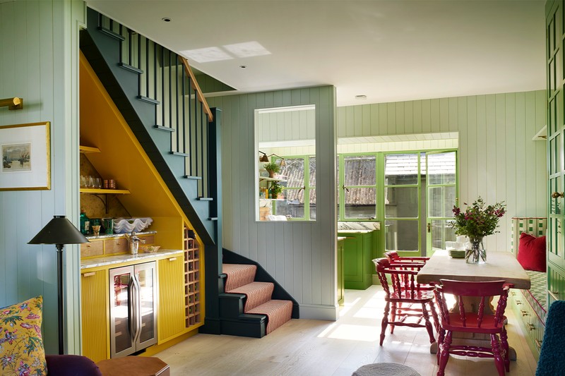
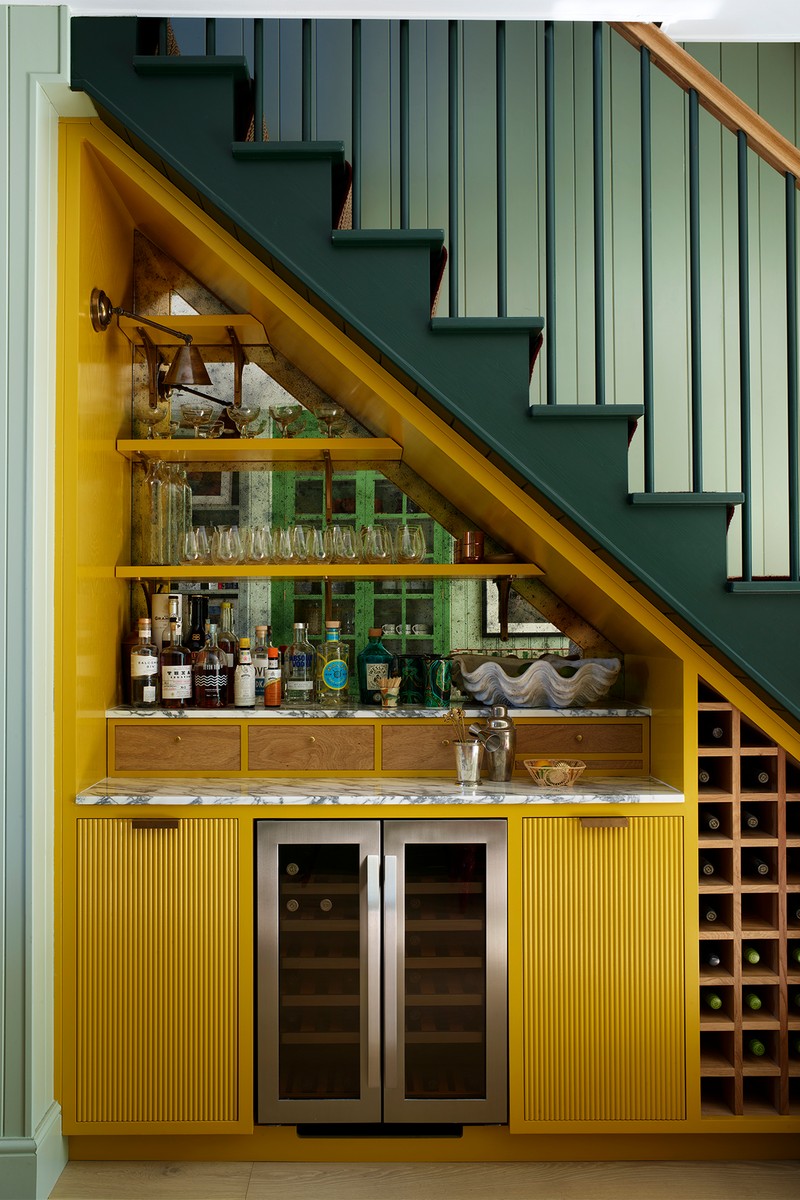
The Understairs Bar
As this was a holiday home, we didn't need to add lots of storage, so we decided to design an ‘under the stairs home bar’, fully equipped with a fridge and small wine storage – an unexpected but incredibly luxurious addition for a terraced cottage. We went quite bold with the decorating, such as drenching the joinery in Paint & Paper Library 'Gamboge', designed open shelving to create a sense of space, paired with marble countertops, a mirrored antique glass backsplash that bounces the light around, and bronze hardware that looks incredibly smart. The light fitting is Hector Finch Mast Light.
BAR PAINT COLOUR - GAMBOGE - Paint & Paper Library
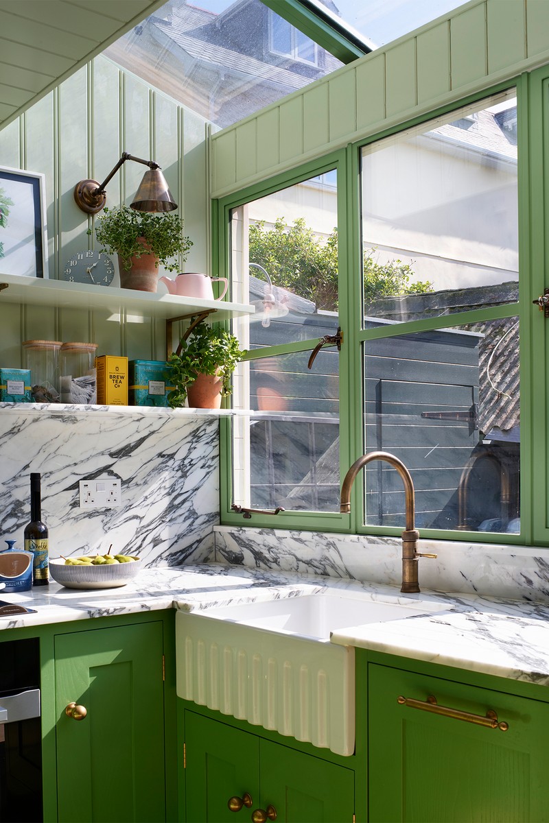
The Kitchen & Dining Area
We needed to maximise the sense of circulation and wanted the space to feel elegant and not too cluttered. Luckily, as it’s a second home, we could be efficient on storage without needing to maximise every inch – we designed open shelves with articulated lights (we didn’t need full wall-hung units that can feel so top heavy) and upped the style stakes with a wonderful arabascato marble and statement green on the units.
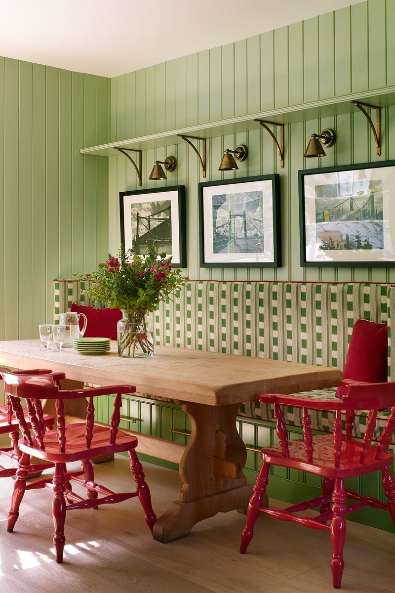
In the dining area, we designed a built-in bench seat with a glass-fronted storage piece to the right — the darker green tones in this area separate it from the living room. The captain's chairs around the dining table came with the house, and our client had grown up with them. They were reconditioned and spray-glossed raspberry red. The client was unsure but trusted us and, thankfully, loved them.
KITCHEN UNITS COLOUR - CELADON - Edward Bulmer
LIGHTS - Holloways of Ludlow
HANDLES - Armac Martin
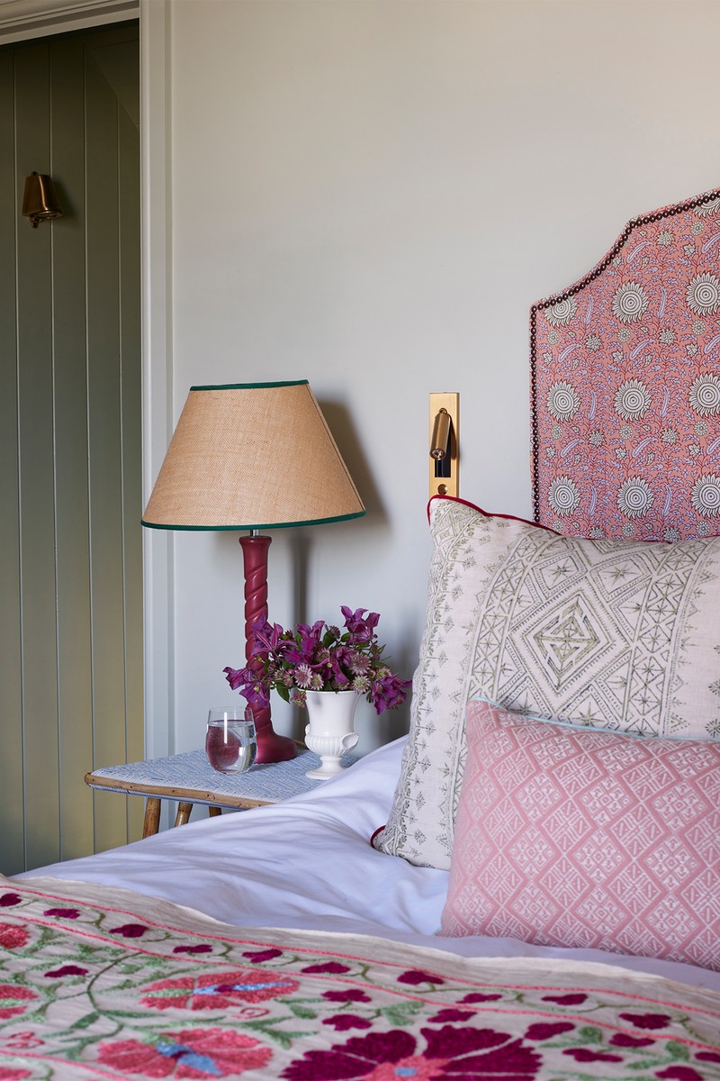
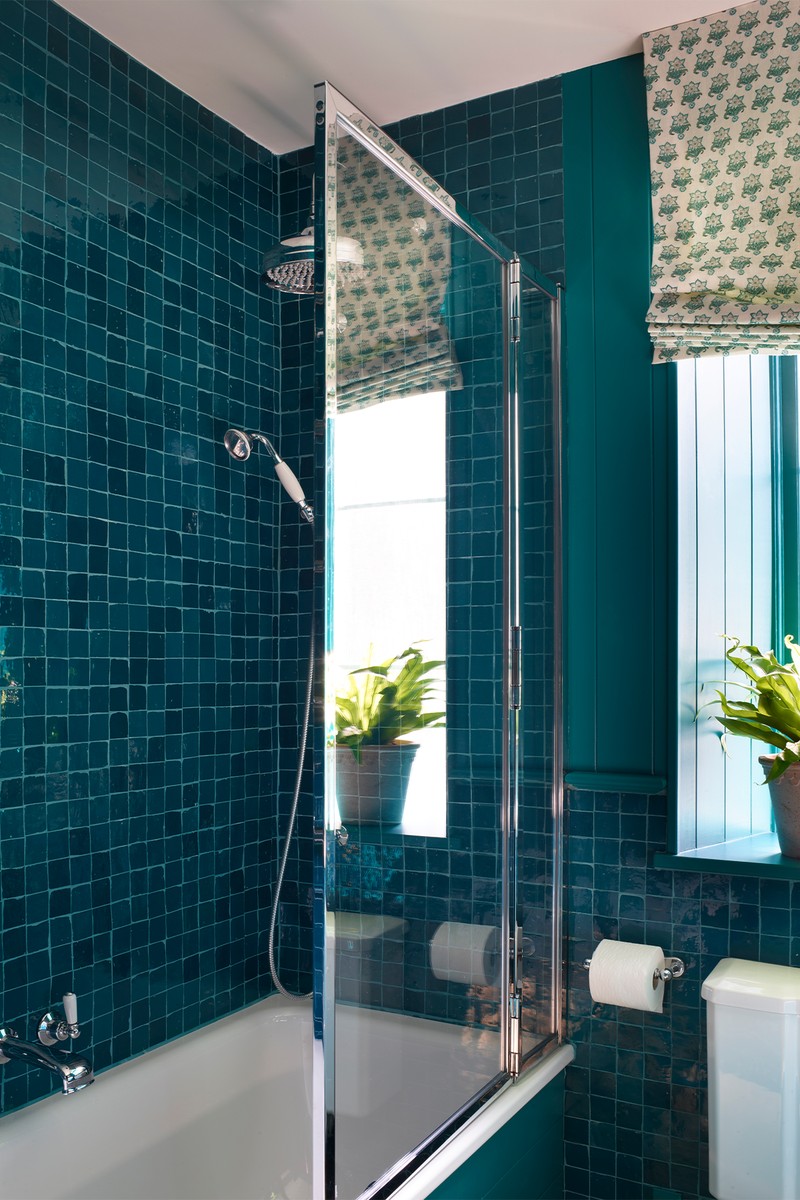
The Main Bedroom & En-Suite
This needed to be a sanctuary away from the rest of the busy house. We had large windows to work with, which opened up the balcony space, so plenty of light flooded in. We drenched the walls and ceilings to give it a sense of calm and used space-saving tricks, such as mounted bedside lights, to help make space for good-sized bedside tables on either side. ~
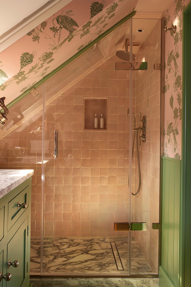
The shower features pink zellige tiles and a floral wallpaper adds some whimsy, contrasting the boldar abescato marble on the base of the shower.
WALLS - GREEN BLUE - Farrow & Ball
HEADBOARD - Pierre Frey
READING LIGHTS - Pooky
BEDSIDE TABLES - Trove
VANITY UNIT - Porter
WALLPAPER - Barneby Gates
/https%3A%2F%2Fsheerluxe.com%2Fsites%2Fsheerluxe%2Ffiles%2Farticles%2F2024%2F09%2Fsl-160924-hutey-humm-credit-rachael-smith-on-the-beach-cottage0028-fullbleed.png)
The Guest Room
In this double room, we wanted it to feel calm. Soft colours such as pale greens, sky blue and raspberry give it character and colour, drenching the walls and ceilings without feeling overbearing.
WALLS - CROMARTY - Farrow & Ball
HEADBOARD - SEMI KALAMKAR - Pierre Frey
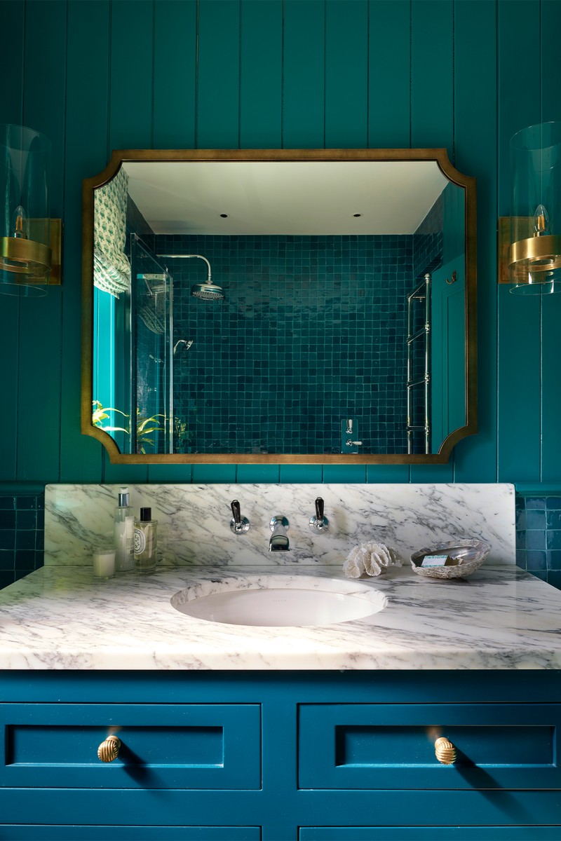
The Bathroom
Deep teal tiles on the lower level, timber cladding on the higher levels and large oversized brass fittings give this bathroom subtle nautical vibes without being too obvious.
WALLS - CROMARTY - Farrow & Ball
BLIND - Pukka Print
LIGHTS - Visual Comfort
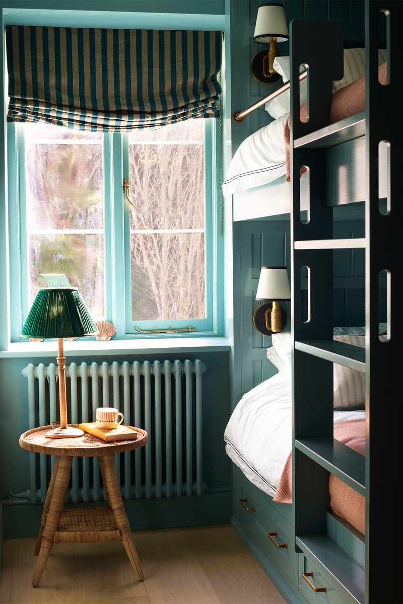
The Bunk Room
This room was such an awkward space, but when we were playing with the floor plan, we realised that by concentrating on a bunk system along the length of the room, we could have four full-sized single beds – each with its own cubby hole complete with a power charger, leather and brass wall light, and a built-in shelf for a book and water. The darker tones make the space feel so cosy, and a wall-mounted TV opposite means that this is the perfect cinema space for children and teenagers on rainy days.
WALLS - VERT DE MER - Edward Bulmer
BLIND - Nicky Haslam for Paolo Moschino Melba
LIGHTS (IN BEDS) - Ralph Lauren
Visit HUTLEY-HUMM.COM
Photography by Rachael Smith
Or continue to comment as a Guest below
DISCLAIMER: We endeavour to always credit the correct original source of every image we use. If you think a credit may be incorrect, please contact us at info@sheerluxe.com.
/https%3A%2F%2Fsheerluxe.com%2Fsites%2Fsheerluxe%2Ffiles%2Fwebsite-images%2F2025%2F03%2Fsign-up-pop-up.jpg)
