This Small Flat Contains Big Inspiration
The Property
This south London home in Clapham was a two-bedroom flat. It consisted of a compressed kitchen that had been awkwardly extended, leaving a large pillar in the space, dark windows and a leaky roof lantern. The owner is a successful young woman who works long hours. She wanted to make sure she had somewhere to relax and occasionally work from home. I stripped everything back in the rear, removing the pillar and changing the roof and glazing. In the front of the property, I rejigged the configuration to optimise the large front room.
The Brief
The owner is in her mid-20s and wanted a practical home to enjoy over the next few years. Our brief was to use some of the owner’s belongings throughout, such as lovely maps and paintings, and create a young vibe. She’s originally from South Africa, so we agreed to incorporate some of the vibrancy of her hometown.
TAKE THE TOUR
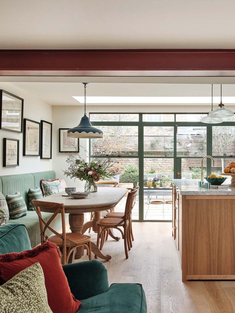
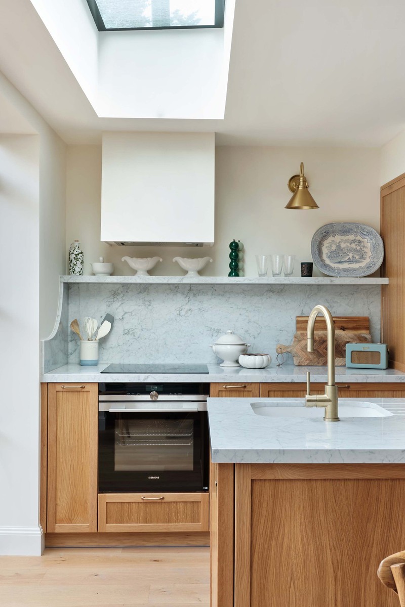
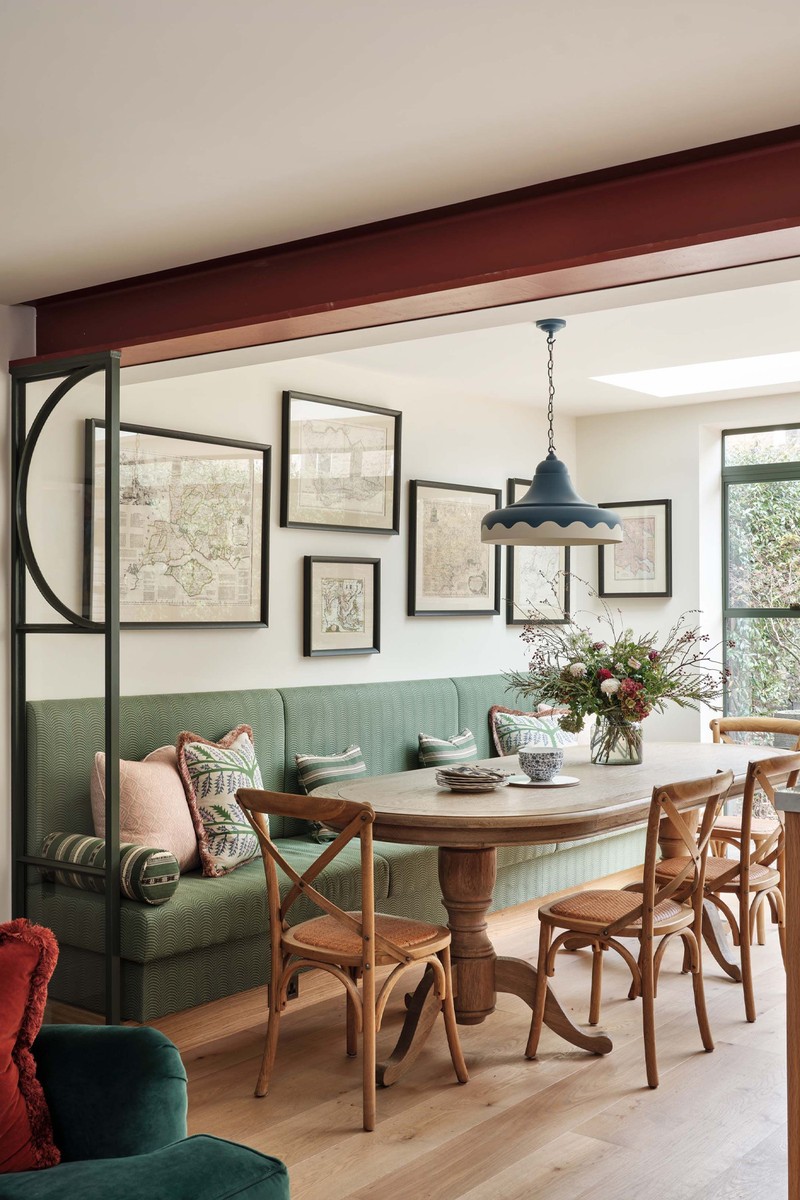
The Kitchen
The outside space is small and has a courtyard feel, so we wanted to optimise the greens from the garden and bring the wood-slatted fencing into the kitchen scheme. With that in mind, we chose natural-looking oak as the base, knowing that oak can always be painted later if the client wants a change.
/https%3A%2F%2Fsheerluxe.com%2Fsites%2Fsheerluxe%2Ffiles%2Farticles%2F2024%2F02%2Fsl-house-tour-lucinda-sandford-2.jpg)
While the kitchen is small, the owner loves cooking, so the space had to be optimised. I find smaller spaces always benefit from having a large dining bench. It means you can host a large dinner or lunch without needing too many chairs. Sourcing the right pedestal table is a must for this, otherwise the legs always get in the way.
As the space is one large room, we wanted to zone the area. We chose little Crittall-glazed fixed panels, which allowed the zoning to happen without changing the light or the flow between the spaces.
PENDANT LIGHT: Lighting Company
The Living Area
The dark green colour palette here gives a moodier feel. I find small ottomans are versatile and useful, and can be used either as tables or seating, so they allow for maximum seating when entertaining without the bulk of extra chairs. I always recommend adding a good tray – I love this beautiful Addison Ross one.
The ceiling height was naturally low, and the owner didn’t want to dig the floor down to create more height. Rather than concealing the new steel, we decided to embrace it and actually left it as near as possible to its natural, galvanised colour.
SOFA: Sofa.com
ARMCHAIR FABRIC: Schumacher
TRAY: Addison Ross
/https%3A%2F%2Fsheerluxe.com%2Fsites%2Fsheerluxe%2Ffiles%2Farticles%2F2024%2F02%2Fsl-house-tour-lucinda-sandford-5.jpg)
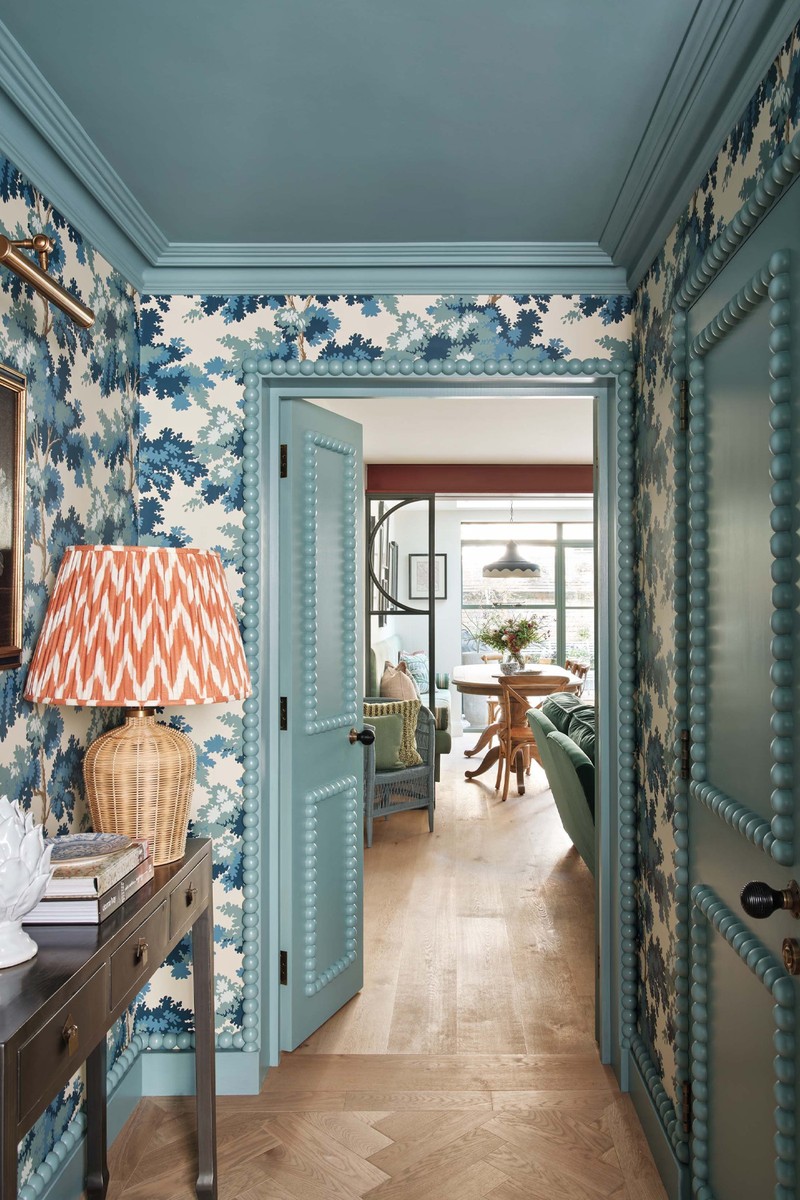
The Corridor
This corridor has no natural light and it’s obviously a tight space, but it’s also an important one as it’s frequently used, so we really focused on finding a way to add some flair to it. The wallpaper makes the colour pop, but it’s the oversized bob-end details around the skirting and doors that define this scheme. Painting the ceiling blue helped to create some atmosphere in this area, and I used a secret door detail to hide the entrance to the basement.
WALLPAPER: Sandberg
MOUDLING: Decora Mouldings
PICTURE LIGHTS: Pooky
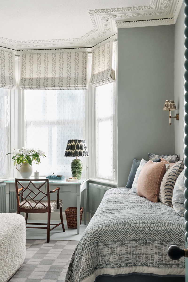
The Study Bedroom
The front room was originally where the client slept, but as it was the lightest of the rooms, we transformed it into a study, so she could work in a bright space. We added bespoke joinery to create a dressing area with a single trundle bed for guests. We left the original ceiling as the detailing was lovely, and choose a tonal blue to match the hallway. For the joinery, we kept it simple, using wallpaper in the reveals.
WARDROBE HANDLES: Beata Heuman
BLIND: Nicholas Herbert
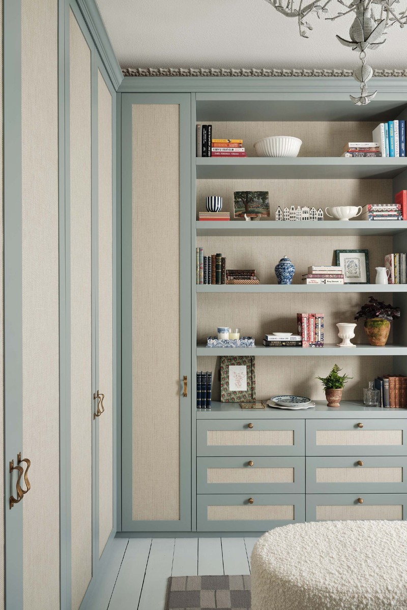
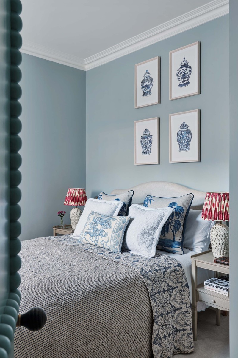
The Main Bedroom
Because we’d created a large dressing area in the other study bedroom, this room’s function became a tranquil sleeping zone, in another shade of blue that matched the hallway. One of my favourite Dunelm chairs occupies a corner here – I use it a lot in my designs and just re-cover it each time in a fabric that works for that particular scheme.
ARMCHAIR: Daals covered In Guy Goodfellow Collection
/https%3A%2F%2Fsheerluxe.com%2Fsites%2Fsheerluxe%2Ffiles%2Farticles%2F2024%2F02%2Fsl-house-tour-lucinda-sandford-9.jpg)
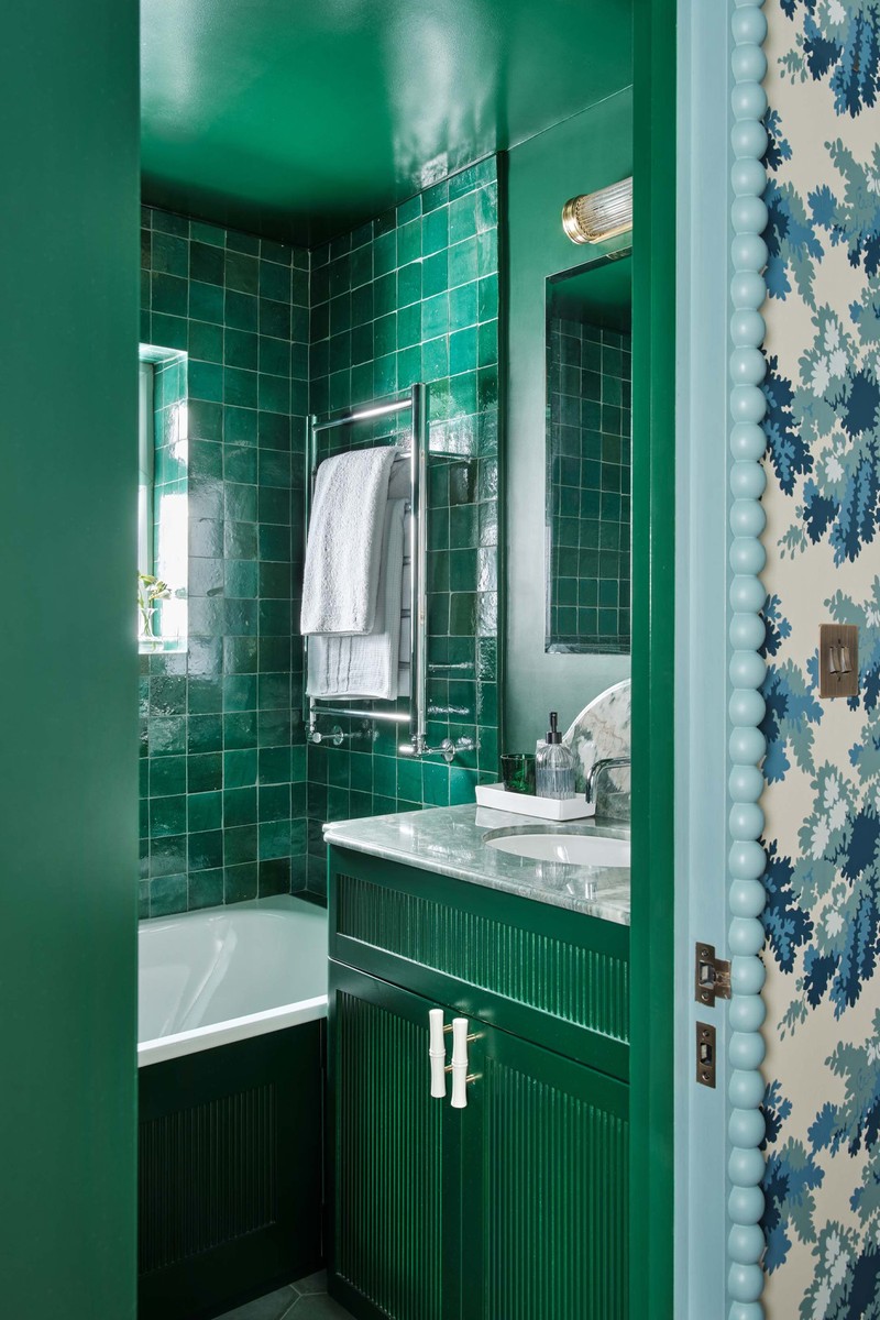
The Bathroom
This bathroom really packs a punch. Although it’s small and compact, we wanted to keep the big scale of the details from the hall, so the colour palette is dark and moody, with a large vanity for storage. The stone around the vanity makes a real impact and, again, we repeated a painted ceiling.
Visit LucindaSanford.com
DISCLAIMER: We endeavour to always credit the correct original source of every image we use. If you think a credit may be incorrect, please contact us at info@sheerluxe.com.
/https%3A%2F%2Fsheerluxe.com%2Fsites%2Fsheerluxe%2Ffiles%2Fwebsite-images%2F2025%2F03%2Fsign-up-pop-up.jpg)
