Meet The Interior Designer: Sarah Peake

Background
My love of interiors started with an interest in fabrics and sewing. I did textiles at school and trained as a pattern cutter at the London College of Fashion. After reading English at university, it took me a while to figure out the next step, but I soon found myself working for the designer Alidad. He taught me so much and made me religious about paying attention to even the smallest detail – it’s what makes the difference between a purely functional space and one that brims with personality. I then stepped into a more senior role at Todhunter Earle and earned more experience running larger projects all over the world.
Style & Ethos
It’s important to be mindful about the context of an interior. I try to avoid having a fixed ‘look’ or style – design is always an amalgamation of your vision, your client's vision and the existing space or building. If there are common threads in my work, they’re probably being bold with colour, using different materials and patterns, and mixing contemporary and antique furniture – but always within a coherent structure. It’s also vital that a space reflects the personality of the client. I also love it when a client wants me to incorporate something they already own, such as a favourite sofa or a writing desk, or forbids me to use certain colours – it means I have to get creative. If you ask me, art lives from constraints and dies from freedom.
Inspiration
I try to take inspiration from everywhere I can: the client, house, architecture and location. I also like researching historical periods and have an ample library of books. I might use a traditional genre as a starting point, but then contrast it with contemporary furniture. I might also get inspiration for the colour scheme from artworks or landscapes – I’m constantly taking pictures.
Colour Palette
I tend to veer towards blues and greens, and warm them up with wood or yellow or gold tones. They’re relaxing colours and fairly neutral, too. I use them a lot in bedrooms and bathrooms. That said, variety is so important, so while there may be one or two colours running throughout a design, I’ll always use others in addition to those anchoring tones.

Materials
I use a lot of natural materials like wood on floors and furniture, and natural linens and bouclé wool fabrics. I also love stone – be it an Italian marble for a bit of glamour or an English limestone for an understated farmhouse floor. But my schemes really come alive via well-executed contrast, which is why I love using these natural elements alongside flashes of brightly coloured lacquers and brasses.
Finishing Touches
It’s often a curly Gotland sheepskin or a heavily textured bouclé – if it hasn’t made its way onto upholstery, then it will appear as a cushion. Second, a Swedish flatweave rug. I’m always on the hunt for original pieces but we have recently been having new ones made in the original MMF factory in Sweden. Third, it has to be beautiful ceramics. I’m completely obsessed with organic ceramic shapes and beautiful glazes.
Instagram Inspiration
/https%3A%2F%2Fsheerluxe.com%2Fsites%2Fsheerluxe%2Ffiles%2Farticles%2F2022%2F05%2Fsarah-peake-profile-170522-parsons-green-01.jpg)
01
Parsons Green house
We started with a blank canvas – the architectural structure and shell were complete, but there was nothing else. The main rooms were effectively white boxes, with beautiful bones and original Victorian features, including stained glass windows, floorboards and tiles in the entrance hall. The clients were a young family with an interest in contemporary furniture and a good collection of modern art. They liked straight lines and fresh patterns, so we strived to create something which was in keeping with their taste but respected the origins of the house.
The starting point for the living room (above) came from the rug – a Nils Nilsson antique found in Sweden. I loved it so much I bought it without showing the client first. We wanted the room to feel contemporary and fresh, but also layered and interesting, so we were conscious of using lots of different finishes and textures. The wallcovering is by Colefax & Fowler, and it created a great backdrop for the clients’ own art. Hanging the different-sized pictures on the awkward wall above the sofa was a ploy to draw the eye away from the lack of symmetry and jutting nibs. The other big transformation was the fireplace. The surround was made to a bespoke design drawn up by us, and the slips were tiled in Balineum Hanley Tube Line tiles in bespoke colours.


In the master bedroom, we wanted to keep the colour palette calm and introduce soft colours. Edward Bulmer ‘Celadon’ works beautifully with the oak window frames. The Vanderhurd rug was another early find which drew in some cool blues into the scheme. To maintain the calm feeling we were conservative with pattern and kept the large swathes of wall and curtain fabric plain – using pattern on smaller areas like the headboard and cushions.
For the guest bedroom, the clients were keen on the idea of single beds – perfect for children’s sleepovers but they could also be made up as a double for adult guests. We designed our Barney beds in collaboration with Christopher Clark Workshops, which are now part of the Workshop by Studio Peake collection and are available to buy in a range of colours. We used strong raspberry reds, emerald greens and powder blue against crisp white. The rug was made by Amy Kent to work with the scheme and Alfred Newall made large, tiered side tables to fit the niches. Naturally, the clients gravitated towards a more neutral colour palette, but they were really pleased with the resulting warmth the colours brought to the space.
/https%3A%2F%2Fsheerluxe.com%2Fsites%2Fsheerluxe%2Ffiles%2Farticles%2F2022%2F05%2Fsarah-peake-profile-170522-vauxhall-03.jpg)
02
Vauxhall cottage
This was my first solo interior design project at Studio Peake. The house is a double-fronted Georgian cottage on a wisteria-filled terrace in south London. The previous owners had used a lot of black and grey, and favoured a rather industrial aesthetic. A late 1980s rear extension hadn’t been done sympathetically either, so a lot of the early work was about rethinking the bones of the house and adding or replacing different architectural elements (like architraves, doors, skirtings, cornices and radiators) that were more in keeping with what would have been there originally. My clients had bought the house and moved in after their honeymoon. After spending six months there, getting to know all the nooks and crannies, they brought me on. The brief was to come up with a colourful, original design that also translated into a comfortable, cosy home.
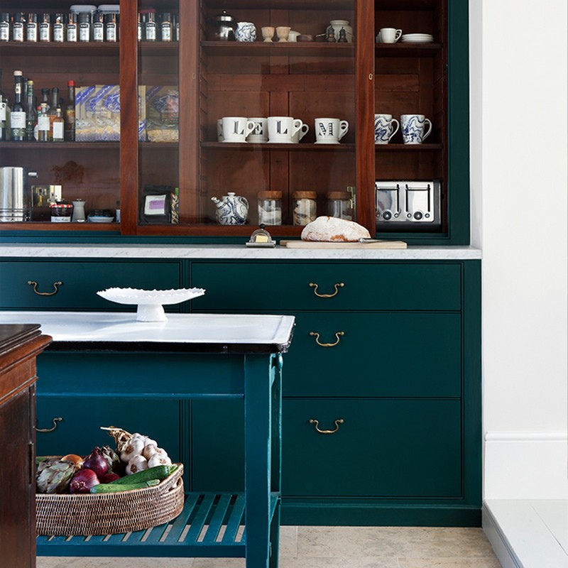
There wasn’t the budget – or the desire – to replace the kitchen, but it was definitely in need of a refresh. The combination of old and new resulted in a very characterful space. We laid a new limestone floor (lanyan limestone by Artisans of Devizes), painted the existing joinery in a green paint match by Dulux, replaced the laminate tops with Carrara marble and found new drawer handles at Lassco reclamation yard. We also brought in a French polisher with the help of Portobello Painters to restore the existing timber cupboards and internals. The floor paint was a special mix from Papers and Paints and the walls were painted Stone I from Paint & Paper Library’s architectural range. To evoke that cosiness, we adorned the front part of the kitchen with soft furnishings, framing the new windows with curtain fabric from Namay Samay and a Samuel & Sons fringe, as well as including a beautiful rug from A Rum Fellow.


The master bedroom is my favourite room in the house and benefits from a lot of natural light. It is colourful, with some bold patterns, yet still feels calm – as a bedroom should. The paint colour on the walls and joinery is ‘Fencing Blue’ by Paint & Paper Library. The curtain fabric is Lasso by Pierre Frey and the headboard is Kelly Wearstler with Romo Linara piping. Above the bed hangs a painting by Venetia Berry, a piece my client had bought before we started the project. The painting was actually my starting point for all the colour choices. The bed linen is Gayle Warwick Sienna appliqué, the throw is from Once Milano and the long cushion we had made out of a Guy Goodfellow fabric with a Samuel & Sons fringe.
The tiny box room was one of the biggest transformations (the second image from the top). Originally, the room was painted black with acid green wallpaper and there was a harshly angled ceiling which came down incredibly low above the window. We designed a ‘bed nook’ in the area near the window where the ceiling was low. This meant that in the standing area, the ceilings felt relatively high. With Billy Crawshaw’s expert help, we panelled the walls with V-grooved MDF and painted them with Edward Bulmer’s ‘Fair Blue’. Within the bed nook we had fun using Ottoline Devries wallpaper, fabric and contrast piping around the headboards and roman blind borders from Colefax & Fowler. We incorporated a bookcase for books and toys above the headboard, as there was no room for a bedside table, and had also included a wall light within the nook in place of a bedside lamp.
/https%3A%2F%2Fsheerluxe.com%2Fsites%2Fsheerluxe%2Ffiles%2Farticles%2F2022%2F05%2Fsarah-peake-profile-170522-barons-court-01.jpg)
03
Barons Court apartment
This is an Edwardian apartment inside a red-brick mansion block on a leafy street in Barons Court. The client had lived in the same apartment in her early 20s before renting it out. When she decided to move back in, she wanted to give the interior a new lease of life. It needed to be fresh and modern but still with a respect for and appreciation of the traditional and historic elements of the building.
The ceilings were incredibly high – the client came to the initial meeting with lots of references to Parisian buildings that often have high ceilings, intricate cornicing and beautiful doors. The ceilings and doors were already in place, with just one door needing to be replaced, but other than that the flat was taken back to the bare bones.

The layout is quite dramatic. You walk through the front door into a long corridor and straight ahead is the bathroom; it’s the first thing you see when you open the door. It’s quite a small bathroom and the client wanted us to make the most of it – a freestanding bath was a must. I was very keen for it not to be overly frilly, so we went with a Water Monopoly bath. The design is quite feminine and soft, but we used light, bright, fresh colours to make it feel modern.
I like to combine traditional and modern, and the study is a classic example where traditional panelling on the walls meets a mid-century modern light fitting. The panelling was all designed in our studio and executed by RC Joinery.
In the bedroom the walls are covered in a wallpaper from Lewis & Wood. An Anthropologie chair sits by a 19th-century secretaire from Kernow Furniture, which we restored and lined with wallpaper. A white ceramic lamp from Richard Taylor sits on top. The antique prints were found at Kempton and reframed.
Visit StudioPeake.com
DISCLAIMER: We endeavour to always credit the correct original source of every image we use. If you think a credit may be incorrect, please contact us at info@sheerluxe.com.
/https%3A%2F%2Fsheerluxe.com%2Fsites%2Fsheerluxe%2Ffiles%2Fwebsite-images%2F2025%2F03%2Fsign-up-pop-up.jpg)
